CSS / 애니메이션 / transition / 속성을 서서히 변화시키는 속성
목차
transition
- transition은 속성을 서서히 변화시키는 속성입니다.
- transition-property, transition-duration, transition-timing-function, transition-delay 속성을 한 번에 정합니다.
- IE는 버전 10부터 지원합니다.
문법
transition: property timing-function duration delay | initial | inherit
- property : transition을 적용시킬 속성을 정합니다. transition-property를 참고하세요.
- timing-function : transition의 진행 속도를 정합니다. transition-timing-function를 참고하세요.
- duration : transition의 총 시간을 정합니다. transition-duration을 참고하세요.
- delay : transition의 시작을 연기합니다. transition-delay를 참고하세요.
- initial : 기본값으로 설정합니다.
- inherit : 부모 요소의 속성값을 상속받습니다.
예제
- 체크박스에 체크하면 원이 큰 사각형으로 바뀌고, 배경색도 변합니다.
- 체크박스의 체크를 해제하면 원래 모양으로 돌아옵니다.
<!doctype html>
<html lang="ko">
	<head>
		<meta charset="utf-8">
		<title>CSS</title>
		<style>
			.jb {
				box-sizing: border-box;
				width: 64px;
				height: 64px;
				margin: 10px 0px;
				background-color: orange;
				border-radius: 100%;
				transition: all ease 2s 0s;
			}
			input:checked ~ .jb {
				width: 100%;
				height: 200px;
				border-radius: 0;
				background-color: red;
			}
		</style>
	</head>
	<body>
		<input type="checkbox">
		<div class="jb"></div>
	</body>
</html>
transition-property
- transition-property로 transition이 적용될 속성을 정합니다.
- IE는 버전 10부터 지원합니다.
문법
transition-property: none | all | property | initial | inherit
- none : 모든 속성에 적용하지 않습니다.
- all : 모든 속성에 적용합니다.
- property : 속성을 정합니다. 여러 개의 속성을 지정할 경우 쉼표로 구분합니다.
- initial : 기본값으로 설정합니다.
- inherit : 부모 요소의 속성값을 상속받습니다.
예제
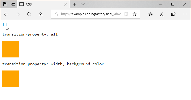
- 체크박스에 체크하면 width, border-radius, background-color의 속성 값이 바뀝니다.
- 첫 번째 박스는 모든 속성에 애니메이션 효과가 적용됩니다.
- 두 번째 박스는 width와 background-color에만 애니메이션 효과가 적용됩니다. border-radius는 체크하자마자 적용됩니다.
<!doctype html>
<html lang="ko">
	<head>
		<meta charset="utf-8">
		<title>CSS</title>
		<style>
			body {
				font-family: Consolas, monospace;
			}
			.jb {
				box-sizing: border-box;
				width: 64px;
				height: 64px;
				margin: 10px 0px;
				background-color: orange;
				transition-duration: 4s;
			}
			input:checked ~ .jb {
				width: 100%;
				border-radius: 20px;
				background-color: red;
			}
			.jb1 {
				transition-property: all;
			}
			.jb2 {
				transition-property: width, background-color;
			}
		</style>
	</head>
	<body>
		<input type="checkbox">
		<p>transition-property: all</p>
		<div class="jb jb1"></div>
		<p>transition-property: width, background-color</p>
		<div class="jb jb2"></div>
	</body>
</html>
transition-timing-function
- transition-timing-function으로 transition의 진행 속도를 조절할 수 있습니다.
- IE는 버전 10부터 지원합니다.
문법
transition-timing-function: ease | linear | ease-in | ease-out | ease-in-out | step-start | step-end | steps( n, start|end ) | cubic-bezier( n, n, n, n ) | initial | inherit;
- 기본값은 ease입니다.
- ease : cubic-bezier( 0.25, 0.1, 0.25, 1 )과 같습니다.
- linear : cubic-bezier( 0, 0, 1, 1 )과 같습니다.
- ease-in : cubic-bezier( 0.42, 0, 1, 1 )과 같습니다.
- ease-out : cubic-bezier( 0, 0, 0.58, 1 )과 같습니다.
- ease-in-out : cubic-bezier( 0.42, 0, 0.58, 1 )과 같습니다.
- step-start : steps( 1, start )와 같습니다.
- step-end : steps( 1, end )와 같습니다.
- steps( n, start|end ) : n단계로 나누어서 변화시킵니다. start 또는 end를 입력하지 않음녀 end로 처리합니다.
- cubic-bezier( n, n, n, n ) : n에는 0부터 1까지의 수를 넣습니다.
- initial : 기본값으로 설정합니다.
- inherit : 부모 요소의 속성값을 상속받습니다.
예제 1
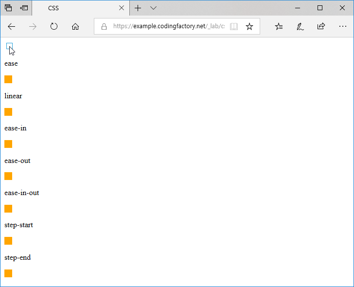
- ease, linear, ease-in, ease-out, ease-in-out, step-start, step-end를 비교하는 예제입니다.
- 체크박스에 체크하면 애니메이션이 시작되고, 체크를 해제하면 원래대로 돌아옵니다.
<!doctype html>
<html lang="ko">
	<head>
		<meta charset="utf-8">
		<title>CSS</title>
		<style>
			.jb {
				box-sizing: border-box;
				width: 16px;
				height: 16px;
				margin: 10px 0px;
				background-color: orange;
				transition-property: all;
				transition-duration: 4s;
			}
			input:checked ~ .jb {
				width: 100%;
			}
			.jb1 {
				transition-timing-function: ease;
			}
			.jb2 {
				transition-timing-function: linear;
			}
			.jb3 {
				transition-timing-function: ease-in;
			}
			.jb4 {
				transition-timing-function: ease-out;
			}
			.jb5 {
				transition-timing-function: ease-in-out;
			}
			.jb6 {
				transition-timing-function: step-start;
			}
			.jb7 {
				transition-timing-function: step-end;
			}
		</style>
	</head>
	<body>
		<input type="checkbox">
		<p>ease</p>
		<div class="jb jb1"></div>
		<p>linear</p>
		<div class="jb jb2"></div>
		<p>ease-in</p>
		<div class="jb jb3"></div>
		<p>ease-out</p>
		<div class="jb jb4"></div>
		<p>ease-in-out</p>
		<div class="jb jb5"></div>
		<p>step-start</p>
		<div class="jb jb6"></div>
		<p>step-end</p>
		<div class="jb jb7"></div>
	</body>
</html>
예제 2
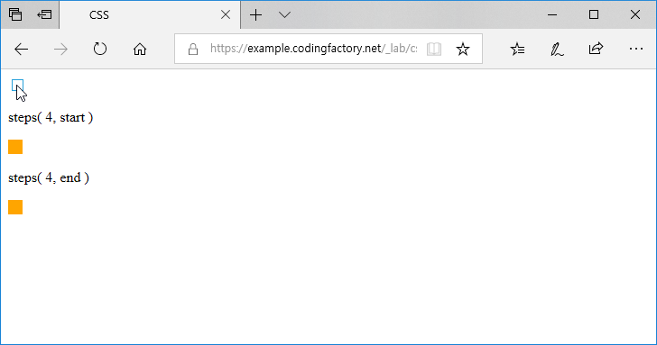
- steps( n, start|end )를 이용하여 4단계로 나누어 변화시키는 예제입니다.
- start로 설정한 경우 각 단계를 시작할 때, end로 설정한 경우 각 단계가 끝날 때 변화시킵니다.
<!doctype html>
<html lang="ko">
	<head>
		<meta charset="utf-8">
		<title>CSS</title>
		<style>
			.jb {
				box-sizing: boerder-box;
				width: 16px;
				height: 16px;
				margin: 10px 0px;
				background-color: orange;
				transition-property: all;
				transition-duration: 4s;
			}
			input:checked ~ .jb {
				width: 100%;
			}
			.jb1 {
				transition-timing-function: steps( 4 );
			}
			.jb2 {
				transition-timing-function: steps( 4, end );
			}
		</style>
	</head>
	<body>
		<input type="checkbox">
		<p>steps( 4, start )</p>
		<div class="jb jb1"></div>
		<p>steps( 4, end )</p>
		<div class="jb jb2"></div>
	</body>
</html>
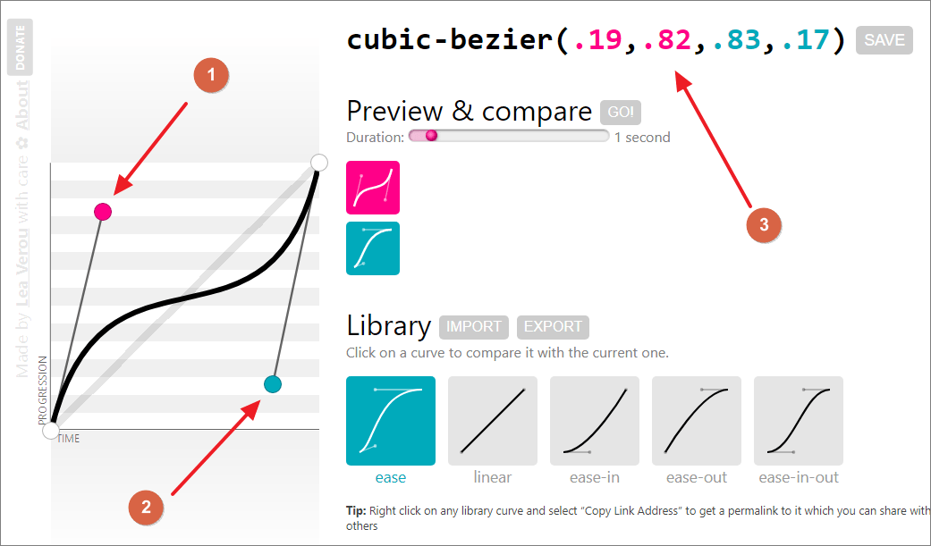
cubic-bezier( n, n, n, n )
- cubic-bezier( n, n, n, n )를 사용할 때 n에 들어갈 값은 http://cubic-bezier.com에서 찾을 수 있습니다.
- 점을 움직여서 원하는 커브를 만들고, 상단에 있는 수를 사용합니다.
transition-duration
- transition-duration로 transition이 끝날 때까지 걸리는 시간을 정합니다.
- IE는 버전 10부터 지원합니다.
문법
transition-duration: time| initial | inherit
- 기본값은 0s입니다.
- 시간 단위는 초(s) 또는 1/1000초(ms)를 사용합니다.
- initial : 기본값으로 설정합니다.
- inherit : 부모 요소의 속성값을 상속받습니다.
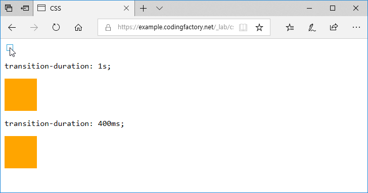
예제
- 체크박스에 체크하면 박스가 커집니다.
- 첫 번째 박스는 다 커지는데 1초가 걸립니다.
- 두 번째 박스는 다 커지는데 0.4초가 걸립니다.
<!doctype html>
<html lang="ko">
	<head>
		<meta charset="utf-8">
		<title>CSS</title>
		<style>
			body {
				font-family: Consolas, monospace;
			}
			.jb {
				box-sizing: border-box;
				width: 64px;
				height: 64px;
				margin: 10px 0px;
				background-color: orange;
			}
			input:checked ~ .jb {
				width: 100%;
			}
			.jb1 {
				transition-duration: 1s;
			}
			.jb2 {
				transition-duration: 400ms;
			}
		</style>
	</head>
	<body>
		<input type="checkbox">
		<p>transition-duration: 1s;</p>
		<div class="jb jb1"></div>
		<p>transition-duration: 400ms;</p>
		<div class="jb jb2"></div>
	</body>
</html>
transition-delay
- transition-delay로 transition이 시작하는 시간을 연기할 수 있습니다.
- IE는 버전 10부터 지원합니다.
문법
transition-delay: time| initial | inherit
- 기본값은 0s입니다.
- 시간 단위는 초(s) 또는 1/1000초(ms)를 사용합니다.
- initial : 기본값으로 설정합니다.
- inherit : 부모 요소의 속성값을 상속받습니다.
예제
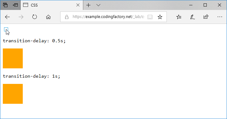
- 체크박스에 체크하면 1초에 걸쳐 박스가 커집니다.
- 첫 번째 박스는 0.5초 대기 후 커집니다. 즉, 박스가 커지는데 1.5초가 걸립니다.
- 두 번째 박스는 1초 대기 후 커집니다. 즉, 박스가 커지는데 2초가 걸립니다.
<!doctype html>
<html lang="ko">
	<head>
		<meta charset="utf-8">
		<title>CSS</title>
		<style>
			body {
				font-family: Consolas, monospace;
			}
			.jb {
				box-sizing: border-box;
				width: 64px;
				height: 64px;
				margin: 10px 0px;
				background-color: orange;
				transition-duration: 1s;
			}
			input:checked ~ .jb {
				width: 100%;
			}
			.jb1 {
				transition-delay: 0.5s;
			}
			.jb2 {
				transition-delay: 1s;
			}
		</style>
	</head>
	<body>
		<input type="checkbox">
		<p>transition-delay: 0.5s;</p>
		<div class="jb jb1"></div>
		<p>transition-delay: 1s;</p>
		<div class="jb jb2"></div>
	</body>
</html>
CSS / accent-color / input, progress에서 강조할 색을 지정하는 속성
개요 accent-color는 강조할 색을 지정하는 속성이다. 아래 요소에 적용할 수 있다. <input type="checkbox"> <input type="radio"> <input type="range"> <progress> 문법 accent-color: auto | color | initial | inherit auto : 기본값으로, 브라우저가 색을 정한다. color : 색을 정한다. initial : 기본값으로 설정한다. inherit : 부모 요소의 속성값을 상속 받는다. 예제 - input checkbox 체크박스를 선택하면 녹색이 된다. <!doctype html> <html lang="ko"> <head> ...

CSS / font-size / 글자 크기 정하는 속성
개요 font-size는 글자 크기를 정하는 속성입니다. 기본값 : medium 상속 : Yes 애니메이션 : Yes 버전 : CSS Level 1 문법 font-size: medium | xx-small | x-small | small | large | x-large | xx-large | smaller | larger | length | initial | inherit medium : 웹브라우저에서 정한 기본 글자크기입니다. xx-small, x-small, small, large, x-large, xx-large : medium에 ...
사진을 강조하는 블로그나 사이트의 경우 이미지 위에 텍스트를 놓는 경우가 많습니다. 텍스트가 보이게 놓기도 하고, 마우스를 올리면 보이게 하기도 합니다. 텍스트를 이미지 위에 어떻게 넣는지 알아보겠습니다. 방법 1 다음은 이미지와 텍스트가 있는 간단한 문서입니다. 이미지는 파란색의 사각형이고, 구분하기 쉽도록 텍스트의 배경색은 노란색으로 했습니다. <!doctype html> <html lang="ko"> <head> <meta charset="utf-8"> <title>CSS</title> <style> .jb-wrap { width: 40%; margin: 10px auto; border: 1px solid ...
CSS / 애니메이션 / transition / 속성을 서서히 변화시키는 속성
transition transition은 속성을 서서히 변화시키는 속성입니다. transition-property, transition-duration, transition-timing-function, transition-delay 속성을 한 번에 정합니다. IE는 버전 10부터 지원합니다. 문법 transition: property timing-function duration delay | initial | inherit property : transition을 적용시킬 속성을 정합니다. transition-property를 참고하세요. timing-function : transition의 진행 속도를 정합니다. transition-timing-function를 참고하세요. duration : transition의 총 시간을 정합니다. transition-duration을 참고하세요. delay : transition의 시작을 연기합니다. transition-delay를 참고하세요. initial : 기본값으로 설정합니다. inherit : 부모 요소의 속성값을 상속받습니다. 예제 체크박스에 ...
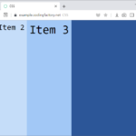
align-items로 교차축(cross axis) 아이템 정렬을 정합니다. 예를 들어 flex-direction의 값이 row인 경우 수직 정렬을 정합니다. 아래는 flex-direction: row일 때의 예제입니다. 기본값은 stretch로, 콘테이너의 높이에 맞게 늘립니다. <!doctype html> <html lang="ko"> <head> <meta charset="utf-8"> <title>CSS</title> <style> body { ...

구글에서 많은 웹폰트를 제공하고 있다. 어떻게 사용하는지, IE를 지원하는 방법은 무엇인지 알아본다. 웹폰트 선택하기 웹브라우저로 Google Fonts에 접속한다. 왼쪽에서 적절히 필터한다. 한글 글꼴이 필요하다면 Language를 Korean으로 한다. 원하는 글꼴을 클릭한다. 사용할 스타일을 선택한다. 오른쪽에 선택한 글꼴과 스타일이 나오고, 웹폰트를 사용하기 위한 코드 예시가 나온다. 여러 글꼴과 스타일을 선택할 수도 있다. 웹폰트 사용하기 예를 들어 Noto Sans Korean 100과 400을 ...
CSS / border-radius / 테두리 둥글게 만드는 속성
border-radius border-radius는 테두리를 둥글게 만드는 속성입니다. CSS3에서 정의되었으며, IE는 버전 9부터 지원합니다.(IE8에서 사용하는 방법) 8개의 속성 값을 넣어야 하지만, 값이 같다면 짧게 쓸 수 있습니다. 다음 상자의 테두리를 여러 가지 방식으로 둥글게 만들어보겠습니다. <!doctype html> <html lang="ko"> <head> <meta charset="utf-8"> <title>CSS</title> <style> div { box-sizing: border-box; width: 200px; height: 200px; margin: 20px auto; background-color: orange; } </style> </head> <body> <div class="jb"></div> </body> </html> 문법 1 border-radius: top-left-x top-right-x bottom-right-x bottom-left-x / top-left-y top-right-y bottom-right-y bottom-left-y 속성의 ...
CSS / background-repeat / 배경 이미지 반복 여부 정하는 속성
개요 background-repeat로 배경 이미지의 반복 여부와 반복 방향을 정합니다. 기본값 : repeat 상속 : No 애니메이션 : No 버전 : CSS Level 1 문법 background-repeat: repeat | repeat-x | repeat-y | no-repeat | inherit repeat : 가로 방향, 세로 방향으로 반복합니다. repeat-x : 가로 방향으로 반복합니다. repeat-y : 세로 방향으로 반복합니다. no-repeat : 반복하지 않습니다. initial : 기본값으로 설정합니다. inherit : 부모 요소의 속성값을 상속받습니다. 예제 <!doctype html> <html lang="ko"> ...
글의 완급 조절, 내용 전환 등을 위해 구분선을 사용하는 경우가 많다. 선은 여러 가지 방식으로 만들 수 있는데, 보기 좋게 꾸미는 것은 CSS로 한다. 아래는 div 태그에 모양을 입혀서 구분선을 만드는 몇 가지 예제이다. 예제 문서 <div class="jb-division-line"></div>를 꾸며서 구분선을 만들 것이다. <!doctype html> <html lang="ko"> <head> <meta charset="utf-8"> ...
목록의 내용만 가운데 정렬하기 목록 자체가 아니라 목록 안의 내용만 가운데 정렬할 때는 text-align 속성을 사용합니다. ul { text-align: center; } 목록 요소 자체를 가운데 정렬하기 목록 요소 자체를 가운데 정렬할 때는 margin 속성을 사용합니다. ul, ol의 기본 가로 크기는 100%이므로, 가로 크기를 지정해줘야 가운데로 정렬됩니다. ul { width: 300px; margin-left: auto; ...