CSS / Reference / font-size
개요
font-size는 글자 크기를 정하는 속성입니다.
- 기본값 : medium
- 상속 : Yes
- 애니메이션 : Yes
- 버전 : CSS Level 1
문법
font-size: medium | xx-small | x-small | small | large | x-large | xx-large | smaller | larger | length | initial | inherit
- medium : 웹브라우저에서 정한 기본 글자크기입니다.
- xx-small, x-small, small, large, x-large, xx-large : medium에 대한 상대적인 크기입니다.
- smaller, larger : 부모 요소의 글자 크기에 대한 상대적인 글자 크기입니다.
- length : px, %, em, rem 등으로 크기를 정합니다.
- initial : 기본값으로 설정합니다.
- inherit : 부모 요소의 속성값을 상속받습니다.
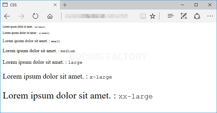
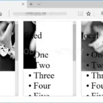
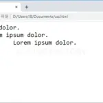
예제 1
- medium, xx-small, x-small, small, large, x-large, xx-large로 글자 크기를 정한 예제입니다.
- 웹브라우저의 기본 글자 크기를 바꾸면 예제의 글자 크기도 바뀝니다.
<!doctype html>
<html lang="ko">
  <head>
    <meta charset="utf-8">
    <title>CSS</title>
    <style>
      .jb-xx-small { font-size: xx-small; }
      .jb-x-small { font-size: x-small; }
      .jb-small { font-size: small; }
      .jb-medium { font-size: medium; }
      .jb-large { font-size: large; }
      .jb-x-large { font-size: x-large; }
      .jb-xx-large { font-size: xx-large; }
    </style>
  </head>
  <body>
    <p class="jb-xx-small">Lorem ipsum dolor sit amet. : <code>xx-small</code></p>
    <p class="jb-x-small">Lorem ipsum dolor sit amet. : <code>x-small</code></p>
    <p class="jb-small">Lorem ipsum dolor sit amet. : <code>small</code></p>
    <p class="jb-medium">Lorem ipsum dolor sit amet. : <code>medium</code></p>
    <p class="jb-large">Lorem ipsum dolor sit amet. : <code>large</code></p>
    <p class="jb-x-large">Lorem ipsum dolor sit amet. : <code>x-large</code></p>
    <p class="jb-xx-large">Lorem ipsum dolor sit amet. : <code>xx-large</code></p>
  </body>
</html>
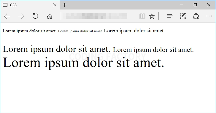
예제 2
- smaller, larger로 글자 크기를 정한 예제입니다.
- 부모 요소의 글자 크기가 변하면 자식 요소의 글자 크기도 변합니다.
<!doctype html>
<html lang="ko">
  <head>
    <meta charset="utf-8">
    <title>CSS</title>
    <style>
      .jb-default-1 { font-size: 16px; }
      .jb-default-2 { font-size: 32px; }
      .jb-smaller { font-size: smaller; }
      .jb-larger { font-size: larger; }
    </style>
  </head>
  <body>
    <p class="jb-default-1">
      <span>Lorem ipsum dolor sit amet.</span>
      <span class="jb-smaller">Lorem ipsum dolor sit amet.</span>
      <span class="jb-larger">Lorem ipsum dolor sit amet.</span>
    </p>
    <p class="jb-default-2">
      <span>Lorem ipsum dolor sit amet.</span>
      <span class="jb-smaller">Lorem ipsum dolor sit amet.</span>
      <span class="jb-larger">Lorem ipsum dolor sit amet.</span>
    </p>
  </body>
</html>
예제 3
- px, %, em, rem을 이용하여 글자 크기를 정하는 예제입니다.
- 웹브라우저의 기본 글자 크기는 보통 16px와 같습니다.
- %와 em은 부모 요소의 글자 크기에 대한 상대적인 글자 크기입니다. 100%와 1em은 부모 요소의 글자 크기와 같고, 숫자가 커질수록 글자가 커지고, 숫자가 작아질수록 글자가 작아집니다.
- rem은 최상위 요소, 즉 html 요소의 글자 크기에 대한 상대적인 글자 크기입니다.
<!doctype html>
<html lang="ko">
  <head>
    <meta charset="utf-8">
    <title>CSS</title>
    <style>
      html { font-size: 32px; }
      .jb-default { font-size: 16px; }
      .jb-percentage { font-size: 150%; }
      .jb-em { font-size: 1.5em; }
      .jb-rem { font-size: 1.5rem; }
    </style>
  </head>
  <body>
    <div class="jb-default">
      <p>Lorem ipsum dolor sit amet.</p>
      <p class="jb-percentage">Lorem ipsum dolor sit amet.</p>
      <p class="jb-em">Lorem ipsum dolor sit amet.</p>
      <p class="jb-rem">Lorem ipsum dolor sit amet.</p>
    </div>
  </body>
</html>

opacity로 요소의 투명도를 정할 수 있습니다. 기본값 : 1 상속 : No 애니메이션 : Yes 버전 : CSS Level 3
text-align은 문단 정렬 방식을 정하는 속성입니다. 기본값 : 읽는 방향이 LTR(왼쪽에서 오른쪽)인 경우 left, RTL(오른쪽에서 왼쪽)인 경우 right 상속 : Yes 애니메이션 : No 버전 : CSS Level 1
CSS / Reference / background-attachment
background-attachment는 배경 이미지의 스크롤 여부를 정하는 속성입니다. 기본값 : scroll 상속 : No 애니메이션 : No 버전 : CSS Level 1
CSS / Reference / backface-visibility
backface-visibility는 요소의 뒷쪽에서 앞면이 보이게 할지 정하는 속성입니다. 기본값 : visible 상속 : No 애니메이션 : No 버전 : CSS Level 3
CSS / Reference / font-variant
font-variant는 소문자를 작은 대문자, 즉 소문자 크기의 대문자로 바꾸는 속성입니다. 따라서 한글에서는 의미 없는 속성입니다. 기본값 : normal 상속 : Yes 애니메이션 : No 버전 : CSS Level 1
CSS / Reference / background-image
background-image는 이미지를 배경으로 사용하게 하는 속성입니다. 기본값 : none 상속 : No 애니메이션 : No 버전 : CSS Level 1
HTML은 탭을 연속하여 여러 개 넣어도 하나의 공백으로 인식합니다. 하지만 pre 태그를 이용하면 입력된 그대로 출력할 수 있습니다. 기본적으로 하나의 탭을 8개의 공백으로 인식합니다. 이 탭 크기를 조정하는 속성이 tab-size입니다.
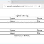
CSS / Reference / caption-side
caption-side는 표(table)의 caption 위치를 정하는 속성입니다. 기본값 : top 상속 : Yes 애니메이션 : No 버전 : CSS Level 2
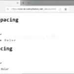
CSS / Reference / letter-spacing, word-spacing
글자 사이의 간격은 letter-spacing으로, 단어 사이의 간격은 word-spacing으로 정합니다. 값이 커지면 간격이 커집니다. 값에는 음수를 넣을 수 있습니다. 음수를 값으로 하는 경우 글자가 겹칠 수 있습니다.
content는 선택한 요소의 앞이나 뒤에 텍스트, 이미지 등을 추가하는 속성입니다. 기본값 : normal 상속 : No 애니메이션 : No 버전 : CSS Level 2