CSS / Reference / aspect-ratio
개요
- aspect-ratio는 선택한 요소의 가로 세로 비율을 정하는 속성입니다.
- 접속하는 기기의 해상도가 변해도, 일정한 가로 세로 비율을 유지하고 싶을 때 유용하게 사용할 수 있습니다.
문법
aspect-ratio: auto | number / number | initial | inherit
- auto : 요소가 고유의 가로 세로 비율을 가진 경우 그 값으로 설정합니다.
- number / number : 가로 대 세로. 세로가 생략된 경우 1로 처리합니다.
- initial : 기본값으로 설정합니다.
- inherit : 부모 요소의 속성값을 상속 받습니다.
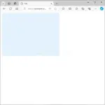
예제 - 고유 가로 세로 비율이 없는 요소
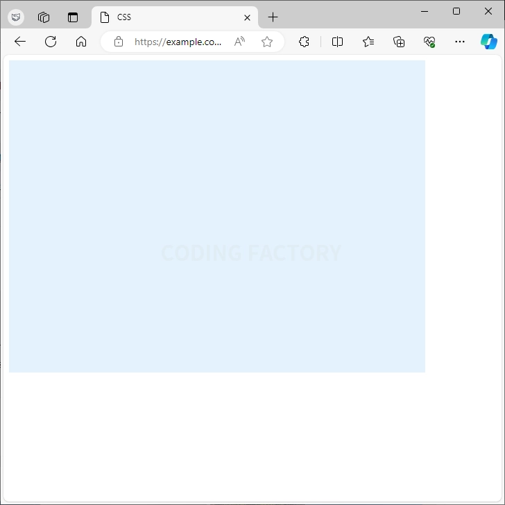
- div 요소의 가로 크기를 600px로 정하고 가로 세로 비율을 4:3으로 합니다. 즉, 세로 크기는 300px가 됩니다.
<!doctype html>
<html lang="ko">
  <head>
    <meta charset="utf-8">
    <title>CSS</title>
    <style type="text/css">
      div {
        background-color: #e3f2fd;
        width: 600px;
        aspect-ratio: 4 / 3;
      }
    </style>
  </head>
  <body>
    <div></div>
  </body>
</html>
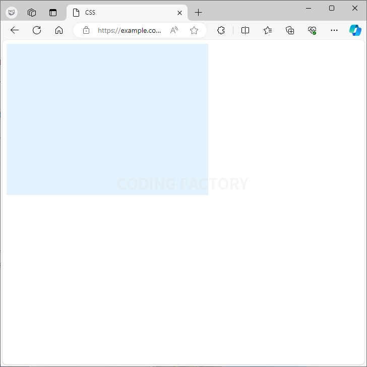
- div 요소의 세로 크기를 300px로 정하고 가로 세로 비율을 4:3으로 합니다. 즉, 가로 크기는 400px가 됩니다.
<!doctype html>
<html lang="ko">
  <head>
    <meta charset="utf-8">
    <title>CSS</title>
    <style type="text/css">
      div {
        background-color: #e3f2fd;
        height: 300px;
        aspect-ratio: 4 / 3;
      }
    </style>
  </head>
  <body>
    <div></div>
  </body>
</html>
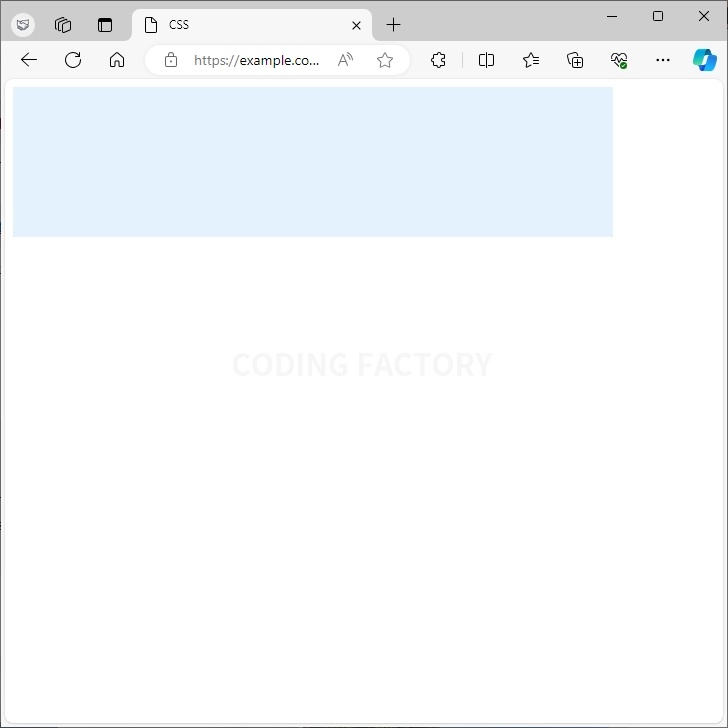
- div 요소의 가로 크기를 600px로 정하고 가로 세로 비율을 4로 하면, 세로는 1로 처리합니다. 즉, 4:1이므로 세로 크기는 150px가 됩니다.
<!doctype html>
<html lang="ko">
  <head>
    <meta charset="utf-8">
    <title>CSS</title>
    <style type="text/css">
      div {
        background-color: #e3f2fd;
        width: 600px;
        aspect-ratio: 4;
      }
    </style>
  </head>
  <body>
    <div></div>
  </body>
</html>
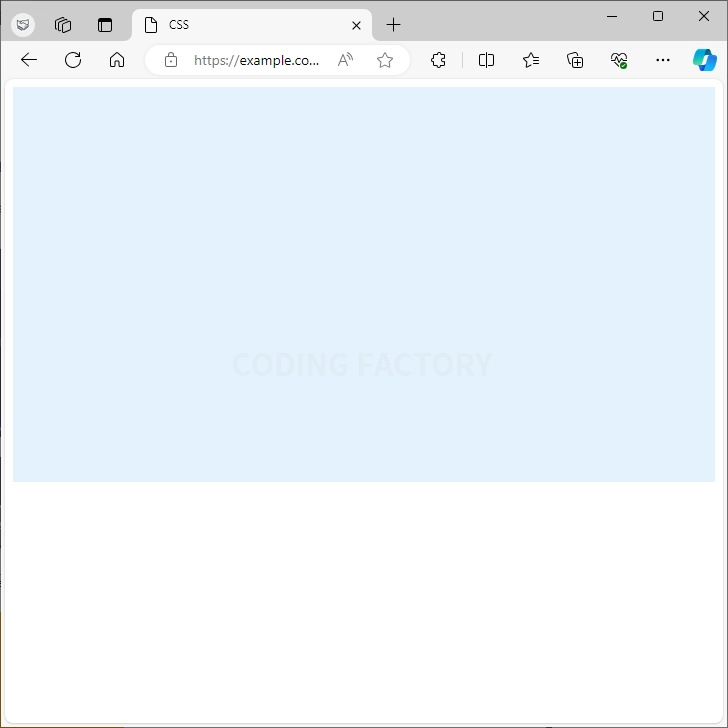
- div 요소의 가로 크기와 세로 크기를 정하지 않으면, 가로 크기 100%로 작동합니다.
<!doctype html>
<html lang="ko">
  <head>
    <meta charset="utf-8">
    <title>CSS</title>
    <style type="text/css">
      div {
        background-color: #e3f2fd;
        aspect-ratio: 16 / 9;
      }
    </style>
  </head>
  <body>
    <div></div>
  </body>
</html>
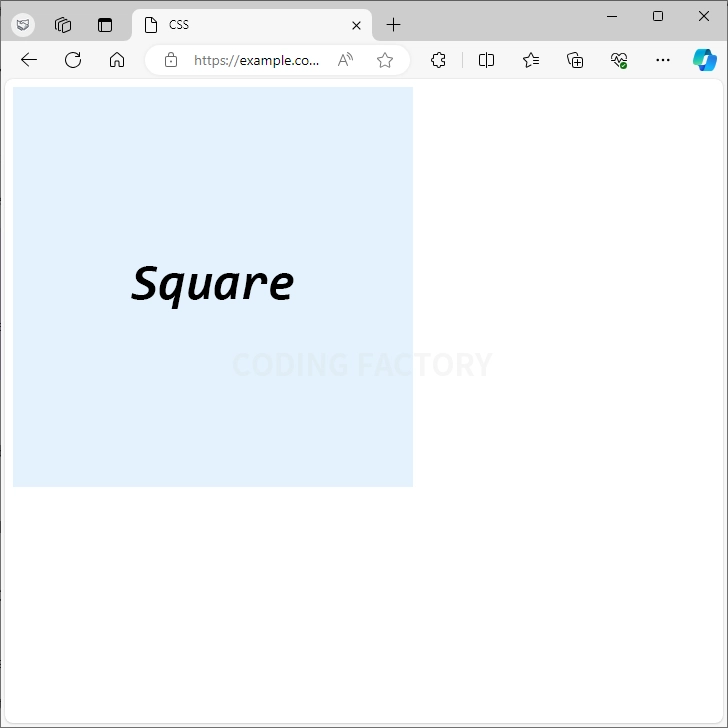
예제 - 고유 가로 세로 비율이 있는 요소
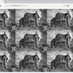
- 이미지와 같이 고유 가로 세로 비율이 있는 요소에서 가로 크기 또는 세로 크기를 지정하지 않으면 aspect-ratio가 적용되지 않습니다.
<!doctype html>
<html lang="ko">
  <head>
    <meta charset="utf-8">
    <title>CSS</title>
    <style type="text/css">
      img {
        aspect-ratio: 4 / 1;
      }
    </style>
  </head>
  <body>
    <img src="images/square-400x400.png" alt="">
  </body>
</html>
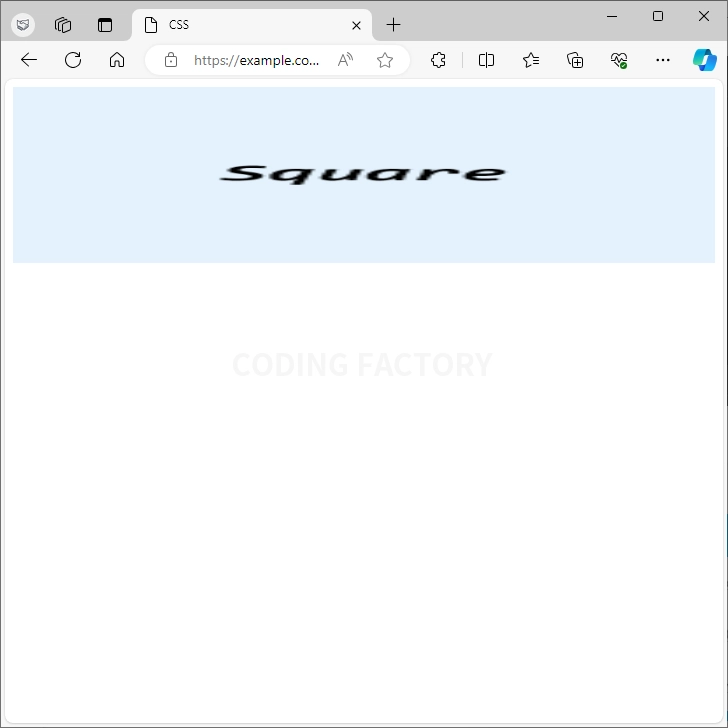
- 가로 크기 또는 세로 크기를 설정해야 aspect-ratio가 적용됩니다.
<!doctype html>
<html lang="ko">
  <head>
    <meta charset="utf-8">
    <title>CSS</title>
    <style type="text/css">
      img {
        width: 100%;
        aspect-ratio: 4 / 1;
      }
    </style>
  </head>
  <body>
    <img src="images/square-400x400.png" alt="">
  </body>
</html>
들여쓰기와 내어쓰기는 text-indent 속성으로 만듭니다. 값이 양수이면 들여쓰기, 값이 음수이면 내어쓰기가 됩니다. 내어쓰기를 할 때는 왼쪽에 여백을 적절히 줍니다.
HTML은 탭을 연속하여 여러 개 넣어도 하나의 공백으로 인식합니다. 하지만 pre 태그를 이용하면 입력된 그대로 출력할 수 있습니다. 기본적으로 하나의 탭을 8개의 공백으로 인식합니다. 이 탭 크기를 조정하는 속성이 tab-size입니다.

opacity로 요소의 투명도를 정할 수 있습니다. 기본값 : 1 상속 : No 애니메이션 : Yes 버전 : CSS Level 3
CSS / Reference / background-repeat
background-repeat는 배경 이미지의 반복 여부와 반복 방향을 정하는 속성입니다. 기본값 : repeat 상속 : No 애니메이션 : No 버전 : CSS Level 1
CSS / Reference / font-variant
font-variant는 소문자를 작은 대문자, 즉 소문자 크기의 대문자로 바꾸는 속성입니다. 따라서 한글에서는 의미 없는 속성입니다. 기본값 : normal 상속 : Yes 애니메이션 : No 버전 : CSS Level 1
quotes는 q 태그로 만든 인용문을 감싸는 큰따옴표를 다른 기호 또는 문자로 바꿔주는 속성입니다. 기본값 : 큰따옴표 상속 : Yes 애니메이션 : No 버전 : CSS Level 2
CSS / Reference / background-color
background-color로 배경의 색을 정합니다. 그 색으로 border와 padding을 포함한 영역을 칠합니다. margin 영역은 칠하지 않습니다. 기본값 : transparent 상속 : No 애니메이션 : Yes 버전 : CSS Level 1
word-wrap은 띄어쓰기가 없는 긴 단어를 어떻게 처리할지 정하는 속성입니다. 기본값 : normal 상속 : Yes 애니메이션 : No 버전 : CSS Level 3
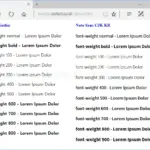
font-weight 속성은 CSS에서 글꼴의 굵기를 지정하는 데 사용됩니다. 텍스트의 가독성을 높이거나 디자인의 강조점을 표현할 때 유용합니다. 기본값 : normal 상속 : Yes 애니메이션 : Yes 버전 : CSS Level 1
CSS / Reference / aspect-ratio
aspect-ratio는 선택한 요소의 가로 세로 비율을 정하는 속성입니다. 접속하는 기기의 해상도가 변해도, 일정한 가로 세로 비율을 유지하고 싶을 때 유용하게 사용할 수 있습니다.