CSS / Tutorial / 마름모 만드는 방법
CSS로 삼각형을 만들 수 있다면 마름모는 쉽게 만들 수 있습니다. 삼각형을 두 개 붙이면 마름모가 되기 때문입니다. 마름모는 네 변의 길이가 같은 사각형이므로, 이등변삼각형 두 개를 붙이며 됩니다.
- HTML 문서에 다음과 같이 내용이 없는 요소를 하나 넣습니다.
<div class="rhombus"></div>
- 크기를 0으로 한 후, border 속성을 이용하여 이등변삼각형을 만듭니다.
- position: relative;는 나머지 반쪽의 위치를 잡기 위해 넣은 것입니다.
.rhombus {
  width: 0px;
  height: 0px;
  border-right: 200px solid #666666;
  border-top: 100px solid transparent;
  border-bottom: 100px solid transparent;
  position: relative;
  left: -50%;
}
- :after 선택자를 이용하여 삼각형을 하나 더 만듭니다.
- position을 이용하여 위치를 잘 맞추면 마름모가 만들어집니다.
.rhombus:after {
  content: "";
  border-left: 200px solid #666666;
  border-top: 100px solid transparent;
  border-bottom: 100px solid transparent;
  position: absolute;
  top: -100px;
  left: 200px;
}
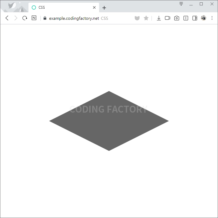
- 전체 코드는 다음과 같습니다.
<!doctype html>
<html lang="ko">
  <head>
    <meta charset="utf-8">
    <title>CSS</title>
    <style>
      body {
        margin: 0px;
      }
      .container {
        display: flex;
        height: 100vh;
        justify-content: center;
        align-items: center;
      }
      .rhombus {
        width: 0px;
        height: 0px;
        border-right: 200px solid #666666;
        border-top: 100px solid transparent;
        border-bottom: 100px solid transparent;
        position: relative;
        left: -50%;
      }
      .rhombus:after {
        content: "";
        border-left: 200px solid #666666;
        border-top: 100px solid transparent;
        border-bottom: 100px solid transparent;
        position: absolute;
        top: -100px;
        left: 200px;
      }
    </style>
  </head>
  <body>
    <div class="container">
      <div class="item">
        <div class="rhombus"></div>
      </div>
    </div>
  </body>
</html>
CSS / Tutorial / 상속(inheritance)
CSS 속성은 상속하는 속성과 상속하지 않는 속성이 있습니다. 상속하는 속성은 자식 요소에 영향을 미칩니다. 상속하지 않는 속성은 자식 요소에 영향을 미치지 않습니다.

CSS / Tutorial / 선택자(Selector)
CSS에서 선택자(CSS Selector)는 HTML 문서의 요소를 선택하고 스타일을 적용할 때 사용되는 구문입니다. 선택자는 특정 요소를 대상으로 스타일을 지정할 수 있도록 돕는 중요한 역할을 하며, 다양한 방법으로 요소를 선택할 수 있습니다.
CSS에서 !important는 특정 스타일 규칙이 다른 모든 스타일 규칙보다 우선 적용되도록 강제하는 데 사용됩니다. 이 키워드는 일반적인 스타일 우선 순위를 무시하고, 해당 스타일이 다른 어떤 스타일보다도 높은 우선순위를 가지도록 합니다.
CSS / Tutorial / CSS를 HTML에 적용시키는 방법
HTML에 CSS를 적용시키는 방법은 세 가지가 있습니다. 각 방법은 장단점이 있으니 상황에 맞게 적절한 방법을 선택합니다. Inline Style Sheet HTML 태그의 style 속성에 CSS 코드를 넣습니다. Internal Style Sheet HTML 문서 안의 과 안에 CSS 코드를 넣습니다. Linking Style Sheet 별도의 CSS 파일을 만들고 HTML 문서와 연결합니다.
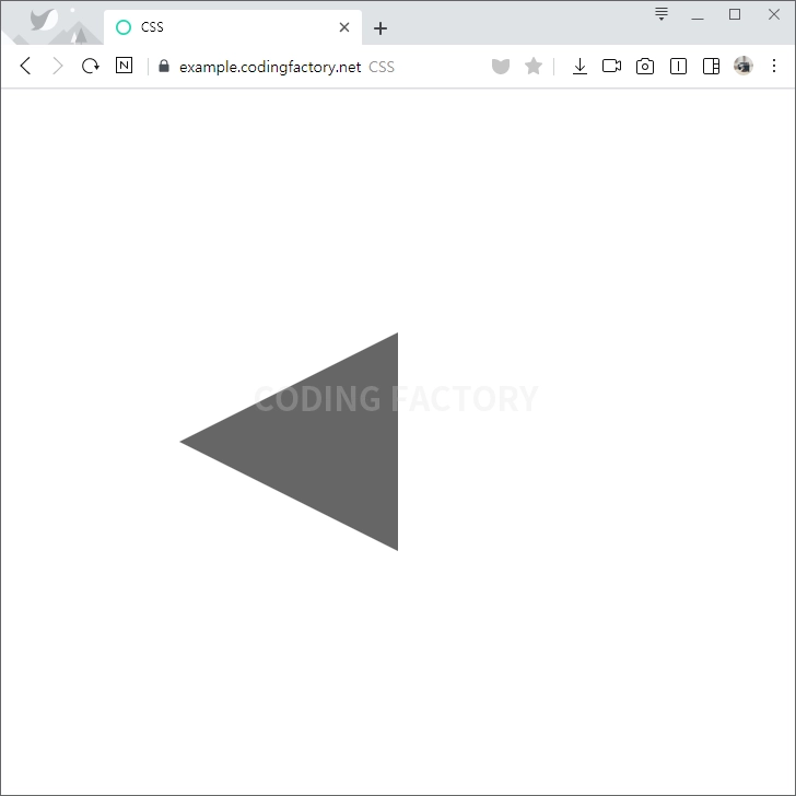
CSS의 border 속성으로 삼각형을 만들 수 있습니다. 여러 형태의 삼각형을 만들고, 그 삼각형을 회전하는 방법을 알아봅니다.
CSS / Tutorial / 양쪽 배분(균등 분할) 정렬 방법
문단 정렬을 양끝으로 꽉차게 하는 경우가 있습니다. 한글에서는 배분 정렬, 워드에서는 균등 분할이라고 합니다. 일반적인 문단에서는 거의 사용하지 않고, 표에서 제목을 넣을 때 많이 사용합니다.
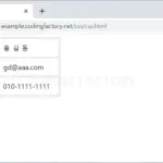
웹페이지에 출력하는 문자열의 길이는 서버단에서 조절하는 게 보통입니다. 하지만, 어떤 경우에는 그게 불가능할 수 있습니다. 이미 전송 받은 문자열을 잘라야 하는 상황이 생길 수 있습니다. CSS를 이용하여 문자열의 일부만 보여주는 방법을 소개해드립니다.
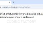
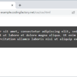
CSS / Tutorial / 인용문(Blockquote) 꾸미는 방법
blockquote 요소의 기본 모양은 양쪽에 여백이 있는 것입니다. 그대로 사용하기보다는 여러 가지 모양으로 꾸미는 것이 일반적입니다. 다음은 아래와 같은 인용문을 꾸미는 몇 가지 예제입니다.
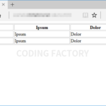
표와 셀의 크기는 정해져있지 않습니다. 내용이 짧으면 작게, 내용이 길면 크게 표와 셀이 만들어집니다. 의도하지 않은 결과가 나오지 않게 하려면 크기를 정하는 게 좋습니다.
CSS / Tutorial / 마우스 호버 효과 / 텍스트 나오게 하는 방법
CSS로 특정 요소에 마우스를 올렸을 때 보이지 않던 특정 요소가 보이게 할 수 있습니다. 아래는 문단에 마우스를 올렸을 때 div 요소가 나오게 하는 예제입니다. div 요소 안에 텍스트가 있지만, 텍스트가 아닌 이미지 등 다른 것도 가능합니다.