CSS / Tutorial / placeholder의 색, 글자 모양 등 꾸미는 방법
placeholder는 HTML5에서 새로 나온 속성으로 input 요소나 textarea 요소에 안내문을 넣을 수 있습니다. 기본 모양은 회색의 글자로, 배경색이 하얀색 또는 밝은 색이면 보기에 괜찮습니다. 하지만 배경색이 어두운 색이거나 화려한 색이면 회색 글자가 어울리지 않을 수 있습니다.
placeholder는 ::placeholder 선택자로 선택하여 꾸밀 수 있습니다.
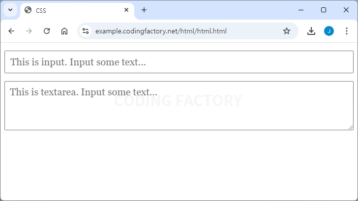
다음은 placeholder 속성이 있는 꾸미기 전의 input과 textarea입니다.
<!doctype html>
<html lang="ko">
  <head>
    <meta charset="utf-8">
    <title>CSS</title>
    <style>
      * {
        box-sizing: border-box;
        font-family: Georgia;
      }
      input {
        width: 100%;
        padding: 10px 10px;
        font-size: 20px;
      }
      textarea {
        width: 100%;
        height: 100px;
        padding: 10px 10px;
        font-size: 20px;
      }
    </style>
  </head>
  <body>
    <p><input placeholder="This is input. Input some text..."></p>
    <textarea placeholder="This is textarea. Input some text..."></textarea>
  </body>
</html>
다음은 ::placeholder 선택자로 글자 색과 모양을 바꾼 것입니다.
input::placeholder {
  color: red;
  font-style: italic;
}
textarea::placeholder {
  color: blue;
  font-weight: bold;
}
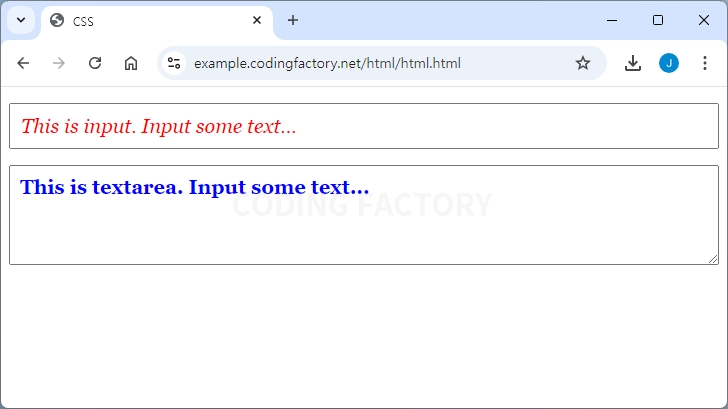
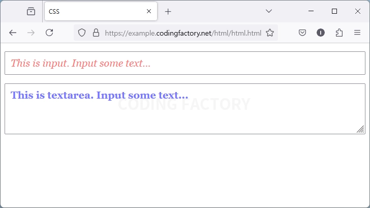
웹브라우저에 따라 모양이 다르게 나올 수 있습니다. 예를 들어 파이어폭스에서는 다음과 같이 나옵니다.
CSS / Tutorial / 양쪽 배분(균등 분할) 정렬 방법
문단 정렬을 양끝으로 꽉차게 하는 경우가 있습니다. 한글에서는 배분 정렬, 워드에서는 균등 분할이라고 합니다. 일반적인 문단에서는 거의 사용하지 않고, 표에서 제목을 넣을 때 많이 사용합니다.
CSS / Tutorial / 상속(inheritance)
CSS 속성은 상속하는 속성과 상속하지 않는 속성이 있습니다. 상속하는 속성은 자식 요소에 영향을 미칩니다. 상속하지 않는 속성은 자식 요소에 영향을 미치지 않습니다.
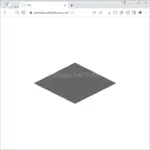
CSS로 삼각형을 만들 수 있다면 마름모는 쉽게 만들 수 있습니다. 삼각형을 두 개 붙이면 마름모가 되기 때문입니다. 마름모는 네 변의 길이가 같은 사각형이므로, 이등변삼각형 두 개를 붙이며 됩니다.

CSS / Tutorial / 선택자(Selector)
CSS에서 선택자(CSS Selector)는 HTML 문서의 요소를 선택하고 스타일을 적용할 때 사용되는 구문입니다. 선택자는 특정 요소를 대상으로 스타일을 지정할 수 있도록 돕는 중요한 역할을 하며, 다양한 방법으로 요소를 선택할 수 있습니다.
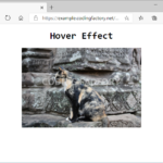
CSS / Tutorial / 마우스 호버 효과 / 텍스트 나오게 하는 방법
CSS로 특정 요소에 마우스를 올렸을 때 보이지 않던 특정 요소가 보이게 할 수 있습니다. 아래는 문단에 마우스를 올렸을 때 div 요소가 나오게 하는 예제입니다. div 요소 안에 텍스트가 있지만, 텍스트가 아닌 이미지 등 다른 것도 가능합니다.
CSS에서 !important는 특정 스타일 규칙이 다른 모든 스타일 규칙보다 우선 적용되도록 강제하는 데 사용됩니다. 이 키워드는 일반적인 스타일 우선 순위를 무시하고, 해당 스타일이 다른 어떤 스타일보다도 높은 우선순위를 가지도록 합니다.
웹페이지에 출력하는 문자열의 길이는 서버단에서 조절하는 게 보통입니다. 하지만, 어떤 경우에는 그게 불가능할 수 있습니다. 이미 전송 받은 문자열을 잘라야 하는 상황이 생길 수 있습니다. CSS를 이용하여 문자열의 일부만 보여주는 방법을 소개해드립니다.
CSS / Tutorial / 인용문(Blockquote) 꾸미는 방법
blockquote 요소의 기본 모양은 양쪽에 여백이 있는 것입니다. 그대로 사용하기보다는 여러 가지 모양으로 꾸미는 것이 일반적입니다. 다음은 아래와 같은 인용문을 꾸미는 몇 가지 예제입니다.
CSS / Tutorial / 세로 가운데 정렬하는 방법
CSS에서 텍스트의 가로 가운데 정렬은 text-align 속성을 이용합니다. 요소의 가로 가운데 정렬은 margin 속성을 이용합니다. 세로 정렬을 가운데로 하려면 어떻게 해야 할까요? 네 가지 방법을 소개합니다.
CSS / Tutorial / 마우스 호버 효과 / 이미지 확대하는 방법
이미지에 마우스를 올렸을 때 이미지가 확대되는 효과를 만들어보겠습니다. 다음과 같이 이미지가 들어간 간단한 HTML 문서를 만듭니다.