CSS / Reference / word-wrap
개요
word-wrap은 띄어쓰기가 없는 긴 단어를 어떻게 처리할지 정하는 속성입니다.
- 기본값 : normal
- 상속 : Yes
- 애니메이션 : No
- 버전 : CSS Level 3
문법
word-wrap: normal | break-word | initial | inherit
- normal : break point에서 줄바꿈합니다.
- break-word : 요소의 경계에서 break point가 아니어도 줄바꿈을 합니다.
- initial : 기본값으로 설정합니다.
- inherit : 부모 요소의 속성값을 상속받습니다.
word-break 속성의 값이 keep-all이면 단어가, break-all이면 글자가 break-point입니다.
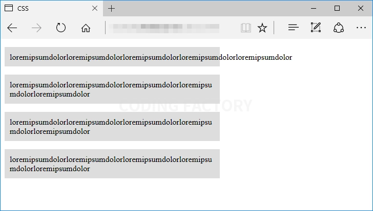
예제
<!doctype html>
<html lang="ko">
<head>
<meta charset="utf-8">
<title>CSS</title>
<style>
p {
width: 400px;
padding: 10px;
background-color: #dddddd;
}
.a {
word-break: keep-all;
word-wrap: normal;
}
.b {
word-break: keep-all;
word-wrap: break-word;
}
.c {
word-break: break-all;
word-wrap: normal;
}
.d {
word-break: break-all;
word-wrap: break-word;
}
</style>
</head>
<body>
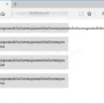
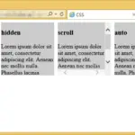
<p class="a">loremipsumdolorloremipsumdolorloremipsumdolorloremipsumdolorloremipsumdolor</p>
<p class="b">loremipsumdolorloremipsumdolorloremipsumdolorloremipsumdolorloremipsumdolor</p>
<p class="c">loremipsumdolorloremipsumdolorloremipsumdolorloremipsumdolorloremipsumdolor</p>
<p class="d">loremipsumdolorloremipsumdolorloremipsumdolorloremipsumdolorloremipsumdolor</p>
</body>
</html>
CSS / Reference / background-size
background-size는 배경 이미지의 가로 크기와 세로 크기를 정하는 속성입니다. 기본값 : auto 상속 : No 애니메이션 : Yes 버전 : CSS Level 3
CSS / Reference / background-attachment
background-attachment는 배경 이미지의 스크롤 여부를 정하는 속성입니다. 기본값 : scroll 상속 : No 애니메이션 : No 버전 : CSS Level 1
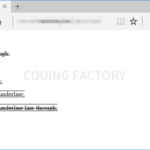
CSS / Reference / text-decoration
text-decoration은 선으로 텍스트를 꾸밀 수 있게 해주는 속성입니다. 기본값 : none 상속 : No 애니메이션 : No 버전 : CSS Level 1
word-wrap은 띄어쓰기가 없는 긴 단어를 어떻게 처리할지 정하는 속성입니다. 기본값 : normal 상속 : Yes 애니메이션 : No 버전 : CSS Level 3
CSS / Reference / background-position
background-position은 배경 이미지의 위치를 정하는 속성입니다. 기본값 : 0% 0% 상속 : No 애니메이션 : Yes 버전 : CSS Level 1
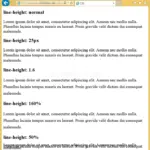
line-height 속성은 텍스트 줄 간격(줄 높이)을 조절하는 데 사용됩니다. 텍스트의 가독성을 높이고, 디자인적으로 더 일관된 레이아웃을 만들기 위해 자주 사용됩니다. 기본값 : normal 상속 : Yes 애니메이션 : Yes 버전 : CSS Level 1
CSS / Reference / align-content
flex-wrap 속성의 값이 wrap인 경우, 아이템들의 가로폭의 합이 콘테이너의 가로폭을 넘어가면 아이템이 다음 줄로 내려갑니다. 이때 여러 줄이 되어버린 아이템들의 정렬을 어떻게 할지 정하는 속성이 align-content입니다.
overflow는 내용이 요소의 크기를 벗어났을 때 어떻게 처리할지를 정하는 속성입니다. 기본값 : visible 상속 : No 애니메이션 : No 버전 : CSS Level 2
CSS / Reference / aspect-ratio
aspect-ratio는 선택한 요소의 가로 세로 비율을 정하는 속성입니다. 접속하는 기기의 해상도가 변해도, 일정한 가로 세로 비율을 유지하고 싶을 때 유용하게 사용할 수 있습니다.
white-space는 스페이스와 탭, 줄바꿈, 자동줄바꿈을 어떻게 처리할지 정하는 속성입니다. 기본값 : normal 상속 : Yes 애니메이션 : No 버전 : CSS Level 1