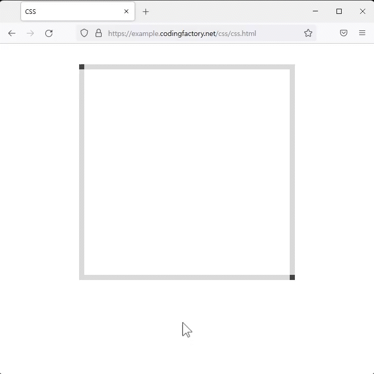
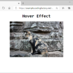
CSS / Tutorial / 마우스 호버 효과 / 서서히 길어지는 선 만드는 방법
마우스를 올리면 선이 그려지는 효과를 만들어봅니다.
위쪽 가로 방향으로 선 그리기
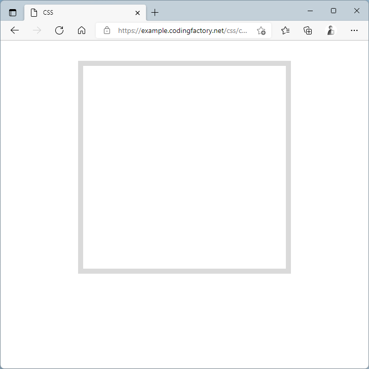
- 다음과 같이 사각형을 만듭니다.
<!doctype html>
<html lang="ko">
  <head>
    <meta charset="utf-8">
    <title>CSS</title>
    <style>
      body {
        box-sizing: border-box;
      }
      .jb {
        width: 400px;
        height: 400px;
        margin: 40px auto;
        border: 10px solid #dadada;
      }
    </style>
  </head>
  <body>
    <div class="jb">
    </div>
  </body>
</html>
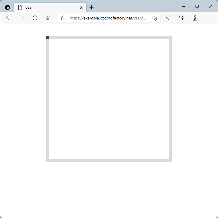
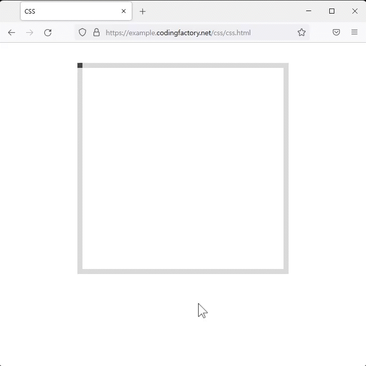
- :before를 이용하여 선이 시작하는 위치를 정합니다.
- position 속성으로 선 위에 선을 그릴 수 있도록 설정합니다.
.jb {
  width: 400px;
  height: 400px;
  margin: 40px auto;
  border: 10px solid #dadada;
  position: relative;
}
.jb:before {
  content: "";
  position: absolute;
  top: -10px;
  left: -10px;
  display: block;
  width: 10px;
  height: 10px;
  background-color: #444444;
}
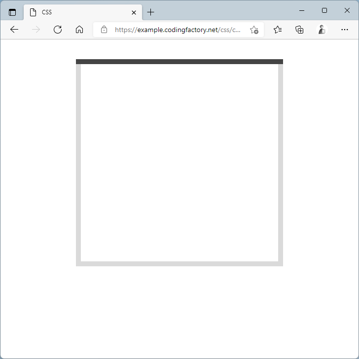
- :hover를 이용하여 마우스를 올리면 긴 선으로 바뀌도록 합니다.
- 여기까지 코딩하면 마우스를 올렸을 때 바로 선이 길어집니다.
.jb:hover:before {
  width: 420px;
}
- transition 속성을 추가하여 애니메이션 효과를 줍니다.
.jb:before {
  content: "";
  position: absolute;
  top: -10px;
  left: -10px;
  display: block;
  width: 10px;
  height: 10px;
  background-color: #444444;
  transition: all linear 0.5s;
}
- 전체 코드는 다음과 같습니다.
<!doctype html>
<html lang="ko">
  <head>
    <meta charset="utf-8">
    <title>CSS</title>
    <style>
      body {
        box-sizing: border-box;
      }
      .jb {
        width: 400px;
        height: 400px;
        margin: 40px auto;
        border: 10px solid #dadada;
        position: relative;
      }
      .jb:before {
        content: "";
        position: absolute;
        top: -10px;
        left: -10px;
        display: block;
        width: 10px;
        height: 10px;
        background-color: #444444;
        transition: all linear 0.5s;
      }
      .jb:hover:before {
        width: 420px;
      }
    </style>
  </head>
  <body>
    <div class="jb">
    </div>
  </body>
</html>
아래쪽 가로 방향으로 선 그리기
- :after를 이용하여 아래쪽에도 같은 효과를 넣습니다.
<!doctype html>
<html lang="ko">
  <head>
    <meta charset="utf-8">
    <title>CSS</title>
    <style>
      body {
        box-sizing: border-box;
      }
      .jb {
        width: 400px;
        height: 400px;
        margin: 40px auto;
        border: 10px solid #dadada;
        position: relative;
      }
      .jb:before {
        content: "";
        position: absolute;
        top: -10px;
        left: -10px;
        display: block;
        width: 10px;
        height: 10px;
        background-color: #444444;
        transition: all linear 0.5s;
      }
      .jb:hover:before {
        width: 420px;
      }
      .jb:after {
        content: "";
        position: absolute;
        bottom: -10px;
        right: -10px;
        display: block;
        width: 10px;
        height: 10px;
        background-color: #444444;
        transition: all linear 0.5s;
      }
      .jb:hover:after {
        width: 420px;
      }
    </style>
  </head>
  <body>
    <div class="jb">
    </div>
  </body>
</html>
CSS / Tutorial / position의 값이 fixed일 때 가운데 정렬하는 방법
position의 fixed를 이용하여 요소의 위치를 고정시킬 수 있습니다. 예를 들어 상단에 고정되는 메뉴바를 만들 때 사용합니다. 그런데, fixed를 하면 요소가 한쪽으로 치우칩니다. 만약 가운데에 위치시키고 싶다면 어떻게 할까요? transform 속성으로 해결할 수 있습니다.
CSS / Tutorial / 인용문(Blockquote) 꾸미는 방법
blockquote 요소의 기본 모양은 양쪽에 여백이 있는 것입니다. 그대로 사용하기보다는 여러 가지 모양으로 꾸미는 것이 일반적입니다. 다음은 아래와 같은 인용문을 꾸미는 몇 가지 예제입니다.
CSS / Tutorial / 양쪽 배분(균등 분할) 정렬 방법
문단 정렬을 양끝으로 꽉차게 하는 경우가 있습니다. 한글에서는 배분 정렬, 워드에서는 균등 분할이라고 합니다. 일반적인 문단에서는 거의 사용하지 않고, 표에서 제목을 넣을 때 많이 사용합니다.

CSS 문법은 선택자(selector), 속성(property), 값(value)의 조합으로 구성됩니다. 다음은 가장 간단한 CSS 코드입니다. h1 { color: red } h1, color, red 세 개의 단어가 있는데 각각 선택자, 속성, 값입니다.
CSS / Tutorial / 마우스 호버 효과 / 이미지 확대하는 방법
이미지에 마우스를 올렸을 때 이미지가 확대되는 효과를 만들어보겠습니다. 다음과 같이 이미지가 들어간 간단한 HTML 문서를 만듭니다.
CSS / Tutorial / placeholder의 색, 글자 모양 등 꾸미는 방법
placeholder는 HTML5에서 새로 나온 속성으로 input 요소나 textarea 요소에 안내문을 넣을 수 있습니다. 기본 모양은 회색의 글자로, 배경색이 하얀색 또는 밝은 색이면 보기에 괜찮습니다. 하지만 배경색이 어두운 색이거나 화려한 색이면 회색 글자가 어울리지 않을 수 있습니다. placeholder는 ::placeholder 선택자로 선택하여 꾸밀 수 있습니다.
CSS / Tutorial / 유튜브 동영상을 반응형으로 삽입하는 방법
유튜브 영상을 블로그나 홈페이지에 넣을 때 보통 iframe을 사용합니다. 코드는 유튜브 영상 공유에서 를 클릭하여 구할 수 있습니다. 아래와 같은 코드인데, 고정폭입니다. 즉 웹브라우저의 가로폭이 커지든 작아지든 가로폭이 일정합니다. 이를 반응형으로 만들고 싶다면 아래처럼 합니다.
CSS / Tutorial / 원 또는 타원 만드는 방법
CSS의 border-radius 속성으로 원 또는 타원을 만들 수 있습니다. HTML 문서에 다음과 같이 내용이 없는 요소를 하나 만듭니다. 적절히 크기를 정하여 정사각형을 만들고, 배경색을 넣습니다. border-radius 속성을 추가하고, 값에 50%를 넣으면 원이 만들어집니다.
CSS / Tutorial / 마우스 호버 효과 / 텍스트 나오게 하는 방법
CSS로 특정 요소에 마우스를 올렸을 때 보이지 않던 특정 요소가 보이게 할 수 있습니다. 아래는 문단에 마우스를 올렸을 때 div 요소가 나오게 하는 예제입니다. div 요소 안에 텍스트가 있지만, 텍스트가 아닌 이미지 등 다른 것도 가능합니다.
CSS / Tutorial / CSS를 HTML에 적용시키는 방법
HTML에 CSS를 적용시키는 방법은 세 가지가 있습니다. 각 방법은 장단점이 있으니 상황에 맞게 적절한 방법을 선택합니다. Inline Style Sheet HTML 태그의 style 속성에 CSS 코드를 넣습니다. Internal Style Sheet HTML 문서 안의 과 안에 CSS 코드를 넣습니다. Linking Style Sheet 별도의 CSS 파일을 만들고 HTML 문서와 연결합니다.