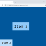
CSS / Flex / flex-direction
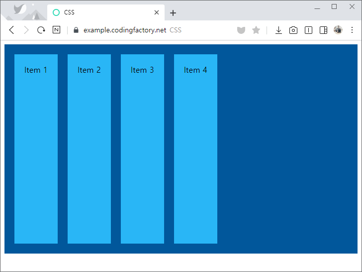
- flex-direction으로 Item의 배열 방향을 정합니다.
- 기본값은 row로, 왼쪽에서 오른쪽으로 배열합니다.
<!doctype html>
<html lang="ko">
  <head>
    <meta charset="utf-8">
    <title>CSS</title>
    <style>
      .jb-container {
        height: 400px;
        padding: 10px;
        background-color: #01579b;
        display: flex;
        flex-direction: row;
      }
      .jb-item {
        margin: 10px;
        padding: 20px;
        background-color: #29b6f6;
      }
    </style>
  </head>
  <body>
    <div class="jb-container">
      <div class="jb-item">Item 1</div>
      <div class="jb-item">Item 2</div>
      <div class="jb-item">Item 3</div>
      <div class="jb-item">Item 4</div>
    </div>
  </body>
</html>
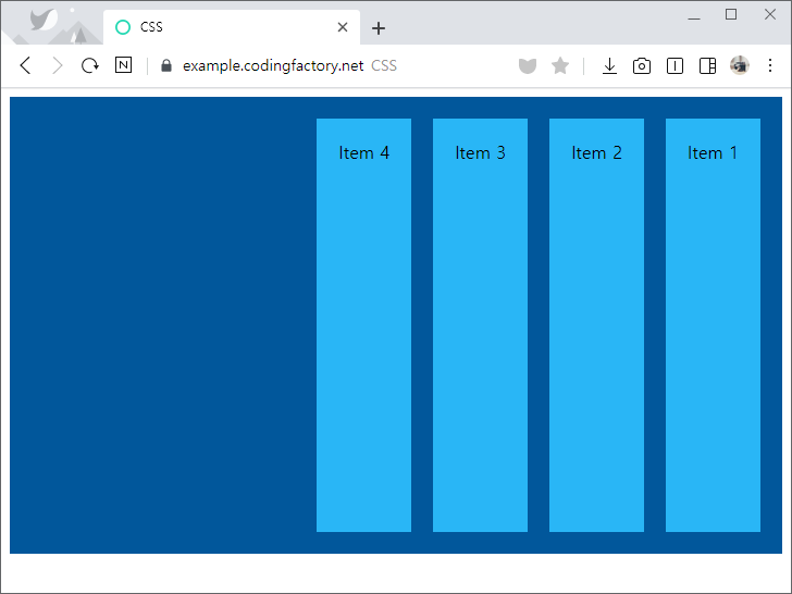
- flex-direction의 값을 row-reverse로 하면, 오른쪽에서 왼쪽으로 배열합니다.
.jb-container {
  height: 400px;
  padding: 10px;
  background-color: #01579b;
  display: flex;
  flex-direction: row-reverse;
}
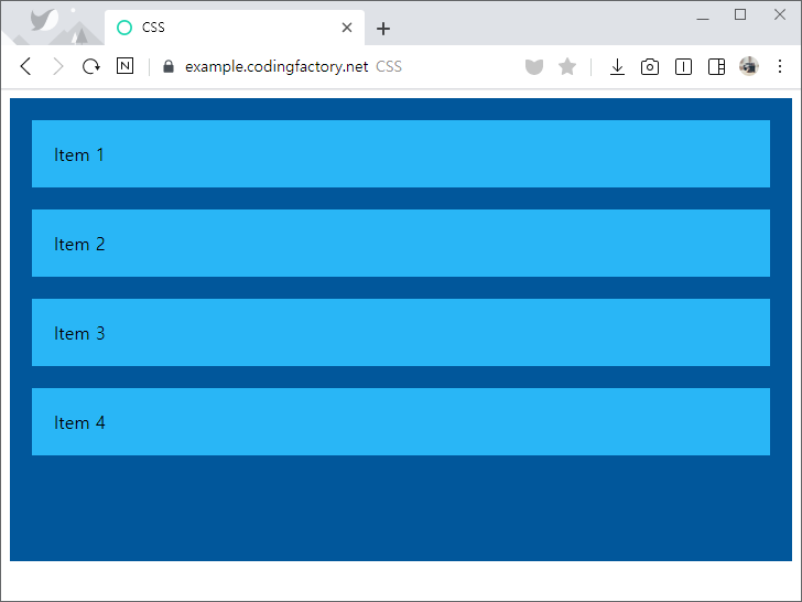
- flex-direction의 값을 column으로 하면, 위에서 아래로 배열합니다.
.jb-container {
  height: 400px;
  padding: 10px;
  background-color: #01579b;
  display: flex;
  flex-direction: column;
}
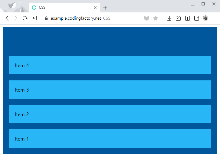
- flex-direction의 값을 column-reverse으로 하면, 아래에서 위로 배열합니다.
.jb-container {
  height: 400px;
  padding: 10px;
  background-color: #01579b;
  display: flex;
  flex-direction: column-reverse;
}
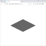
마름모는 삼각형을 두 개 붙여서 만든다. HTML 문서에 다음과 같이 내용이 없는 요소를 하나 넣는다. <div class="rhombus"></div> 크기를 0으로 한 후, border 속성을 이용하여 삼각형을 만든다. position: relative;는 나머지 반쪽의 위치를 잡기 위해 넣은 것이다. .rhombus { width: 0px; height: 0px; border-right: 200px solid #666666; border-top: 100px solid transparent; border-bottom: ...

CSS / table-layout / 표(table) 크기 고정시키기
표(table)는 width 속성으로 가로 크기를 정할 수 있습니다. 다음은 가로 크기가 500px인 간단한 표입니다. <!doctype html> <html lang="ko"> <head> <meta charset="utf-8"> <title>CSS</title> <style> table { width: 500px; } td { padding: 10px; border: 1px solid #666666; } </style> </head> <body> <table> <tr> <td class="c1">HAHAHA</td> <td class="c2">Lorem ipsum dolor sit amet, consectetur adipiscing elit. Aenean nec mollis nulla. Phasellus lacinia tempus mauris eu laoreet. Proin gravida velit dictum dui consequat malesuada.</td> </tr> </table> </body> </html> 표 ...
CSS / Flex / align-self / 아이템의 교차축 정렬 정하는 속성
align-items로 교차축(cross axis) 아이템 정렬을 정합니다. 이렇게 정한 정렬은 콘테이너 안의 모든 아이템에 적용됩니다. <!doctype html> <html lang="ko"> <head> <meta charset="utf-8"> <title>CSS</title> <style> body { box-sizing: border-box; ...
유튜브 영상을 블로그나 홈페이지에 넣을 때 보통 iframe을 사용한다. 코드는 유튜브 영상 공유에서 를 클릭하여 구할 수 있다. 아래와 같은 코드인데, 고정폭이다. 즉 웹브라우저의 가로폭이 커지든 작아지든 가로폭이 일정하다. <iframe width="560" height="315" src="https://www.youtube.com/embed/ybhXVSAdIRE" frameborder="0" allow="accelerometer; autoplay; encrypted-media; gyroscope; picture-in-picture" allowfullscreen></iframe> 이를 반응형으로 만들고 싶다면 아래처럼 한다. 16:9 크기의 div로 감싸고, iframe에 style을 추가하여 ...
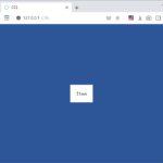
justify-content, align-items 속성을 이용하여 안쪽 요소를 바깥쪽 요소의 정가운데에 배치할 수 있습니다. <!doctype html> <html lang="ko"> <head> <meta charset="utf-8"> <title>CSS</title> <style> body { box-sizing: border-box; ...
CSS / IE에서 표의 셀 안의 이미지 크기 설정하는 방법
표의 셀 안에 200x200 크기의 이미지를 넣고, 셀의 가로 크기를 100px로 정해도, 이미지는 200x200 크기로 나옵니다. 셀의 크기에 맞게 이미지가 줄어들게 하는 방법은 두가지가 있습니다. <!doctype html> <html lang="ko"> <head> <meta charset="utf-8"> <title>CSS</title> <style> table { ...
CSS에서 !important는 특정 스타일 규칙이 다른 모든 스타일 규칙보다 우선 적용되도록 강제하는 데 사용됩니다. 이 키워드는 일반적인 스타일 우선순위를 무시하고, 해당 스타일이 다른 어떤 스타일보다도 높은 우선순위를 가지도록 합니다. property: value !important; 예를 들어 다음은, 마지막에 설정한 color의 값이 blue이므로, red는 무시하고 문단의 글자색을 파란색으로 만듭니다. p { color: red; } p { ...
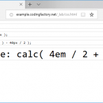
CSS / calc() - 속성값을 사칙연산으로 정할 수 있게 하는 함수
개요 calc()는 괄호 안의 식을 계산한 결과를 속성값으로 사용하게 해주는 함수이다. 예를 들어 font-size: calc( 10px + 10px ); 는 글자 크기를 20px로 설정한다. 문법 연산자 +는 덧셈, -는 뺄셈, *는 곱셈, /는 나눗셈이다. 곱셈과 나눗셈의 좌우에는 공백이 없어도 된다. 하지만, 덧셈과 뺄셈의 좌우에는 공백이 있어야 한다. 계산 순서 왼쪽에서 오른쪽으로 계산한다. 곱셈과 나눗셈을 먼저 하고, 덧셈과 뺄셈은 나중에 한다. 괄호가 있으면 ...
CSS로 특정 요소에 마우스를 올렸을 때 보이지 않던 특정 요소가 보이게 할 수 있다. 아래는 문단에 마우스를 올렸을 때 div 요소가 나오게 하는 예제이다. div 요소 안에 텍스트가 있지만, 텍스트가 아닌 이미지 등 다른 것도 가능하다. 마우스 올렸을 때 모양 만들기 마우스를 올렸을 때 보이길 원하는 모양을 먼저 만든다. .jb-title에 마우스를 올리면 .jb-text가 ...
CSS의 애니메이션 속성으로 동적인 효과를 만들 수 있습니다. IE는 버전 10 이상부터 지원합니다. animation 예제 다음은 CSS로 만든 간단한 애니메이션입니다. 작은 박스가 커졌다 작아집니다. 코드는 다음과 같습니다. <!doctype html> <html lang="ko"> <head> <meta charset="utf-8"> <title>CSS</title> <style> @keyframes big { ...