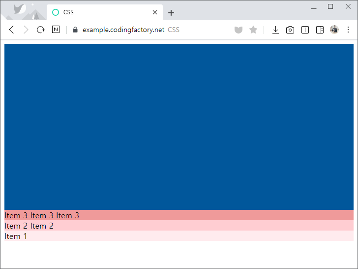
CSS / Flex / justify-content
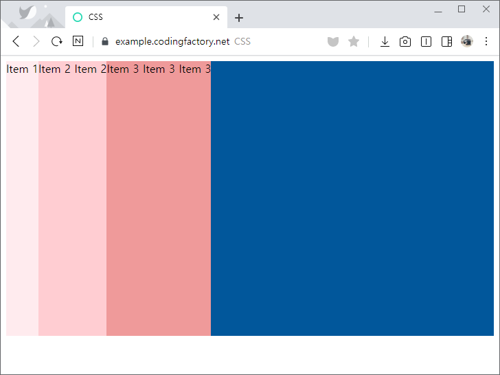
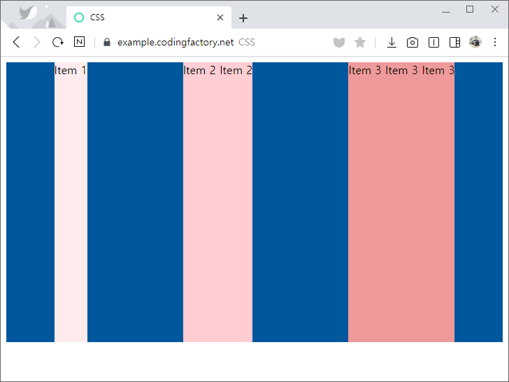
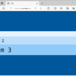
- justify-content로 flex-direction으로 정한 방향으로의 정렬을 정합니다. 예를 들어 flex-direction의 값이 row라면 가로 방향의 정렬을 정합니다.
- 기본값은 flex-start로 시작점부터 아이템을 배치합니다.
<!doctype html>
<html lang="ko">
  <head>
    <meta charset="utf-8">
    <title>CSS</title>
    <style>
      * {
        box-sizing: border-box;
      }
      .jb-container {
        height: 400px;
        background-color: #01579b;
        display: flex;
        justify-content: flex-start;
      }
      .jb-item:nth-child(1) {
        background-color: #ffebee;
      }
      .jb-item:nth-child(2) {
        background-color: #ffcdd2;
      }
      .jb-item:nth-child(3) {
        background-color: #ef9a9a;
      }
      .jb-item:nth-child(4) {
        background-color: #e57373;
      }
    </style>
  </head>
  <body>
    <div class="jb-container">
      <div class="jb-item">Item 1</div>
      <div class="jb-item">Item 2 Item 2</div>
      <div class="jb-item">Item 3 Item 3 Item 3</div>
    </div>
  </body>
</html>
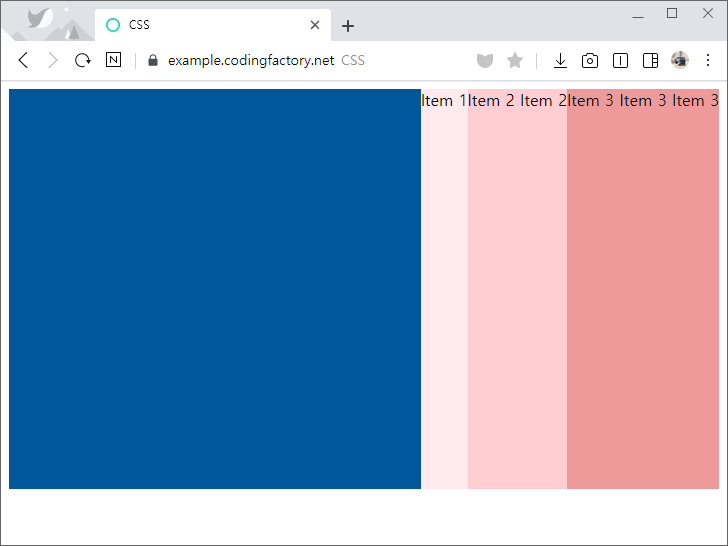
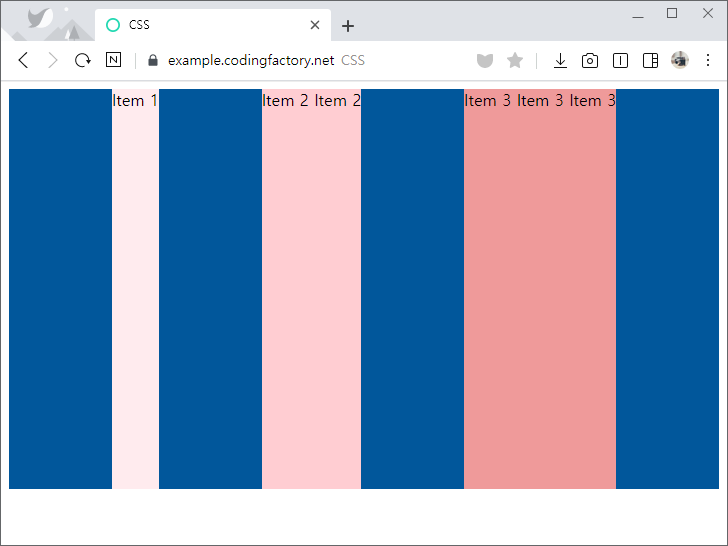
- justify-content의 값을 flex-end로 정하면 플렉스가 끝나는 지점에 배치합니다.
.jb-container {
  height: 400px;
  background-color: #01579b;
  display: flex;
  justify-content: flex-end;
}
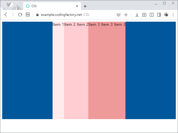
- justify-content의 값을 center로 정하면 가운데에 배치합니다.
.jb-container {
  height: 400px;
  background-color: #01579b;
  display: flex;
  justify-content: center;
}
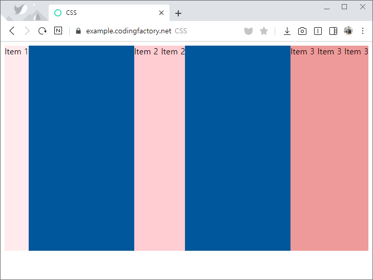
- justify-content의 값을 space-between으로 정하면 빈 공간을 균등하게 나누어 아이템 사이에 간격을 만듭니다.
.jb-container {
  height: 400px;
  background-color: #01579b;
  display: flex;
  justify-content: space-between;
}
- justify-content의 값을 space-around로 정하면 양 옆의 간격을 균등하게 만듭니다.
- 아이템 사이의 간격은 양끝 간격의 두 배가 됩니다.
.jb-container {
  height: 400px;
  background-color: #01579b;
  display: flex;
  justify-content: space-around;
}
- justify-content의 값을 space-evenly로 정하면 양끝과 아이템 사이의 간격을 동일하게 만듭니다.
.jb-container {
  height: 400px;
  background-color: #01579b;
  display: flex;
  justify-content: space-evenly;
}
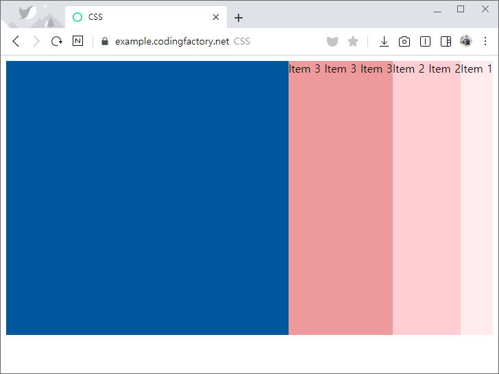
- flex-direction의 값을 row-reverse로 정하면 플렉스 시작점이 오른쪽이 됩니다.
.jb-container {
  height: 400px;
  background-color: #01579b;
  display: flex;
  flex-direction: row-reverse;
  justify-content: flex-start;
}
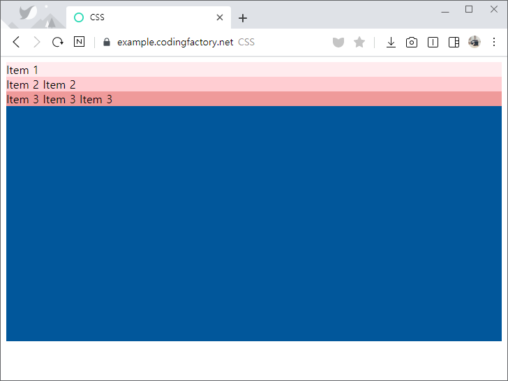
- flex-direction의 값을 column으로 정하면 플렉스 시작점이 위쪽이 됩니다.
.jb-container {
  height: 400px;
  background-color: #01579b;
  display: flex;
  flex-direction: column;
  justify-content: flex-start;
}
- flex-direction의 값을 column-reverse로 정하면 플렉스 시작점이 아래쪽이 됩니다.
.jb-container {
  height: 400px;
  background-color: #01579b;
  display: flex;
  flex-direction: column-reverse;
  justify-content: flex-start;
}
CSS / Grid / grid-template-columns, grid-template-rows
grid-template-columns grid-template-columns 속성으로 열의 개수와 폭을 정합니다. 기본값은 none으로, 열을 만들이 않습니다. 속성값의 개수가 열의 개수이고, 각 속성값이 열 너비입니다. 예를 들어 속성값이 100px 50% auto라면 3열이 만들어지고, 1열의 너비는 100px, 2열의 너비는 50%, 3열의 너비는 남은 공간 전부가 됩니다. <!doctype html> <html lang="ko"> <head> <meta charset="utf-8"> <title>CSS</title> ...
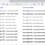
CSS / font-weight / 글자 굵기 정하는 속성
개요 font-weight로 글자의 굵기를 정한다. 기본값 : normal 상속 : Yes 애니메이션 : Yes 버전 : CSS Level 1 문법 font-weight: normal | bold | bolder | lighter | number | initial | inherit normal : 보통 굵기이다. 숫자 400과 같다. bold : 굵은 굵기이다. 숫자 700과 같다. bolder : 상속된 값보다 굵은 굵기다. lighter : 상속된 값보다 얇은 굵기이다. number : ...
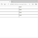
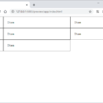
그리드에서 열 개수는 grid-template-columns로 정합니다. 그 개수를 넘어가면 행이 바뀌죠. 그리고 높이는 행마다 다르게 정해집니다. 예를 들어 다음과 같은 HTML 문서가 있을 때, 첫번째 행의 높이와 다른 행의 높이는 다릅니다. <!doctype html> <html lang="ko"> <head> <meta charset="utf-8"> <title>CSS</title> <style> ...
개요 flex-wrap 속성의 값이 wrap인 경우, 아이템들의 가로폭의 합이 콘테이너의 가로폭을 넘어가면 아이템이 다음 줄로 내려간다. 이때 여러 줄이 되어버린 아이템들의 정렬을 어떻게 할지 정하는 속성이 align-content이다. 문법 align-content: stretch | center | flex-start | flex-end | space-between | space-around | space-evenly | initial | inherit stretch : 기본값으로, 높이를 꽉 채운다. flex-start : 위쪽부터 ...
CSS / background-origin / 배경 이미지를 어느 영역부터 채워나갈지를 정하는 속성
개요 HTML 요소는 박스로 이루어져 있고, 바깥 여백 영역(Margin Area), 테두리 영역(Border Area), 안쪽 여백 영역(Padding Area), 내용 영역(Content Area)으로 구분합니다. background-origin으로 배경 이미지를 어느 영역부터 채워나갈지를 정합니다. 기본값 : padding-box 상속 : No 애니메이션 : No 버전 : CSS Level 3 문법 background-origin: border-box | padding-box | content-box | initial | inherit; border-box : 테두리 영역 왼쪽 위부터 채웁니다. padding-box : 안쪽 여백 영역 왼쪽 ...
CSS / Flex / align-self / 아이템의 교차축 정렬 정하는 속성
align-items로 교차축(cross axis) 아이템 정렬을 정합니다. 이렇게 정한 정렬은 콘테이너 안의 모든 아이템에 적용됩니다. <!doctype html> <html lang="ko"> <head> <meta charset="utf-8"> <title>CSS</title> <style> body { box-sizing: border-box; ...
CSS / list-style-image / 목록의 마커로 이미지 사용하기
개요 list-style-image로 이미지를 ul, ol 등의 목록의 마커(marker)로 사용할 수 있습니다. 기본값 : none 상속 : Yes 애니메이션 : No 버전 : CSS Level 1 문법 list-style-image: none | url | initial | inherit none : 이미지가 없습니다. url : 사용할 이미지의 URL을 입력합니다. initial : 기본값으로 설정합니다. inherit : 부모 요소의 속성값을 상속받습니다. 예제 이미지는 원본 크기 그대로 나옵니다. 따라서 글자 크기에 ...
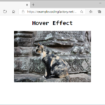
이미지에 마우스를 올렸을 때 이미지가 확대되는 효과를 만들어보겠습니다. 우선 다음과 같이 이미지가 들어간 간단한 HTML 문서를 만듭니다. <!doctype html> <html lang="ko"> <head> <meta charset="utf-8"> <title>CSS</title> <style> body { box-sizing: border-box; ...
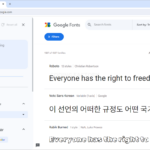
구글에서 많은 웹폰트를 제공하고 있다. 어떻게 사용하는지, IE를 지원하는 방법은 무엇인지 알아본다. 웹폰트 선택하기 웹브라우저로 Google Fonts에 접속한다. 왼쪽에서 적절히 필터한다. 한글 글꼴이 필요하다면 Language를 Korean으로 한다. 원하는 글꼴을 클릭한다. 사용할 스타일을 선택한다. 오른쪽에 선택한 글꼴과 스타일이 나오고, 웹폰트를 사용하기 위한 코드 예시가 나온다. 여러 글꼴과 스타일을 선택할 수도 있다. 웹폰트 사용하기 예를 들어 Noto Sans Korean 100과 400을 ...
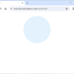
CSS의 border-radius 속성으로 원을 만들 수 있다. 원 만들기 HTML 문서에 다음과 같이 내용이 없는 요소를 하나 만든다. <div class="circle"></div> 적절히 크기를 정하여 정사각형을 만들고, 배경색을 넣는다. <!doctype html> <html lang="ko"> <head> <meta charset="utf-8"> <title>CSS</title> <style> .circle { ...