CSS / Flex / align-items
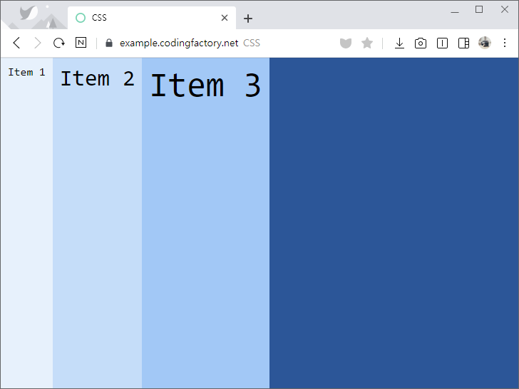
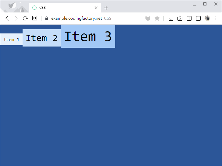
- align-items로 교차축(cross axis) 아이템 정렬을 정합니다. 예를 들어 flex-direction의 값이 row인 경우 수직 정렬을 정합니다. 아래는 flex-direction: row일 때의 예제입니다.
- 기본값은 stretch로, 콘테이너의 높이에 맞게 늘립니다.
<!doctype html>
<html lang="ko">
  <head>
    <meta charset="utf-8">
    <title>CSS</title>
    <style>
      body {
        box-sizing: border-box;
        margin: 0px;
        font-family: Consolas, monospace;
      }
      .jb-container {
        height: 100vh;
        background-color: #01579b;
        display: flex;
        align-items: stretch;
      }
      .jb-item {
        padding: 10px;
      }
      .jb-item:nth-child(1) {
        background-color: #e3f2fd;
      }
      .jb-item:nth-child(2) {
        background-color: #bbdefb;
        font-size: 2em;
      }
      .jb-item:nth-child(3) {
        background-color: #90caf9;
        font-size: 3em;
      }
    </style>
  </head>
  <body>
    <div class="jb-container">
      <div class="jb-item">Item 1</div>
      <div class="jb-item">Item 2</div>
      <div class="jb-item">Item 3</div>
    </div>
  </body>
</html>
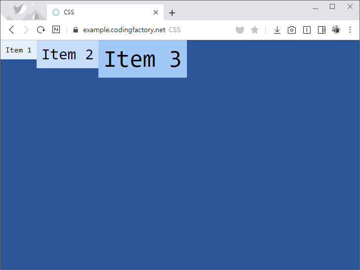
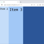
- align-items의 값을 flex-start로 정하면, 위쪽에 맞춥니다.
.jb-container {
  height: 100vh;
  background-color: #01579b;
  display: flex;
  align-items: flex-start;
}
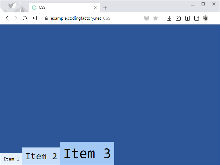
- align-items의 값을 flex-end로 정하면, 아래쪽에 맞춥니다.
.jb-container {
  height: 100vh;
  background-color: #01579b;
  display: flex;
  align-items: flex-end;
}
- align-items의 값을 center로 정하면, 중간에 맞춥니다.
.jb-container {
  height: 100vh;
  background-color: #01579b;
  display: flex;
  align-items: center;
}
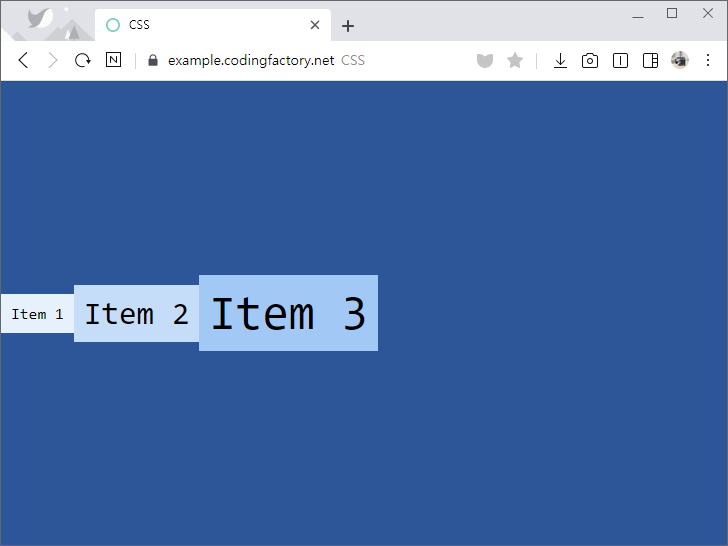
- align-items의 값을 baseline으로 정하면, 글자의 베이스라인에 맞춥니다.
.jb-container {
  height: 100vh;
  background-color: #01579b;
  display: flex;
  align-items: baseline;
}
글의 완급 조절, 내용 전환 등을 위해 구분선을 사용하는 경우가 많다. 선은 여러 가지 방식으로 만들 수 있는데, 보기 좋게 꾸미는 것은 CSS로 한다. 아래는 div 태그에 모양을 입혀서 구분선을 만드는 몇 가지 예제이다. 예제 문서 <div class="jb-division-line"></div>를 꾸며서 구분선을 만들 것이다. <!doctype html> <html lang="ko"> <head> <meta charset="utf-8"> ...

체크박스 꾸미는 방법 체크박스를 바로 꾸미는 건 어렵습니다. 그래서 체크박스와 연결된 라벨(label)을 만들고 라벨을 꾸밉니다. 라벨을 클릭하면 체크박스가 체크되고, 다시 클릭하면 체크가 해제되는 성질을 이용하는 겁니다. 체크박스 만들기 빈 라벨을 가진 체크박스를 만듭니다. for 속성을 이용해서 체크박스와 라벨을 연결시켜야 합니다. <!doctype html> <html lang="ko"> <head> <meta charset="utf-8"> <title>CSS</title> ...
CSS / border-collapse / 표의 테두리와 셀의 테두리 사이의 간격 처리 방식 정하는 속성
개요 border-collapse는 표(table)의 테두리와 셀(td)의 테두리 사이의 간격을 어떻게 처리할 지 정한다. 기본값 : separate 상속 : Yes 애니메이션 : No 버전 : CSS Level 2 문법 border-collapse: separate | collapse | initial | inherit separate : 표(table)의 테두리와 셀(td)의 테두리 사이에 간격을 둔다. collapse : 표(table)의 테두리와 셀(td)의 테두리 사이의 간격을 없앤다. 겹치는 부분은 한 줄로 나타낸다. initial : 기본값으로 ...
CSS / background-position / 배경 이미지의 위치를 정하는 속성
개요 background-position은 배경 이미지의 위치를 정하는 속성입니다. 기본값 : 0% 0% 상속 : No 애니메이션 : Yes 버전 : CSS Level 1 문법 background-position: x-position y-position | initial | inherit x-position y-position : 가로 위치와 세로 위치를 정합니다. initial : 기본값으로 설정합니다. inherit : 부모 요소의 속성값을 상속받습니다. 위치 값으로 사용할 수 있는 것은 다음과 같습니다. 가로 위치 값 : left, center, right, 백분율, 길이 세로 위치 ...
align-items로 교차축(cross axis) 아이템 정렬을 정합니다. 예를 들어 flex-direction의 값이 row인 경우 수직 정렬을 정합니다. 아래는 flex-direction: row일 때의 예제입니다. 기본값은 stretch로, 콘테이너의 높이에 맞게 늘립니다. <!doctype html> <html lang="ko"> <head> <meta charset="utf-8"> <title>CSS</title> <style> body { ...
개요 color로 텍스트의 색을 정합니다. 상속 : Yes 애니메이션 : Yes 버전 : CSS Level 1 문법 color: color | initial | inherit color : 색을 정합니다. initial : 기본값으로 설정합니다. inherit : 부모 요소의 속성값을 상속받습니다. 예제 <!doctype html> <html lang="ko"> <head> <meta charset="utf-8"> <title>CSS</title> <style> ...
CSS / border-radius / 테두리 둥글게 만드는 속성
border-radius border-radius는 테두리를 둥글게 만드는 속성입니다. CSS3에서 정의되었으며, IE는 버전 9부터 지원합니다.(IE8에서 사용하는 방법) 8개의 속성 값을 넣어야 하지만, 값이 같다면 짧게 쓸 수 있습니다. 다음 상자의 테두리를 여러 가지 방식으로 둥글게 만들어보겠습니다. <!doctype html> <html lang="ko"> <head> <meta charset="utf-8"> <title>CSS</title> <style> div { box-sizing: border-box; width: 200px; height: 200px; margin: 20px auto; background-color: orange; } </style> </head> <body> <div class="jb"></div> </body> </html> 문법 1 border-radius: top-left-x top-right-x bottom-right-x bottom-left-x / top-left-y top-right-y bottom-right-y bottom-left-y 속성의 ...
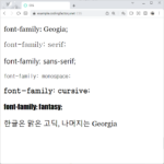
개요 font-family는 글꼴을 설정하는 속성이다. 기본값 : 웹브라우저의 기본 글꼴 상속 : Yes 애니메이션 : No 버전 : CSS Level 1 문법 font-family: font | initial | inherit font : family-name 또는 generic-family initial : 기본값으로 설정 inherit : 부모 요소의 속성값을 상속받음 font family-name은 글꼴 이름이다. 글꼴 이름에 띄어쓰기가 있으면 작은 따옴표 또는 큰 따옴표로 감싼다. generic-family는 글꼴 유형이다. 글꼴 유형은 다음과 ...
문법 CSS 문법은 선택자(selector), 속성(property), 값(value)의 조합으로 구성됩니다. 다음은 가장 간단한 CSS 코드입니다. h1 { color: red } h1, color, red 세 개의 단어가 있는데 각각 선택자, 속성, 값입니다. 선택자(selector) : 무엇을 꾸밀지 정합니다. h1은 h1 요소를 꾸미겠다는 뜻입니다. 태그, 클래스, ID 등 다양한 선택자가 있습니다. 속성(property) : 어떤 모양을 꾸밀지 정한다. color는 색을 꾸미겠다는 ...
선택자 링크는 <a> 태그로 만듭니다. 따라서 <a> 태그를 선택하여 꾸밉니다. 예를 들어 a { color: red; } 는 링크의 색을 빨간색으로 만듭니다. 가상 클래스를 이용하면 좀 더 다양하게 꾸밀 수 있습니다. a:link - 방문하지 않은 링크 a:visited - 방문했던 링크 a:hover - 마우스가 올려진 링크 a:active - 클릭하는 순간 링크 주의할 점은 a:hover는 a:link와 a:visited 뒤에 와야 하고, a:active는 ...