CSS / Flex / flex-wrap
개요
flex-wrap은 아이템들의 가로 크기 합이 콘테이너의 가로 크기를 넘어갈 때 어떻게 처리할지를 정한다.
문법
flex-wrap: nowrap | wrap | wrap-reverse | initial | inherit
nowrap: 기본값으로, 넘기지 않는다.wrap: 넘긴다.wrap-reverse: 역순으로 넘긴다.initial: 기본값으로 설정한다.inherit: 부모 요소의 속성값을 상속 받는다.
예제 - nowrap
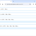
- 기본값은
nowrap으로...
<!doctype html>
<html lang="ko">
  <head>
    <meta charset="utf-8">
    <title>CSS</title>
    <style>
      * {
        box-sizing: border-box;
      }
      .jb-container {
        height: 400px;
        background-color: #01579b;
        display: flex;
        flex-wrap: nowrap;
      }
      .jb-item:nth-child(1) {
        background-color: #ffebee;
      }
      .jb-item:nth-child(2) {
        background-color: #ffcdd2;
      }
      .jb-item:nth-child(3) {
        background-color: #ef9a9a;
      }
      .jb-item:nth-child(4) {
        background-color: #e57373;
      }
    </style>
  </head>
  <body>
    <div class="jb-container">
      <div class="jb-item">Item 1</div>
      <div class="jb-item">Item 2</div>
      <div class="jb-item">Item 3</div>
      <div class="jb-item">Item 4</div>
    </div>
  </body>
</html>
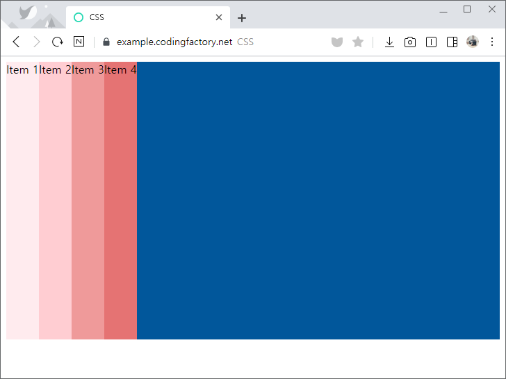
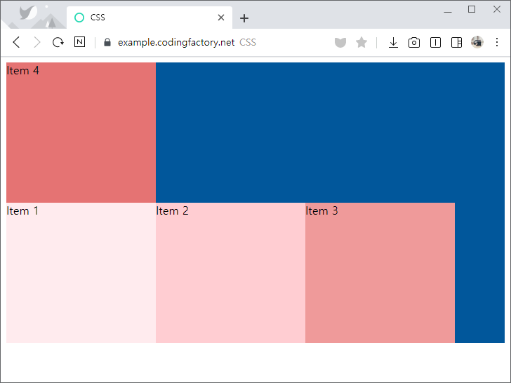
- 아이템의 가로 크기를 늘려도 한 줄에 나오도록 크기를 조정한다.
.jb-item {
  width: 30%;
}
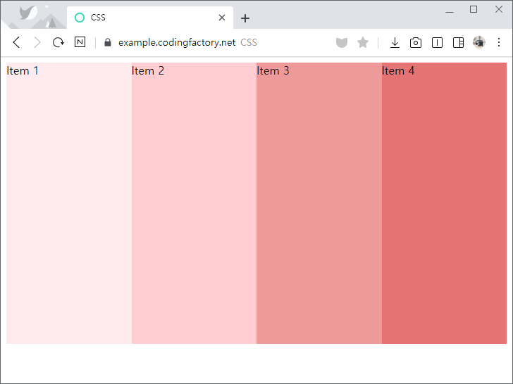
예제 - wrap
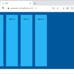
flex-wrap의 값을wrap으로 정하면, 아이템을 다음 줄로 넘긴다.
.jb-container {
  height: 400px;
  background-color: #01579b;
  display: flex;
  flex-wrap: wrap;
}
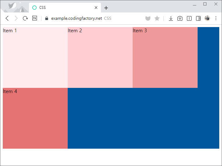
flex-direction의 값이column일 때flex-wrap의 값을wrap으로 정하면, 오른쪽으로 넘긴다.
.jb-container {
  height: 400px;
  background-color: #01579b;
  display: flex;
  flex-direction: column;
  flex-wrap: wrap;
}
.jb-item {
  height: 30%;
}
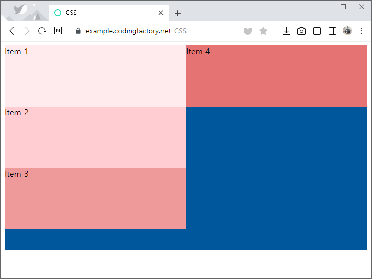
예제 - wrap-reverse
flex-wrap의 값을wrap-reverse로 정하면, 아이템을 이전 줄로 넘긴다.
.jb-container {
  height: 400px;
  background-color: #01579b;
  display: flex;
  flex-wrap: wrap-reverse;
}
개요 font-family는 글꼴을 설정하는 속성이다. 기본값 : 웹브라우저의 기본 글꼴 상속 : Yes 애니메이션 : No 버전 : CSS Level 1 문법 font-family: font | initial | inherit font : family-name 또는 generic-family initial : 기본값으로 설정 inherit : 부모 요소의 속성값을 상속받음 font family-name은 글꼴 이름이다. 글꼴 이름에 띄어쓰기가 있으면 작은 따옴표 또는 큰 따옴표로 감싼다. generic-family는 글꼴 유형이다. 글꼴 유형은 다음과 ...

float float는 요소를 왼쪽 또는 오른쪽에 배치할 때 유용한 속성입니다. float 속성을 부여한 요소의 다음 요소는 float 속성을 부여한 요소가 차지하는 위치만 제외하고 나머지 공간을 채우게 됩니다. 사진을 왼쪽 또는 오른쪽에 배치하고 그 주위를 텍스트로 채울 때 사용하거나, 사이트 레이아웃을 만들 때 사용합니다. overflow overflow는 내용이 요소의 크기를 벗어났을 때 어떻게 처리할지를 정하는 속성입니다. ...
CSS에서 텍스트의 가로 가운데 정렬은 text-align 속성을 이용합니다. text-align: center; 요소의 가로 가운데 정렬은 margin 속성을 이용합니다. margin-left: auto; margin-right: auto; 그렇다면 다음처럼 세로 정렬을 가운데로 하려면 어떻게 해야 할까요? 방법 1 - padding 속성 이용하기 바깥쪽 요소에 padding 속성을 추가해서 세로 정렬을 가운데로 할 수 있습니다. <!doctype html> <html lang="ko"> <head> <meta charset="utf-8"> ...
flex-direction으로 Item의 배열 방향을 정합니다. 기본값은 row로, 왼쪽에서 오른쪽으로 배열합니다. <!doctype html> <html lang="ko"> <head> <meta charset="utf-8"> <title>CSS</title> <style> .jb-container { height: 400px; padding: ...
목록의 내용만 가운데 정렬하기 목록 자체가 아니라 목록 안의 내용만 가운데 정렬할 때는 text-align 속성을 사용합니다. ul { text-align: center; } 목록 요소 자체를 가운데 정렬하기 목록 요소 자체를 가운데 정렬할 때는 margin 속성을 사용합니다. ul, ol의 기본 가로 크기는 100%이므로, 가로 크기를 지정해줘야 가운데로 정렬됩니다. ul { width: 300px; margin-left: auto; ...
CSS / word-break / 줄바꿈을 단어 기준으로 할 지 글자 기준으로 할 지 정하는 속성
개요 word-break는 줄바꿈을 할 때 단어 기준으로 할 지 글자 기준으로 할 지 정하는 속성이다. 기본값 : normal 상속 : Yes 애니메이션 : No 버전 : CSS Level 3 문법 word-break: normal | break-all | keep-all | initial | inherit; normal : CJK 문자는 글자 기준으로, CJK 이외의 문자는 단어 기준으로 줄바꿈한다. break-all : 글자 기준으로 줄바꿈한다. keep-all : 단어 ...
CSS / text-decoration / 선으로 텍스트를 꾸미는 속성
개요 text-decoration은 선으로 텍스트를 꾸밀 수 있게 해주는 속성입니다. 기본값 : none 상속 : No 애니메이션 : No 버전 : CSS Level 1 문법 text-decoration: none | line-through | overline | underline | initial | inherit none : 선을 만들지 않습니다. line-through : 글자 중간에 선을 만듭니다. overline : 글자 위에 선을 만듭니다. underline : 글자 아래에 선을 만듭니다. initial : 기본값으로 ...
display: grid 그리드(grid)는 콘테이너(container)와 아이템(item)으로 구성됩니다. 아래는 그리드를 위한 간단한 HTML 문서입니다. <!doctype html> <html lang="ko"> <head> <meta charset="utf-8"> <title>CSS</title> <style> body { box-sizing: border-box; ...
CSS / content / 요소 앞 또는 뒤에 텍스트, 이미지 등 콘텐트 추가하기
content content 속성은 선택한 요소의 앞이나 뒤에 텍스트, 이미지 등을 추가한다. 예를 들어 p 요소 앞에 콘텐트를 넣으려면 다음과 같이 하고 p:before { content: xxx; } 뒤에 넣으려면 다음과 같이 한다. p:after { content: xxx; } 텍스트 추가하기 p 요소 앞에 Hello World를 추가한다. <!doctype html> <html lang="ko"> <head> <meta charset="utf-8"> ...
CSS / border-width / 테두리 두께 정하는 속성
개요 border-width은 테두리(border)의 두께를 정하는 속성으로, 다음 속성의 단축 속성이다. border-top-width border-right-width border-bottom-width border-left-width 문법 border-width: medium | thin | thick | length | initial | inherit; initial : 기본값으로 설정한다. 기본값은 medium이다. inherit : 부모 요소의 속성값을 상속받는다. 속성값은 한 개에서 네 개까지 정할 수 있다. 다음은 모든 테두리의 두께를 xx로 만든다. border-width: xx 다음은 위쪽과 아래쪽 테두리의 두께는 xx로, 왼쪽와 오른쪽의 두께는 yy로 ...