CSS / Flex / justify-content
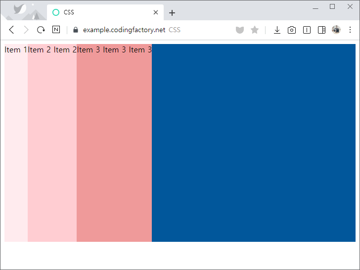
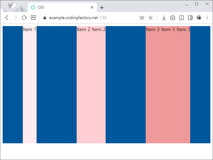
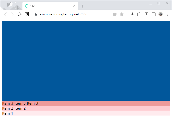
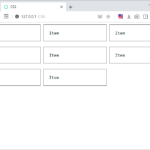
- justify-content로 flex-direction으로 정한 방향으로의 정렬을 정합니다. 예를 들어 flex-direction의 값이 row라면 가로 방향의 정렬을 정합니다.
- 기본값은 flex-start로 시작점부터 아이템을 배치합니다.
<!doctype html>
<html lang="ko">
  <head>
    <meta charset="utf-8">
    <title>CSS</title>
    <style>
      * {
        box-sizing: border-box;
      }
      .jb-container {
        height: 400px;
        background-color: #01579b;
        display: flex;
        justify-content: flex-start;
      }
      .jb-item:nth-child(1) {
        background-color: #ffebee;
      }
      .jb-item:nth-child(2) {
        background-color: #ffcdd2;
      }
      .jb-item:nth-child(3) {
        background-color: #ef9a9a;
      }
      .jb-item:nth-child(4) {
        background-color: #e57373;
      }
    </style>
  </head>
  <body>
    <div class="jb-container">
      <div class="jb-item">Item 1</div>
      <div class="jb-item">Item 2 Item 2</div>
      <div class="jb-item">Item 3 Item 3 Item 3</div>
    </div>
  </body>
</html>
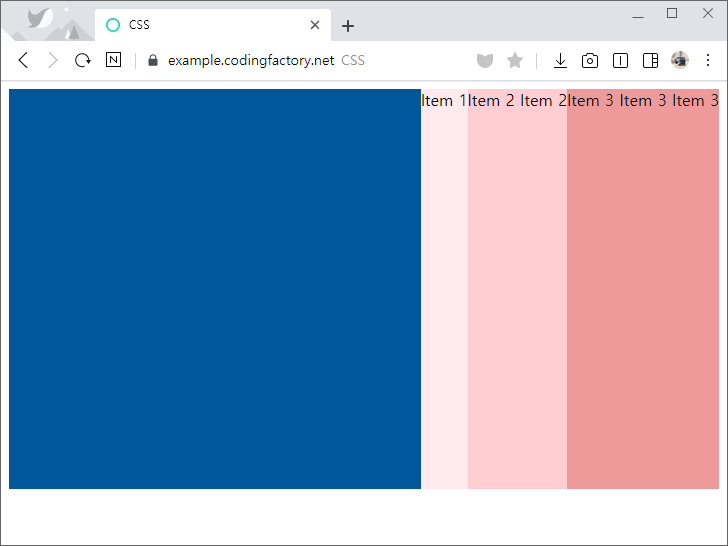
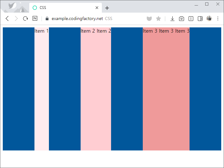
- justify-content의 값을 flex-end로 정하면 플렉스가 끝나는 지점에 배치합니다.
.jb-container {
  height: 400px;
  background-color: #01579b;
  display: flex;
  justify-content: flex-end;
}
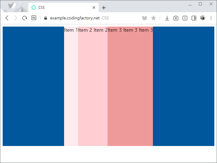
- justify-content의 값을 center로 정하면 가운데에 배치합니다.
.jb-container {
  height: 400px;
  background-color: #01579b;
  display: flex;
  justify-content: center;
}
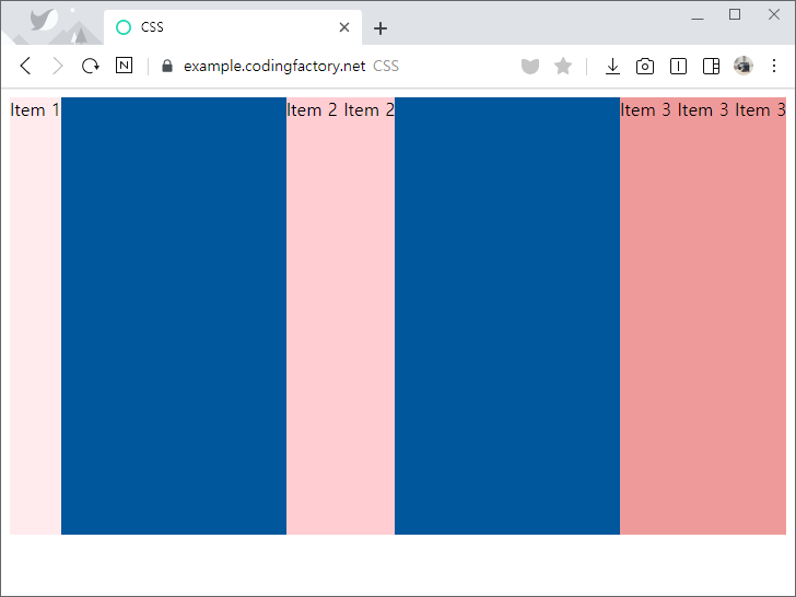
- justify-content의 값을 space-between으로 정하면 빈 공간을 균등하게 나누어 아이템 사이에 간격을 만듭니다.
.jb-container {
  height: 400px;
  background-color: #01579b;
  display: flex;
  justify-content: space-between;
}
- justify-content의 값을 space-around로 정하면 양 옆의 간격을 균등하게 만듭니다.
- 아이템 사이의 간격은 양끝 간격의 두 배가 됩니다.
.jb-container {
  height: 400px;
  background-color: #01579b;
  display: flex;
  justify-content: space-around;
}
- justify-content의 값을 space-evenly로 정하면 양끝과 아이템 사이의 간격을 동일하게 만듭니다.
.jb-container {
  height: 400px;
  background-color: #01579b;
  display: flex;
  justify-content: space-evenly;
}
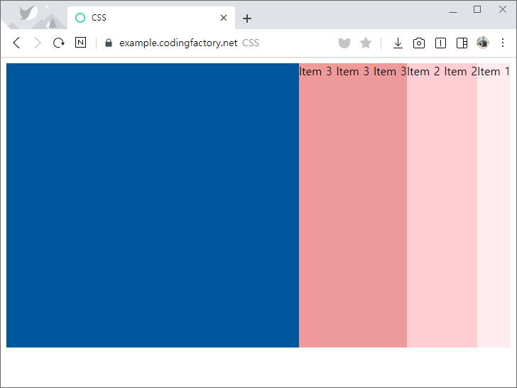
- flex-direction의 값을 row-reverse로 정하면 플렉스 시작점이 오른쪽이 됩니다.
.jb-container {
  height: 400px;
  background-color: #01579b;
  display: flex;
  flex-direction: row-reverse;
  justify-content: flex-start;
}
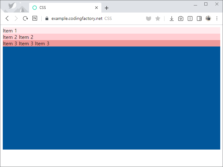
- flex-direction의 값을 column으로 정하면 플렉스 시작점이 위쪽이 됩니다.
.jb-container {
  height: 400px;
  background-color: #01579b;
  display: flex;
  flex-direction: column;
  justify-content: flex-start;
}
- flex-direction의 값을 column-reverse로 정하면 플렉스 시작점이 아래쪽이 됩니다.
.jb-container {
  height: 400px;
  background-color: #01579b;
  display: flex;
  flex-direction: column-reverse;
  justify-content: flex-start;
}

테두리 만드는 속성 테두리는 border 속성으로 만듭니다. table, th, td 요소에 적용할 수 있습니다. tr 요소에는 적용되지 않습니다. 기본 모양 아무런 꾸밈을 하지 않았다면 기본 모양은 테두리가 없는 것입니다. th 요소는 보통 굵은 글씨에 가운데 정렬이 기본 모양입니다. <!doctype html> <html lang="ko"> <head> <meta charset="utf-8"> <title>CSS</title> ...
상속(inheritance) CSS 속성은 상속하는 속성과 상속하지 않는 속성이 있습니다. 상속하는 속성은 자식 요소에 영향을 미칩니다. 상속하지 않는 속성은 자식 요소에 영향을 미치지 않습니다. 상속하는 속성 예를 들어 color는 상속하는 속성입니다. 부모 요소에서 정한 색이 자식 요소에도 적용됩니다. 즉 <style> p { color: blue; } </style> <p>Lorem <em>Ipsum</em></p> 일 때, Lorem 뿐만 아니라 Ipsum의 색도 파란색이 됩니다. 상속하지 않는 속성 예를 들어 ...
Box Model HTML 요소는 박스(box)로 이루어져 있습니다. 박스 위에 박스를 얹거나 박스들을 배열하여 문서를 만들어 나갑니다. 예를 들어 다음과 같이 코드를 작성했다면 <body> <header> <h1>Lorem</h1> </header> </body> body 박스 위에 header 박스가 있고, header 박스 위에 h1 박스가 있는 것입니다. 박스의 구성 하나의 박스는 바깥 여백 영역, 테두리 영역, 안쪽 여백 영역, ...
CSS / aspect-ratio / 요소의 가로 세로 비율 정하는 속성
개요 aspect-ratio는 선택한 요소의 가로 세로 비율을 정하는 속성이다. 접속하는 기기의 해상도가 변해도, 일정한 가로 세로 비율을 유지하고 싶을 때 유용하게 사용할 수 있다. 문법 aspect-ratio: auto | number / number | initial | inherit auto : 요소가 고유의 가로 세로 비율을 가진 경우 그 값으로 설정한다. number / number : 가로 대 세로. 세로가 생략된 ...
유튜브 영상을 블로그나 홈페이지에 넣을 때 보통 iframe을 사용한다. 코드는 유튜브 영상 공유에서 를 클릭하여 구할 수 있다. 아래와 같은 코드인데, 고정폭이다. 즉 웹브라우저의 가로폭이 커지든 작아지든 가로폭이 일정하다. <iframe width="560" height="315" src="https://www.youtube.com/embed/ybhXVSAdIRE" frameborder="0" allow="accelerometer; autoplay; encrypted-media; gyroscope; picture-in-picture" allowfullscreen></iframe> 이를 반응형으로 만들고 싶다면 아래처럼 한다. 16:9 크기의 div로 감싸고, iframe에 style을 추가하여 ...
CSS / IE에서 표의 셀 안의 이미지 크기 설정하는 방법
표의 셀 안에 200x200 크기의 이미지를 넣고, 셀의 가로 크기를 100px로 정해도, 이미지는 200x200 크기로 나옵니다. 셀의 크기에 맞게 이미지가 줄어들게 하는 방법은 두가지가 있습니다. <!doctype html> <html lang="ko"> <head> <meta charset="utf-8"> <title>CSS</title> <style> table { ...
order 속성으로 그리드 아이템의 순서를 변경할 수 있습니다. 시각적인 순서만 바뀔 뿐 문서 구조가 바뀌는 것은 아닙니다. order 속성의 기본값은 0입니다. 값이 같은 경우 입력된 순서대로 나옵니다. <!doctype html> <html lang="ko"> <head> <meta charset="utf-8"> <title>CSS</title> <style> body { ...
CSS / line-height / 줄 높이 정하는 속성
개요 line-height는 줄 높이를 정하는 속성입니다. 기본값 : normal 상속 : Yes 애니메이션 : Yes 버전 : CSS Level 1 문법 line-height: normal | length | number | percentage | initial | inherit normal : 웹브라우저에서 정한 기본값입니다. 보통 1.2입니다. length : 길이로 줄 높이를 정합니다. number : 글자 크기의 몇 배인지로 줄 높이를 정합니다. percentage : 글자 크기의 몇 %로 줄 ...
CSS / Grid / grid-column-gap, grid-row-gap, grid-gap
그리드 아이템 사이의 간격을 정하는 속성은 grid-row-gap, grid-column-gap, grid-gap입니다. grid-column-gap은 열 사이의 간격, grid-row-gap은 행 사이의 간격, grid-gap은 행과 열의 간격을 동시에 정할 수 있는 축약형입니다. 아래는 아이템 사이에 간격이 없는 간단한 그리드입니다. <!doctype html> <html lang="ko"> <head> <meta charset="utf-8"> <title>CSS</title> <style> ...
CSS / list-style-type / 목록 앞의 마커 정하는 속성
목록은 <ul> 또는 <ol> 태그로 만든다. 목록 앞에 붙는 도형이나 문자을 마커(Marker)라고 하는데, 어떤 형식 또는 모양의 마커를 사용할지는 list-style-type으로 정한다. 속성값은 다음과 같다. <ul> : disc, circle, square <ol> : decimal, decimal-leading-zero, lower-roman, upper-roman, lower-greek, lower-latin, upper-latin, armenian, georgian, lower-alpha, upper-alpha 공통 : none 의미상으로는 <ul>과 <ol>에 사용하는 속성값을 구분하는 게 맞지만, <ul>에 decimal을 사용하거나 ...