CSS / Flex / flex-wrap
개요
flex-wrap은 아이템들의 가로 크기 합이 콘테이너의 가로 크기를 넘어갈 때 어떻게 처리할지를 정한다.
문법
flex-wrap: nowrap | wrap | wrap-reverse | initial | inherit
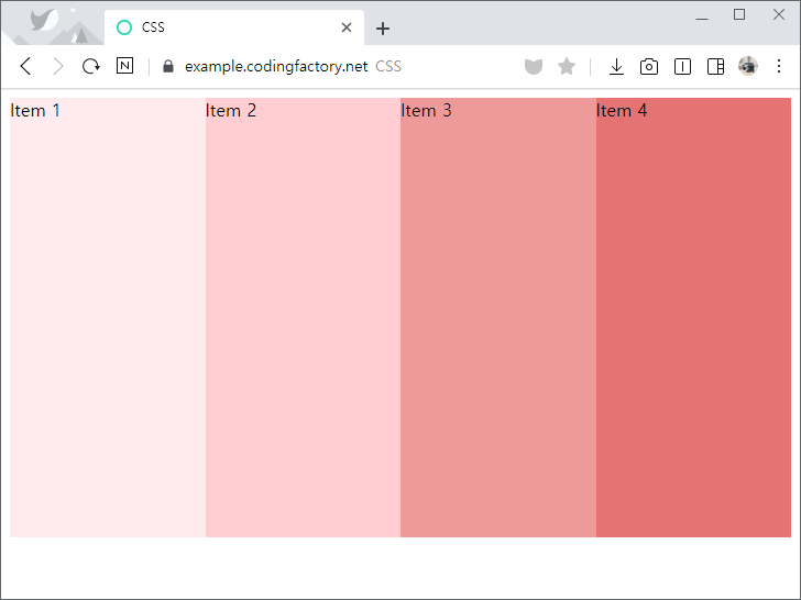
nowrap: 기본값으로, 넘기지 않는다.wrap: 넘긴다.wrap-reverse: 역순으로 넘긴다.initial: 기본값으로 설정한다.inherit: 부모 요소의 속성값을 상속 받는다.
예제 - nowrap
- 기본값은
nowrap으로...
<!doctype html>
<html lang="ko">
  <head>
    <meta charset="utf-8">
    <title>CSS</title>
    <style>
      * {
        box-sizing: border-box;
      }
      .jb-container {
        height: 400px;
        background-color: #01579b;
        display: flex;
        flex-wrap: nowrap;
      }
      .jb-item:nth-child(1) {
        background-color: #ffebee;
      }
      .jb-item:nth-child(2) {
        background-color: #ffcdd2;
      }
      .jb-item:nth-child(3) {
        background-color: #ef9a9a;
      }
      .jb-item:nth-child(4) {
        background-color: #e57373;
      }
    </style>
  </head>
  <body>
    <div class="jb-container">
      <div class="jb-item">Item 1</div>
      <div class="jb-item">Item 2</div>
      <div class="jb-item">Item 3</div>
      <div class="jb-item">Item 4</div>
    </div>
  </body>
</html>
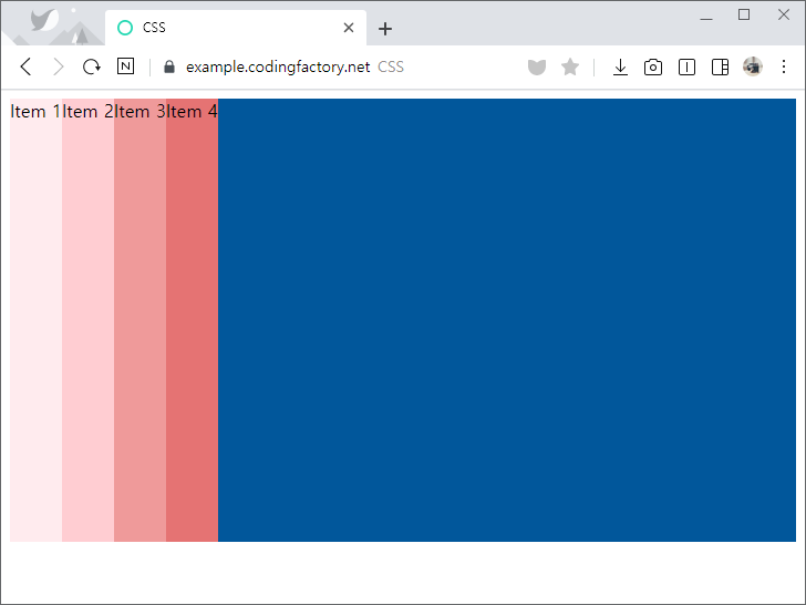
- 아이템의 가로 크기를 늘려도 한 줄에 나오도록 크기를 조정한다.
.jb-item {
  width: 30%;
}
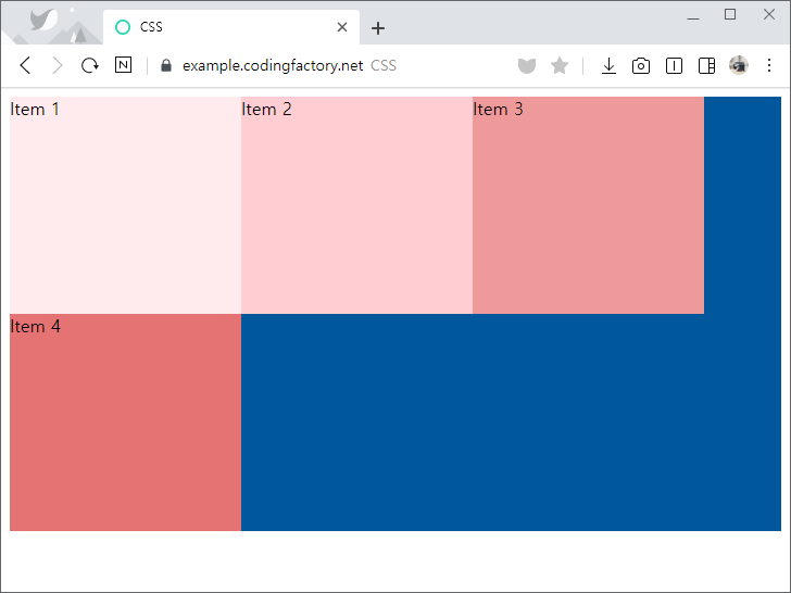
예제 - wrap
flex-wrap의 값을wrap으로 정하면, 아이템을 다음 줄로 넘긴다.
.jb-container {
  height: 400px;
  background-color: #01579b;
  display: flex;
  flex-wrap: wrap;
}
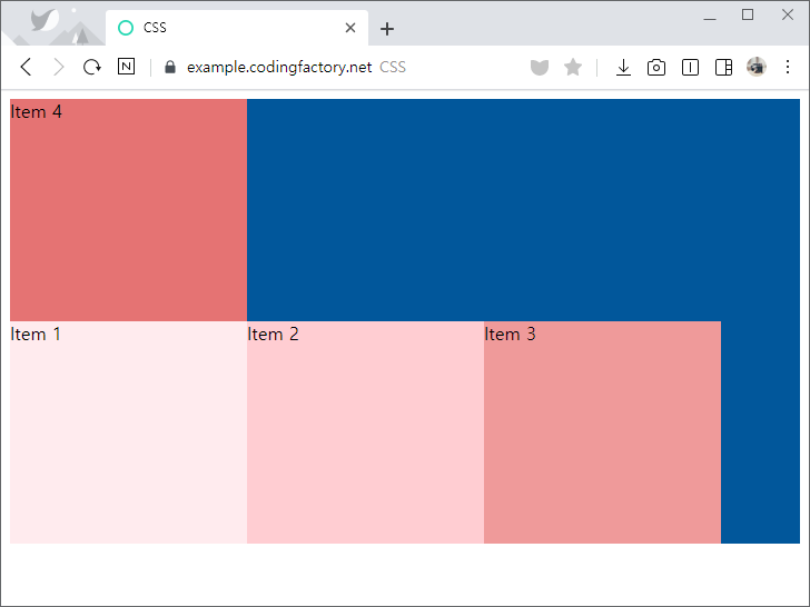
flex-direction의 값이column일 때flex-wrap의 값을wrap으로 정하면, 오른쪽으로 넘긴다.
.jb-container {
  height: 400px;
  background-color: #01579b;
  display: flex;
  flex-direction: column;
  flex-wrap: wrap;
}
.jb-item {
  height: 30%;
}
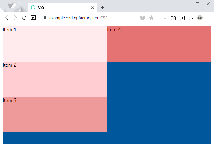
예제 - wrap-reverse
flex-wrap의 값을wrap-reverse로 정하면, 아이템을 이전 줄로 넘긴다.
.jb-container {
  height: 400px;
  background-color: #01579b;
  display: flex;
  flex-wrap: wrap-reverse;
}

CSS / text-indent / 들여쓰기, 내어쓰기 만드는 속성
text-indent 들여쓰기와 내어쓰기는 text-indent 속성으로 만듭니다. 값이 양수이면 들여쓰기, 값이 음수이면 내어쓰기가 됩니다. 기본값은 0입니다. 내어쓰기를 할 때는 왼쪽에 여백을 적절히 줍니다. 예제 <!doctype html> <html lang="ko"> <head> <meta charset="utf-8"> <title>CSS</title> <style> p { font-size: 20px; ...
CSS / 체크박스(checkbox)와 라벨(label) 높이 조정하기
체크박스와 라벨 체크박스(checkbox)와 라벨(label)을 나란히 놓았을 때, 높이가 잘 맞지 않는 경우가 발생합니다. 높이를 조정하는 방법은 여러 가지가 있는데, 그 중 하나는 position 속성을 이용하는 것입니다. position 속성의 값을 relative로 정한 후 top 속성의 값을 적절히 정하면 됩니다. checkbox를 옮길 수도 있고 label을 옮길 수도 있습니다. 예제 다음은 높이를 조정하는 간단한 예제입니다. 첫 번째 체크박스와 라벨은 아무런 ...
CSS / font-weight / 글자 굵기 정하는 속성
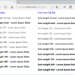
개요 font-weight로 글자의 굵기를 정한다. 기본값 : normal 상속 : Yes 애니메이션 : Yes 버전 : CSS Level 1 문법 font-weight: normal | bold | bolder | lighter | number | initial | inherit normal : 보통 굵기이다. 숫자 400과 같다. bold : 굵은 굵기이다. 숫자 700과 같다. bolder : 상속된 값보다 굵은 굵기다. lighter : 상속된 값보다 얇은 굵기이다. number : ...
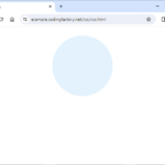
CSS의 border-radius 속성으로 원을 만들 수 있다. 원 만들기 HTML 문서에 다음과 같이 내용이 없는 요소를 하나 만든다. <div class="circle"></div> 적절히 크기를 정하여 정사각형을 만들고, 배경색을 넣는다. <!doctype html> <html lang="ko"> <head> <meta charset="utf-8"> <title>CSS</title> <style> .circle { ...
CSS / text-transform / 대문자로 또는 소문자로 바꾸는 속성
개요 text-transform은 대문자로 또는 소문자로 바꾸는 속성입니다. 기본값 : none 상속 : Yes 버전 : CSS Level 1 한글에서는 의미가 없는 속성입니다. 문법 text-transform: none | capitalize | uppercase | lowercase | initial | inherit none : 입력된 그대로 출력합니다. capitalize : 단어의 첫번째 글자를 대문자로 바꿉니다. uppercase : 모든 글자를 대문자로 바꿉니다. lowercase : 모든 글자를 소문자로 바꿉니다. initial : 기본값으로 ...
선택자 링크는 <a> 태그로 만듭니다. 따라서 <a> 태그를 선택하여 꾸밉니다. 예를 들어 a { color: red; } 는 링크의 색을 빨간색으로 만듭니다. 가상 클래스를 이용하면 좀 더 다양하게 꾸밀 수 있습니다. a:link - 방문하지 않은 링크 a:visited - 방문했던 링크 a:hover - 마우스가 올려진 링크 a:active - 클릭하는 순간 링크 주의할 점은 a:hover는 a:link와 a:visited 뒤에 와야 하고, a:active는 ...
CSS / Flex / IE에서 flex-basis 오류 해결하는 방법
Flex를 이용하여 다단 배열을 만들려고 합니다. 내용에 상관없이 같은 폭을 가진 다단 배열을 만든다면 flex-basis를 사용하는 게 편합니다. 아래는 Flex를 이용한 간단한 2단 배열입니다. box-sizing의 값을 border-box로 설정하고, flex-basis의 값을 50%로 하면 간단히 만들어집니다. <!doctype html> <html lang="ko"> <head> <meta charset="utf-8"> <title>CSS</title> <style> ...
CSS 변수 CSS에 변수를 만들고 사용할 수 있습니다. 변수를 이용하면 여러 값을 한 번에 변경할 수 있습니다. 변수 선언 --variable-name: value; 변수를 정의하면, 변수를 정의한 요소와 그 하위 요소에서 그 변수를 사용할 수 있습니다. 만약 어느 곳에서나 사용할 수 있게 하려면 :root에 정의합니다. 변수 사용 property: var( --variable-name ) 예제 기본 변수 --my-color-1을 red로 설정하고 사용합니다. <!doctype html> <html lang="ko"> <head> <meta charset="utf-8"> <title>CSS</title> <style> :root ...
버튼을 꾸미는 방법 중의 하나는 이미지를 이용하는 것입니다. 적당한 크기의 버튼을 만듭니다. 그 크기에 맞는 이미지를 배경으로 정합니다. 다음은 32x32 크기의 돋보기 이미지를 이용해서 버튼을 꾸미는 예제입니다. <!doctype html> <html lang="ko"> <head> <meta charset="utf-8"> <title>CSS</title> <style> input { ...
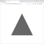
CSS의 border 속성으로 삼각형을 만들 수 있다. 여러 형태의 삼각형을 만들고, 그 삼각형을 회전하는 방법을 알아본다. 삼각형 만들기 기본 HTML 문서에 다음과 같이 내용이 없는 요소를 하나 만든다. <div class="triangle"></div> 가로와 세로의 크기를 0으로 만든다. 아래쪽, 왼쪽, 오른쪽에 테두리를 추가하면 사각형을 만들 수 있다. .triangle { width: 0px; height: 0px; border-bottom: 360px solid #666666; ...