CSS / Reference / opacity
개요
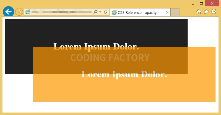
opacity로 요소의 투명도를 정할 수 있습니다.
- 기본값 : 1
- 상속 : No
- 애니메이션 : Yes
- 버전 : CSS Level 3
문법
opacity: number | initial | inherit
- number : 0.0부터 1.0까지의 수를 넣습니다. 숫자가 작을수록 투명해집니다.
- initial : 기본값으로 설정합니다.
- inherit : 부모 요소의 속성값을 상속받습니다.
예제
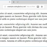
<!doctype html>
<html lang="ko">
  <head>
    <meta charset="utf-8">
    <title>CSS Reference | opacity</title>
    <style>
      .a {
        width: 600px;
        padding: 50px 0px;
        border: 1px solid #212121;
        background-color: #212121;
        text-align: center;
        color: #ffffff;
      }
      .b {
        position: fixed;
        top: 100px;
        left: 100px;
        width: 600px;
        padding: 50px 0px;
        border: 1px solid #ff9800;
        background-color: #ff9800;
        text-align: center;
        color: #ffffff;
        opacity: 0.7;
      }
    </style>
  </head>
  <body>
    <div class="a">
      <h1>Lorem Ipsum Dolor.</h1>
    </div>
    <div class="b">
      <h1>Lorem Ipsum Dolor.</h1>
    </div>
  </body>
</html>

text-align은 문단 정렬 방식을 정하는 속성입니다. 기본값 : 읽는 방향이 LTR(왼쪽에서 오른쪽)인 경우 left, RTL(오른쪽에서 왼쪽)인 경우 right 상속 : Yes 애니메이션 : No 버전 : CSS Level 1
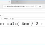
calc()는 괄호 안의 식을 계산한 결과를 속성값으로 사용하게 해주는 함수입니다. 예를 들어 다음은 는 글자 크기를 20px로 설정합니다. font-size: calc( 10px + 10px );
clip 속성으로 요소의 특정 부분만 나오도록 할 수 있습니다. 기본값 : auto 상속 : No 애니메이션 : Yes 버전 : CSS Level 2
font-style은 글자 모양을 정하는 속성으로, 기울임 여부를 정합니다. 기본값 : normal 상속 : Yes 애니메이션 : No 버전 : CSS Level 1

CSS / Reference / accent-color
accent-color는 HTML의 폼 요소에 사용되는 강조 색상을 정하는 속성입니다. 기본적으로 브라우저는 사용자 인터페이스 요소에 특정한 시스템 색상을 사용하지만, accent-color를 사용하면 이러한 요소들의 강조 색상을 커스터마이즈할 수 있습니다.
들여쓰기와 내어쓰기는 text-indent 속성으로 만듭니다. 값이 양수이면 들여쓰기, 값이 음수이면 내어쓰기가 됩니다. 내어쓰기를 할 때는 왼쪽에 여백을 적절히 줍니다.

CSS / Reference / background-size
background-size는 배경 이미지의 가로 크기와 세로 크기를 정하는 속성입니다. 기본값 : auto 상속 : No 애니메이션 : Yes 버전 : CSS Level 3
font-size는 글자 크기를 정하는 속성입니다. 기본값 : medium 상속 : Yes 애니메이션 : Yes 버전 : CSS Level 1
CSS / Reference / background-image
background-image는 이미지를 배경으로 사용하게 하는 속성입니다. 기본값 : none 상속 : No 애니메이션 : No 버전 : CSS Level 1
white-space는 스페이스와 탭, 줄바꿈, 자동줄바꿈을 어떻게 처리할지 정하는 속성입니다. 기본값 : normal 상속 : Yes 애니메이션 : No 버전 : CSS Level 1