
CSS / Reference / aspect-ratio
aspect-ratio는 요소의 가로와 세로 비율을 위한 선호 비율을 지정합니다. 한 축의 크기가 auto일 때 다른 축을 바탕으로 크기를 계산하는 데 쓰이며, 가로·세로를 모두 고정하면 그 값들이 비율보다 우선할 수 있습니다.
문법과 주요 값
| 속성 | 초기값 | 상속 | 주요 적용 조건 |
|---|---|---|---|
aspect-ratio |
auto | 아니요 | 대부분의 크기 지정 상자; 일반 인라인·표 내부 상자 등 제외 |
초기값은 브라우저 기본 스타일시트가 HTML 요소에 적용한 값과 같다는 뜻이 아닙니다. 실제 값은 개발자 도구의 Computed에서 확인하세요.
.video { width: 100%; aspect-ratio: 16 / 9; }
.square { width: 240px; aspect-ratio: 1; }
| 값 또는 구분 | 동작과 선택 기준 |
|---|---|
auto |
별도의 지정 비율 없음; 대체 요소는 고유 비율 사용 가능 |
16 / 9 |
가로 16 : 세로 9의 선호 비율 |
1 |
정사각형 선호 비율 |
auto 16 / 9 |
대체 요소에서 고유 비율을 얻기 전 사용할 지정 비율 |
값과 적용 조건은 MDN aspect-ratio에서 확인할 수 있습니다.
실행 예제와 결과 비교
아래 전체 코드를 UTF-8 형식의 aspect-ratio-example.html 파일로 저장한 뒤 브라우저로 여세요. 예제용 CSS는 이 파일 안에만 넣고 사이트 전체 스타일시트에 그대로 붙여 넣지 않습니다.
<!doctype html>
<html lang="ko">
<head>
<meta charset="utf-8">
<meta name="viewport" content="width=device-width, initial-scale=1">
<title>aspect-ratio 비교 예제</title>
<style>
body { margin: 0; color: #20242b; background: #fff; font: 16px/1.7 "Malgun Gothic", sans-serif; }
#demo { padding: 24px; max-width: 820px; margin: auto; }
h1 { font-size: 22px; margin: 0 0 20px; }
.samples { display: flex; flex-wrap: wrap; gap: 24px; }
.label { margin: 0 0 8px; font-weight: 700; }
.target, .reference { width: 240px; height: auto; background: #bfe3ff; }
.target { aspect-ratio: 16 / 9; }
.reference { aspect-ratio: 1; }
</style>
</head>
<body>
<main id="demo">
<h1>aspect-ratio 적용 비교</h1>
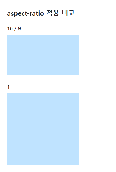
<section class="samples"><div class="a"><p class="label">16 / 9</p><div class="target"></div></div><div class="b"><p class="label">1</p><div class="reference"></div></div></section>
</main>
</body>
</html>
너비 240px인 첫 박스의 높이는 135px, 두 번째 정사각형은 240px입니다. 너비가 바뀌면 auto 높이도 선호 비율에 따라 바뀝니다.
선호 비율과 크기 제약
aspect-ratio는 모든 상황에서 크기를 강제하는 잠금 장치가 아닙니다. width와 height, min/max 크기, 콘텐츠 최소 크기와 flex·grid의 배치 제약이 결과에 영향을 줍니다. 양쪽 크기를 고정하면 비율 선언만으로 한쪽이 자동 수정되지 않습니다.
이미지 박스와 이미지 내용
img의 박스에 비율을 지정해도 사진을 어떻게 맞출지는 object-fit이 정합니다. cover는 자를 수 있고 contain은 빈 공간을 남길 수 있습니다. 이미지의 원래 width·height 정보를 HTML에 제공하는 것과 CSS 선호 비율은 구분되며, 콘텐츠 로딩 전 공간을 마련하려면 두 정보가 모순되지 않도록 합니다.
고유 이미지 비율과 CSS의 선호 비율
다음 전체 문서를 css-reference-13776-practice.html로 UTF-8 저장한 뒤 브라우저에서 엽니다. 다른 예제 파일에 중첩해서 붙이지 않고 별도 파일로 시험합니다.
<!doctype html>
<html lang="ko">
<head>
<meta charset="utf-8">
<meta name="viewport" content="width=device-width, initial-scale=1">
<title>고유 이미지 비율과 CSS의 선호 비율</title>
<style>
body { margin: 16px; color: #20242b; font: 16px/1.7 sans-serif; }
main { max-width: 52rem; margin: auto; }
h1 { font-size: 1.35rem; }
.samples { display: flex; flex-wrap: wrap; gap: 24px; }
.samples > * { max-width: 100%; min-width: 0; }
:focus-visible { outline: 3px solid #005fcc; outline-offset: 3px; }
.sample {width:240px;max-width:100%;background:#e6f2ff;border:0;} img {display:block;height:auto;} .auto {aspect-ratio:auto 16 / 9;} .crop {aspect-ratio:16 / 9;height:auto;object-fit:cover;} .contain {object-fit:contain;}
</style>
</head>
<body>
<main>
<h1>고유 이미지 비율과 CSS의 선호 비율</h1>
<p>일반 div: auto 16 / 9</p><div class="sample auto"></div><p>고유 비율 2:1 이미지: auto 16 / 9</p><img class="sample auto" src="data:image/svg+xml,%3Csvg xmlns='http://www.w3.org/2000/svg' width='80' height='40'%3E%3Crect width='80' height='40' fill='%23006c9c'/%3E%3Ccircle cx='20' cy='20' r='12' fill='%23ffd166'/%3E%3C/svg%3E" alt="가로 80, 세로 40인 파란 도형"><p>16 / 9 + cover</p><img class="sample crop" src="data:image/svg+xml,%3Csvg xmlns='http://www.w3.org/2000/svg' width='80' height='40'%3E%3Crect width='80' height='40' fill='%23006c9c'/%3E%3Ccircle cx='20' cy='20' r='12' fill='%23ffd166'/%3E%3C/svg%3E" alt="16:9 상자에 맞춰 자른 도형"><p>16 / 9 + contain</p><img class="sample crop contain" src="data:image/svg+xml,%3Csvg xmlns='http://www.w3.org/2000/svg' width='80' height='40'%3E%3Crect width='80' height='40' fill='%23006c9c'/%3E%3Ccircle cx='20' cy='20' r='12' fill='%23ffd166'/%3E%3C/svg%3E" alt="전체가 보이는 2:1 도형">
</main>
</body>
</html>
너비 240px일 때 일반 div는 135px이고 로드된 2:1 이미지는 auto 때문에 120px입니다. auto가 없는 16/9 이미지 상자는 135px이고 cover는 잘림, contain은 빈 공간이 생깁니다. .sample 너비만 200px로 바꾸고 비례 변화를 확인한 뒤 복구합니다. width와 height를 모두 확정하면 선호 비율이 두 길이를 강제로 덮어쓰지 않습니다.
별도 비율 예제에서 .sample에 height:100px을 추가하면 가로 240px·세로 100px 두 축이 확정되어 선호 비율이 그 크기를 덮어쓰지 않습니다. 복구한 뒤 min-height:160px만 추가하면 최소 높이 제약 때문에 135px보다 커질 수 있습니다. 두 실험을 동시에 켜지 말고 각 제약을 제거해 원래 값으로 복구하세요.
반응형 이미지 크기와 비율을 함께 설계하려면 이미지와 동영상 크기·비율 맞추기를 참고하세요. 본문의 조건과 함께 비교할 관련 속성은 box-sizing입니다.
적용되지 않거나 예상과 다를 때
- 비율이 안 맞으면 height가 auto인지와 min-height 등의 제한을 확인합니다.
- 사진이 찌그러지면 박스 비율뿐 아니라 object-fit과 이미지 크기 설정을 확인합니다.
문단 안의 인라인 내용을 정렬하고 블록 자체의 배치와 구분합니다. start·end의 쓰기 방향과 양끝·마지막 줄 정렬을 비교합니다.
CSS / Reference / aspect-ratio
선호 가로세로 비율과 이미지의 고유 비율을 구분합니다. auto 조합, 확정 크기, cover·contain의 잘림과 빈 공간을 실행 예제로 비교합니다.
CSS / Reference / background-size
cover·contain을 같은 이미지와 영역에서 비교합니다. 비율 유지, 잘림, 빈 공간과 padding-box 기준의 크기 계산을 함께 확인합니다.
사용 중단된 clip의 좌표를 읽고 clip-path의 inset 거리와 비교합니다. 절대 위치 조건과 크기 변경 시 좌표 재계산을 설명합니다.
CSS / Reference / background-position
배경 위치의 백분율이 영역과 이미지 크기의 차이에 적용되는 이유를 설명합니다. 동일 영역에서 0·50·100%를 비교하고 위치와 잘림을 조정합니다.
CSS / Reference / background-image
배경 이미지의 주소 기준과 여러 레이어의 순서를 설명합니다. 인라인 SVG 예제로 실행하고 외부 CSS의 상대 경로와 요청 실패를 확인합니다.
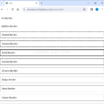
CSS / Reference / border-style
테두리 스타일의 1~4개 값 대응과 none의 계산 두께를 설명합니다. 접힌 표에서 hidden이 이웃 경계를 억제하는 차이도 실행 예제로 확인합니다.
CSS / Reference / accent-color
체크박스·라디오·범위·진행률의 기본 강조색을 지정합니다. 레이블과 키보드 조작, disabled·appearance 및 운영체제별 차이를 확인합니다.
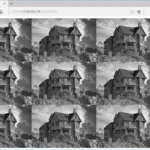
CSS / Reference / background-repeat
repeat·no-repeat·space·round를 같은 타일로 비교합니다. 반복 방향, 타일 간격과 크기 조정, 한 축에 한 타일만 들어가는 조건을 살펴봅니다.
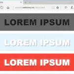
텍스트 그림자의 위치·흐림·레이어 순서를 조정합니다. 박스 그림자와의 차이, 잘림 및 실제 글자 대비를 함께 점검합니다.