How to Make a Circle, Ellipse, or Ring with CSS
Set border-radius: 50% on a square to make a circle or on a rectangle with unequal sides to make an ellipse. Add a border and leave the background transparent to draw a ring. Use aspect-ratio: 1 to keep a circle round as its width changes.
Why 50% makes a circle or an ellipse
At 50%, the horizontal radius of each corner is half the border box width, and the vertical radius is half the height. A 120 × 120px box has two 60px radii. A 240 × 120px box has a 120px horizontal radius and a 60px vertical radius.
If you want a long button with straight sides between rounded ends, use a large length such as border-radius: 9999px. The outline of the ellipse made with 50% curves the whole way around.
CSS specification for border-radius and percentage radii
Try filled shapes and rings in one file
Save the complete example as shapes.html and open it in a browser. It shows a filled circle, a filled ellipse, and two rings that use different box sizing rules.
<!doctype html>
<html lang="en">
<head>
  <meta charset="utf-8">
  <meta name="viewport" content="width=device-width, initial-scale=1">
  <title>CSS circles and ellipses</title>
  <style>
    body { margin: 1rem; font: 1rem/1.5 system-ui, sans-serif; }
    .examples {
      display: grid;
      grid-template-columns: repeat(auto-fit, minmax(min(100%, 16rem), 1fr));
      gap: 1rem;
      max-width: 36rem;
      margin-inline: auto;
    }
    figure {
      display: grid;
      align-content: center;
      justify-items: center;
      gap: 0.75rem;
      min-height: 9rem;
      margin: 0;
      padding: 1rem;
      background-color: #f3f5fb;
      text-align: center;
      overflow-wrap: anywhere;
    }
    .shape {
      display: block;
      box-sizing: border-box;
      width: min(100%, 120px);
      aspect-ratio: 1;
      border-radius: 50%;
    }
    .circle { background-color: #5878d2; }
    .ellipse {
      width: min(100%, 240px);
      aspect-ratio: 2 / 1;
      background-color: #549f9a;
    }
    .ring { border: 8px solid #786bc1; }
    .ring--content {
      box-sizing: content-box;
      width: min(calc(100% - 16px), 120px);
    }
  </style>
</head>
<body>
  <div class="examples">
    <figure><span class="shape circle" aria-hidden="true"></span><figcaption>Filled circle</figcaption></figure>
    <figure><span class="shape ellipse" aria-hidden="true"></span><figcaption>Wide ellipse</figcaption></figure>
    <figure><span class="shape ring" aria-hidden="true"></span><figcaption>Ring with 120px outer diameter</figcaption></figure>
    <figure><span class="shape ring ring--content" aria-hidden="true"></span><figcaption>Ring with 120px inner diameter</figcaption></figure>
  </div>
</body>
</html>
When there is enough space, the circle measures 120 × 120px and the ellipse 240 × 120px. The first ring is 120px across on the outside and the second is 136px. Narrow the window to see the shapes fit their cards.
Keep the shape's proportions as it resizes
The sample sets width to the smaller of the available space and a maximum size. It leaves the height automatic and uses aspect-ratio: 1 for the circle or aspect-ratio: 2 / 1 for the wide ellipse. For a tall ellipse, use 1 / 2 and choose a maximum width.
If a circle looks oval, inspect the actual border box width and height in developer tools. When both dimensions are fixed, aspect-ratio cannot derive one from the other. Look for a competing height declaration or a size constraint.
CSS specification for aspect-ratio
Set the outer diameter and thickness of a ring
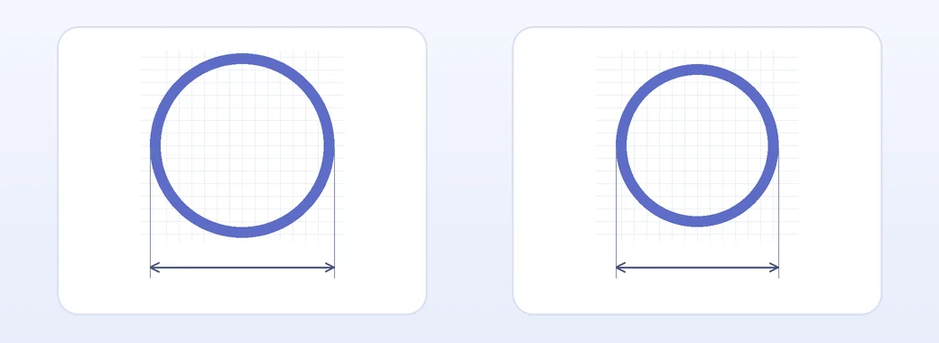
The rings use border: 8px solid #786bc1. With box-sizing: border-box, both sides of the border fit inside the 120px width, leaving an inner diameter of 104px. With content-box, 120px refers to the inside. Adding 8px on each side makes the outside 136px.
The diagram shows content-box on the left and border-box on the right. Use border-box when you need to match the outside of the ring to another element.
Leave the background unset or use background-color: transparent to let the surrounding background show through the ring. Choose a border color that stands out against it.
Crop a profile photo into a circle
Save a portrait or landscape photo as profile.jpg next to your HTML file. Add the markup to <body> and the CSS inside <style> to crop the photo to a circle up to 96px wide.
<img class="avatar" src="profile.jpg"
  alt="Mina Kim’s profile photo" width="96" height="96">
.avatar {
display: block;
width: min(100%, 96px);
height: auto;
aspect-ratio: 1;
border-radius: 50%;
object-fit: cover;
object-position: 50% 35%;
}object-fit: cover preserves the original photo ratio, fills the circle, and crops the portions outside it. Reduce the second object-position value if you need to bring more of the top into view. Use contain to keep the entire photo visible, allowing space around it.
Use a text alternative with the person's name if the photo helps identify them. An empty alt="" is suitable when an adjacent name already provides the same information and the photo adds no other meaning.