如何用 CSS 制作圆形、椭圆和圆环
给正方形设置 border-radius: 50% 可以得到圆形,给宽高不同的矩形设置则得到椭圆。添加 border 并让背景保持透明,可以制作圆环。使用 aspect-ratio: 1 可以在元素宽度变化时保持圆形。
为什么同样的 50% 能做出圆形或椭圆
设置为 50% 时,角的水平半径是包含边框的盒子宽度的一半,垂直半径是其高度的一半。120 × 120px 的盒子两个半径都是 60px。240 × 120px 的盒子水平半径为 120px,垂直半径为 60px。
长按钮如果希望两端为圆弧、中间保留直线,可使用 border-radius: 9999px 这样的较大长度值。用 50% 做成的椭圆,外缘全程是曲线。
在一个文件中试做实心图形和圆环
将下面的完整代码保存为 shapes.html,再用浏览器打开。可以比较实心圆、实心椭圆和尺寸计算方式不同的两个圆环。
<!doctype html>
<html lang="zh-CN">
<head>
  <meta charset="utf-8">
  <meta name="viewport" content="width=device-width, initial-scale=1">
  <title>用 CSS 制作圆形和椭圆</title>
  <style>
    body { margin: 1rem; font: 1rem/1.5 system-ui, sans-serif; }
    .examples {
      display: grid;
      grid-template-columns: repeat(auto-fit, minmax(min(100%, 16rem), 1fr));
      gap: 1rem;
      max-width: 36rem;
      margin-inline: auto;
    }
    figure {
      display: grid;
      align-content: center;
      justify-items: center;
      gap: 0.75rem;
      min-height: 9rem;
      margin: 0;
      padding: 1rem;
      background-color: #f3f5fb;
      text-align: center;
      overflow-wrap: anywhere;
    }
    .shape {
      display: block;
      box-sizing: border-box;
      width: min(100%, 120px);
      aspect-ratio: 1;
      border-radius: 50%;
    }
    .circle { background-color: #5878d2; }
    .ellipse {
      width: min(100%, 240px);
      aspect-ratio: 2 / 1;
      background-color: #549f9a;
    }
    .ring { border: 8px solid #786bc1; }
    .ring--content {
      box-sizing: content-box;
      width: min(calc(100% - 16px), 120px);
    }
  </style>
</head>
<body>
  <div class="examples">
    <figure><span class="shape circle" aria-hidden="true"></span><figcaption>实心圆</figcaption></figure>
    <figure><span class="shape ellipse" aria-hidden="true"></span><figcaption>横向椭圆</figcaption></figure>
    <figure><span class="shape ring" aria-hidden="true"></span><figcaption>外径为 120px 的圆环</figcaption></figure>
    <figure><span class="shape ring ring--content" aria-hidden="true"></span><figcaption>内径为 120px 的圆环</figcaption></figure>
  </div>
</body>
</html>
空间足够时,圆形为 120 × 120px,椭圆为 240 × 120px。第一个圆环的外径为 120px,第二个为 136px。缩窄窗口,可以看到图形随各自的卡片缩小。
缩放时保持图形的宽高比例
示例给 width 使用可用宽度与最大值中的较小值,高度保持自动。圆形使用 aspect-ratio: 1,横向椭圆使用 2 / 1。如果需要纵向椭圆,改成 1 / 2 并设置合适的最大宽度。
如果圆形看起来像椭圆,请在开发者工具中比较包含边框的实际宽高。如果宽高都已固定,aspect-ratio 就无法根据一个尺寸推算另一个。也请检查其他 height 声明和尺寸限制。
设置圆环的外径和边框厚度
示例用 border: 8px solid #786bc1 绘制圆环。使用 box-sizing: border-box 时,两侧边框都包含在 120px 内,内径为 104px。使用 content-box 时,120px 指内径,两侧分别加上 8px 后,外径为 136px。
下图左侧是 content-box,右侧是 border-box。如果需要让圆环外径与另一个元素的尺寸一致,可以用 border-box。
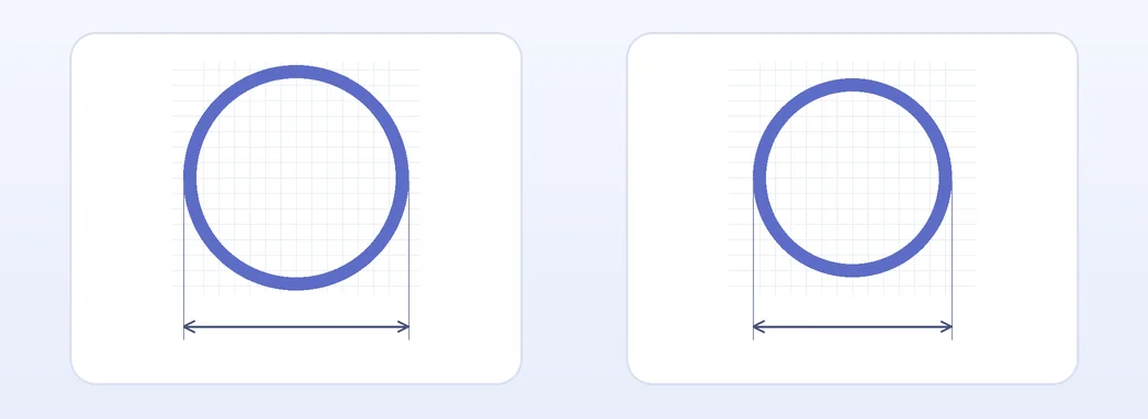
不设置背景色或使用 background-color: transparent,可以让圆环内部透出页面背景。请选择容易与背景区分的边框颜色。
将头像裁剪成圆形
将横向或纵向的照片保存为 profile.jpg,放在 HTML 文件旁边。把下面的 HTML 加到 <body>,CSS 加到 <style>,即可裁剪出最大宽度为 96px 的圆形头像。
<img class="avatar" src="profile.jpg"
  alt="金美娜的个人头像" width="96" height="96">
.avatar {
display: block;
width: min(100%, 96px);
height: auto;
aspect-ratio: 1;
border-radius: 50%;
object-fit: cover;
object-position: 50% 35%;
}object-fit: cover 会保留原始比例、填满圆形区域并裁掉超出的部分。如果希望多显示照片顶部,可以调小 object-position 的第二个值。contain 会保留整张照片,但可能留下空白。
如果照片有助于识别人物,请用包含姓名的替代文本。如果旁边已经显示相同姓名,且照片没有额外信息,可以使用 alt=""。