CSS 教程 / 响应式图片与视频:aspect-ratio 与 object-fit
响应式媒体需要合理的元素尺寸以及用于适配内容的明确规则。aspect-ratio 帮助确定盒子的比例,而 object-fit: cover 或 contain 决定图片或视频是在该盒子中填充还是适应。
区分内在尺寸和显示尺寸
如果原始尺寸是400×300,那么比例是4:3。如果显示宽度是288像素,并保持相同的比例,则显示高度是216像素。HTML 的 width 和 height 提供了图像的大小和比例信息,而 CSS 控制在页面上显示的尺寸。与其通过清除 HTML 中的尺寸属性来解决问题,不如检查 CSS 中被覆盖的值是什么。
img { max-width: 100%; height: auto; }
/* Instead of forcing the small original size to grow, it is reduced to fit the parent. */
max-width: 100% 是一个上限,它可以防止元素比其父元素更宽,但不会无条件地增加原本较小的尺寸。width: 100% 是让元素填满父级可用宽度的设置,因此它可能被放大超过原始尺寸。照片清晰度和下载大小是两个独立的问题。即使在 CSS 中看起来很小,你仍然可以下载大文件,当你使用 srcset · sizes 时,浏览器会从候选图片中选择一个,因此你必须检查屏幕上的显示尺寸和实际选择的文件。
使用 aspect-ratio 进行自动大小调整
aspect-ratio: 16 / 9 使用16宽比9高的比例来计算尺寸。如果宽度为288px,高度为162px。为了进行比例计算,至少一个尺寸必须是自动的,并且如果宽度和高度都被固定,即使输入了此属性,固定尺寸也优先。你也可以查看 MDN:aspect-ratio 的尺寸计算条件 。
.thumbnail { width: 100%; height: auto; aspect-ratio: 16 / 9; object-fit: cover; }
.gallery { display: flex; flex-wrap: wrap; gap: 1rem; align-items: flex-start; }
Flexbox 对齐、换行、gap、grow 与 shrink 解释了交叉轴对齐;其中 stretch 可能拉伸作为 Flex 项目的图片。为了在并排放置不同原始比例的图像时自动计算高度,也可以查看父元素的 align-items: flex-start 或子元素的 align-self。如果将 height 设为 auto 后仍未呈现预期比例,父元素的对齐规则可能是原因。
在实际操作中,box-sizing 通常统一使用 border-box。当添加边框或内边距时,测量盒子的大小和比例变得很重要。下面比较示例中的图片没有边框或内边距,以避免混淆。
比较适应和裁剪行为
| 属性 值 | 原始比例 | 显示区域 | 细节 |
|---|---|---|---|
| fill | 可以扩展以适应区域 | 填满区域 | 根据原图可能会有失真 |
| cover | 保持 | 填充而无空白 | 如果比例不同,部分内容会被裁切。 |
| contain | 保持 | 适应以完全显示 | 如果比例不同,会留下空白 |
将 4:3 图像放入 16:9 盒子中,使用 cover 会裁切顶部和底部。居中定位会将裁切分配在顶部和底部之间;object-position: center top 会保留顶部并在下方裁切更多。在选择裁切前检查重要的边缘内容。CSS 背景使用相关的适应选项,但其内容和可访问性角色与 HTML 图像不同。请参阅 CSS 背景颜色和图像:cover 和 contain。
下方示意图展示了相同几何练习图在原始比例下的效果,包括 cover、contain 以及靠上对齐的 cover。对比绿色和红色的边缘带以及空余的侧边空间。在这些例子中中央圆圈保持可见,因此边缘带让裁剪更容易识别。下面的完整 HTML 示例可让你重现该对比。
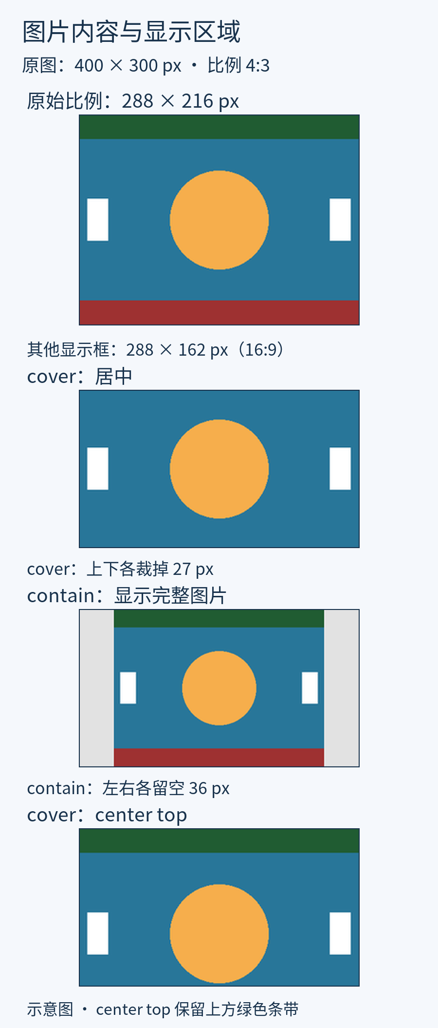
运行四图对比
将其保存为 image-ratio.html ,以 UTF-8 编码保存并在浏览器中打开。原始图片作为 SVG 数据包含在文件中,因此无需外部图像。每张图片的 HTML width、height 属性保留原始 400×300 尺寸信息,并通过 CSS 决定屏幕大小和显示比例。
<!doctype html>
<html lang="en">
<head>
<meta charset="utf-8">
<meta name="viewport" content="width=device-width, initial-scale=1">
<title>image-ratio.html</title>
<style>
*, *::before, *::after { box-sizing: border-box; }
body { margin: 0; font: 1rem/1.6 sans-serif; color: #243447; }
h1, h2, p { margin-top: 0; } a { color: #145f8f; }
a:focus-visible, button:focus-visible, input:focus-visible { outline: 3px solid #ac4100; outline-offset: 3px; }
main { width: min(100%, 65rem); margin-inline: auto; padding: 1rem; }
.gallery { display: flex; flex-wrap: wrap; gap: 1rem; align-items: flex-start; }
.sample { width: min(100%, 18rem); margin: 0; }
.sample img { display: block; width: 100%; height: auto; background: #e2e2e2; }
.sample p { margin: .5rem 0 0; } .cover, .contain { aspect-ratio: 16 / 9; }
.cover { object-fit: cover; } .contain { object-fit: contain; }
.top { object-position: center top; }
</style>
</head>
<body>
<main><h1>Compare the size and cropping of the same picture</h1><div class="gallery"><div class="sample"><img class="" src="data:image/svg+xml,%3Csvg%20xmlns%3D%22http%3A%2F%2Fwww.w3.org%2F2000%2Fsvg%22%20width%3D%22400%22%20height%3D%22300%22%20viewBox%3D%220%200%20400%20300%22%3E%3Crect%20width%3D%22400%22%20height%3D%22300%22%20fill%3D%22%23287699%22%2F%3E%3Crect%20width%3D%22400%22%20height%3D%2235%22%20fill%3D%22%23205c32%22%2F%3E%3Crect%20y%3D%22265%22%20width%3D%22400%22%20height%3D%2235%22%20fill%3D%22%239e3131%22%2F%3E%3Ccircle%20cx%3D%22200%22%20cy%3D%22150%22%20r%3D%2270%22%20fill%3D%22%23f6ae4c%22%2F%3E%3Crect%20x%3D%2212%22%20y%3D%22120%22%20width%3D%2230%22%20height%3D%2260%22%20fill%3D%22white%22%2F%3E%3Crect%20x%3D%22358%22%20y%3D%22120%22%20width%3D%2230%22%20height%3D%2260%22%20fill%3D%22white%22%2F%3E%3C%2Fsvg%3E" width="400" height="300" alt="Top green band, bottom red band and center orange circle"><p>Original 4:3</p></div>
<div class="sample"><img class="cover" src="data:image/svg+xml,%3Csvg%20xmlns%3D%22http%3A%2F%2Fwww.w3.org%2F2000%2Fsvg%22%20width%3D%22400%22%20height%3D%22300%22%20viewBox%3D%220%200%20400%20300%22%3E%3Crect%20width%3D%22400%22%20height%3D%22300%22%20fill%3D%22%23287699%22%2F%3E%3Crect%20width%3D%22400%22%20height%3D%2235%22%20fill%3D%22%23205c32%22%2F%3E%3Crect%20y%3D%22265%22%20width%3D%22400%22%20height%3D%2235%22%20fill%3D%22%239e3131%22%2F%3E%3Ccircle%20cx%3D%22200%22%20cy%3D%22150%22%20r%3D%2270%22%20fill%3D%22%23f6ae4c%22%2F%3E%3Crect%20x%3D%2212%22%20y%3D%22120%22%20width%3D%2230%22%20height%3D%2260%22%20fill%3D%22white%22%2F%3E%3Crect%20x%3D%22358%22%20y%3D%22120%22%20width%3D%2230%22%20height%3D%2260%22%20fill%3D%22white%22%2F%3E%3C%2Fsvg%3E" width="400" height="300" alt="Top green band, bottom red band and center orange circle"><p>16:9 cover, center</p></div>
<div class="sample"><img class="contain" src="data:image/svg+xml,%3Csvg%20xmlns%3D%22http%3A%2F%2Fwww.w3.org%2F2000%2Fsvg%22%20width%3D%22400%22%20height%3D%22300%22%20viewBox%3D%220%200%20400%20300%22%3E%3Crect%20width%3D%22400%22%20height%3D%22300%22%20fill%3D%22%23287699%22%2F%3E%3Crect%20width%3D%22400%22%20height%3D%2235%22%20fill%3D%22%23205c32%22%2F%3E%3Crect%20y%3D%22265%22%20width%3D%22400%22%20height%3D%2235%22%20fill%3D%22%239e3131%22%2F%3E%3Ccircle%20cx%3D%22200%22%20cy%3D%22150%22%20r%3D%2270%22%20fill%3D%22%23f6ae4c%22%2F%3E%3Crect%20x%3D%2212%22%20y%3D%22120%22%20width%3D%2230%22%20height%3D%2260%22%20fill%3D%22white%22%2F%3E%3Crect%20x%3D%22358%22%20y%3D%22120%22%20width%3D%2230%22%20height%3D%2260%22%20fill%3D%22white%22%2F%3E%3C%2Fsvg%3E" width="400" height="300" alt="Top green band, bottom red band and center orange circle"><p>16:9 contain</p></div>
<div class="sample"><img class="cover top" src="data:image/svg+xml,%3Csvg%20xmlns%3D%22http%3A%2F%2Fwww.w3.org%2F2000%2Fsvg%22%20width%3D%22400%22%20height%3D%22300%22%20viewBox%3D%220%200%20400%20300%22%3E%3Crect%20width%3D%22400%22%20height%3D%22300%22%20fill%3D%22%23287699%22%2F%3E%3Crect%20width%3D%22400%22%20height%3D%2235%22%20fill%3D%22%23205c32%22%2F%3E%3Crect%20y%3D%22265%22%20width%3D%22400%22%20height%3D%2235%22%20fill%3D%22%239e3131%22%2F%3E%3Ccircle%20cx%3D%22200%22%20cy%3D%22150%22%20r%3D%2270%22%20fill%3D%22%23f6ae4c%22%2F%3E%3Crect%20x%3D%2212%22%20y%3D%22120%22%20width%3D%2230%22%20height%3D%2260%22%20fill%3D%22white%22%2F%3E%3Crect%20x%3D%22358%22%20y%3D%22120%22%20width%3D%2230%22%20height%3D%2260%22%20fill%3D%22white%22%2F%3E%3C%2Fsvg%3E" width="400" height="300" alt="Top green band, bottom red band and center orange circle"><p>16:9 cover, top</p></div>
</div></main>
</body>
</html>- 在大屏幕上,确保每张图片的宽度限制为18rem。在根字体为16px的情况下,其宽度为288px,按原始比例显示时高度为 216px,其余三个 16:9 显示框的高度为 162px。
- 仅将
.sample img的高度更改为300px。即使应用16:9比例,也要检查由于固定高度,区域为288×300px,并将其恢复为自动。 - 仅将
.gallery的align-items更改为stretch。确保同一行的包装器高度相同,但包装器内图片的比例保持不变,并恢复为flex-start。在此示例中,Flex项为示例包装器,而不是图片。在直接将图片作为Flex项放置的配置中,自动高度可能增加,因此必须检查对齐。 - 仅将
.top的 object-position 改为 center bottom。这一次,请确保红色带保持不变,绿色带被切割,然后将其恢复为 center top。
示例中的 SVG 还具有保持形状比例的特性。如果图像元素的显示区域不正确并产生空白,圆形不一定会被扭曲。不仅要看形状,还要在开发者工具中检查 img 元素的宽度和高度。
在显示框中调整视频内容的大小
在下面的练习中,一个为本课制作的 400×300 静音视频被显示在一个 16:9 的区域内。视频中没有音频或字幕信息,只有橙色圆圈的运动,用于检查上下和两侧的空间以及播放操作。示例中包含了用于练习的 WebM 练习视频文件。需要离线练习时,先在可联网的环境中下载此文件并将其放在与 HTML 相同的文件夹中,将源地址替换为文件名。
<!doctype html>
<html lang="en">
<head>
<meta charset="utf-8">
<meta name="viewport" content="width=device-width, initial-scale=1">
<title>video-ratio.html</title>
<style>
*, *::before, *::after { box-sizing: border-box; }
body { margin: 0; font: 1rem/1.6 sans-serif; color: #243447; }
h1, h2, p { margin-top: 0; } a { color: #145f8f; }
a:focus-visible, button:focus-visible, input:focus-visible { outline: 3px solid #ac4100; outline-offset: 3px; }
main { width: min(100%, 34rem); margin-inline: auto; padding: 1rem; }
video { display: block; width: 100%; height: auto; aspect-ratio: 16 / 9; object-fit: contain; background: #111; }
</style>
</head>
<body>
<main><h1>Video display ratio</h1>
<p id="video-description">This silent sample video shows an orange circle moving on a blue background. Play and pause it to compare aspect ratios.</p>
<video controls preload="metadata" width="400" height="300" aria-describedby="video-description">
  <source src="https://www.codingfactory.net/wp-content/uploads/css-media-ratio-motion-v1.webm" type="video/webm">
  <a href="https://www.codingfactory.net/wp-content/uploads/css-media-ratio-motion-v1.webm">Download the sample video</a>
</video></main>
</body>
</html>
controls 允许用户使用浏览器操作,例如播放/暂停,而 preload="metadata" 是预加载提示,建议播放前读取元数据。实际的下载方法由您的浏览器决定。由于我们没有包含自动播放,请按播放按钮以确认。如果仅将 object-fit 更改为 cover,您可以看到差异,即区域保持不变,而顶部和底部的内容被裁剪。确认后,恢复为 contain。
object-fit 适用于替换元素(如图片和视频)的内容填充。它不会以同样的方式调整嵌入视频的 iframe 内容:需要给该 iframe 一个适当比例的容器,并在容器内调整其大小。不同于这个无声的装饰示例,有声音的有意义的视频需要合适的替代方案,例如字幕。参见 MDN:object-fit, MDN:video。