
CSS Tutorial / Responsive Images and Video: aspect-ratio and object-fit
Responsive media needs both sensible element sizing and a deliberate rule for fitting its content. aspect-ratio helps establish a box's proportions, while object-fit: cover or contain determines whether an image or video fills or fits within that box.
Separate intrinsic dimensions and display size
If the original is 400×300, the ratio is 4:3. If the display width is 288px and keeping the same proportions, the display height is 216px. HTML's width and height provide information on the size and ratio of the image, and CSS controls the size to be displayed on the page. Rather than solving the problem by clearing the size property in the HTML, check what value is being overwritten in the CSS.
img { max-width: 100%; height: auto; }
/* Instead of forcing the small original size to grow, it is reduced to fit the parent. */
max-width: 100% is an upper limit that prevents it from becoming wider than its parent and does not unconditionally increase the small original. width: 100% is a specification that fills the parent width, so it may be enlarged beyond the original. Photo clarity and download size are separate issues. You can download large files even if they look small with CSS, and when you use srcset · sizes, the browser selects an image from among the candidates, so you must check the display size on the screen and the actual selected file.
Use aspect-ratio for automatic sizing
aspect-ratio: 16 / 9 uses the ratio of 16 width to 9 height to calculate the size. If the width is 288px, the height is 162px. At least one size must be automatic for proportional calculations to be made, and if both width and height are fixed, that fixed size takes precedence even if you enter this property. You can also check MDN's aspect-ratio size calculation conditions.
.thumbnail { width: 100%; height: auto; aspect-ratio: 16 / 9; object-fit: cover; }
.gallery { display: flex; flex-wrap: wrap; gap: 1rem; align-items: flex-start; }
Flexbox Alignment, Wrapping, gap, grow, and shrink can match the height of images in the same line. To automatically calculate the height when placing images with different original ratios side by side, also check the parent's align-items: flex-start or the item's align-self. If the ratio feels the same after changing only the height to auto, the parent's alignment rule may be the cause.
In practice, box-sizing is unified as border-box. When adding borders or padding, it becomes important to measure the size and proportions of the box. The images in the comparison examples below have no borders or padding to avoid confusion.
Compare fitting and cropping behavior
| attribute value | original ratio | display area | detail |
|---|---|---|---|
| fill | Can be expanded to fit the area | replenishment | Distortion possible depending on the original |
| cover | maintain | Fill without empty space | If the ratio is different, some parts are cut off. |
| contain | maintain | Fit to fit the whole thing | If the ratio is different, empty space is left |
Fitting a 4:3 image into a 16:9 box with cover crops its top and bottom. Center positioning divides the crop between them; object-position: center top preserves the top and crops more below. Check important edge content before choosing a crop. CSS backgrounds use related fitting choices but have a different content and accessibility role from HTML images. See CSS Background Colors and Images: cover and contain.
The following picture is the result of displaying the same exercise original with original ratio, cover, contain, and top-aligned cover. Compare whether a green band and a red band remain or whether an empty space is created. The center circle avoids the truncation in this example, so the band is a more obvious check.
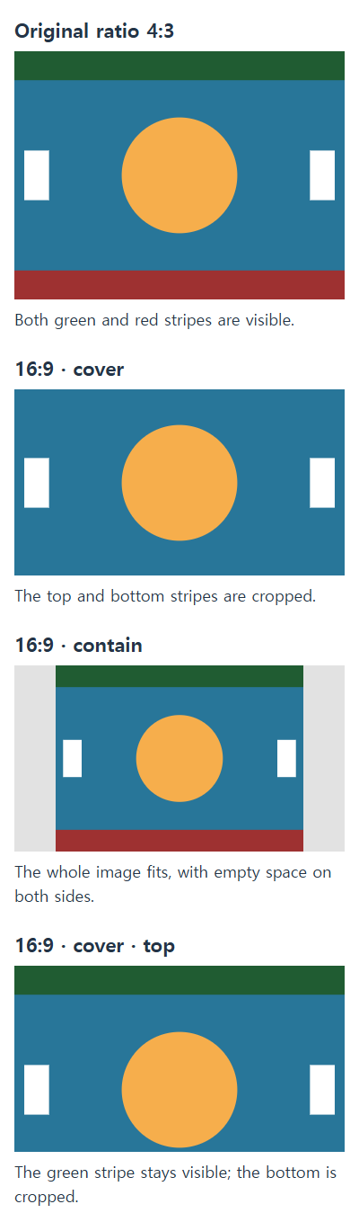
Run the four-image comparison
Save it as image-ratio.html and open it. The original picture is included as SVG data within the file, so no external image is needed. The width and height properties of each image maintain the original 400×300 information, and determine the screen size and display ratio using CSS.
<!doctype html>
<html lang="en">
<head>
<meta charset="utf-8">
<meta name="viewport" content="width=device-width, initial-scale=1">
<title>image-ratio.html</title>
<style>
*, *::before, *::after { box-sizing: border-box; }
body { margin: 0; font: 1rem/1.6 sans-serif; color: #243447; }
h1, h2, p { margin-top: 0; } a { color: #145f8f; }
a:focus-visible, button:focus-visible, input:focus-visible { outline: 3px solid #ac4100; outline-offset: 3px; }
main { width: min(100%, 65rem); margin-inline: auto; padding: 1rem; }
.gallery { display: flex; flex-wrap: wrap; gap: 1rem; align-items: flex-start; }
.sample { width: min(100%, 18rem); margin: 0; }
.sample img { display: block; width: 100%; height: auto; background: #e2e2e2; }
.sample p { margin: .5rem 0 0; } .cover, .contain { aspect-ratio: 16 / 9; }
.cover { object-fit: cover; } .contain { object-fit: contain; }
.top { object-position: center top; }
</style>
</head>
<body>
<main><h1>Compare the size and cropping of the same picture</h1><div class="gallery"><div class="sample"><img class="" src="data:image/svg+xml,%3Csvg%20xmlns%3D%22http%3A%2F%2Fwww.w3.org%2F2000%2Fsvg%22%20width%3D%22400%22%20height%3D%22300%22%20viewBox%3D%220%200%20400%20300%22%3E%3Crect%20width%3D%22400%22%20height%3D%22300%22%20fill%3D%22%23287699%22%2F%3E%3Crect%20width%3D%22400%22%20height%3D%2235%22%20fill%3D%22%23205c32%22%2F%3E%3Crect%20y%3D%22265%22%20width%3D%22400%22%20height%3D%2235%22%20fill%3D%22%239e3131%22%2F%3E%3Ccircle%20cx%3D%22200%22%20cy%3D%22150%22%20r%3D%2270%22%20fill%3D%22%23f6ae4c%22%2F%3E%3Crect%20x%3D%2212%22%20y%3D%22120%22%20width%3D%2230%22%20height%3D%2260%22%20fill%3D%22white%22%2F%3E%3Crect%20x%3D%22358%22%20y%3D%22120%22%20width%3D%2230%22%20height%3D%2260%22%20fill%3D%22white%22%2F%3E%3C%2Fsvg%3E" width="400" height="300" alt="Top green band, bottom red band and center orange circle"><p>Original 4:3</p></div>
<div class="sample"><img class="cover" src="data:image/svg+xml,%3Csvg%20xmlns%3D%22http%3A%2F%2Fwww.w3.org%2F2000%2Fsvg%22%20width%3D%22400%22%20height%3D%22300%22%20viewBox%3D%220%200%20400%20300%22%3E%3Crect%20width%3D%22400%22%20height%3D%22300%22%20fill%3D%22%23287699%22%2F%3E%3Crect%20width%3D%22400%22%20height%3D%2235%22%20fill%3D%22%23205c32%22%2F%3E%3Crect%20y%3D%22265%22%20width%3D%22400%22%20height%3D%2235%22%20fill%3D%22%239e3131%22%2F%3E%3Ccircle%20cx%3D%22200%22%20cy%3D%22150%22%20r%3D%2270%22%20fill%3D%22%23f6ae4c%22%2F%3E%3Crect%20x%3D%2212%22%20y%3D%22120%22%20width%3D%2230%22%20height%3D%2260%22%20fill%3D%22white%22%2F%3E%3Crect%20x%3D%22358%22%20y%3D%22120%22%20width%3D%2230%22%20height%3D%2260%22%20fill%3D%22white%22%2F%3E%3C%2Fsvg%3E" width="400" height="300" alt="Top green band, bottom red band and center orange circle"><p>16:9 cover, center</p></div>
<div class="sample"><img class="contain" src="data:image/svg+xml,%3Csvg%20xmlns%3D%22http%3A%2F%2Fwww.w3.org%2F2000%2Fsvg%22%20width%3D%22400%22%20height%3D%22300%22%20viewBox%3D%220%200%20400%20300%22%3E%3Crect%20width%3D%22400%22%20height%3D%22300%22%20fill%3D%22%23287699%22%2F%3E%3Crect%20width%3D%22400%22%20height%3D%2235%22%20fill%3D%22%23205c32%22%2F%3E%3Crect%20y%3D%22265%22%20width%3D%22400%22%20height%3D%2235%22%20fill%3D%22%239e3131%22%2F%3E%3Ccircle%20cx%3D%22200%22%20cy%3D%22150%22%20r%3D%2270%22%20fill%3D%22%23f6ae4c%22%2F%3E%3Crect%20x%3D%2212%22%20y%3D%22120%22%20width%3D%2230%22%20height%3D%2260%22%20fill%3D%22white%22%2F%3E%3Crect%20x%3D%22358%22%20y%3D%22120%22%20width%3D%2230%22%20height%3D%2260%22%20fill%3D%22white%22%2F%3E%3C%2Fsvg%3E" width="400" height="300" alt="Top green band, bottom red band and center orange circle"><p>16:9 contain</p></div>
<div class="sample"><img class="cover top" src="data:image/svg+xml,%3Csvg%20xmlns%3D%22http%3A%2F%2Fwww.w3.org%2F2000%2Fsvg%22%20width%3D%22400%22%20height%3D%22300%22%20viewBox%3D%220%200%20400%20300%22%3E%3Crect%20width%3D%22400%22%20height%3D%22300%22%20fill%3D%22%23287699%22%2F%3E%3Crect%20width%3D%22400%22%20height%3D%2235%22%20fill%3D%22%23205c32%22%2F%3E%3Crect%20y%3D%22265%22%20width%3D%22400%22%20height%3D%2235%22%20fill%3D%22%239e3131%22%2F%3E%3Ccircle%20cx%3D%22200%22%20cy%3D%22150%22%20r%3D%2270%22%20fill%3D%22%23f6ae4c%22%2F%3E%3Crect%20x%3D%2212%22%20y%3D%22120%22%20width%3D%2230%22%20height%3D%2260%22%20fill%3D%22white%22%2F%3E%3Crect%20x%3D%22358%22%20y%3D%22120%22%20width%3D%2230%22%20height%3D%2260%22%20fill%3D%22white%22%2F%3E%3C%2Fsvg%3E" width="400" height="300" alt="Top green band, bottom red band and center orange circle"><p>16:9 cover, top</p></div>
</div></main>
</body>
</html>
- On wide screens, ensure the width of each picture is limited to 18rem. With a root font of 16px, it's 288px wide, the original is 216px high, and the remaining 16:9 area is 162px high.
- Change only the height of
.sample imgto 300px. Even if the 16:9 ratio is applied, check that the area is 288×300px due to the fixed height and restore it to auto. - Change only the align-items of
.galleryto stretch. Make sure the height of the wrapper for the same line is the same, but the proportions of the image inside the wrapper are maintained, and revert to flex-start. In this example, the Flex item is a sample wrapper, not an image. In configurations where images are placed directly as Flex items, the automatic height may increase, so alignment must be checked. - Change only the object-position of
.topto center bottom. This time, make sure that the red band remains and the green band is cut, and then restore it to the center top.
SVG in the example also has the characteristic of maintaining the proportions of the shapes. If the display area of an image element is incorrect and creates empty space, the circle will not necessarily be distorted. Instead of just looking at the shape, check the width and height of the img element in developer tools.
Size video content within its display box
In the exercise below, a 400×300 silent video created for this lesson is displayed as contain within a 16:9 area. There is no audio or subtitle information in the video, only the movement of the orange circle, which is used to check the top, bottom, and side spaces and playback operations. The address of the WebM video file for practice is included in the example. In an environment without a network, download this file and place it in the same folder as the HTML, replacing the source address with the file name.
<!doctype html>
<html lang="en">
<head>
<meta charset="utf-8">
<meta name="viewport" content="width=device-width, initial-scale=1">
<title>video-ratio.html</title>
<style>
*, *::before, *::after { box-sizing: border-box; }
body { margin: 0; font: 1rem/1.6 sans-serif; color: #243447; }
h1, h2, p { margin-top: 0; } a { color: #145f8f; }
a:focus-visible, button:focus-visible, input:focus-visible { outline: 3px solid #ac4100; outline-offset: 3px; }
main { width: min(100%, 34rem); margin-inline: auto; padding: 1rem; }
video { display: block; width: 100%; height: auto; aspect-ratio: 16 / 9; object-fit: contain; background: #111; }
</style>
</head>
<body>
<main><h1>Video display ratio</h1>
<p id="video-description">This silent sample video shows an orange circle moving on a blue background. Play and pause it to compare aspect ratios.</p>
<video controls preload="metadata" width="400" height="300" aria-describedby="video-description">
  <source src="https://www.codingfactory.net/wp-content/uploads/css-media-ratio-motion-v1.webm" type="video/webm">
  <a href="https://www.codingfactory.net/wp-content/uploads/css-media-ratio-motion-v1.webm">Download the sample video</a>
</video></main>
</body>
</html>
controls allows the user to use browser operations such as play/pause, and preload="metadata" is a hint that requests meta information to be read before playback. The actual download method is determined by your browser. Since we didn't include autoplay, press the play button to confirm. If you change only object-fit to cover, you can see the difference in that the area remains the same and the contents at the top and bottom are cut off. After confirmation, restore to contain.
object-fit fits content in replaced elements such as images and videos. It does not size an embedded video's iframe content in the same way: give that iframe an appropriately proportioned wrapper and size it within the wrapper. Unlike this silent decorative example, a video with meaningful audio needs suitable alternatives, such as captions. See MDN: object fit, MDN: video.

CSS Tutorial / CSS z-index and Stacking Contexts
Inspect parent and child stacking contexts, compare real overlap examples, and distinguish stacking order from clipping problems.

CSS Tutorial / The CSS Box Model: Content, Padding, Border, and Margin
Measure the four box areas, compare padding shorthand and vertical margin collapse, and inspect the resulting dimensions in DevTools.

CSS Tutorial / CSS Width, Height, min/max Limits, and box-sizing
Compare content-box and border-box sizing, percentage heights, fluid width limits, and the consequences of fixed heights for growing text.

CSS Tutorial / CSS display: Block, Inline, inline-block, and Hiding
Compare block and inline sizing, replaced elements such as images, and the layout and interaction differences between common hiding techniques.

CSS Tutorial / CSS Transforms and Transitions
Compare transform order and origins, add hover and keyboard transitions, and test overflow and reduced-motion behavior.

CSS Tutorial / Responsive Images and Video: aspect-ratio and object-fit
Compare original image proportions, cover, contain, and object-position, then test responsive video sizing with a downloadable sample.

CSS Tutorial / CSS Paragraph and List Styling
Style paragraphs and ordered or unordered lists, compare inside and outside markers, and check spacing and wrapped text on narrow screens.

CSS Tutorial / CSS Syntax: Selectors, Declarations, Comments, and Errors
Read and write CSS rules, use comments, and distinguish syntax errors from selectors that do not match and declarations overridden by other rules.

CSS Tutorial / CSS Fonts, Font Sizes, and Line Height
Build a readable font stack, compare line-height inheritance, and use browser tools to identify the fonts actually rendering your text.
CSS Tutorial / Flexbox Basics: Containers, Items, and Axes
Create a Flexbox container, distinguish direct children from nested content, and compare row, column, and their main and cross axes.