
CSS Tutorial / Flexbox Basics: Containers, Items, and Axes
Flexbox lays out a container's direct child items along a main axis and distributes space along that axis. flex-direction chooses the main-axis direction, while the cross axis runs perpendicular to it; row is not universally synonymous with horizontal.
Choose a Flexbox container and its items
Flexbox suits one-dimensional relationships such as navigation items, a search field beside a button, or an icon beside a description. Spacing these with repeated whitespace or independently positioned elements is fragile as content and available width change. Flexbox distributes a container's available space among its direct children.
If you need a grid that consistently aligns rows and columns at the same time, review Grid. Flexbox can also be split into multiple lines, but each line distributes space separately, so the columns in the first line do not always match the columns in the second line. A large area of the page can be used together as a Grid, and a collection of buttons within it can be used together like a Flexbox. To align multiple rows and columns together, compare CSS Grid Basics: Tracks, Lines, and Item Placement which creates rows and columns together.
.menu {
  display: flex;
  gap: 12px;
}
This declaration is not a command to sort .menu itself within its parent. This is a command to sort children directly in .menu. For example, if you have two divs inside a .menu and two spans inside the first div, the Flex item is two divs. If you want to lay out the span horizontally, you must also specify a separate display: flex in that div.
Identify the main and cross axes
The main axis is the direction in which Flex items are listed, and the cross axis is the direction perpendicular to the main axis. Rather than memorizing which property controls the width or height, you need to understand which axis controls it so you can align it accurately even when you change it to a column.
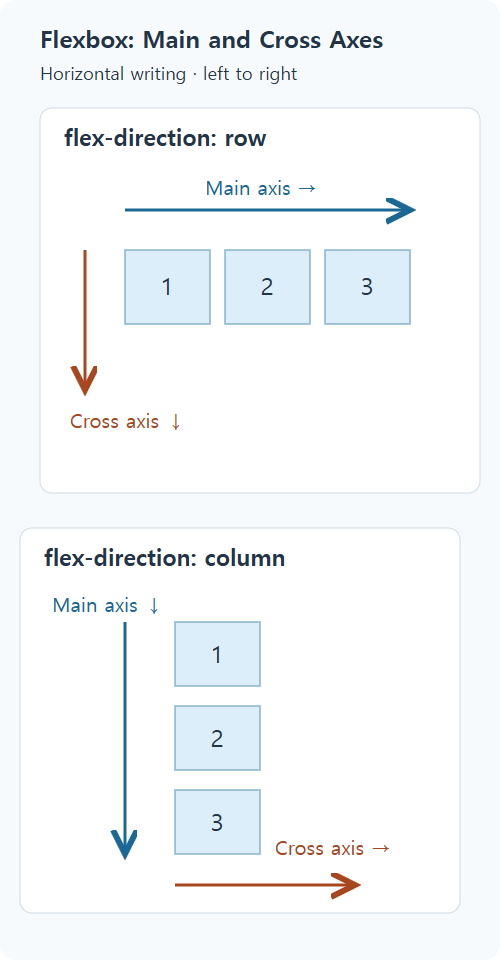
| flex-direction | General horizontal writing, left to right document order | Main axis/cross axis |
|---|---|---|
| row | left → right | Horizontal / vertical |
| row-reverse | right → left | Horizontal / vertical |
| column | up → down | Vertical/Horizontal |
| column-reverse | down → up | Vertical/Horizontal |
The directions in this table assume writing-mode: horizontal-tb and direction: ltr. In right-to-left or vertical writing, physical directions change. row follows the inline direction, so it does not always begin on the left. For further detail, see MDN's Flexbox Basic Concepts You can check the axis and writing direction in.
Understand the initial Flexbox behavior
If a separate value is not specified, the direction is row and the line break is nowrap. Items are clustered at the beginning of the main axis and do not automatically expand along the main axis to fill the extra space. It may shrink if there is insufficient space, but if it cannot shrink sufficiently due to the minimum size of the content or specified constraints, it may overflow outside the parent. Detailed control of alignment, line breaks, and item size will be continued in Flexbox Alignment, Wrapping, gap, grow, and shrink.
On cross axes, stretch is the default alignment behavior. Items with auto height in a row usually fill the same row height. This is why short description cards appear the same height as long description cards. Don't assume that items that already have a clear height or automatic margins will automatically stretch. In column, the cross axis is horizontal, so the width appears to increase.
The initial resizing of an item can be understood as flex: 0 1 auto. 0 means not to enlarge by taking the remaining space, 1 means to participate in reduction in the insufficient space, and auto means to use the size specification and content of the corresponding main axis as the basis. At this stage, the placement direction and basic operation are first checked, and practice of adjusting the ratio and line breaks is covered in detail in the alignment and size adjustment lesson.
Compare normal flow and Flexbox directions
Save the code below as a UTF-8 file flex-direction.html and open it in your browser. No separate libraries are required. All links are written in the order of first, second, third, and only the CSS is different. The general layout section specifies links as blocks and shows them line by line.
<!doctype html>
<html lang="en">
<head>
  <meta charset="utf-8">
  <meta name="viewport" content="width=device-width, initial-scale=1">
  <title>flex-direction.html</title>
  <style>
* { box-sizing: border-box; }
body { margin: 16px; font: 16px/1.6 sans-serif; color: #243447; }
h1 { font-size: 24px; } h2 { font-size: 20px; margin-top: 32px; }
a { color: #145f8f; } a:focus-visible { outline: 3px solid #b4470b; outline-offset: 3px; }
.demo { border: 2px dashed #789; padding: 12px; margin-bottom: 20px; }
 .demo > a, .nested > div { padding: 12px; background: #dceefa; }
 .normal > a { display: block; margin-bottom: 8px; }
 .row, .column, .reverse, .nested { display: flex; gap: 12px; }
 .column { flex-direction: column; }
 .reverse { flex-direction: row-reverse; }
 .nested > div { flex: 1; min-width: 0; }
 .nested span { display: block; }
 .initial { display: flex; gap: 12px; border: 2px dashed #789; }
 .initial > div { width: 180px; min-width: 0; padding: 12px; background: #e8f5de; }
  </style>
</head>
<body>
<h1>Same HTML order, different placement</h1>
<h2>Normal block flow</h2><div class="demo normal"><a href="#result">First</a>
<a href="#result">Second</a>
<a href="#result">Third</a></div>
<h2>row</h2><div class="demo row"><a href="#result">First</a>
<a href="#result">Second</a>
<a href="#result">Third</a></div>
<h2>column</h2><div class="demo column"><a href="#result">First</a>
<a href="#result">Second</a>
<a href="#result">Third</a></div>
<h2>row-reverse</h2><div class="demo reverse"><a href="#result">First</a>
<a href="#result">Second</a>
<a href="#result">Third</a></div>
<h2>Direct and nested children</h2><div class="demo nested"><div><span>First line of box A</span><span>Second line of box A</span></div><div>Box B</div></div>
<h2>Initial size and growth</h2><div class="initial"><div>Short description</div><div>Two-line description<br>Second line</div><div>Three-line description<br>Second line<br>Third line</div></div>
<p id="result">This is the link destination. Use the links above to check keyboard navigation order.</p>
</body>
</html>
- In the row section, make sure the three items are on the same line. Just add flex-direction: column to .row to change it to vertical. After confirmation, remove the declaration and return it to the original row.
- Notice how the links in the column section widen horizontally. Adding align-items: flex-start to .column makes the link closer to the width of the content. This is because the cross axis of the column is horizontal. After comparing, remove the added declaration.
- In the row-reverse section, first digit appears on the right, but HTML still has first digit first. Press the Tab key to make sure you move from first → second → third. Do not change important reading orders with just reverse, as the screen's left-right order and keyboard navigation order may change.
- In nested child sections, only large boxes A and B are placed side by side. The two spans in A are vertical. .nested > If you add display: flex to the div, even the internal arrangement will change. Remove the added declaration after checking.
- In the last section, make sure the three cards are the same height, and on wide screens, each card doesn't fill the entire remaining width. Narrowing the screen reduces card width without line breaks. If you add flex-shrink: 0 to the .initial > div, it won't shrink, causing horizontal overflow. Remove the added declaration after checking.
Diagnose unexpected layout results
In developer tools, select the actual parent, not the child you want to sort, and check the applied value of display. Next, check the flex-direction, width·height·min-width, and margin of the child. If the flex is covered by another rule or the sort target is one level further in, you won't get the expected results.
Line breaks are different from changing rows and columns. In a situation where one horizontal line overflows, you must first decide whether the column is appropriate and whether flex-wrap is needed to maintain multiple rows. If content is hidden on mobile, check the minimum collapsible size and reading order before hiding it with overflow: hidden. Temporary modifications in developer tools can be reverted with a refresh, and if you modified a file, you'll need to restore any saved values yourself.

CSS Tutorial / CSS Combinators and Pseudo-Classes
Compare descendant, child, and sibling selectors, then test hover, focus, and child-position conditions in a complete example.

CSS Tutorial / The CSS Box Model: Content, Padding, Border, and Margin
Measure the four box areas, compare padding shorthand and vertical margin collapse, and inspect the resulting dimensions in DevTools.

CSS Tutorial / Pseudo-Elements: ::before and ::after
Add decorative pseudo-elements, compare them with the original page, and keep essential information in HTML while checking keyboard access.

CSS Tutorial / CSS Link States and Visible Keyboard Focus
Compare link states in a working multi-file example, inspect keyboard focus, and understand browser privacy restrictions on visited-link styles.

CSS Tutorial / Inspect CSS with DevTools: Styles and Computed
Use Styles, Computed, and the box model display to diagnose CSS, compare temporary edits, and transfer a confirmed change to the correct source file.

CSS Tutorial / CSS Overflow, Long Text Wrapping, and Ellipsis
Compare scrolling, clipping, long-word wrapping, and single-line ellipsis, including keyboard access and minimum-size issues in layout containers.

CSS Tutorial / CSS z-index and Stacking Contexts
Inspect parent and child stacking contexts, compare real overlap examples, and distinguish stacking order from clipping problems.

CSS Tutorial / CSS Media Queries and Content-Based Breakpoints
Calculate a practical layout breakpoint, compare overlapping min/max conditions, and test the widths immediately around each threshold.

CSS Tutorial / Check Responsive CSS with Width, Zoom, and Keyboard Tests
Follow a repeatable browser checklist, test breakpoint boundaries and longer text, and record layout problems before changing CSS rules.

CSS Tutorial / Organize CSS with Shared Styles, Nesting, and Layers
Refactor a small stylesheet without changing its layout, compare nesting and cascade layers, and check relative file paths and selector specificity.