
CSS Tutorial / The CSS Box Model: Content, Padding, Border, and Margin
The CSS box model describes an element's content area, padding, border, and outer margin. These areas affect its visible dimensions and spacing, while adjacent vertical block margins can collapse under particular conditions.
Identify the four box areas
The picture below shows the locations of the four areas. Text or images are placed inside the blue content, and yellow padding and a green border surround the outside. The orange margin is outside the border. The color of the picture is to distinguish the area, and the background color of the element is not painted on the margin itself.
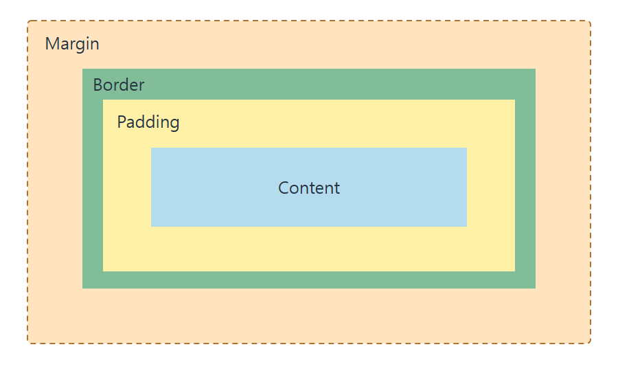
| area | role | Use in garden information cards |
|---|---|---|
| content | Area where letters and images are placed | Visitor information |
| padding | Space between content and border | Space the text so that it does not stick to the border |
| border | border of elements | line around the card |
| margin | spacing outside the border | Separates it from another card |
The default background color is visible in the content and padding areas and can also be drawn behind borders. The element's background is not drawn in the margin area. Therefore, to expand the colored area of the card, you need to increase the padding, not the margin. How far the background is drawn can be changed with a separate property, but the default behavior is used here.
Calculate declared and outer widths
.card {

  width: 200px;

  padding: 20px;

  border: 2px solid #2f6e9b;

  margin: 16px;

  background-color: #eaf4fa;

}
For a regular content-box element, width: 200px measures the content. Adding 20px padding and 2px borders on both sides produces a 244px border-box. The 16px margins lie outside it, making the horizontal space including both margins 276px. Vertical margins can collapse, so do not apply this simple addition to every vertical case. For further detail, see CSS Width, Height, min/max Limits, and box-sizing.
Use box-sizing: border-box to include the padding and border in the declared width. Changing only that property in this example gives a 200px border-box and a 156px content area. The next sizing comparison measures the same cards under both box-sizing rules. See MDN: Introduction.
Read one-to-four-value spacing shorthand
| declaration | Top | right | Bottom | left |
|---|---|---|---|---|
| padding: 10px | 10px | 10px | 10px | 10px |
| padding: 10px 20px | 10px | 20px | 10px | 20px |
| padding: 10px 20px 30px | 10px | 20px | 30px | 20px |
| padding: 10px 20px 30px 40px | 10px | 20px | 30px | 40px |
Margin values are also specified in the same order. If the value is two, it is up and down, left and right, if it is three it is up, left and right, down, and if it is four it is clockwise from top. If you only want to change some directions, use individual properties like padding-top. If you rewrite shorthand properties later, the individual values specified earlier may also change, so check the order of application.
padding-inline and margin-block are logical properties based on the writing direction of the text. In general horizontal writing in left-to-right horizontal writing, inline corresponds to left and right, and block corresponds to top and bottom, but in vertical writing, the physical direction is different. This does not always mean a fixed horizontal or vertical direction. You can check the direction correspondence in MDN's margin-block description.
Understand vertical margin collapsing
Adjacent vertical margins in a normal block flow are conditionally merged into one gap. This is called margin collapsing. Positive margins where the bottom margin of the previous element is 20px and the top margin of the next element is 30px may appear as a larger value of 30px instead of 50px.
Margin collapse does not combine horizontal margins or padding, and Flexbox and Grid item margins do not collapse like normal-flow block margins. Parent–child margins and negative margins introduce other conditions. This exercise deliberately compares only positive vertical margins between two sibling blocks. See MDN: Margin collapsing.
Run the example and measure each area
Save the code below as box-model.html in UTF-8 and open it. The first card checks the four areas, and the two rows inside the dotted box are for observing the vertical margin collapse. The last box shows padding for three values.
<!doctype html>

<html lang="en">

<head>

  <meta charset="utf-8">

  <meta name="viewport" content="width=device-width, initial-scale=1">

  <title>Box model and spacing exercise</title>

  <style>

    body { margin: 16px; font: 16px/1.6 sans-serif; color: #333; }

    .card { width: 200px; padding: 20px; border: 2px solid #2f6e9b;

      margin: 16px; background-color: #eaf4fa; }

    .collapse-demo { max-width: 300px; padding: 8px; border: 1px dashed #777; }

    .row { padding: 8px; background: #e9f7ef; }

    .first { margin-bottom: 20px; }

    .second { margin-top: 30px; }

    .three-values { max-width: 250px; padding: 10px 20px 30px;

      border: 1px solid #b98022; background: #fff4d9; }

  </style>

</head>

<body>

  <h1>The four box areas</h1>

  <div class="card">The content width is 200px; the width including the border is 244px.</div>

  <h2>Vertical margin collapsing</h2>

  <div class="collapse-demo">

    <div class="row first">Bottom margin: 20px</div>

    <div class="row second">Top margin: 30px</div>

  </div>

  <h2>Padding with three values</h2>

  <div class="three-values">Top: 10px; left and right: 20px; bottom: 30px</div>

</body>

</html>
- In Developer Tools, under Elements, select the .card and look for the box model display in Styles or Computed. Make sure the content is 200px, padding on the left and right is 20px, border is 2px, and margin is 16px.
- Change only the padding to 30px. The content will remain 200px and the width to the border will be 264px. If you return it to the original 20px and change the margin to 32px, the width of the card itself will remain 244px and the surrounding spacing will change.
- Look between the two rows inside the dotted box. The positive vertical margins of 20px and 30px are combined, resulting in a spacing of 30px. If you change the bottom margin of the first row to 40px, the spacing becomes 40px. After comparing, revert back to 20px.
- Check that the bottom padding of .three-values is 30px, top is 10px, and left and right are 20px. If you delete the last 30px to make it two values, the bottom also becomes 10px.
Spacing that differs from expected may occur due to the browser's default p·h1 margin, higher specificity selectors, or margin collapsing. First, check what margin is for which element and change it one value at a time. Temporary changes in developer tools disappear when you refresh, and changes you save to files must be manually reverted to their original values.

CSS Tutorial / Fluid CSS Layouts with min, max, and clamp
Build a bounded fluid layout, compare flexible sizes and spacing, and check that longer content fits without introducing horizontal page scrolling.

CSS Tutorial / CSS Fonts, Font Sizes, and Line Height
Build a readable font stack, compare line-height inheritance, and use browser tools to identify the fonts actually rendering your text.

CSS Tutorial / CSS Colors and Units: px, em, rem, and Percentages
Compare equivalent color formats and practical sizing examples, including nested em values, rem, percentages, and unitless line height.

CSS Tutorial / CSS Grid: repeat, auto-fit, auto-fill, and Areas
Compare auto-fit and auto-fill, test minimum track sizes and long text, and use named areas without confusing visual placement with reading order.

CSS Tutorial / CSS display: Block, Inline, inline-block, and Hiding
Compare block and inline sizing, replaced elements such as images, and the layout and interaction differences between common hiding techniques.

CSS Tutorial / CSS Variables: var(), Scope, Inheritance, and Fallbacks
Declare and override custom properties, compare undefined and invalid values, and diagnose computed-value failures and inherited results.

CSS Tutorial / CSS Tables: Borders, Sizing, and table-layout
Style semantic tables, compare automatic and fixed layout with long content, and provide horizontal scrolling when a table needs more space.

CSS Tutorial / CSS Transforms and Transitions
Compare transform order and origins, add hover and keyboard transitions, and test overflow and reduced-motion behavior.

CSS Tutorial / Check Responsive CSS with Width, Zoom, and Keyboard Tests
Follow a repeatable browser checklist, test breakpoint boundaries and longer text, and record layout problems before changing CSS rules.

CSS Tutorial / CSS Overflow, Long Text Wrapping, and Ellipsis
Compare scrolling, clipping, long-word wrapping, and single-line ellipsis, including keyboard access and minimum-size issues in layout containers.