
CSS Tutorial / CSS Background Colors and Images: cover and contain
CSS backgrounds can fill an element with color or an image while leaving the HTML content unchanged. background-size: cover fills the area and may crop the image; contain shows the whole image and may leave unused space.
Understand background colors and images
The background color is visible where there is no image and behind transparent areas. The background color can remain even when the image is not loaded. The background image itself is not the content of the element and does not automatically create the element height. If you just put the image URL in an empty div and don't specify a height, there may not be any area to display. When displaying meaningful photos as HTML content, compare with the example using Responsive Images and Video: aspect-ratio and object-fit.
.sample {

  height: 300px;

  background-color: #e8e8e8;

  background-image: url("images/landscape.webp");

}
If the image itself conveys information, such as a photo or explanatory diagram in the text, it is appropriate to use HTML img and alternative text. You cannot directly attach the alt attribute to a CSS background. In the blank exercise box in this lesson, you'll put an accessibility name that describes the results of the comparison, but you don't need to add a role every time you use the decorative background in an actual service. Don't put important descriptions only in the background image.
Prepare the sample image and folder
Open the 600×400 practice background image below and save it with the name landscape.webp. Use the trees on the left and right and the center circle as objects of comparison. Put the 3:2 ratio picture into a square box so it's easy to see where the parts are cropped.

background-practice/
  backgrounds.html
  images/
    landscape.webp
Because the example embeds its CSS in backgrounds.html, images/landscape.webp is resolved from that HTML document. If you move the styles into css/style.css, use ../images/landscape.webp for the same image. Relative URLs in external CSS are resolved from the stylesheet. Check filename case and extensions, too. For further detail, see MDN. When separating styles, also check the connection path. See Apply CSS with Inline, Internal, and External Styles.
Compare cover and contain
| value | image ratio | Result of putting a 600×400 picture in a 300×300 box |
|---|---|---|
| cover | maintain | Zooms in/out to 450×300 and cuts off 75px on the left and right sides. |
| contain | maintain | Reduce to 300×200, leaving 50px at the top and bottom. |
| 100% 100% | Original proportions may vary | A circle can be transformed into an oval by setting it to 300×300. |
These dimensions assume a 300 × 300 background area, centered positioning, no repetition, and no border or padding. cover fills the area by cropping part of the image; contain preserves the whole image and exposes the background color in unused space. When the image and area have the same ratio, the two results can look identical. See MDN: background size.
Below is the result of the entire example, with both backgrounds displayed at the same size. In cover, part of the tree at the left and right ends is cut off, and in contain, the entire picture and the gray background above and below are visible.
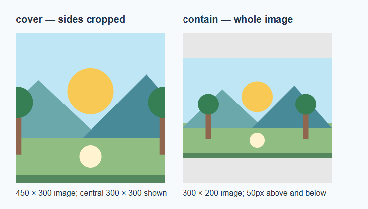
If you compare cover·contain with just a CSS gradient that has no unique size and ratio, the difference will be almost invisible as it fills the same area. For cropping practice, use an image file with a fixed size and ratio like now.
Control repetition and position
.repeat {

  background-size: 100px auto;

  background-repeat: repeat;

  background-position: left top;

}

.no-repeat {

  background-size: 100px auto;

  background-repeat: no-repeat;

  background-position: left top;

}
background-size: 100px auto sets the width to 100px and the height to match the original ratio. repeat fills the background area with a small picture repeatedly, no-repeat displays it only once. Because of the basic repetition, the picture may be repeated even in the empty space of contain, so specify no-repeat when comparing an entire picture.
background-position sets the criteria for placing images. Center divides the remaining space or cut portion into both sides, and left top aligns it based on the top left. If you change the position on the cover, the size does not change, but the side that is cut changes. The example uses separate properties, so be careful not to initialize other settings later by adding the background shorthand property.
Run the complete background example
Save the code below as UTF-8 in backgrounds.html in the folder prepared earlier and open it. Use the same picture in four boxes to compare size and repetition. If the window is narrow, the box width will be reduced and the height will remain at 300px, so the size of the clipping and empty space will also be recalculated.
<!doctype html>

<html lang="en">

<head>

  <meta charset="utf-8">

  <meta name="viewport" content="width=device-width, initial-scale=1">

  <title>Comparing background image sizes</title>

  <style>

    * { box-sizing: border-box; }

    body { margin: 24px; color: #333; font: 1rem/1.7 sans-serif; }

    .sample { width: 100%; max-width: 300px; height: 300px; margin-block-end: 24px;

      background-color: #e8e8e8; background-image: url("images/landscape.webp");

      background-position: center; background-repeat: no-repeat; }

    .cover { background-size: cover; }

    .contain { background-size: contain; }

    .repeat { background-size: 100px auto; background-repeat: repeat; background-position: left top; }

    .no-repeat { background-size: 100px auto; background-position: left top; }

  </style>

</head>

<body>

  <h1>Comparing background images</h1>

  <h2>cover:Fill the box</h2><div class="sample cover" role="img" aria-label="Background with left and right sides cut out"></div>

  <h2>contain:Contains the entire picture</h2><div class="sample contain" role="img" aria-label="Background with empty space above and below"></div>

  <h2>repeat: small repetition</h2><div class="sample repeat" role="img" aria-label="Background with repeated small pictures"></div>

  <h2>no-repeat:Show small once</h2><div class="sample no-repeat" role="img" aria-label="Background with only one page displayed in the upper left corner"></div>

</body>

</html>
Change one property at a time
- Make sure in Developer Tools that the window is wide enough so the first two boxes are 300×300. Compare the left and right cuts of cover and the top and bottom space of contain.
- Change only the background-position of the cover to left top. After making sure that more trees on the left are visible and more on the right are cut, return it to center.
- Change background-repeat in contain to repeat. Check if part of the picture repeats in the empty space and revert to no-repeat.
- Change the size of .no-repeat from 100px auto to 100% 100%. Check if the proportions of the center circle change and return them to their original values.
Diagnose missing images and unexpected cropping
- Open the practice image link directly to make sure the original file is visible. Check the saved file name and actual extension and calculate the path according to the HTML/CSS location.
- Inspect the image request in the DevTools Network panel. A 404 response calls for checking the path. If the response succeeds but the image is invisible, inspect the box dimensions and the applied background-image declaration.
- If you want it to be filled without empty space, check if it is a cover. To show the entire picture, specify contain and no-repeat together. If the figure scales the same as the box, the difference between the two values will be small.
- If you're adding a background behind your text, make sure the text is readable in both light and dark areas. Because the purpose of this lesson is to compare pictures, the explanatory text is placed outside the box.
Before forcibly stretching the background image, decide whether it is an image that needs to be seen as a whole or a decoration that can be cut out. Images that require full text, such as product photos or descriptive diagrams, and decorative backgrounds should not be treated to the same standard.

CSS Tutorial / CSS Link States and Visible Keyboard Focus
Compare link states in a working multi-file example, inspect keyboard focus, and understand browser privacy restrictions on visited-link styles.

CSS Tutorial / CSS Container Queries for Reusable Components
Reuse one card in main content and sidebar containers, compare nearest and named containers, and verify the baseline layout when a query does not apply.
CSS Tutorial / Flexbox Basics: Containers, Items, and Axes
Create a Flexbox container, distinguish direct children from nested content, and compare row, column, and their main and cross axes.

CSS Tutorial / CSS Colors and Units: px, em, rem, and Percentages
Compare equivalent color formats and practical sizing examples, including nested em values, rem, percentages, and unitless line height.

CSS Tutorial / CSS Overflow, Long Text Wrapping, and Ellipsis
Compare scrolling, clipping, long-word wrapping, and single-line ellipsis, including keyboard access and minimum-size issues in layout containers.

CSS Tutorial / Responsive Images and Video: aspect-ratio and object-fit
Compare original image proportions, cover, contain, and object-position, then test responsive video sizing with a downloadable sample.

CSS Tutorial / Fluid CSS Layouts with min, max, and clamp
Build a bounded fluid layout, compare flexible sizes and spacing, and check that longer content fits without introducing horizontal page scrolling.

CSS Tutorial / CSS Tables: Borders, Sizing, and table-layout
Style semantic tables, compare automatic and fixed layout with long content, and provide horizontal scrolling when a table needs more space.

CSS Tutorial / CSS Form States: Focus, Validation, disabled, and readonly
Compare form states, create accessible labels and error messages, and inspect which enabled, disabled, and read-only fields enter submitted form data.

CSS Tutorial / The CSS Box Model: Content, Padding, Border, and Margin
Measure the four box areas, compare padding shorthand and vertical margin collapse, and inspect the resulting dimensions in DevTools.