如何用 CSS 边框和 clip-path 制作三角形
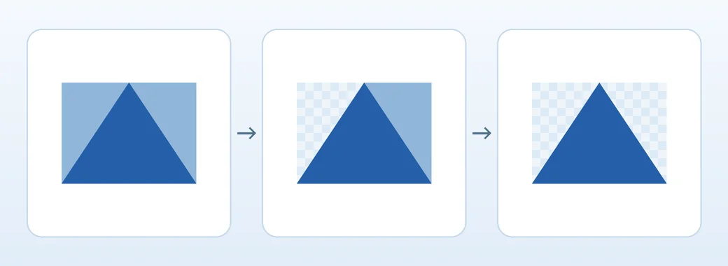
要用 CSS 制作向上的三角形,可以给宽高都为 0 的元素设置有色的下边框,以及透明的左右边框。下边框的厚度决定高度,左右边框厚度相加就是底边长度。如果三角形需要随元素大小缩放,可以使用 clip-path: polygon()。
透明边框如何形成三角形
空的 <span> 上边框厚度为 0,因此左、右、下三条边框交于一点。把两侧的颜色设为 transparent 会保留边框所占的空间,同时只显示下边框形成的三角形。
左右各为 32px、下边框为 48px 时,三角形底边为 64px,高为 48px。两侧同宽时顶点居中,两侧不同宽时顶点会偏向较细的边框。
在一个文件中试用六种三角形
将完整代码保存为 triangles.html,然后在浏览器中打开。无需安装库。每个图形下方都标明了预期结果。
<!doctype html>
<html lang="zh-CN">
<head>
  <meta charset="utf-8">
  <meta name="viewport" content="width=device-width, initial-scale=1">
  <title>用 CSS 制作三角形</title>
  <style>
    body { margin: 1.5rem; font: 1rem/1.5 system-ui, sans-serif; }
    .examples {
      display: grid;
      grid-template-columns: repeat(auto-fit, minmax(min(100%, 9rem), 1fr));
      gap: 1rem;
    }
    figure {
      display: grid;
      justify-items: center;
      align-content: center;
      gap: 1rem;
      min-block-size: 8rem;
      margin: 0;
      padding: 0.75rem;
      background: #eef4fa;
      text-align: center;
    }
    .triangle {
      --ink: #255fa8;
      width: 0;
      height: 0;
      border-style: solid;
      border-width: 0 32px 48px;
      border-color: transparent transparent var(--ink);
    }
    .triangle--equilateral {
      border-bottom-width: calc(32px * 1.732);
    }
    .triangle--right-angle {
      border-left-width: 0;
    }
    .triangle--east {
      border-width: 32px 0 32px 48px;
      border-color: transparent transparent transparent var(--ink);
    }
    .triangle--tilted {
      transform: rotate(25deg);
    }
    .clipped {
      width: min(100%, 8rem);
      aspect-ratio: 4 / 3;
      background: linear-gradient(145deg, #2d72c2, #155d59);
      clip-path: polygon(50% 0%, 100% 100%, 0% 100%);
    }
  </style>
</head>
<body>
  <div class="examples">
    <figure><span class="triangle" aria-hidden="true"></span><figcaption>等腰三角形</figcaption></figure>
    <figure><span class="triangle triangle--equilateral" aria-hidden="true"></span><figcaption>近似等边三角形</figcaption></figure>
    <figure><span class="triangle triangle--right-angle" aria-hidden="true"></span><figcaption>直角三角形</figcaption></figure>
    <figure><span class="triangle triangle--east" aria-hidden="true"></span><figcaption>指向右侧</figcaption></figure>
    <figure><span class="triangle triangle--tilted" aria-hidden="true"></span><figcaption>旋转 25 度</figcaption></figure>
    <figure><span class="clipped" aria-hidden="true"></span><figcaption>用 clip-path 制作的三角形</figcaption></figure>
  </div>
</body>
</html>
前三个图形朝上,第四个朝右。第五个把基本三角形顺时针旋转 25 度。最后一个把可调整宽度的渐变矩形裁剪成三角形。
制作等边三角形和直角三角形
等边三角形的高度是底边长度的一半乘以 √3。底边为 64px 时,用 calc(32px * 1.732) 得到约 55.4px。浏览器可能按设备像素调整边框厚度,小尺寸下看到的是近似形状。
把左边框厚度设为 0 并保留右侧 32px,就会得到左侧为竖边的直角三角形。只把右侧设为 0 时,直角会在另一侧。给两侧设不同的正值,可以让顶点偏离中心。
改变指向或按角度旋转
给与所需指向相反的边框上色。与有色边框相对的边框厚度设为 0,其余两侧设为透明。下表使用物理方向。
| 顶点朝向 | 有色边框 | 透明边框 |
|---|---|---|
| 上 | border-bottom |
border-left / border-right |
| 右 | border-left |
border-top / border-bottom |
| 下 | border-top |
border-left / border-right |
| 左 | border-right |
border-top / border-bottom |
如果需要四个方向之间的角度,可以用 transform: rotate(25deg)。在这个从左到右书写的示例中,正角度表示顺时针旋转。旋转不会改变布局中原来的盒子尺寸。图形重叠时可以调整间距。
用 clip-path 制作响应式三角形
clip-path: polygon(50% 0%, 100% 100%, 0% 100%) 将顶部中央和底部两个角连接起来。元素本身有宽高,因此可以改变宽高比或填入渐变。示例的宽度最大为 8rem,可用空间不足时会减小。
如果图形不显示,请在计算样式中检查边框是否为 solid、有色边框厚度是否大于 0,以及透明边框的厚度是否符合预期。使用 clip-path 时,还要确认元素宽高大于 0,并且有可见的背景或内容。
装饰性图形可以使用 aria-hidden="true"。如果三角形表示展开或导航操作,请给按钮或链接提供文本名称,并传达当前状态或目的地。