How to Make a Triangle with CSS Borders and clip-path
To make an upward-pointing CSS triangle, give a zero-size element a colored bottom border and transparent side borders. The bottom border sets the height, and the two side border widths add up to the base. If you want the triangle to scale with the element, use clip-path: polygon().
How transparent borders form a triangle
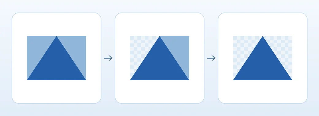
The example uses an empty <span> with borders. The top border has zero width, so the left, right, and bottom borders meet at a point. Setting the side colors to transparent keeps the space those borders occupy and reveals the colored bottom triangle.
With 32px on each side and 48px on the bottom, the triangle is 64px wide and 48px high. Equal side widths center the tip. Unequal side widths shift it toward the narrower border.
Try six triangle variants in one file
Save the complete example as triangles.html and open it in a browser. No libraries are needed. Each figure has a caption that identifies the result.
<!doctype html>
<html lang="en">
<head>
  <meta charset="utf-8">
  <meta name="viewport" content="width=device-width, initial-scale=1">
  <title>CSS triangles</title>
  <style>
    body { margin: 1.5rem; font: 1rem/1.5 system-ui, sans-serif; }
    .examples {
      display: grid;
      grid-template-columns: repeat(auto-fit, minmax(min(100%, 9rem), 1fr));
      gap: 1rem;
    }
    figure {
      display: grid;
      justify-items: center;
      align-content: center;
      gap: 1rem;
      min-block-size: 8rem;
      margin: 0;
      padding: 0.75rem;
      background: #eef4fa;
      text-align: center;
    }
    .triangle {
      --ink: #255fa8;
      width: 0;
      height: 0;
      border-style: solid;
      border-width: 0 32px 48px;
      border-color: transparent transparent var(--ink);
    }
    .triangle--equilateral {
      border-bottom-width: calc(32px * 1.732);
    }
    .triangle--right-angle {
      border-left-width: 0;
    }
    .triangle--east {
      border-width: 32px 0 32px 48px;
      border-color: transparent transparent transparent var(--ink);
    }
    .triangle--tilted {
      transform: rotate(25deg);
    }
    .clipped {
      width: min(100%, 8rem);
      aspect-ratio: 4 / 3;
      background: linear-gradient(145deg, #2d72c2, #155d59);
      clip-path: polygon(50% 0%, 100% 100%, 0% 100%);
    }
  </style>
</head>
<body>
  <div class="examples">
    <figure><span class="triangle" aria-hidden="true"></span><figcaption>Isosceles triangle</figcaption></figure>
    <figure><span class="triangle triangle--equilateral" aria-hidden="true"></span><figcaption>Approximate equilateral triangle</figcaption></figure>
    <figure><span class="triangle triangle--right-angle" aria-hidden="true"></span><figcaption>Right triangle</figcaption></figure>
    <figure><span class="triangle triangle--east" aria-hidden="true"></span><figcaption>Points right</figcaption></figure>
    <figure><span class="triangle triangle--tilted" aria-hidden="true"></span><figcaption>Rotated 25 degrees</figcaption></figure>
    <figure><span class="clipped" aria-hidden="true"></span><figcaption>Triangle made with clip-path</figcaption></figure>
  </div>
</body>
</html>
The first three shapes point up, and the fourth points right. The fifth is the first triangle rotated 25 degrees clockwise. The last clips a gradient-filled rectangle with a flexible width.
Make equilateral and right triangles
An equilateral triangle is half its base times √3 high. For a 64px base, use calc(32px * 1.732) for a height of about 55.4px. The browser may snap the border width to device pixels, so small triangles can look slightly approximate.
Set the left border width to zero and keep 32px on the right to make a right triangle with a vertical left edge. Set only the right border width to zero for a right angle on the other side. Give the transparent borders different positive widths for an off-center tip.
Change the direction or rotate by an angle
To change direction using borders, color the edge opposite the point. Set the border across from the colored edge to zero and keep the other two transparent. This table uses physical directions in a horizontal layout.
| Point direction | Colored border | Transparent borders |
|---|---|---|
| Up | border-bottom |
border-left / border-right |
| Right | border-left |
border-top / border-bottom |
| Down | border-top |
border-left / border-right |
| Left | border-right |
border-top / border-bottom |
For an angle between those four directions, add a transform such as transform: rotate(25deg). A positive angle turns clockwise in this left-to-right example. Rotation does not resize the original layout box, so adjust the spacing or container if the shape overlaps a neighbor.
CSS Transforms specification for rotate()
Use clip-path for a responsive triangle
clip-path: polygon(50% 0%, 100% 100%, 0% 100%) joins the top center, bottom right, and bottom left of an element. The element has a real width and height, so you can change its aspect ratio or fill it with a gradient. The example is at most 8rem wide and shrinks when less space is available.
CSS Masking specification for clip-path
If the triangle is missing, inspect the computed styles. Check that the border style is solid, its colored edge has a positive width, and the transparent borders have the intended widths. For clip-path, check that the element has a positive width and height and a visible background or content.
A decorative shape can use aria-hidden="true" as in the example. If it marks an expand control or a previous or next action, give the button or link a text name and convey its state or destination.