Bootstrap 4 / Buttons / 버튼 꾸미기
Buttons
CSS로 꾸밀 때 손이 많이 가는 것 중의 하나가 버튼입니다. Bootstrap을 사용하면 여러 색의 버튼을 쉽게 만들 수 있습니다.
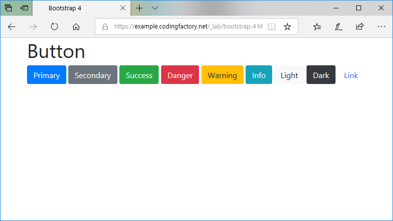
기본
클래스의 값으로 btn btn-xxx를 추가하면 버튼이 꾸며집니다. xxx에 들어갈 문자열에 따라 색이 달라집니다. 버튼에 마우스를 올리면 좀 더 진한 색으로 바뀝니다.
<!doctype html>
<html lang="ko">
	<head>
		<meta charset="utf-8">
		<meta name="viewport" content="width=device-width, initial-scale=1">
		<title>Bootstrap 4</title>
		<link rel="stylesheet" href="https://stackpath.bootstrapcdn.com/bootstrap/4.1.3/css/bootstrap.min.css">
	</head>
	<body>
		<div class="container">
			<div class="row">
				<div class="col">
					<h1>Button</h1>
					<button type="button" class="btn btn-primary">Primary</button>
					<button type="button" class="btn btn-secondary">Secondary</button>
					<button type="button" class="btn btn-success">Success</button>
					<button type="button" class="btn btn-danger">Danger</button>
					<button type="button" class="btn btn-warning">Warning</button>
					<button type="button" class="btn btn-info">Info</button>
					<button type="button" class="btn btn-light">Light</button>
					<button type="button" class="btn btn-dark">Dark</button>
					<button type="button" class="btn btn-link">Link</button>
				</div>
			</div>
		</div>
		<script src="https://code.jquery.com/jquery-3.3.1.slim.min.js"></script>
		<script src="https://cdnjs.cloudflare.com/ajax/libs/popper.js/1.14.3/umd/popper.min.js"></script>
		<script src="https://stackpath.bootstrapcdn.com/bootstrap/4.1.3/js/bootstrap.min.js"></script>
	</body>
</html>
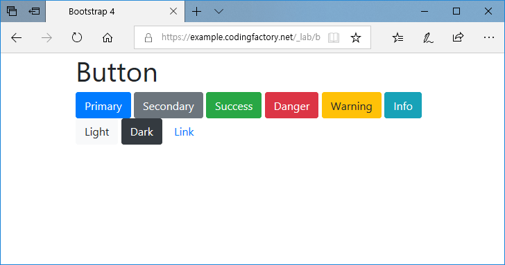
위 아래 여백이 없으므로, 줄바꿈이 있을 때 버튼이 붙는다는 것에 주의합니다.
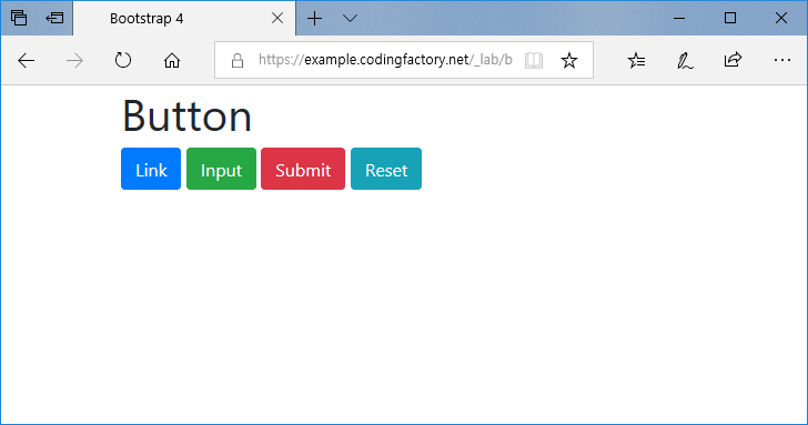
버튼 모양으로 만들 수 있는 태그
꼭 button만 꾸밀 수 있는 것은 아닙니다. a, input, span, p 등 다른 요소도 꾸밀 수 있습니다.
<a class="btn btn-primary" href="#">Link</a>
<input class="btn btn-success" type="button" value="Input">
<input class="btn btn-danger" type="submit" value="Submit">
<input class="btn btn-info" type="reset" value="Reset">
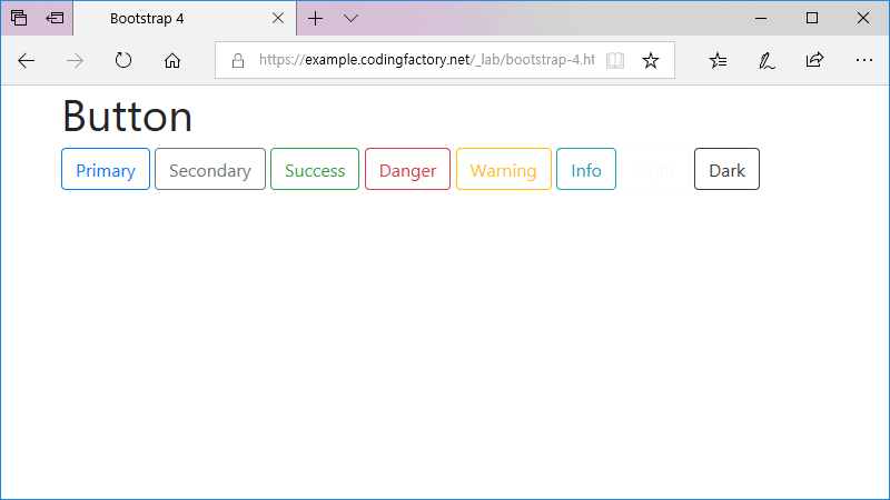
테두리 모양의 버튼
outline 문자열을 추가하여 흰 배경에 테두리가 있는 버튼을 만들 수 있습니다.
<button type="button" class="btn btn-outline-primary">Primary</button>
<button type="button" class="btn btn-outline-secondary">Secondary</button>
<button type="button" class="btn btn-outline-success">Success</button>
<button type="button" class="btn btn-outline-danger">Danger</button>
<button type="button" class="btn btn-outline-warning">Warning</button>
<button type="button" class="btn btn-outline-info">Info</button>
<button type="button" class="btn btn-outline-light">Light</button>
<button type="button" class="btn btn-outline-dark">Dark</button>
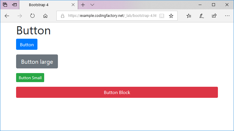
크기
클래스에 btn-lg를 추가하면 버튼이 커지고, btn-sm을 추가하면 버튼이 작아집니다. btn-block을 추가하면 block 레벨의 버튼이 만들어집니다.
<p><button type="button" class="btn btn-primary">Button</button></p>
<p><button type="button" class="btn btn-secondary btn-lg">Button large</button></p>
<p><button type="button" class="btn btn-success btn-sm">Button Small</button></p>
<p><button type="button" class="btn btn-danger btn-block">Button Block</button></p>
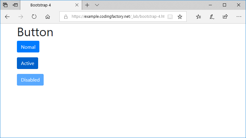
활성화와 비활성화
클래스에 active를 추가하면 색이 진해집니다. disabled를 축하면 색이 흐려집니다.
<p><button type="button" class="btn btn-primary">Nomal</button></p>
<p><button type="button" class="btn btn-primary active">Active</button></p>
<p><button type="button" class="btn btn-primary" disabled>Disabled</button></p>
클래스 값으로 disabled를 추가해도 됩니다.
<span class="btn btn-primary disabled">Disabled</span>

Bootstrap 4 / Breadcrumb / 사이트 이동 경로 꾸미기
Breadcrumb Breadcrumb는 빵 부스러기라는 뜻인데, 웹사이트에서는 사이트 이동 경로를 의미합니다. Bootstrap은 Breadcrumb을 꾸미는 CSS를 포함하고 있습니다. Indicate the current page’s location within a navigational hierarchy that automatically adds separators via CSS. 예제 1 Breadcrumb은 ol 또는 ul 태그로 만듭니다. 가로로 방향으로 나열되고 구분자는 '/'입니다. <!doctype html> <html lang="ko"> <head> <meta charset="utf-8"> ...
Bootstrap 4 / Buttons / 버튼 꾸미기
Buttons CSS로 꾸밀 때 손이 많이 가는 것 중의 하나가 버튼입니다. Bootstrap을 사용하면 여러 색의 버튼을 쉽게 만들 수 있습니다. 기본 클래스의 값으로 btn btn-xxx를 추가하면 버튼이 꾸며집니다. xxx에 들어갈 문자열에 따라 색이 달라집니다. 버튼에 마우스를 올리면 좀 더 진한 색으로 바뀝니다. <!doctype html> <html lang="ko"> <head> <meta charset="utf-8"> <meta name="viewport" content="width=device-width, initial-scale=1"> <title>Bootstrap 4</title> <link rel="stylesheet" href="https://stackpath.bootstrapcdn.com/bootstrap/4.1.3/css/bootstrap.min.css"> </head> <body> <div class="container"> <div class="row"> <div ...
Bootstrap 4 / Button Group / 버튼 묶음 만들기
Button Group 버튼을 연속하여 만들면 가로로 배열되고, 버튼 사이에 간격이 있습니다. <!doctype html> <html lang="ko"> <head> <meta charset="utf-8"> <meta name="viewport" content="width=device-width, initial-scale=1"> <title>Bootstrap 4</title> <link rel="stylesheet" href="https://stackpath.bootstrapcdn.com/bootstrap/4.3.1/css/bootstrap.min.css"> </head> <body> <div class="container"> ...
Bootstrap 4 / Navs / 목록으로 메뉴 만들기
홈페이지의 메뉴는 보통 ul 태그로 만듭니다. 메뉴 구성하기에는 편하지만, 디자인하는 것은 손이 많이 갑니다. 가로로 배열하고 마커를 없애고, 정렬을 정하고... 하지만 Bootstrap을 이용하면 몇 개의 class를 추가하는 것만으로 쉽게 메뉴를 디자인할 수 있습니다. 메뉴 만들기 메뉴를 만드는 방법은 다음 두 가지가 있습니다. 결과는 같지만 마크업이 다릅니다. 주의할 점은, 두 번째 방법은 flex를 ...
Bootstrap 4 / List Group / 목록 꾸미기
List Group list-group로 목록을 꾸밀 수 있습니다. ul 요소에 사용하는 것이 기본이나, 링크나 버튼에서 적용 가능합니다. List groups are a flexible and powerful component for displaying a series of content. Modify and extend them to support just about any content within. 기본 가장 기본적인 리스트 그룹입니다. ul 요소에는 .list-group를, li 요소에는 .list-group-item를 추가합니다. <!doctype html> <html ...
Bootstrap 4 / Tooltips / 마우스 올렸을 때 툴팁 모양 꾸미기
Tooltip HTML 요소에 title 속성을 추가하면, 요소에 마우스를 올렸을 때 title 속성의 값이 툴팁(Tooltip)으로 나옵니다. 툴팁 모양은 웹브라우저마다 다릅니다. Bootstrap은 툴팁 모양을 통일시키고, 위치를 정할 수 있는 기능을 포함하고 있습니다. Tooltip 꾸미기 스크립트에 다음 코드를 추가합니다. $(function () { $('').tooltip() }) 다음과 같이 마크업합니다.(span 요소는 예로 들은 것일 뿐, a, button 등 다른 요소에도 사용할 수 있습니다.) <span ...
Bootstrap 4 / Popovers / 클릭했을 때 메시지 나오게 하기
Popovers Popover를 이용하여 요소를 클릭했을 때 메시지가 있는 작은 창을 띄울 수 있습니다. 아래는 예제 실행 영상입니다. 예제 1 요소에 다음과 같은 속성을 추가합니다. data-toggle="popover" title="Popover title" data-content="Lorem Ipsum Dolor Lorem Ipsum Dolor Lorem Ipsum Dolor" data-toggle : 스크립트와 연결할 때 사용합니다. title : 메시지의 제목입니다. 내용과 구문되어 나옵니다. data-content : 메시지의 내용입니다. 다음과 같은 스크립트를 추가합니다. <script> ...
Bootstrap 4 / Badge / New, 숫자 등 작은 라벨 만들기
Badge 새 글일 경우 New를 붙이거나, 글 목록에 댓글 개수를 보여주는 것을 보신 적이 있을 겁니다. Bootsrap의 Badge를 이용하면 쉽게 모양을 꾸밀 수 있습니다. 기본 클래스에 'badge badge-primary' 등을 붙이면 배지가 만들어집니다. 글자 크기는 em 단위로 정해져 있어서, 주위 글자 크기에 맞게 조정됩니다. <!doctype html> <html lang="ko"> <head> <meta charset="utf-8"> ...
Bootstrap 4 / Layout / .container, .row, .col
.container Bootstrap에서 레이아웃은 .container, .row, .col로 만듭니다. 표(table)와 구성이 비슷합니다. .container는 table, .row는 tr, .col은 td에 대응한다고 보면 됩니다. .container로 내용이 들어갈 공간의 가로폭을 정합니다. .container, .container-sm, .container-md, .container-lg, .container-xl, .container-fluid를 사용할 수 있고, 해상도에 대한 container의 크기는 다음과 같습니다. 576px 미만 576px 이상 768px 이상 992px 이상 1200px 이상 .container 100% 540px 720px 960px 1140px .container-sm 100% 540px 720px 960px 1140px .container-md 100% 100% 720px 960px 1140px .container-lg 100% 100% 100% 960px 1140px .container-xl 100% 100% 100% 100% 1140px .container-fluid 100% 100% 100% 100% 100% 예제 - .container, .container-sm .contaner의 크기를 확인할 수 있는 ...
필요한 파일 Bootstrap을 사용하기 위해 필요한 파일은 bootstrap.css, jquery.js, popper.js, bootstrap.js입니다. bootstrap.css : Bootstrap의 CSS 파일입니다. jquery.js, popper.js : bootstrap.js를 사용하기 위해 필요합니다. bootstrap.js : Bootstrap의 JS 파일입니다. 이 파일들을 CDN에서 불러올 수도 있고, 다운로드 받아 사용할 수도 있습니다. CDN 이용하기 다음은 CDN을 이용한 HTML 문서입니다. <!doctype html> <html lang="ko"> <head> <meta charset="utf-8"> ...