Bootstrap 4 / Breadcrumb / 사이트 이동 경로 꾸미기
Breadcrumb
Breadcrumb는 빵 부스러기라는 뜻인데, 웹사이트에서는 사이트 이동 경로를 의미합니다. Bootstrap은 Breadcrumb을 꾸미는 CSS를 포함하고 있습니다.
Indicate the current page’s location within a navigational hierarchy that automatically adds separators via CSS.
예제 1
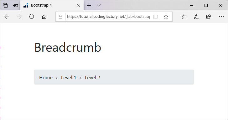
Breadcrumb은 ol 또는 ul 태그로 만듭니다. 가로로 방향으로 나열되고 구분자는 '/'입니다.
<!doctype html>
<html lang="ko">
  <head>
    <meta charset="utf-8">
    <meta name="viewport" content="width=device-width, initial-scale=1">
    <title>Bootstrap 4</title>
    <link rel="stylesheet" href="https://stackpath.bootstrapcdn.com/bootstrap/4.3.1/css/bootstrap.min.css">
    <style>
      h1 { margin: 50px 0px; }
    </style>
  </head>
  <body>
    <div class="container">
      <div class="row">
        <div class="col-12">
          <h1>Breadcrumb</h1>
          <ol class="breadcrumb">
            <li class="breadcrumb-item">Home</li>
            <li class="breadcrumb-item">Level 1</li>
            <li class="breadcrumb-item">Level 2</li>
          </ol>
        </div>
      </div>
    </div>
    <script src="https://code.jquery.com/jquery-3.3.1.slim.min.js"></script>
    <script src="https://cdnjs.cloudflare.com/ajax/libs/popper.js/1.14.7/umd/popper.min.js"></script>
    <script src="https://stackpath.bootstrapcdn.com/bootstrap/4.3.1/js/bootstrap.min.js"></script>
  </body>
</html>

예제 2
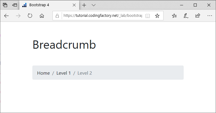
구분자는 CSS로 변경할 수 있습니다. 다음은 구분자를 '/'에서 '>'로 변경한 것입니다.
<!doctype html>
<html lang="ko">
  <head>
    <meta charset="utf-8">
    <meta name="viewport" content="width=device-width, initial-scale=1">
    <title>Bootstrap 4</title>
    <link rel="stylesheet" href="https://stackpath.bootstrapcdn.com/bootstrap/4.3.1/css/bootstrap.min.css">
    <style>
      h1 { margin: 50px 0px; }
      .breadcrumb-item+.breadcrumb-item::before { content: ">"; }
    </style>
  </head>
  <body>
    <div class="container">
      <div class="row">
        <div class="col-12">
          <h1>Breadcrumb</h1>
          <ol class="breadcrumb">
            <li class="breadcrumb-item">Home</li>
            <li class="breadcrumb-item">Level 1</li>
            <li class="breadcrumb-item">Level 2</li>
          </ol>
        </div>
      </div>
    </div>
    <script src="https://code.jquery.com/jquery-3.3.1.slim.min.js"></script>
    <script src="https://cdnjs.cloudflare.com/ajax/libs/popper.js/1.14.7/umd/popper.min.js"></script>
    <script src="https://stackpath.bootstrapcdn.com/bootstrap/4.3.1/js/bootstrap.min.js"></script>
  </body>
</html>
예제 3
li 요소에 active 클래스를 추가하면 글자색이 변합니다.
<!doctype html>
<html lang="ko">
  <head>
    <meta charset="utf-8">
    <meta name="viewport" content="width=device-width, initial-scale=1">
    <title>Bootstrap 4</title>
    <link rel="stylesheet" href="https://stackpath.bootstrapcdn.com/bootstrap/4.3.1/css/bootstrap.min.css">
    <style>
      h1 { margin: 50px 0px; }
    </style>
  </head>
  <body>
    <div class="container">
      <div class="row">
        <div class="col-12">
          <h1>Breadcrumb</h1>
          <ol class="breadcrumb">
            <li class="breadcrumb-item">Home</li>
            <li class="breadcrumb-item">Level 1</li>
            <li class="breadcrumb-item active">Level 2</li>
          </ol>
        </div>
      </div>
    </div>
    <script src="https://code.jquery.com/jquery-3.3.1.slim.min.js"></script>
    <script src="https://cdnjs.cloudflare.com/ajax/libs/popper.js/1.14.7/umd/popper.min.js"></script>
    <script src="https://stackpath.bootstrapcdn.com/bootstrap/4.3.1/js/bootstrap.min.js"></script>
  </body>
</html>

Bootstrap 4 / Pagination / 이전 또는 다음 페이지로 연결하는 링크 꾸미기
글이 많을 때 다음 글 또는 이전 글, 다음 글 목록 또는 이전 글 목록으로 이동하는 링크를 만듭니다. 이를 페이지네이션(Pagination)이라고 하는데, Bootstrap에서는 페이지네이션을 쉽게 꾸밀 수 있습니다. 기본 ul의 클래스를 pagination, li의 클래스를 page-item, a의 클래스를 page-link로 정하면 가로로 배열된 페이지네이션이 만들어집니다. <!doctype html> <html lang="ko"> <head> <meta charset="utf-8"> <meta name="viewport" content="width=device-width, initial-scale=1"> <title>Bootstrap 4</title> <link rel="stylesheet" href="https://stackpath.bootstrapcdn.com/bootstrap/4.1.3/css/bootstrap.min.css"> <style> p { ...
제목들이 나열되어 있고, 제목을 클릭하면 같은 화면에서 내용이 바뀌는 것을 탭이라고 합니다. 탭을 이용하면 작은 공간에 많은 콘텐츠를 담을 수 있습니다. 아래는 간단한 탭 예제입니다. QWE의 내용이 보여지는 상태에서... ASD나 ZXC를 클릭하면 화면 전환 없이 내용이 바뀝니다. Bootstrap을 이용하면 탭을 쉽게 만들 수 있습니다. 위 탭을 만든 코드는 다음과 같습니다. <ul class="nav nav-tabs"> ...
Bootstrap 4 / Popovers / 클릭했을 때 메시지 나오게 하기
Popovers Popover를 이용하여 요소를 클릭했을 때 메시지가 있는 작은 창을 띄울 수 있습니다. 아래는 예제 실행 영상입니다. 예제 1 요소에 다음과 같은 속성을 추가합니다. data-toggle="popover" title="Popover title" data-content="Lorem Ipsum Dolor Lorem Ipsum Dolor Lorem Ipsum Dolor" data-toggle : 스크립트와 연결할 때 사용합니다. title : 메시지의 제목입니다. 내용과 구문되어 나옵니다. data-content : 메시지의 내용입니다. 다음과 같은 스크립트를 추가합니다. <script> ...
Bootstrap 4 / Badge / New, 숫자 등 작은 라벨 만들기
Badge 새 글일 경우 New를 붙이거나, 글 목록에 댓글 개수를 보여주는 것을 보신 적이 있을 겁니다. Bootsrap의 Badge를 이용하면 쉽게 모양을 꾸밀 수 있습니다. 기본 클래스에 'badge badge-primary' 등을 붙이면 배지가 만들어집니다. 글자 크기는 em 단위로 정해져 있어서, 주위 글자 크기에 맞게 조정됩니다. <!doctype html> <html lang="ko"> <head> <meta charset="utf-8"> ...
Bootstrap 4 / Button Group / 버튼 묶음 만들기
Button Group 버튼을 연속하여 만들면 가로로 배열되고, 버튼 사이에 간격이 있습니다. <!doctype html> <html lang="ko"> <head> <meta charset="utf-8"> <meta name="viewport" content="width=device-width, initial-scale=1"> <title>Bootstrap 4</title> <link rel="stylesheet" href="https://stackpath.bootstrapcdn.com/bootstrap/4.3.1/css/bootstrap.min.css"> </head> <body> <div class="container"> ...
필요한 파일 Bootstrap을 사용하기 위해 필요한 파일은 bootstrap.css, jquery.js, popper.js, bootstrap.js입니다. bootstrap.css : Bootstrap의 CSS 파일입니다. jquery.js, popper.js : bootstrap.js를 사용하기 위해 필요합니다. bootstrap.js : Bootstrap의 JS 파일입니다. 이 파일들을 CDN에서 불러올 수도 있고, 다운로드 받아 사용할 수도 있습니다. CDN 이용하기 다음은 CDN을 이용한 HTML 문서입니다. <!doctype html> <html lang="ko"> <head> <meta charset="utf-8"> ...
콘텐츠 목록을 보여줄 때 카드형 배열을 많이 사용합니다. Bootstrap을 이용하면 카드 목록을 쉽게 만들 수 있습니다. 기본 카드를 만드는 기본적인 마크업은 다음과 같습니다. <div class="card"> <div class="card-header"> My Card </div> <img src="images/card-image.png" alt="" /> <div class="card-body"> <h5 class="card-title">Lorem</h5> <p class="card-text">Lorem ...
Bootstrap 4 / Layout / .container, .row, .col
.container Bootstrap에서 레이아웃은 .container, .row, .col로 만듭니다. 표(table)와 구성이 비슷합니다. .container는 table, .row는 tr, .col은 td에 대응한다고 보면 됩니다. .container로 내용이 들어갈 공간의 가로폭을 정합니다. .container, .container-sm, .container-md, .container-lg, .container-xl, .container-fluid를 사용할 수 있고, 해상도에 대한 container의 크기는 다음과 같습니다. 576px 미만 576px 이상 768px 이상 992px 이상 1200px 이상 .container 100% 540px 720px 960px 1140px .container-sm 100% 540px 720px 960px 1140px .container-md 100% 100% 720px 960px 1140px .container-lg 100% 100% 100% 960px 1140px .container-xl 100% 100% 100% 100% 1140px .container-fluid 100% 100% 100% 100% 100% 예제 - .container, .container-sm .contaner의 크기를 확인할 수 있는 ...
Bootstrap 4 / Alerts / 닫을 수 있는 메시지 만들기
Alert Alert는 방문자에게 특정 메시지를 보여줄 때 주로 사용합니다. 메시지에 맞게 색을 고를 수 있으며, 닫기 버튼을 추가할 수 있습니다. Provide contextual feedback messages for typical user actions with the handful of available and flexible alert messages. Alert 만들기 클래스의 값으로 'alert alert-primary' 등을 추가하면 Alert가 만들어집니다. primary, secondary alert, success, danger, warning, info, ...
Bootstrap 4 / 체크박스, 라디오 버튼 꾸미기
Bootstrap을 이용하면 체크박스와 라디오 버튼을 쉽게 꾸밀 수 있습니다. 두 가지 방법을 소개합니다. 방법 1 <!doctype html> <html lang="ko"> <head> <meta charset="utf-8"> <meta name="viewport" content="width=device-width, initial-scale=1"> <title>Bootstrap 4</title> <link rel="stylesheet" href="https://stackpath.bootstrapcdn.com/bootstrap/4.1.3/css/bootstrap.min.css"> <style> p { margin:20px 0px; } </style> </head> <body> <div class="container"> <div class="row"> <div class="col"> <p><strong>Checkbox</strong></p> <div class="custom-control custom-checkbox"> <input type="checkbox" id="jb-checkbox" class="custom-control-input"> <label class="custom-control-label" for="jb-checkbox">Checkbox</label> </div> <p><strong>Radio Button</strong></p> <div class="custom-control custom-radio"> <input type="radio" name="jb-radio" id="jb-radio-1" class="custom-control-input"> <label class="custom-control-label" for="jb-radio-1">Radio Button 1</label> </div> <div class="custom-control custom-radio"> <input ...