How to Make a CSS Diamond or Rhombus
For a CSS diamond with equal diagonals, rotate a square with transform: rotate(45deg). To make a wider or taller rhombus, clip a rectangle with clip-path: polygon() or join two identical isosceles triangles along their bases.
Try three CSS diamonds in one file
Save the complete example as rhombus.html and open it in a browser. You can compare the three methods on one page without installing a library.
<!doctype html>
<html lang="en">
<head>
  <meta charset="utf-8">
  <meta name="viewport" content="width=device-width, initial-scale=1">
  <title>CSS diamonds</title>
  <style>
    body { margin: 1rem; font: 1rem/1.5 system-ui, sans-serif; }
    .examples {
      display: grid;
      grid-template-columns: repeat(auto-fit, minmax(min(100%, 13rem), 1fr));
      gap: 1rem;
      max-width: 46rem;
      margin-inline: auto;
    }
    figure {
      margin: 0;
      padding: 0.75rem;
      text-align: center;
      overflow-wrap: anywhere;
      background: #f7f1ec;
    }
    .stage {
      display: grid;
      place-items: center;
      min-height: 8rem;
    }
    .rotated {
      width: min(70%, 80px);
      aspect-ratio: 1;
      background: #a85a59;
      transform: rotate(45deg);
    }
    .clipped {
      width: min(100%, 144px);
      aspect-ratio: 18 / 11;
      background: #456f89;
      clip-path: polygon(50% 0%, 100% 50%, 50% 100%, 0% 50%);
    }
    .joined {
      --half-width: min(72px, 20vw);
      --half-height: calc(var(--half-width) * 11 / 18);
      display: inline-flex;
      direction: ltr;
      color: #a4613a;
    }
    .joined::before,
    .joined::after {
      content: "";
      width: 0;
      height: 0;
      border-block: var(--half-height) solid transparent;
    }
    .joined::before { border-right: var(--half-width) solid currentColor; }
    .joined::after { border-left: var(--half-width) solid currentColor; }
  </style>
</head>
<body>
  <div class="examples">
    <figure>
      <div class="stage" aria-hidden="true"><span class="rotated"></span></div>
      <figcaption>Square rotated 45 degrees</figcaption>
    </figure>
    <figure>
      <div class="stage" aria-hidden="true"><span class="clipped"></span></div>
      <figcaption>Diamond clipped with clip-path</figcaption>
    </figure>
    <figure>
      <div class="stage" aria-hidden="true"><span class="joined"></span></div>
      <figcaption>Diamond made of two triangles</figcaption>
    </figure>
  </div>
</body>
</html>
With enough space, the first diamond is about 113px across in both directions. The second and third are 144px wide and 88px tall. Narrow the window to see how each shape scales.
Rotate a square by 45 degrees
In .rotated, aspect-ratio: 1 keeps the box square. After a 45-degree rotation around its center, the corners point up, right, down, and left. With an 80px side, each visible diagonal measures 80 × √2, about 113px.
The original layout box keeps its width and height after rotation. In the example, .stage reserves at least 8rem of vertical space. If the diamond touches its neighbors, give the stage more space or reduce the square.
CSS Transforms specification for rotate()
Set the diagonal ratio with clip-path
The .clipped element starts as a box with an 18 / 11 aspect ratio. The clip-path vertices use percentages, so they follow the box as it shrinks and preserve the proportions.
polygon(50% 0%, 100% 50%, 50% 100%, 0% 50%) joins the midpoints of the top, right, bottom, and left edges. The horizontal diagonal equals the box width and the vertical diagonal equals its height. Try 11 / 18 for a taller diamond.
CSS Masking specification for clip-path
Join two CSS border triangles
In .joined, ::before makes an isosceles triangle pointing left and ::after makes one pointing right. Each zero-size pseudo-element has transparent top and bottom borders and one colored border. inline-flex places the two vertical bases next to each other.
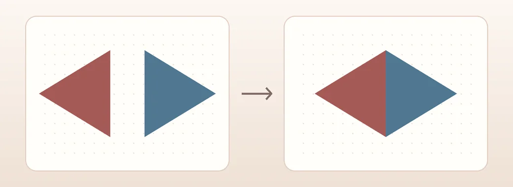
The colored border controls half the horizontal diagonal. Each transparent border controls half the vertical diagonal. Values of 72px and 44px produce a 144 × 88px diamond. The demo caps the first value at 72px and lets it shrink with the viewport.
How CSS borders form triangles
Choose a method for your layout
Rotating a square is a short solution for a decorative icon. Use clip-path to set a specific ratio or fill the diamond with a gradient. Use two border triangles to color each half independently.
If a gap appears, inspect the parent’s gap, margins on the pseudo-elements, and the top and bottom border widths of both triangles. If you see a faint seam between equally colored halves, clip-path draws the shape in one piece.
Keep visible text outside the shape or rotate just the decorative layer. For a clickable icon, provide a text name for the button and make sure its keyboard focus indicator remains visible.