
CSS / Reference / word-break: Language-Sensitive Breaks Versus Emergency Wrapping
word-break selects word-breaking rules. Keep-all restricts breaks between CJK characters, while break-all can split non-CJK words aggressively; select the rule according to the language and task.
Syntax and value choices
| Property | Initial value | Inherited | Main application conditions |
|---|---|---|---|
word-break |
normal | Yes | All elements; visible effects depend on the text, image, or box conditions below |
Initial values are not necessarily the values assigned to HTML elements by the browser’s stylesheet. Inspect the actual result in developer tools’ Computed panel.
.copy { word-break: keep-all; overflow-wrap: anywhere; }
.identifier { word-break: break-all; }
| Value or category | Behavior and choice |
|---|---|
normal |
Use the normal language-sensitive break rules. |
keep-all |
Restrict CJK breaks while retaining spaces and other break opportunities. |
break-all |
Permit aggressive breaks within applicable words. |
break-word |
Deprecated compatibility value; distinguish it from overflow-wrap values. |
For supported values and conditions, see MDN word-break.
Run the example and compare results
Save this complete code as css-reference-10658-example.html in UTF-8 and open it in a browser. Keep its demonstration styles in that file rather than pasting them into a site-wide stylesheet.
<!doctype html>
<html lang="en">
<head>
<meta charset="utf-8">
<meta name="viewport" content="width=device-width, initial-scale=1">
<title>word-break comparison example</title>
<style>
body { margin: 0; color: #20242b; background: #fff; font: 16px/1.7 "Malgun Gothic", sans-serif; }
#demo { padding: 24px; max-width: 820px; margin: auto; }
h1 { font-size: 22px; margin: 0 0 20px; }
.samples { display: flex; flex-wrap: wrap; gap: 24px; }
.label { margin: 0 0 8px; font-weight: 700; }
.samples { gap: 180px; }
.target, .reference { width: 190px; padding: 10px; border: 1px solid #718096; }
.target { word-break: keep-all; }
.reference { word-break: break-all; }

/* Keep the practice box within a narrow viewport. */
.target, .reference { overflow-x: auto; }
</style>
</head>
<body>
<main id="demo">
<h1>word-break comparison</h1>
<section class="samples"><div class="a"><p class="label">keep-all</p><div class="target">한국어띄어쓰기없는예제문장 Supercalifragilisticexpialidocious</div></div><div class="b"><p class="label">break-all</p><div class="reference">한국어띄어쓰기없는예제문장 Supercalifragilisticexpialidocious</div></div></section>
</main>
</body>
</html>
Keep-all can leave a long unspaced group wider than the box. Break-all splits applicable long words. For occasional overflow in identifiers or URLs, consider overflow-wrap instead.
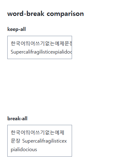
Language and exceptions
Keep-all does not prohibit every line break as nowrap does. Spaces remain opportunities, while a long unbroken group can overflow. Combining keep-all with overflow-wrap: anywhere can provide emergency breaks where required.
Avoid a global break-all fix
Aggressive breaks can make ordinary English words harder to read. Restrict the rule to an appropriate field or code display and compare actual sentences. Hyphenation has separate language and dictionary conditions.
The Korean string is intentional language-specific sample text; the labels and surrounding explanation are English.
Change one setting at a time
Use the complete example file above. Change only the specified selector or value rather than several comparison conditions at once.
- Use the same original text and change only .target’s word-break through normal, keep-all, and break-all, comparing Korean and English. Set lang to the document’s actual main language.
- Word-break:break-word is deprecated compatibility syntax. It is not interchangeable with overflow-wrap:break-word for intrinsic sizing. Select an appropriate overflow-wrap value in new code and restore the original example.
Compare normal first. Temporarily replace the same sample with https://example.com/longunbrokensegment and inspect opportunities inside a URL, then restore the Korean/English text and original keep-all/break-all. Do not generalize URL or CJK (Chinese, Japanese, and Korean) behavior to every language.
For overflow causes and usable scroll regions, see CSS Overflow, Long Text Wrapping, and Ellipsis. Related properties to compare alongside these conditions are word-wrap, white-space.
When the result is missing or unexpected
- Check that white-space: nowrap is not preventing wrapping.
- Compare Korean, English, and a long URL rather than generalizing from one string.

CSS / Reference / text-align: Text, Inline Content, and Block Alignment
Align text by physical or logical sides and distinguish it from centering a block. Inspect justification, final lines, and direction-sensitive layouts.

CSS / Reference / background-size: Cover, Contain, and Background Sizing
Compare background cover and contain using a known image ratio. Account for positioning areas, percentages, cropping, repeated tiles, and the element’s own size.
CSS / Reference / line-height: Unitless Ratios, Inherited Lengths, and Line Boxes
Choose scalable line-height values and compare ratio inheritance with fixed lengths. Separate line boxes from paragraph margins and test larger child text.

CSS / Reference / word-break: Language-Sensitive Breaks Versus Emergency Wrapping
Choose word-breaking behavior for actual scripts and long strings. Compare normal, keep-all, and break-all, and distinguish deprecated break-word from overflow-wrap.
CSS / Reference / content: Generate Pseudo-Element Text and Decoration
Generate strings, attribute labels, counters, and decorative pseudo-elements. Compare none with an empty string and retain important information in real HTML.
CSS / Reference / background-image: Images, Gradients, Relative Paths, and Layers
Paint gradients or image layers, resolve paths from the correct stylesheet location, and keep meaningful pictures in accessible HTML rather than background decoration.
CSS / Reference / overflow: Visible Overflow, Scrolling, Hidden, and Clip
Choose clipping and scrolling behavior with appropriate size constraints. Compare hidden with clip and inspect axis interactions and flex minimum sizes.

CSS / Reference / aspect-ratio: Preferred Ratios, Natural Images, and Constraints
Use preferred aspect ratios with automatic sizing and inspect competing constraints. Distinguish a replaced image’s natural ratio from its CSS box and object-fit behavior.
CSS / Reference / tab-size: Preserved Tabs and Tab-Stop Positions
Set tab stops for real tab characters and inspect their positions. Distinguish editor-generated spaces, whitespace collapsing, and visual wrapping.
CSS / Reference / background-attachment: Viewport, Box, and Internal Scroll Attachment
Compare local and scroll backgrounds inside a scrolling box and distinguish them from viewport-fixed backgrounds. Test target-browser behavior and a usable fallback.