
CSS / Reference / text-align: Text, Inline Content, and Block Alignment
text-align aligns text and inline content within a block. It does not center the block’s own box; start and end follow writing direction, unlike physical left and right.
Syntax and value choices
| Property | Initial value | Inherited | Main application conditions |
|---|---|---|---|
text-align |
start , or a nameless value that acts as left if direction is ltr , right if direction is rtl if start is not supported by the browser. | Yes | Inline content inside block containers |
Initial values are not necessarily the values assigned to HTML elements by the browser’s stylesheet. Inspect the actual result in developer tools’ Computed panel.
.copy { text-align: start; }
.title { text-align: center; }
| Value or category | Behavior and choice |
|---|---|
start / end |
Align to the writing direction’s start or end. |
left / right |
Align to a physical horizontal side. |
center |
Center inline content. |
justify |
Distribute eligible spacing; the last line usually follows separate rules. |
For supported values and conditions, see MDN text-align.
Run the example and compare results
Save this complete code as css-reference-10692-example.html in UTF-8 and open it in a browser. Keep its demonstration styles in that file rather than pasting them into a site-wide stylesheet.
<!doctype html>
<html lang="en">
<head>
<meta charset="utf-8">
<meta name="viewport" content="width=device-width, initial-scale=1">
<title>text-align comparison example</title>
<style>
body { margin: 0; color: #20242b; background: #fff; font: 16px/1.7 "Malgun Gothic", sans-serif; }
#demo { padding: 24px; max-width: 820px; margin: auto; }
h1 { font-size: 22px; margin: 0 0 20px; }
.samples { display: flex; flex-wrap: wrap; gap: 24px; }
.label { margin: 0 0 8px; font-weight: 700; }
.target, .reference { width: 260px; padding: 12px; border: 1px solid #718096; }
.target { text-align: center; }
.reference { text-align: justify; }
</style>
</head>
<body>
<main id="demo">
<h1>text-align comparison</h1>
<section class="samples"><div class="a"><p class="label">center</p><div class="target">Compare alignment within this paragraph. Inspect the gaps in full lines and in a short final line.</div></div><div class="b"><p class="label">justify</p><div class="reference">Compare alignment within this paragraph. Inspect the gaps in full lines and in a short final line.</div></div></section>
</main>
</body>
</html>
Center places each line centrally. Justify adjusts spacing to align line edges, while a short final line normally behaves differently.
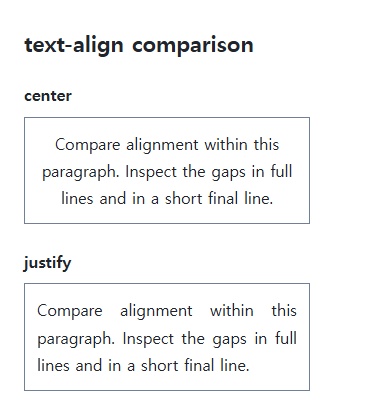
The box versus its inline content
Parent text-align can affect inline and inline-block children but does not automatically center an ordinary block’s width and margins. Use margin-inline: auto or the appropriate layout-container alignment for the block itself.
Justification and readability
A narrow line with long English words can produce large gaps. Inspect language-sensitive wrapping, hyphenation, and width. text-align-last separately controls the final line; choose readable default alignment rather than applying justify everywhere.
Change one setting at a time
Use the complete example file above. Change only the specified selector or value rather than several comparison conditions at once.
- Change only text-align among start, end, center, and justify on the same paragraph. Inspect the first and last lines, then test text-align-last separately and restore it.
- Use suitable directional content to compare start/end with left/right under dir="rtl", then restore the original direction. Test centering the block separately with margin-inline:auto.
Add dir="rtl" to the first file’s .target start tag and replace its content with the Arabic sentence below. Change only text-align among start, end, left, and right. Start follows the right edge and end the left; left/right remain physical. Restore the original direction and content afterward.
<div class="target" dir="rtl" lang="ar">هذا نص عربي لمقارنة محاذاة الفقرة واتجاه الكتابة.</div>
Block centering is a separate condition. Temporarily remove the first file’s Flex layout on .samples, apply margin-inline:auto to .target, inspect its containing content area, then restore both changes.
For coordinated font sizing, line heights, and typeface choices, see CSS Fonts, Font Sizes, and Line Height. Related properties to compare alongside these conditions are word-break, text-indent.
When the result is missing or unexpected
- Identify whether the alignment target is the box or its inline content.
- Inspect available width and language before masking justification gaps with global break-all.

CSS / Reference / empty-cells: Show or Hide Empty Table Cells
Control empty-cell borders and backgrounds in a separated table while preserving its structure. Compare show, hide, whitespace, and the collapsed-border exception.

CSS / Reference / overflow: Visible Overflow, Scrolling, Hidden, and Clip
Choose clipping and scrolling behavior with appropriate size constraints. Compare hidden with clip and inspect axis interactions and flex minimum sizes.

CSS / Reference / text-indent: First-Line Indents and Hanging Paragraphs
Create first-line and hanging indents, distinguish them from paragraph padding, and check inheritance, writing direction, and narrow-screen clipping.

CSS / Reference / border-width: Side Widths, Shorthand Order, and Box Size
Set border widths using valid lengths and shorthand ordering. Inspect none, box-sizing, and hover changes without treating keyword widths as fixed pixels.
CSS / Reference / border-spacing: Separate Cell Gaps and Collapsed Borders
Set horizontal and vertical gaps in separate-border tables. Distinguish cell padding, zero spacing, collapsed borders, and browser default styles.

CSS / Reference / box-sizing: Content and Border Boxes, Including Small-Size Limits
Calculate content-box and border-box sizes, including margins and the minimum content-size limit. Apply resets deliberately and check external components.

CSS / Reference / background-image: Images, Gradients, Relative Paths, and Layers
Paint gradients or image layers, resolve paths from the correct stylesheet location, and keep meaningful pictures in accessible HTML rather than background decoration.
CSS / Reference / background-color: Background Alpha, Inheritance, and Contrast
Set a background or a partly transparent color without fading the text. Distinguish transparency from inheritance and provide readable image fallbacks.
CSS / Reference / box-shadow: Offsets, Blur, Spread, and Inset Shadows
Build box shadows from offsets, blur, and spread, then inspect clipping and layering. Distinguish box geometry from glyph or transparent-image shadows.
CSS / Reference / text-shadow: Glyph Shadows, Layers, and Contrast
Add text shadows without box-shadow-only syntax. Compare blur and layer order, preserve legibility, and avoid treating decoration as a contrast guarantee.