
CSS / Reference / border-width: Side Widths, Shorthand Order, and Box Size
border-width specifies the widths of the four border sides. The style must allow a border to paint; width alone does not create a border when the style is none.
Syntax and value choices
| Property | Initial value | Inherited | Main application conditions |
|---|---|---|---|
border-width |
medium (all sides; computed width is zero for none/hidden) | No | All elements; visible effects depend on the text, image, or box conditions below |
Initial values are not necessarily the values assigned to HTML elements by the browser’s stylesheet. Inspect the actual result in developer tools’ Computed panel.
.box { border-style: solid; border-width: 2px 6px 10px 14px; }
| Value or category | Behavior and choice |
|---|---|
2px |
Use the same width on all sides. |
2px 6px |
Set top/bottom and left/right respectively. |
2px 6px 10px |
Set top, left/right, and bottom. |
thin / medium / thick |
Browser-defined widths, not universal fixed pixel values. |
For supported values and conditions, see MDN border-width.
Run the example and compare results
Save this complete code as css-reference-13769-example.html in UTF-8 and open it in a browser. Keep its demonstration styles in that file rather than pasting them into a site-wide stylesheet.
<!doctype html>
<html lang="en">
<head>
<meta charset="utf-8">
<meta name="viewport" content="width=device-width, initial-scale=1">
<title>border-width comparison example</title>
<style>
body { margin: 0; color: #20242b; background: #fff; font: 16px/1.7 "Malgun Gothic", sans-serif; }
#demo { padding: 24px; max-width: 820px; margin: auto; }
h1 { font-size: 22px; margin: 0 0 20px; }
.samples { display: flex; flex-wrap: wrap; gap: 24px; }
.label { margin: 0 0 8px; font-weight: 700; }
.target, .reference { width: 220px; padding: 12px; border-style: solid; border-color: #006c9c; }
.target { border-width: 2px 6px 10px 14px; }
.reference { border-width: 2px; }
</style>
</head>
<body>
<main id="demo">
<h1>border-width comparison</h1>
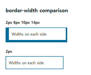
<section class="samples"><div class="a"><p class="label">2px 6px 10px 14px</p><div class="target">Widths on each side</div></div><div class="b"><p class="label">2px</p><div class="reference">Widths on each side</div></div></section>
</main>
</body>
</html>
The first box’s left border is widest and its top border narrowest. The second uses the same width on every side.
Nonnegative lengths rather than percentages
Use supported nonnegative lengths or width keywords. A percentage of the box is not border-width syntax. With none or hidden styles, the computed border width can be zero despite a specified width.
Width changes and box size
Content-box adds border widths outside width; border-box includes them inside its declared size. If a hover width change moves neighbors, consider an outline or shadow when that alternative fits the design.
Change one setting at a time
Use the complete example file above. Change only the specified selector or value rather than several comparison conditions at once.
- Change only .target’s border-width through one, two, three, and four values, mapping the result to top, right, bottom, and left.
- Check the zero computed width under border-style:none. A hover border change can shift layout, so compare an outline or shadow when appropriate and restore the original values.
| Count | Top | Right | Bottom | Left |
|---|---|---|---|---|
| 1: 2px | 2 | 2 | 2 | 2 |
| 2: 2px 6px | 2 | 6 | 2 | 6 |
| 3: 2px 6px 10px | 2 | 6 | 10 | 6 |
| 4: 2px 6px 10px 14px | 2 | 6 | 10 | 14 |
Table numbers are in px. Append these rules to the first file’s style element and compare outer geometry before and during hover. Then replace the hover rule with border-width:2px; outline:6px solid #006c9c: the outline does not enlarge layout space. Remove the temporary rules afterward.
.target { border-width:2px; }
.target:hover { border-width:8px; }
For using borders and shadows together on components, see CSS Borders, Rounded Corners, and Shadows. Related properties to compare alongside these conditions are box-sizing, border-style.
When the result is missing or unexpected
- Inspect side-specific declarations when one edge differs unexpectedly.
- Compare full geometry and box-sizing when a width change shifts the layout.

CSS / Reference / letter-spacing, word-spacing: Compare Character and Word Spacing
Adjust character and word gaps independently using the same text and a normal baseline. Account for inheritance, language, wrapping, and excessive negative spacing.

CSS / Reference / align-content: Flex Lines, Grid Tracks, and Available Space
Distribute available space in flex, grid, and supported block layouts. Compare wrap with nowrap, fixed with auto tracks, and content-group alignment with item alignment.

CSS / Reference / border-width: Side Widths, Shorthand Order, and Box Size
Set border widths using valid lengths and shorthand ordering. Inspect none, box-sizing, and hover changes without treating keyword widths as fixed pixels.
CSS / Reference / text-decoration: Decoration Propagation, Underlines, and Link Meaning
Style text decoration and compare parent-originated lines with child rules. Keep links identifiable and separate meaningful deletions from visual strike-through.
CSS / Reference / font-style: Italic, Oblique, and Available Font Faces
Request italic or oblique forms while accounting for real faces and synthesis. Separate visual styling from emphasis semantics and inspect font-loading failures.

CSS / Reference / aspect-ratio: Preferred Ratios, Natural Images, and Constraints
Use preferred aspect ratios with automatic sizing and inspect competing constraints. Distinguish a replaced image’s natural ratio from its CSS box and object-fit behavior.
CSS / Reference / text-indent: First-Line Indents and Hanging Paragraphs
Create first-line and hanging indents, distinguish them from paragraph padding, and check inheritance, writing direction, and narrow-screen clipping.

CSS / Reference / background-image: Images, Gradients, Relative Paths, and Layers
Paint gradients or image layers, resolve paths from the correct stylesheet location, and keep meaningful pictures in accessible HTML rather than background decoration.
CSS / Reference / background-attachment: Viewport, Box, and Internal Scroll Attachment
Compare local and scroll backgrounds inside a scrolling box and distinguish them from viewport-fixed backgrounds. Test target-browser behavior and a usable fallback.

CSS / Reference / list-style-position: Inside and Outside Markers on Wrapped Items
Choose marker placement using wrapped text, list spacing, and actual child structure. Preserve list meaning and diagnose clipped outside markers.