
CSS / Reference / align-content: Flex Lines, Grid Tracks, and Available Space
align-content distributes available space around flex lines, grid tracks, or supported block content. It is different from aligning individual items, and it has no effect on a nowrap flex container.
Syntax and value choices
| Property | Initial value | Inherited | Main application conditions |
|---|---|---|---|
align-content |
normal | No | Grid tracks, wrapping Flex lines, and supported blocks; ineffective in nowrap Flex |
Initial values are not necessarily the values assigned to HTML elements by the browser’s stylesheet. Inspect the actual result in developer tools’ Computed panel.
.grid { display: grid; grid-template-columns: repeat(2, 80px); grid-auto-rows: 40px; height: 220px; align-content: space-between; }
| Value or category | Behavior and choice |
|---|---|
start / end / center |
Place the content group at an edge or center. |
space-between |
Distribute additional space between lines or tracks. |
space-around / space-evenly |
Distribute surrounding space using different gap relationships. |
stretch |
Expand eligible lines or tracks. |
normal |
Use layout-dependent behavior; it is not universally identical to stretch. |
For supported values and conditions, see MDN align-content.
Run the example and compare results
Save this complete code as css-reference-12377-example.html in UTF-8 and open it in a browser. Keep its demonstration styles in that file rather than pasting them into a site-wide stylesheet.
<!doctype html>
<html lang="en">
<head>
<meta charset="utf-8">
<meta name="viewport" content="width=device-width, initial-scale=1">
<title>align-content comparison example</title>
<style>
body { margin: 0; color: #20242b; background: #fff; font: 16px/1.7 "Malgun Gothic", sans-serif; }
#demo { padding: 24px; max-width: 820px; margin: auto; }
h1 { font-size: 22px; margin: 0 0 20px; }
.samples { display: flex; flex-wrap: wrap; gap: 24px; }
.label { margin: 0 0 8px; font-weight: 700; }
.target, .reference { display: grid; grid-template-columns: repeat(2, 80px); grid-auto-rows: 40px; gap: 8px; width: 180px; height: 220px; border: 1px solid #718096; }
.target { align-content: space-between; }
.reference { align-content: center; }
.item { background: #bfe3ff; text-align: center; }
</style>
</head>
<body>
<main id="demo">
<h1>align-content comparison</h1>
<section class="samples"><div class="a"><p class="label">space-between</p><div class="target"><div class="item">1</div><div class="item">2</div><div class="item">3</div><div class="item">4</div></div></div><div class="b"><p class="label">center</p><div class="reference"><div class="item">1</div><div class="item">2</div><div class="item">3</div><div class="item">4</div></div></div></section>
</main>
</body>
</html>
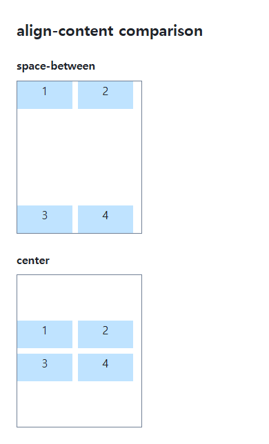
Space-between separates the two fixed-height grid rows; center keeps their group in the middle. The declared gap and additional distributed space are separate quantities.
Flex lines and the cross axis
Flex direction determines the cross axis. A wrap container can use line-distribution behavior, while nowrap cannot. Align-items and align-self control an item within its line, rather than distributing the lines as a group.
Remaining space and stretch conditions
A container fitting its contents has little space to distribute. Grid stretch can enlarge eligible auto tracks but does not turn a fixed 40px row into an auto-sized row. Inspect the actual layout and browser support for block alignment.
Compare Flex lines, Grid tracks, and block content
Save this complete document as css-reference-12377-practice.html in UTF-8 and open it in a browser. Test it as a separate file rather than nesting it inside another example.
<!doctype html>
<html lang="en">
<head>
  <meta charset="utf-8">
  <meta name="viewport" content="width=device-width, initial-scale=1">
  <title>Compare Flex lines, Grid tracks, and block content</title>
  <style>
    body { margin: 16px; color: #20242b; font: 16px/1.7 sans-serif; }
    main { max-width: 52rem; margin: auto; }
    h1 { font-size: 1.35rem; }
    .samples { display: flex; flex-wrap: wrap; gap: 24px; }
    .samples > * { max-width: 100%; min-width: 0; }
    :focus-visible { outline: 3px solid #005fcc; outline-offset: 3px; }
.container { width:180px;height:200px;border:2px solid #718096;background:#e6f2ff;margin-bottom:20px;gap:8px;align-content:center;overflow-x:auto; } .container > div {background:#ffd166;} .flex {display:flex;align-items:flex-start;} .flex > div {flex:0 0 80px;height:40px;} .wrap {flex-wrap:wrap;} .grid {display:grid;grid-template-columns:1fr 1fr;grid-template-rows:40px 40px;} .stretch {align-content:stretch;grid-template-rows:auto auto;} .block {align-content:center;}
  </style>
</head>
<body>
<main>
  <h1>Compare Flex lines, Grid tracks, and block content</h1>
<p>Flex nowrap</p><div class="container flex"><div>A</div><div>B</div><div>C</div><div>D</div></div><p>Flex wrap</p><div class="container flex wrap"><div>A</div><div>B</div><div>C</div><div>D</div></div><p>Grid: 40px tracks / center</p><div class="container grid"><div>A</div><div>B</div><div>C</div><div>D</div></div><p>Grid: auto tracks / stretch</p><div class="container grid stretch"><div>A</div><div>B</div><div>C</div><div>D</div></div><p>Ordinary block / center</p><div class="container block"><p>Text in a block</p></div>
</main>
</body>
</html>
Align-content does not distribute lines in nowrap Flex; wrapping Flex can distribute cross-axis free space. Do not treat a wrap container with one actual line as identical to nowrap. Fixed 40px Grid tracks center as a group, while auto tracks can stretch. Verify ordinary-block alignment in target browsers. Change only each container’s align-content to start, compare, and restore it.
For Grid tracks and auto sizing, see CSS Grid Basics: Tracks, Lines, and Item Placement.
Align-items sets item alignment within each line or cell; align-self overrides an individual item. Keep align-content:center on the wrapping Flex container and change only align-items to center, then restore flex-start. Equal 40px item and line heights can hide the difference; temporarily make only the second item 20px tall, repeat the comparison, then restore both values.
For axes and free-space alignment in an actual Flex layout, see Flexbox Alignment, Wrapping, gap, grow, and shrink.
When the result is missing or unexpected
- Check flex-wrap and cross-axis size when flex alignment seems ineffective.
- Distinguish placing the group from aligning items inside it.

CSS / Reference / font-size: Understand px, em, rem, and Text Enlargement
Choose text-size units by their reference and test nested em scaling. Check the actual root size, browser enlargement, and layout constraints.
CSS / Reference / font-family: Font Lists, Glyph Fallback, and Loading
Build a font stack with appropriate generic fallbacks and inspect the fonts actually used. Distinguish naming a family from loading files and covering characters.

CSS / Reference / box-shadow: Offsets, Blur, Spread, and Inset Shadows
Build box shadows from offsets, blur, and spread, then inspect clipping and layering. Distinguish box geometry from glyph or transparent-image shadows.
CSS / Reference / opacity: Group Transparency, Background Alpha, and Interaction
Fade an element and its children or make only its background translucent. Check stacking, contrast, keyboard focus, and the difference between transparency and hiding.

CSS / Reference / calc(): Calculate CSS Values and Understand Their Types
Combine percentages and lengths with calc(), inspect the actual parent width, and distinguish invalid expressions from newer typed arithmetic and special numeric results.

CSS / Reference / background-position: Percentages, Centers, and Edge Offsets
Position backgrounds using centers, percentages, or edge offsets. Calculate percentages from the remaining space and account for oversized cover images and multiple layers.
CSS / Reference / border-width: Side Widths, Shorthand Order, and Box Size
Set border widths using valid lengths and shorthand ordering. Inspect none, box-sizing, and hover changes without treating keyword widths as fixed pixels.
CSS / Reference / font-variant: Small Capitals and Font Features
Use small capitals without changing the source string and choose specific variant longhands. Compare real font support with synthesized presentation.

CSS / Reference / word-wrap: Legacy Alias and Min-Content Wrapping
Use overflow-wrap to manage long strings and understand the word-wrap alias. Compare anywhere with break-word in intrinsic sizing and flex or grid layouts.
CSS / Reference / background-repeat: Tiling, Space, and Round
Control horizontal and vertical background tiling and compare repeat, no-repeat, space, and round with the same tile and positioning area.