
CSS / Reference / background-repeat: Tiling, Space, and Round
background-repeat sets background tiling on each axis. Use no-repeat for one tile, repeat-x for horizontal repetition, or repeat-y for vertical repetition.
Syntax and value choices
| Property | Initial value | Inherited | Main application conditions |
|---|---|---|---|
background-repeat |
repeat | No | All elements; visible effects depend on the text, image, or box conditions below |
Initial values are not necessarily the values assigned to HTML elements by the browser’s stylesheet. Inspect the actual result in developer tools’ Computed panel.
.pattern { background-repeat: repeat; }
.hero { background-repeat: no-repeat; }
| Value or category | Behavior and choice |
|---|---|
repeat |
Repeat on both axes. |
repeat-x / repeat-y |
Repeat horizontally / vertically. |
no-repeat |
Paint a single tile. |
space / round |
Distribute tile gaps / adjust tile size to fit whole tiles. |
For supported values and conditions, see MDN background-repeat.
Run the example and compare results
Save this complete code as css-reference-10571-example.html in UTF-8 and open it in a browser. Keep its demonstration styles in that file rather than pasting them into a site-wide stylesheet.
<!doctype html>
<html lang="en">
<head>
<meta charset="utf-8">
<meta name="viewport" content="width=device-width, initial-scale=1">
<title>background-repeat comparison example</title>
<style>
body { margin: 0; color: #20242b; background: #fff; font: 16px/1.7 "Malgun Gothic", sans-serif; }
#demo { padding: 24px; max-width: 820px; margin: auto; }
h1 { font-size: 22px; margin: 0 0 20px; }
.samples { display: flex; flex-wrap: wrap; gap: 24px; }
.label { margin: 0 0 8px; font-weight: 700; }
.target, .reference { width: 240px; height: 150px; border: 12px dashed #718096; padding: 20px; background-color: #eaf2f8; background-image: url("data:image/svg+xml,%3Csvg xmlns='http://www.w3.org/2000/svg' width='160' height='80'%3E%3Crect width='160' height='80' fill='%23006c9c'/%3E%3Ccircle cx='40' cy='40' r='24' fill='%23ffd166'/%3E%3C/svg%3E"); background-repeat: no-repeat; }
.target, .reference { background-size: 80px 40px; }
.target { background-repeat: repeat; }
.reference { background-repeat: no-repeat; }

/* Keep the practice box within a narrow viewport. */
.target, .reference { max-width: calc(100vw - 48px - 64px); }
</style>
</head>
<body>
<main id="demo">
<h1>background-repeat comparison</h1>
<section class="samples"><div class="a"><p class="label">repeat</p><div class="target"></div></div><div class="b"><p class="label">no-repeat</p><div class="reference"></div></div></section>
</main>
</body>
</html>
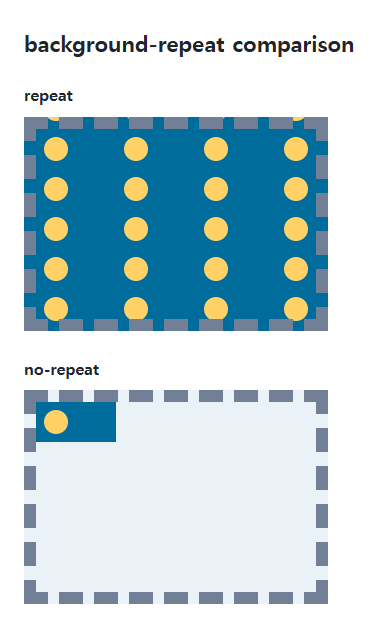
The first box repeats the same shape; the second paints it once. Changing tile size changes how many repetitions fit.
Two axes and several layers
Two values specify horizontal then vertical behavior. repeat no-repeat is the two-axis form corresponding to repeat-x. Separate repeat settings with commas when using several background images.
Space versus round
space distributes remaining room between whole tiles when possible. round changes tile dimensions to fit an integer count. Inspect both background-size and image ratio, especially when only one tile can fit.
When tiles do not fit evenly
Save this complete document as css-reference-10571-practice.html in UTF-8 and open it in a browser. Test it as a separate file rather than nesting it inside another example.
<!doctype html>
<html lang="en">
<head>
  <meta charset="utf-8">
  <meta name="viewport" content="width=device-width, initial-scale=1">
  <title>When tiles do not fit evenly</title>
  <style>
    body { margin: 16px; color: #20242b; font: 16px/1.7 sans-serif; }
    main { max-width: 52rem; margin: auto; }
    h1 { font-size: 1.35rem; }
    .samples { display: flex; flex-wrap: wrap; gap: 24px; }
    .samples > * { max-width: 100%; min-width: 0; }
    :focus-visible { outline: 3px solid #005fcc; outline-offset: 3px; }
.tile { width:220px;height:120px;max-width:100%;background-color:#e6f2ff;background-image:url("data:image/svg+xml,%3Csvg xmlns='http://www.w3.org/2000/svg' width='80' height='40'%3E%3Crect width='80' height='40' fill='%23006c9c'/%3E%3Ccircle cx='20' cy='20' r='12' fill='%23ffd166'/%3E%3C/svg%3E");background-size:80px 40px;background-position:center; }
  </style>
</head>
<body>
<main>
  <h1>When tiles do not fit evenly</h1>
<p>repeat</p><div class="tile" style="background-repeat:repeat"></div><p>no-repeat</p><div class="tile" style="background-repeat:no-repeat"></div><p>space</p><div class="tile" style="background-repeat:space"></div><p>round</p><div class="tile" style="background-repeat:round"></div>
</main>
</body>
</html>
Repeat can crop edge tiles; space distributes gaps between whole tiles; round adjusts tile sizes. Change only repeat mode on the same element, retaining the 220px area and 80px tile width. If only one tile fits on an axis under space, inspect position on that axis, then restore the original values.
In this separate comparison, round fits three horizontal tiles into 220px, reducing an 80px tile to about 73.33px. Three 40px tiles already fit vertically. Independent adjustments can change the tile’s intrinsic proportions.
For combining background properties in one practical design, see CSS Background Colors and Images: cover and contain. Related properties to compare alongside these conditions are background-size.
When the result is missing or unexpected
- Check whether a later background shorthand resets the repeat settings.
- Inspect background-size and intrinsic size when the number of tiles is unexpected.

CSS / Reference / letter-spacing, word-spacing: Compare Character and Word Spacing
Adjust character and word gaps independently using the same text and a normal baseline. Account for inheritance, language, wrapping, and excessive negative spacing.

CSS / Reference / calc(): Calculate CSS Values and Understand Their Types
Combine percentages and lengths with calc(), inspect the actual parent width, and distinguish invalid expressions from newer typed arithmetic and special numeric results.
CSS / Reference / font-size: Understand px, em, rem, and Text Enlargement
Choose text-size units by their reference and test nested em scaling. Check the actual root size, browser enlargement, and layout constraints.

CSS / Reference / background-size: Cover, Contain, and Background Sizing
Compare background cover and contain using a known image ratio. Account for positioning areas, percentages, cropping, repeated tiles, and the element’s own size.
CSS / Reference / font-family: Font Lists, Glyph Fallback, and Loading
Build a font stack with appropriate generic fallbacks and inspect the fonts actually used. Distinguish naming a family from loading files and covering characters.
CSS / Reference / font-variant: Small Capitals and Font Features
Use small capitals without changing the source string and choose specific variant longhands. Compare real font support with synthesized presentation.
CSS / Reference / content: Generate Pseudo-Element Text and Decoration
Generate strings, attribute labels, counters, and decorative pseudo-elements. Compare none with an empty string and retain important information in real HTML.
CSS / Reference / font-weight: Numeric Weights, Relative Weights, and Font Matching
Request numeric or relative font weights and inspect the supplied faces. Compare static and variable-font behavior without assuming every number produces a unique weight.

CSS / Reference / list-style-type: Change List Markers and Numbering
Style list markers while keeping ordered and unordered semantics. Compare numbering styles, starting values, marker removal, and shorthand resets.
CSS / Reference / font-style: Italic, Oblique, and Available Font Faces
Request italic or oblique forms while accounting for real faces and synthesis. Separate visual styling from emphasis semantics and inspect font-loading failures.