
CSS / Reference / background-size: Cover, Contain, and Background Sizing
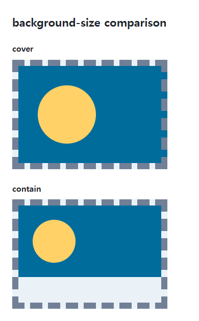
background-size sets a background image’s displayed size. cover preserves its ratio while filling the positioning area, possibly cropping it; contain fits the entire image and can leave unused space.
Syntax and value choices
| Property | Initial value | Inherited | Main application conditions |
|---|---|---|---|
background-size |
auto auto | No | All elements; visible effects depend on the text, image, or box conditions below |
Initial values are not necessarily the values assigned to HTML elements by the browser’s stylesheet. Inspect the actual result in developer tools’ Computed panel.
.hero { background-size: cover; background-position: center; }
.logo { background-size: contain; background-repeat: no-repeat; }
| Value or category | Behavior and choice |
|---|---|
auto |
Use intrinsic size and ratio where available. |
120px auto |
Set width to 120px and preserve the ratio when possible. |
100% 100% |
Size both axes to the positioning area, potentially distorting the image. |
cover / contain |
Fill the area / fit the whole image while preserving its ratio. |
For supported values and conditions, see MDN background-size.
Run the example and compare results
Save this complete code as css-reference-10559-example.html in UTF-8 and open it in a browser. Keep its demonstration styles in that file rather than pasting them into a site-wide stylesheet.
<!doctype html>
<html lang="en">
<head>
<meta charset="utf-8">
<meta name="viewport" content="width=device-width, initial-scale=1">
<title>background-size comparison example</title>
<style>
body { margin: 0; color: #20242b; background: #fff; font: 16px/1.7 "Malgun Gothic", sans-serif; }
#demo { padding: 24px; max-width: 820px; margin: auto; }
h1 { font-size: 22px; margin: 0 0 20px; }
.samples { display: flex; flex-wrap: wrap; gap: 24px; }
.label { margin: 0 0 8px; font-weight: 700; }
.target, .reference { width: 240px; height: 150px; border: 12px dashed #718096; padding: 20px; background-color: #eaf2f8; background-image: url("data:image/svg+xml,%3Csvg xmlns='http://www.w3.org/2000/svg' width='160' height='80'%3E%3Crect width='160' height='80' fill='%23006c9c'/%3E%3Ccircle cx='40' cy='40' r='24' fill='%23ffd166'/%3E%3C/svg%3E"); background-repeat: no-repeat; }
.target { background-size: cover; }
.reference { background-size: contain; }

/* Keep the practice box within a narrow viewport. */
.target, .reference { max-width: calc(100vw - 48px - 64px); }
</style>
</head>
<body>
<main id="demo">
<h1>background-size comparison</h1>
<section class="samples"><div class="a"><p class="label">cover</p><div class="target"></div></div><div class="b"><p class="label">contain</p><div class="reference"></div></div></section>
</main>
</body>
</html>
The built-in shape has a 160:80 ratio. Cover may crop it; contain leaves space when the area has a different ratio.
Percentages and a single size
Two values mean width then height. With one size, height is auto. Percentages use the background positioning area, whose box depends on background-origin, rather than the image’s original pixel size.
Image type and important content
Adjust background-position if a crop removes an important part. A background does not create an element’s height. Separate layer sizes with commas, and remember that gradients have no photographic intrinsic dimensions.
Change one setting at a time
Use the complete example file above. Change only the specified selector or value rather than several comparison conditions at once.
- In the wide original example, the default padding-box positioning area is 240+40=280px wide and 150+40=190px high.
- For the 2:1 image, that area gives 380×190px with cover and 280×140px with contain. A narrower content width changes those numbers. Change only background-position to center, compare cropping, and restore left top.
For combining background properties in one practical design, see CSS Background Colors and Images: cover and contain. Related properties to compare alongside these conditions are background-position, background-origin.
When the result is missing or unexpected
- Check the element’s size and the image request before adjusting its background size.
- Use no-repeat when contain leaves space that should stay unfilled.

CSS / Reference / background-size: Cover, Contain, and Background Sizing
Compare background cover and contain using a known image ratio. Account for positioning areas, percentages, cropping, repeated tiles, and the element’s own size.

CSS / Reference / font-style: Italic, Oblique, and Available Font Faces
Request italic or oblique forms while accounting for real faces and synthesis. Separate visual styling from emphasis semantics and inspect font-loading failures.
CSS / Reference / letter-spacing, word-spacing: Compare Character and Word Spacing
Adjust character and word gaps independently using the same text and a normal baseline. Account for inheritance, language, wrapping, and excessive negative spacing.
CSS / Reference / quotes: Choose Nested Quotation Marks
Choose generated quotation pairs for nested text and distinguish them from literal punctuation. Compare automatic marks, none, and quotation-depth operations.
CSS / Reference / background-repeat: Tiling, Space, and Round
Control horizontal and vertical background tiling and compare repeat, no-repeat, space, and round with the same tile and positioning area.
CSS / Reference / font-size: Understand px, em, rem, and Text Enlargement
Choose text-size units by their reference and test nested em scaling. Check the actual root size, browser enlargement, and layout constraints.

CSS / Reference / list-style-type: Change List Markers and Numbering
Style list markers while keeping ordered and unordered semantics. Compare numbering styles, starting values, marker removal, and shorthand resets.
CSS / Reference / font-variant: Small Capitals and Font Features
Use small capitals without changing the source string and choose specific variant longhands. Compare real font support with synthesized presentation.
CSS / Reference / font-weight: Numeric Weights, Relative Weights, and Font Matching
Request numeric or relative font weights and inspect the supplied faces. Compare static and variable-font behavior without assuming every number produces a unique weight.

CSS / Reference / calc(): Calculate CSS Values and Understand Their Types
Combine percentages and lengths with calc(), inspect the actual parent width, and distinguish invalid expressions from newer typed arithmetic and special numeric results.