
CSS / Reference / background-position: Percentages, Centers, and Edge Offsets
background-position places a background image within its positioning area. Percentage positions use the remaining space after subtracting the displayed image size, rather than simply placing its top-left corner at that percentage.
Syntax and value choices
| Property | Initial value | Inherited | Main application conditions |
|---|---|---|---|
background-position |
0% 0% | No | All elements; visible effects depend on the text, image, or box conditions below |
Initial values are not necessarily the values assigned to HTML elements by the browser’s stylesheet. Inspect the actual result in developer tools’ Computed panel.
.hero { background-position: center; }
.icon { background-position: right 12px bottom 8px; }
| Value or category | Behavior and choice |
|---|---|
left top |
Align the top and left edges. |
center / 50% 50% |
Align the centers of the image and positioning area. |
right bottom |
Align the bottom and right edges. |
right 12px bottom 8px |
Offset inward from the right and bottom edges. |
For supported values and conditions, see MDN background-position.
Run the example and compare results
Save this complete code as css-reference-10595-example.html in UTF-8 and open it in a browser. Keep its demonstration styles in that file rather than pasting them into a site-wide stylesheet.
<!doctype html>
<html lang="en">
<head>
<meta charset="utf-8">
<meta name="viewport" content="width=device-width, initial-scale=1">
<title>background-position comparison example</title>
<style>
body { margin: 0; color: #20242b; background: #fff; font: 16px/1.7 "Malgun Gothic", sans-serif; }
#demo { padding: 24px; max-width: 820px; margin: auto; }
h1 { font-size: 22px; margin: 0 0 20px; }
.samples { display: flex; flex-wrap: wrap; gap: 24px; }
.label { margin: 0 0 8px; font-weight: 700; }
.target, .reference { width: 240px; height: 150px; border: 12px dashed #718096; padding: 20px; background-color: #eaf2f8; background-image: url("data:image/svg+xml,%3Csvg xmlns='http://www.w3.org/2000/svg' width='160' height='80'%3E%3Crect width='160' height='80' fill='%23006c9c'/%3E%3Ccircle cx='40' cy='40' r='24' fill='%23ffd166'/%3E%3C/svg%3E"); background-repeat: no-repeat; }
.target, .reference { background-size: 80px 40px; }
.target { background-position: 50% 50%; }
.reference { background-position: right 12px bottom 8px; }

/* Keep the practice box within a narrow viewport. */
.target, .reference { max-width: calc(100vw - 48px - 64px); }
</style>
</head>
<body>
<main id="demo">
<h1>background-position comparison</h1>
<section class="samples"><div class="a"><p class="label">50% 50%</p><div class="target"></div></div><div class="b"><p class="label">Right: 12px / bottom: 8px</p><div class="reference"></div></div></section>
</main>
</body>
</html>
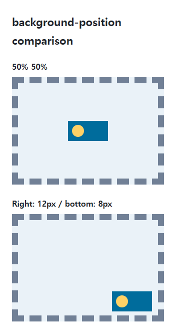
The first shape is centered. The second is placed at specified distances from the right and bottom edges; the image’s own size participates in that placement.
Percentage positions are not ordinary coordinates
For a horizontal percentage, calculate against area width minus image width. Equal widths leave no horizontal space, so 0%, 50%, and 100% can coincide. An oversized cover image creates negative remaining space and changes the crop.
One value and several backgrounds
Some single-value forms center the other axis. Specify both axes when placement is important, or use explicit edge offsets. Use comma-separated positions corresponding to the image-layer order.
Calculate percentage positioning offsets
Save this complete document as css-reference-10595-practice.html in UTF-8 and open it in a browser. Test it as a separate file rather than nesting it inside another example.
<!doctype html>
<html lang="en">
<head>
  <meta charset="utf-8">
  <meta name="viewport" content="width=device-width, initial-scale=1">
  <title>Calculate percentage positioning offsets</title>
  <style>
    body { margin: 16px; color: #20242b; font: 16px/1.7 sans-serif; }
    main { max-width: 52rem; margin: auto; }
    h1 { font-size: 1.35rem; }
    .samples { display: flex; flex-wrap: wrap; gap: 24px; }
    .samples > * { max-width: 100%; min-width: 0; }
    :focus-visible { outline: 3px solid #005fcc; outline-offset: 3px; }
.tile { width:240px;max-width:100%;height:100px;padding:0;border:2px solid #718096;background-origin:content-box;background-image:url("data:image/svg+xml,%3Csvg xmlns='http://www.w3.org/2000/svg' width='80' height='40'%3E%3Crect width='80' height='40' fill='%23006c9c'/%3E%3Ccircle cx='20' cy='20' r='12' fill='%23ffd166'/%3E%3C/svg%3E");background-size:80px 40px;background-repeat:no-repeat;background-color:#e6f2ff; }
  </style>
</head>
<body>
<main>
  <h1>Calculate percentage positioning offsets</h1>
<p>0%</p><div class="tile" style="background-position:0% 0"></div><p>50%</p><div class="tile" style="background-position:50% 0"></div><p>100%</p><div class="tile" style="background-position:100% 0"></div>
</main>
</body>
</html>
With this separate example’s 240px content area, the horizontal offset is (240−80)×percentage: 0, 80, or 160px. This differs from the earlier padding-box area. Change only 240px to 200px and expect 0, 60, or 120px, then restore it. If max-width constrains the box, calculate using its actual content width.
| Syntax | Horizontal axis | Vertical axis |
|---|---|---|
right 12px bottom 8px |
12px inward from the right edge | 8px inward from the bottom edge |
left 12px top 8px |
12px from the left | 8px from the top |
12px 8px |
Length from the left | Length from the top |
For combining background properties in one practical design, see CSS Background Colors and Images: cover and contain. Related properties to compare alongside these conditions are background-size, background-origin.
When the result is missing or unexpected
- Check whether the image and area have the same size when position changes appear ineffective.
- Temporarily use no-repeat if repeated tiles obscure the placement change.

CSS / Reference / background-position: Percentages, Centers, and Edge Offsets
Position backgrounds using centers, percentages, or edge offsets. Calculate percentages from the remaining space and account for oversized cover images and multiple layers.

CSS / Reference / font-weight: Numeric Weights, Relative Weights, and Font Matching
Request numeric or relative font weights and inspect the supplied faces. Compare static and variable-font behavior without assuming every number produces a unique weight.
CSS / Reference / font-family: Font Lists, Glyph Fallback, and Loading
Build a font stack with appropriate generic fallbacks and inspect the fonts actually used. Distinguish naming a family from loading files and covering characters.
CSS / Reference / background-clip: Background Painting Areas and Text Clipping
Choose border, padding, or content painting areas independently of image positioning. Compare visible boundaries and plan readable fallbacks for text-clipped backgrounds.
CSS / Reference / font-style: Italic, Oblique, and Available Font Faces
Request italic or oblique forms while accounting for real faces and synthesis. Separate visual styling from emphasis semantics and inspect font-loading failures.
CSS / Reference / background-size: Cover, Contain, and Background Sizing
Compare background cover and contain using a known image ratio. Account for positioning areas, percentages, cropping, repeated tiles, and the element’s own size.

CSS / Reference / calc(): Calculate CSS Values and Understand Their Types
Combine percentages and lengths with calc(), inspect the actual parent width, and distinguish invalid expressions from newer typed arithmetic and special numeric results.

CSS / Reference / empty-cells: Show or Hide Empty Table Cells
Control empty-cell borders and backgrounds in a separated table while preserving its structure. Compare show, hide, whitespace, and the collapsed-border exception.
CSS / Reference / letter-spacing, word-spacing: Compare Character and Word Spacing
Adjust character and word gaps independently using the same text and a normal baseline. Account for inheritance, language, wrapping, and excessive negative spacing.
CSS / Reference / quotes: Choose Nested Quotation Marks
Choose generated quotation pairs for nested text and distinguish them from literal punctuation. Compare automatic marks, none, and quotation-depth operations.