
CSS / Reference / opacity: Group Transparency, Background Alpha, and Interaction
opacity controls the opacity of an element composited together with its descendants. Use a background color’s alpha instead when only the background should fade and text should remain opaque.
Syntax and value choices
| Property | Initial value | Inherited | Main application conditions |
|---|---|---|---|
opacity |
1 | No | All elements; visible effects depend on the text, image, or box conditions below |
Initial values are not necessarily the values assigned to HTML elements by the browser’s stylesheet. Inspect the actual result in developer tools’ Computed panel.
.faded { opacity: 0.5; }
.background-only { background-color: rgb(0 108 156 / 50%); }
| Value or category | Behavior and choice |
|---|---|
1 |
Fully opaque. |
0.5 |
Composite the element and its descendants at partial opacity. |
0 |
Invisible painting; layout and interaction do not automatically disappear. |
Out-of-range values |
The used opacity is limited to its permitted range. |
For supported values and conditions, see MDN opacity.
Run the example and compare results
Save this complete code as css-reference-10646-example.html in UTF-8 and open it in a browser. Keep its demonstration styles in that file rather than pasting them into a site-wide stylesheet.
<!doctype html>
<html lang="en">
<head>
<meta charset="utf-8">
<meta name="viewport" content="width=device-width, initial-scale=1">
<title>opacity comparison example</title>
<style>
body { margin: 0; color: #20242b; background: #fff; font: 16px/1.7 "Malgun Gothic", sans-serif; }
#demo { padding: 24px; max-width: 820px; margin: auto; }
h1 { font-size: 22px; margin: 0 0 20px; }
.samples { display: flex; flex-wrap: wrap; gap: 24px; }
.label { margin: 0 0 8px; font-weight: 700; }
.samples { background: #ffd166; padding: 16px; }
.target, .reference { width: 220px; padding: 20px; background: #006c9c; color: white; }
.target { opacity: 0.5; }
.reference { background: rgb(0 108 156 / 50%); }
</style>
</head>
<body>
<main id="demo">
<h1>opacity comparison</h1>
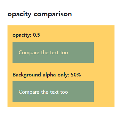
<section class="samples"><div class="a"><p class="label">opacity: 0.5</p><div class="target">Compare the text too</div></div><div class="b"><p class="label">Background alpha only: 50%</p><div class="reference">Compare the text too</div></div></section>
</main>
</body>
</html>
The first box also fades its white text. The second blends only its background with the color behind it; a child opacity of 1 cannot undo a parent’s group opacity.
Transparent is not the same as removed
An opacity-zero element can still occupy space, receive clicks, and appear in keyboard navigation. Choose hidden, display, visibility, or another appropriate state mechanism according to the actual requirement.
Stacking and readable states
Opacity below 1 creates a stacking context, changing how descendant z-index values compete with surrounding elements. Fading also affects text contrast. Do not use faintness as the only indication of a state.
Keyboard interaction remains when transparent
Save this complete document as css-reference-10646-practice.html in UTF-8 and open it in a browser. Test it as a separate file rather than nesting it inside another example.
<!doctype html>
<html lang="en">
<head>
  <meta charset="utf-8">
  <meta name="viewport" content="width=device-width, initial-scale=1">
  <title>Keyboard interaction remains when transparent</title>
  <style>
    body { margin: 16px; color: #20242b; font: 16px/1.7 sans-serif; }
    main { max-width: 52rem; margin: auto; }
    h1 { font-size: 1.35rem; }
    .samples { display: flex; flex-wrap: wrap; gap: 24px; }
    .samples > * { max-width: 100%; min-width: 0; }
    :focus-visible { outline: 3px solid #005fcc; outline-offset: 3px; }
#invisible { opacity:0; } button {margin:8px;padding:10px;} #invisible:focus-visible { opacity:1; }
  </style>
</head>
<body>
<main>
  <h1>Keyboard interaction remains when transparent</h1>
<p>The transparent button is on the left. Tab focus makes it visible for inspection.</p><button id="invisible" type="button">Transparent button</button><button id="visible" type="button">Visible button</button><p id="count" aria-live="polite">0</p><script>let count=0;for(const button of document.querySelectorAll("button")){button.addEventListener("click",()=>{document.getElementById("count").textContent=String(++count);});}</script>
</main>
</body>
</html>
Tab to the transparent button and press Space or Enter to increment the counter. Opacity:0 alone retains layout and interaction. The focus-visible override exists for this demonstration. Temporarily add the hidden attribute in Elements, compare removal of space and interaction, then remove it to restore the sample.
For stacking contexts created by opacity below 1 and their relationship to z-index, see CSS z-index and Stacking Contexts.
Opacity can also reduce text contrast after compositing. Choose hidden, display:none, or visibility:hidden according to required layout, accessibility, and interaction. Visibility:hidden retains space while normally removing the element from focus navigation.
For coordinated font sizing, line heights, and typeface choices, see CSS Fonts, Font Sizes, and Line Height. Related properties to compare alongside these conditions are background-color.
When the result is missing or unexpected
- Compare background alpha if the intended effect should leave text opaque.
- Inspect interaction and focus separately when a transparent button still responds.

CSS / Reference / background-image: Images, Gradients, Relative Paths, and Layers
Paint gradients or image layers, resolve paths from the correct stylesheet location, and keep meaningful pictures in accessible HTML rather than background decoration.

CSS / Reference / caption-side: Place a Table Caption Above or Below
Place captions visually while keeping them first in the table’s source structure. Match caption text to the data and check alignment, width, and writing direction.

CSS / Reference / border-style: Border Patterns, Side Order, and Hidden Conflicts
Choose border patterns for each side and inspect shorthand resets. Compare none with hidden in collapsed tables and account for zero computed border widths.

CSS / Reference / text-indent: First-Line Indents and Hanging Paragraphs
Create first-line and hanging indents, distinguish them from paragraph padding, and check inheritance, writing direction, and narrow-screen clipping.

CSS / Reference / box-sizing: Content and Border Boxes, Including Small-Size Limits
Calculate content-box and border-box sizes, including margins and the minimum content-size limit. Apply resets deliberately and check external components.
CSS / Reference / letter-spacing, word-spacing: Compare Character and Word Spacing
Adjust character and word gaps independently using the same text and a normal baseline. Account for inheritance, language, wrapping, and excessive negative spacing.
CSS / Reference / background-size: Cover, Contain, and Background Sizing
Compare background cover and contain using a known image ratio. Account for positioning areas, percentages, cropping, repeated tiles, and the element’s own size.
CSS / Reference / opacity: Group Transparency, Background Alpha, and Interaction
Fade an element and its children or make only its background translucent. Check stacking, contrast, keyboard focus, and the difference between transparency and hiding.
CSS / Reference / background-color: Background Alpha, Inheritance, and Contrast
Set a background or a partly transparent color without fading the text. Distinguish transparency from inheritance and provide readable image fallbacks.

CSS / Reference / list-style-type: Change List Markers and Numbering
Style list markers while keeping ordered and unordered semantics. Compare numbering styles, starting values, marker removal, and shorthand resets.