
CSS / Reference / accent-color: Native Control Accents and Accessible States
accent-color requests an accent on supported native controls such as checkboxes, radios, ranges, and progress indicators. It does not recolor every part or state of every form control.
Syntax and value choices
| Property | Initial value | Inherited | Main application conditions |
|---|---|---|---|
accent-color |
auto | Yes | Inherited declarations; visible on supported native controls |
Initial values are not necessarily the values assigned to HTML elements by the browser’s stylesheet. Inspect the actual result in developer tools’ Computed panel.
input, progress { accent-color: #006c9c; }
| Value or category | Behavior and choice |
|---|---|
auto |
Let the browser choose an accent. |
A color |
Request an accent for supported parts. |
checkbox / radio |
Common selected-state examples. |
range / progress |
Supported track or progress parts vary by browser. |
For supported values and conditions, see MDN accent-color.
Run the example and compare results
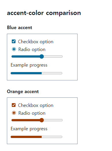
Save this complete code as css-reference-13774-example.html in UTF-8 and open it in a browser. Keep its demonstration styles in that file rather than pasting them into a site-wide stylesheet.
<!doctype html>
<html lang="en">
<head>
<meta charset="utf-8">
<meta name="viewport" content="width=device-width, initial-scale=1">
<title>accent-color comparison example</title>
<style>
body { margin: 0; color: #20242b; background: #fff; font: 16px/1.7 "Malgun Gothic", sans-serif; }
#demo { padding: 24px; max-width: 820px; margin: auto; }
h1 { font-size: 22px; margin: 0 0 20px; }
.samples { display: flex; flex-wrap: wrap; gap: 24px; }
.label { margin: 0 0 8px; font-weight: 700; }
.target, .reference { width: 220px; padding: 12px; border: 1px solid #718096; }
.target { accent-color: #006c9c; }
.reference { accent-color: #a03c00; }
label { display: block; }
input[type="range"], progress { width: 180px; }
</style>
</head>
<body>
<main id="demo">
<h1>accent-color comparison</h1>
<section class="samples"><div class="a"><p class="label">Blue accent</p><div class="target"><label><input type="checkbox" checked> Checkbox option</label><label><input type="radio" name="accent-option" checked> Radio option</label><input type="range" value="60" aria-label="Range value"><label for="progress-1">Example progress</label><progress id="progress-1" value="60" max="100">60%</progress></div></div><div class="b"><p class="label">Orange accent</p><div class="reference"><label><input type="checkbox" checked> Checkbox option</label><label><input type="radio" name="reference-option" checked> Radio option</label><input type="range" value="60" aria-label="Range value"><label for="progress-2">Example progress</label><progress id="progress-2" value="60" max="100">60%</progress></div></div></section>
</main>
</body>
</html>
Compare the supported accent parts. Borders, backgrounds, and unselected states do not necessarily all use the requested color.
Keep native control behavior
Accent-color requests color while retaining native controls. Removing their appearance can also remove the part that displays the accent. Preserving native UI makes it easier to retain keyboard operation and state handling.
Contrast and environmental differences
Browsers can adjust internal marks for contrast. Forced colors, platform themes, and different engines may alter the result. Do not promise exact pixels; label controls and progress indicators and use actual state values.
Change one setting at a time
Use the complete example file above. Change only the specified selector or value rather than several comparison conditions at once.
- Select and clear the checkbox, including with Tab and Space. The radio controls are independent samples with different names. Each progress indicator has a meaningful label.
- Temporarily add disabled, compare color and interaction, then restore it. Appearance:none can remove the accented native part; colors and shapes need not be identical across platforms.
Check the relevant conditions in Accessible names for progress.
For form states, labels, and keyboard focus, see CSS Form States: Focus, Validation, disabled, and readonly. Related properties to compare alongside these conditions are color.
When the result is missing or unexpected
- Compare unselected, selected, and disabled states.
- Check the control type and appearance rules if the color is unchanged.

CSS / Reference / border-style: Border Patterns, Side Order, and Hidden Conflicts
Choose border patterns for each side and inspect shorthand resets. Compare none with hidden in collapsed tables and account for zero computed border widths.

CSS / Reference / background-color: Background Alpha, Inheritance, and Contrast
Set a background or a partly transparent color without fading the text. Distinguish transparency from inheritance and provide readable image fallbacks.

CSS / Reference / text-decoration: Decoration Propagation, Underlines, and Link Meaning
Style text decoration and compare parent-originated lines with child rules. Keep links identifiable and separate meaningful deletions from visual strike-through.
CSS / Reference / text-align: Text, Inline Content, and Block Alignment
Align text by physical or logical sides and distinguish it from centering a block. Inspect justification, final lines, and direction-sensitive layouts.

CSS / Reference / caption-side: Place a Table Caption Above or Below
Place captions visually while keeping them first in the table’s source structure. Match caption text to the data and check alignment, width, and writing direction.

CSS / Reference / accent-color: Native Control Accents and Accessible States
Request native-control accent colors without replacing their behavior. Compare selected and disabled states, accessible names, and browser-dependent contrast treatments.
CSS / Reference / background-position: Percentages, Centers, and Edge Offsets
Position backgrounds using centers, percentages, or edge offsets. Calculate percentages from the remaining space and account for oversized cover images and multiple layers.
CSS / Reference / font-size: Understand px, em, rem, and Text Enlargement
Choose text-size units by their reference and test nested em scaling. Check the actual root size, browser enlargement, and layout constraints.
CSS / Reference / text-shadow: Glyph Shadows, Layers, and Contrast
Add text shadows without box-shadow-only syntax. Compare blur and layer order, preserve legibility, and avoid treating decoration as a contrast guarantee.
CSS / Reference / content: Generate Pseudo-Element Text and Decoration
Generate strings, attribute labels, counters, and decorative pseudo-elements. Compare none with an empty string and retain important information in real HTML.