
CSS / Reference / aspect-ratio: Preferred Ratios, Natural Images, and Constraints
aspect-ratio supplies a preferred width-to-height ratio used in automatic sizing. Setting both dimensions explicitly, or other min/max and layout constraints, can take precedence over that preferred ratio.
Syntax and value choices
| Property | Initial value | Inherited | Main application conditions |
|---|---|---|---|
aspect-ratio |
auto | No | Most sizing boxes; excludes ordinary inline and internal table boxes |
Initial values are not necessarily the values assigned to HTML elements by the browser’s stylesheet. Inspect the actual result in developer tools’ Computed panel.
.video { width: 100%; aspect-ratio: 16 / 9; }
.square { width: 240px; aspect-ratio: 1; }
| Value or category | Behavior and choice |
|---|---|
auto |
Use no specified ratio; a replaced element may have a natural ratio. |
16 / 9 |
Prefer a width-to-height ratio of 16 to 9. |
1 |
Prefer a square. |
auto 16 / 9 |
Use a natural replaced-element ratio when available; otherwise use the specified ratio. |
For supported values and conditions, see MDN aspect-ratio.
Run the example and compare results
Save this complete code as css-reference-13776-example.html in UTF-8 and open it in a browser. Keep its demonstration styles in that file rather than pasting them into a site-wide stylesheet.
<!doctype html>
<html lang="en">
<head>
<meta charset="utf-8">
<meta name="viewport" content="width=device-width, initial-scale=1">
<title>aspect-ratio comparison example</title>
<style>
body { margin: 0; color: #20242b; background: #fff; font: 16px/1.7 "Malgun Gothic", sans-serif; }
#demo { padding: 24px; max-width: 820px; margin: auto; }
h1 { font-size: 22px; margin: 0 0 20px; }
.samples { display: flex; flex-wrap: wrap; gap: 24px; }
.label { margin: 0 0 8px; font-weight: 700; }
.target, .reference { width: 240px; height: auto; background: #bfe3ff; }
.target { aspect-ratio: 16 / 9; }
.reference { aspect-ratio: 1; }
</style>
</head>
<body>
<main id="demo">
<h1>aspect-ratio comparison</h1>
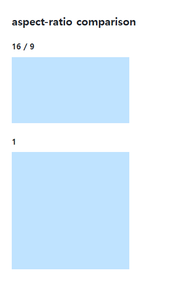
<section class="samples"><div class="a"><p class="label">16 / 9</p><div class="target"></div></div><div class="b"><p class="label">1</p><div class="reference"></div></div></section>
</main>
</body>
</html>
At 240px width, the 16:9 box is 135px high and the square is 240px high. An auto height can change with the width.
A preference rather than a locked size
Width, height, min/max limits, content minimums, and flex or grid constraints influence the final box. A ratio declaration does not rewrite two fixed dimensions to force a match.
Image boxes versus image content
Object-fit determines how an image is placed inside its box: cover can crop and contain can leave space. Natural HTML dimensions and a CSS preferred ratio have different roles. Keep loading placeholders and the final image behavior intentional.
Intrinsic image ratios and preferred CSS ratios
Save this complete document as css-reference-13776-practice.html in UTF-8 and open it in a browser. Test it as a separate file rather than nesting it inside another example.
<!doctype html>
<html lang="en">
<head>
<meta charset="utf-8">
<meta name="viewport" content="width=device-width, initial-scale=1">
<title>Intrinsic image ratios and preferred CSS ratios</title>
<style>
body { margin: 16px; color: #20242b; font: 16px/1.7 sans-serif; }
main { max-width: 52rem; margin: auto; }
h1 { font-size: 1.35rem; }
.samples { display: flex; flex-wrap: wrap; gap: 24px; }
.samples > * { max-width: 100%; min-width: 0; }
:focus-visible { outline: 3px solid #005fcc; outline-offset: 3px; }
.sample {width:240px;max-width:100%;background:#e6f2ff;border:0;} img {display:block;height:auto;} .auto {aspect-ratio:auto 16 / 9;} .crop {aspect-ratio:16 / 9;height:auto;object-fit:cover;} .contain {object-fit:contain;}
</style>
</head>
<body>
<main>
<h1>Intrinsic image ratios and preferred CSS ratios</h1>
<p>Ordinary div: auto 16 / 9</p><div class="sample auto"></div><p>Intrinsic 2:1 image: auto 16 / 9</p><img class="sample auto" src="data:image/svg+xml,%3Csvg xmlns='http://www.w3.org/2000/svg' width='80' height='40'%3E%3Crect width='80' height='40' fill='%23006c9c'/%3E%3Ccircle cx='20' cy='20' r='12' fill='%23ffd166'/%3E%3C/svg%3E" alt="Blue 80 by 40 illustration"><p>16 / 9 + cover</p><img class="sample crop" src="data:image/svg+xml,%3Csvg xmlns='http://www.w3.org/2000/svg' width='80' height='40'%3E%3Crect width='80' height='40' fill='%23006c9c'/%3E%3Ccircle cx='20' cy='20' r='12' fill='%23ffd166'/%3E%3C/svg%3E" alt="Illustration cropped into a 16:9 box"><p>16 / 9 + contain</p><img class="sample crop contain" src="data:image/svg+xml,%3Csvg xmlns='http://www.w3.org/2000/svg' width='80' height='40'%3E%3Crect width='80' height='40' fill='%23006c9c'/%3E%3Ccircle cx='20' cy='20' r='12' fill='%23ffd166'/%3E%3C/svg%3E" alt="Complete 2:1 illustration">
</main>
</body>
</html>
At 240px wide, the ordinary div is 135px tall; the loaded 2:1 image is 120px because auto uses its natural ratio. Without auto, the 16/9 image box is 135px: cover crops and contain leaves space. Change only .sample width to 200px, inspect proportional changes, and restore it. A preferred ratio does not forcibly override two definite dimensions.
In the separate ratio example, adding height:100px to .sample makes both dimensions definite at 240×100px; the preferred ratio does not override them. Restore it, then add only min-height:160px to observe the minimum constraint exceeding 135px. Test each constraint separately and remove it to restore the original.
For responsive image sizing and ratios, see Responsive Images and Video: aspect-ratio and object-fit. Related properties to compare alongside these conditions are box-sizing.
When the result is missing or unexpected
- Inspect height:auto and min/max constraints when the ratio appears wrong.
- Inspect object-fit and the box dimensions if a photo is distorted.

CSS / Reference / opacity: Group Transparency, Background Alpha, and Interaction
Fade an element and its children or make only its background translucent. Check stacking, contrast, keyboard focus, and the difference between transparency and hiding.

CSS / Reference / border-style: Border Patterns, Side Order, and Hidden Conflicts
Choose border patterns for each side and inspect shorthand resets. Compare none with hidden in collapsed tables and account for zero computed border widths.
CSS / Reference / border-width: Side Widths, Shorthand Order, and Box Size
Set border widths using valid lengths and shorthand ordering. Inspect none, box-sizing, and hover changes without treating keyword widths as fixed pixels.

CSS / Reference / align-content: Flex Lines, Grid Tracks, and Available Space
Distribute available space in flex, grid, and supported block layouts. Compare wrap with nowrap, fixed with auto tracks, and content-group alignment with item alignment.

CSS / Reference / white-space: Preserve Spaces, Line Breaks, and Wrapping
Choose whitespace behavior by preservation and wrapping needs. Compare traditional values and break-spaces, and handle long words with separate wrapping properties.
CSS / Reference / overflow: Visible Overflow, Scrolling, Hidden, and Clip
Choose clipping and scrolling behavior with appropriate size constraints. Compare hidden with clip and inspect axis interactions and flex minimum sizes.

CSS / Reference / accent-color: Native Control Accents and Accessible States
Request native-control accent colors without replacing their behavior. Compare selected and disabled states, accessible names, and browser-dependent contrast treatments.

CSS / Reference / calc(): Calculate CSS Values and Understand Their Types
Combine percentages and lengths with calc(), inspect the actual parent width, and distinguish invalid expressions from newer typed arithmetic and special numeric results.

CSS / Reference / border-spacing: Separate Cell Gaps and Collapsed Borders
Set horizontal and vertical gaps in separate-border tables. Distinguish cell padding, zero spacing, collapsed borders, and browser default styles.
CSS / Reference / text-shadow: Glyph Shadows, Layers, and Contrast
Add text shadows without box-shadow-only syntax. Compare blur and layer order, preserve legibility, and avoid treating decoration as a contrast guarantee.