
CSS / Reference / word-wrap: Legacy Alias and Min-Content Wrapping
word-wrap is the legacy alias of overflow-wrap. It permits emergency breaks in otherwise unbreakable text; prefer the overflow-wrap spelling in new code.
Syntax and value choices
| Property | Initial value | Inherited | Main application conditions |
|---|---|---|---|
word-wrap |
normal | Yes | All elements; visible effects depend on the text, image, or box conditions below |
Initial values are not necessarily the values assigned to HTML elements by the browser’s stylesheet. Inspect the actual result in developer tools’ Computed panel.
.content { overflow-wrap: anywhere; }
.legacy { word-wrap: break-word; }
| Value or category | Behavior and choice |
|---|---|
normal |
Use ordinary available line-break opportunities. |
break-word |
Permit emergency breaks without adding them to min-content sizing. |
anywhere |
Also account for those opportunities in min-content sizing. |
word-wrap |
A compatibility alias of overflow-wrap. |
For supported values and conditions, see MDN overflow-wrap.
Run the example and compare results
Save this complete code as css-reference-10661-example.html in UTF-8 and open it in a browser. Keep its demonstration styles in that file rather than pasting them into a site-wide stylesheet.
<!doctype html>
<html lang="en">
<head>
<meta charset="utf-8">
<meta name="viewport" content="width=device-width, initial-scale=1">
<title>word-wrap comparison example</title>
<style>
body { margin: 0; color: #20242b; background: #fff; font: 16px/1.7 "Malgun Gothic", sans-serif; }
#demo { padding: 24px; max-width: 820px; margin: auto; }
h1 { font-size: 22px; margin: 0 0 20px; }
.samples { display: flex; flex-wrap: wrap; gap: 24px; }
.label { margin: 0 0 8px; font-weight: 700; }
.target, .reference { width: 200px; padding: 10px; border: 1px solid #718096; }
.target { overflow-wrap: anywhere; }
.reference { overflow-wrap: normal; }

/* Keep the practice box within a narrow viewport. */
.target, .reference { overflow-x: auto; }
</style>
</head>
<body>
<main id="demo">
<h1>word-wrap comparison</h1>
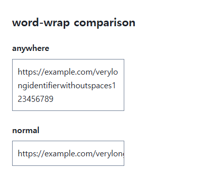
<section class="samples"><div class="a"><p class="label">anywhere</p><div class="target">https://example.com/verylongidentifierwithoutspaces123456789</div></div><div class="b"><p class="label">normal</p><div class="reference">https://example.com/verylongidentifierwithoutspaces123456789</div></div></section>
</main>
</body>
</html>
The anywhere sample breaks a long address as needed. Normal can leave it wider than the box; that intentional overflow is visible through the sample’s scroll area.
Anywhere versus break-word sizing
At a fixed width the two can look alike, but they differ when calculating min-content. That difference can affect flex and grid minimum sizing. Check the container’s own minimum size rather than expecting one text property to solve every layout constraint.
Emergency wrapping is not truncation
Overflow-wrap tries to avoid an unbreakable string’s overflow; it is not the same as aggressive break-all behavior. It does not remove text or add an ellipsis. Test actual URLs and user-entered identifiers.
Min-content widths: anywhere versus break-word
Save this complete document as css-reference-10661-practice.html in UTF-8 and open it in a browser. Test it as a separate file rather than nesting it inside another example.
<!doctype html>
<html lang="en">
<head>
  <meta charset="utf-8">
  <meta name="viewport" content="width=device-width, initial-scale=1">
  <title>Min-content widths: anywhere versus break-word</title>
  <style>
    body { margin: 16px; color: #20242b; font: 16px/1.7 sans-serif; }
    main { max-width: 52rem; margin: auto; }
    h1 { font-size: 1.35rem; }
    .samples { display: flex; flex-wrap: wrap; gap: 24px; }
    .samples > * { max-width: 100%; min-width: 0; }
    :focus-visible { outline: 3px solid #005fcc; outline-offset: 3px; }
.scroll {overflow-x:auto;max-width:100%;} .sample {width:min-content;max-width:none;border:2px solid #006c9c;font-family:monospace;margin-bottom:16px;} .anywhere {overflow-wrap:anywhere;} .break {overflow-wrap:break-word;}
  </style>
</head>
<body>
<main>
  <h1>Min-content widths: anywhere versus break-word</h1>
<div class="scroll"><p>anywhere</p><div class="sample anywhere">https://example.com/averylongunbrokenresourceidentifier</div><p>break-word</p><div class="sample break">https://example.com/averylongunbrokenresourceidentifier</div></div>
</main>
</body>
</html>
Anywhere includes emergency opportunities in min-content sizing, making the first box much narrower; break-word does not. Inspect the wider second box using the inner scrollbar. Change only .break to anywhere, compare the widths, and restore it. Automatic Flex/Grid minima can also matter; decide separately whether min-width:0 is appropriate.
For overflow causes and usable scroll regions, see CSS Overflow, Long Text Wrapping, and Ellipsis. Related properties to compare alongside these conditions are word-break, white-space.
When the result is missing or unexpected
- Check for nowrap and an actual width constraint.
- Inspect whether a flex child needs min-width: 0.

CSS / Reference / color: Foreground Colors, CurrentColor, and Contrast
Set foreground colors and reuse them through currentColor. Inspect inheritance, alpha compositing, readable contrast, and non-color state cues.

CSS / Reference / background-origin: Positioning References Versus Painting Boundaries
Choose a background image’s positioning box and distinguish it from background-clip. Compare how padding, borders, percentage sizes, and fixed attachment affect the reference.

CSS / Reference / empty-cells: Show or Hide Empty Table Cells
Control empty-cell borders and backgrounds in a separated table while preserving its structure. Compare show, hide, whitespace, and the collapsed-border exception.

CSS / Reference / backface-visibility: Front and Back Faces Under 3D Rotation
Choose whether a 3D-transformed back face is painted. Compare front and reverse states and account for accessible interaction when building a multi-face interface.

CSS / Reference / border-width: Side Widths, Shorthand Order, and Box Size
Set border widths using valid lengths and shorthand ordering. Inspect none, box-sizing, and hover changes without treating keyword widths as fixed pixels.
CSS / Reference / background-size: Cover, Contain, and Background Sizing
Compare background cover and contain using a known image ratio. Account for positioning areas, percentages, cropping, repeated tiles, and the element’s own size.

CSS / Reference / accent-color: Native Control Accents and Accessible States
Request native-control accent colors without replacing their behavior. Compare selected and disabled states, accessible names, and browser-dependent contrast treatments.
CSS / Reference / font-size: Understand px, em, rem, and Text Enlargement
Choose text-size units by their reference and test nested em scaling. Check the actual root size, browser enlargement, and layout constraints.
CSS / Reference / letter-spacing, word-spacing: Compare Character and Word Spacing
Adjust character and word gaps independently using the same text and a normal baseline. Account for inheritance, language, wrapping, and excessive negative spacing.

CSS / Reference / box-sizing: Content and Border Boxes, Including Small-Size Limits
Calculate content-box and border-box sizes, including margins and the minimum content-size limit. Apply resets deliberately and check external components.