
CSS / Reference / backface-visibility: Front and Back Faces Under 3D Rotation
backface-visibility controls whether a transformed element’s back face is painted when it faces the viewer. Use a 3D rotation such as rotateY for the comparison; a plain 2D rotation does not demonstrate the same condition.
Syntax and value choices
| Property | Initial value | Inherited | Main application conditions |
|---|---|---|---|
backface-visibility |
visible | No | 3D reverse sides of transformable elements |
Initial values are not necessarily the values assigned to HTML elements by the browser’s stylesheet. Inspect the actual result in developer tools’ Computed panel.
.face { backface-visibility: hidden; transform: rotateY(180deg); }
| Value or category | Behavior and choice |
|---|---|
visible |
Paint the back-facing surface. |
hidden |
Do not paint the back-facing surface. |
rotateY(180deg) |
Turn a surface to show its reverse. |
preserve-3d |
A separate setting relevant when arranging multiple surfaces. |
For supported values and conditions, see MDN backface-visibility.
Run the example and compare results
Save this complete code as css-reference-10971-example.html in UTF-8 and open it in a browser. Keep its demonstration styles in that file rather than pasting them into a site-wide stylesheet.
<!doctype html>
<html lang="en">
<head>
<meta charset="utf-8">
<meta name="viewport" content="width=device-width, initial-scale=1">
<title>backface-visibility comparison example</title>
<style>
body { margin: 0; color: #20242b; background: #fff; font: 16px/1.7 "Malgun Gothic", sans-serif; }
#demo { padding: 24px; max-width: 820px; margin: auto; }
h1 { font-size: 22px; margin: 0 0 20px; }
.samples { display: flex; flex-wrap: wrap; gap: 24px; }
.label { margin: 0 0 8px; font-weight: 700; }
.frame { width: 220px; height: 120px; perspective: 600px; border: 1px dashed #718096; }
.target, .reference { width: 220px; height: 120px; background: #bfe3ff; transform: rotateY(180deg); text-align: center; line-height: 120px; }
.target { backface-visibility: hidden; }
.reference { backface-visibility: visible; }
</style>
</head>
<body>
<main id="demo">
<h1>backface-visibility comparison</h1>
<section class="samples"><div><p class="label">hidden / 180-degree rotation</p><div class="frame"><div class="target">Front FACE</div></div></div><div><p class="label">visible / 180-degree rotation</p><div class="frame"><div class="reference">Front FACE</div></div></div></section>
</main>
</body>
</html>
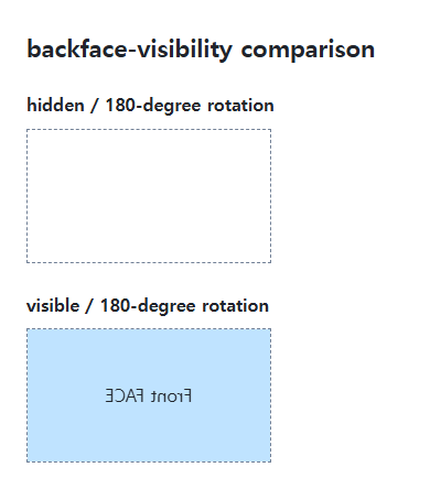
The hidden sample is not painted at 180 degrees; the visible sample shows mirrored text. Restoring the rotation to 0deg displays both front faces.
Individual faces in a two-sided card
A card can use separate front and back surfaces, each with hidden backface visibility. Position and rotate the reverse surface deliberately and inspect the parent’s 3D context. The visibility property alone does not construct a complete card.
Hidden painting and interaction
Do not assume a visually hidden face is automatically removed from accessible navigation. A real interactive card needs deliberate state, focus, and active-control management. Also account for reduced-motion preferences when adding a transition.
Change one setting at a time
Use the complete example file above. Change only the specified selector or value rather than several comparison conditions at once.
- Change only rotateY(180deg) to 0deg to show the fronts. Compare near 90deg and 180deg, then restore the original rotation.
- A real two-sided card also needs face positioning, parent rotation, active controls, tab behavior, and reduced-motion handling. This property alone does not implement the interface.
For combining rotation with state transitions, see CSS Transforms and Transitions.
When the result is missing or unexpected
- Compare rotateY or rotateX rather than an ordinary 2D rotation.
- Inspect both parent and face angles if the intended front is missing.

CSS / Reference / box-shadow: Offsets, Blur, Spread, and Inset Shadows
Build box shadows from offsets, blur, and spread, then inspect clipping and layering. Distinguish box geometry from glyph or transparent-image shadows.

CSS / Reference / clip: Understand Legacy Clip and Migrate to Clip-Path
Read legacy rect coordinates and compare them with clip-path inset distances. Keep layout sizing and clipping separate when migrating existing CSS.

CSS / Reference / text-align: Text, Inline Content, and Block Alignment
Align text by physical or logical sides and distinguish it from centering a block. Inspect justification, final lines, and direction-sensitive layouts.
CSS / Reference / opacity: Group Transparency, Background Alpha, and Interaction
Fade an element and its children or make only its background translucent. Check stacking, contrast, keyboard focus, and the difference between transparency and hiding.

CSS / Reference / background-image: Images, Gradients, Relative Paths, and Layers
Paint gradients or image layers, resolve paths from the correct stylesheet location, and keep meaningful pictures in accessible HTML rather than background decoration.

CSS / Reference / word-wrap: Legacy Alias and Min-Content Wrapping
Use overflow-wrap to manage long strings and understand the word-wrap alias. Compare anywhere with break-word in intrinsic sizing and flex or grid layouts.
CSS / Reference / background-origin: Positioning References Versus Painting Boundaries
Choose a background image’s positioning box and distinguish it from background-clip. Compare how padding, borders, percentage sizes, and fixed attachment affect the reference.

CSS / Reference / border-spacing: Separate Cell Gaps and Collapsed Borders
Set horizontal and vertical gaps in separate-border tables. Distinguish cell padding, zero spacing, collapsed borders, and browser default styles.
CSS / Reference / text-shadow: Glyph Shadows, Layers, and Contrast
Add text shadows without box-shadow-only syntax. Compare blur and layer order, preserve legibility, and avoid treating decoration as a contrast guarantee.

CSS / Reference / align-content: Flex Lines, Grid Tracks, and Available Space
Distribute available space in flex, grid, and supported block layouts. Compare wrap with nowrap, fixed with auto tracks, and content-group alignment with item alignment.