
CSS / Reference / background-size: Cover, Contain, and Background Sizing
background-size sets a background image’s displayed size. cover preserves its ratio while filling the positioning area, possibly cropping it; contain fits the entire image and can leave unused space.
Syntax and value choices
| Property | Initial value | Inherited | Main application conditions |
|---|---|---|---|
background-size |
auto auto | No | All elements; visible effects depend on the text, image, or box conditions below |
Initial values are not necessarily the values assigned to HTML elements by the browser’s stylesheet. Inspect the actual result in developer tools’ Computed panel.
.hero { background-size: cover; background-position: center; }
.logo { background-size: contain; background-repeat: no-repeat; }
| Value or category | Behavior and choice |
|---|---|
auto |
Use intrinsic size and ratio where available. |
120px auto |
Set width to 120px and preserve the ratio when possible. |
100% 100% |
Size both axes to the positioning area, potentially distorting the image. |
cover / contain |
Fill the area / fit the whole image while preserving its ratio. |
For supported values and conditions, see MDN background-size.
Run the example and compare results
Save this complete code as css-reference-10559-example.html in UTF-8 and open it in a browser. Keep its demonstration styles in that file rather than pasting them into a site-wide stylesheet.
<!doctype html>
<html lang="en">
<head>
<meta charset="utf-8">
<meta name="viewport" content="width=device-width, initial-scale=1">
<title>background-size comparison example</title>
<style>
body { margin: 0; color: #20242b; background: #fff; font: 16px/1.7 "Malgun Gothic", sans-serif; }
#demo { padding: 24px; max-width: 820px; margin: auto; }
h1 { font-size: 22px; margin: 0 0 20px; }
.samples { display: flex; flex-wrap: wrap; gap: 24px; }
.label { margin: 0 0 8px; font-weight: 700; }
.target, .reference { width: 240px; height: 150px; border: 12px dashed #718096; padding: 20px; background-color: #eaf2f8; background-image: url("data:image/svg+xml,%3Csvg xmlns='http://www.w3.org/2000/svg' width='160' height='80'%3E%3Crect width='160' height='80' fill='%23006c9c'/%3E%3Ccircle cx='40' cy='40' r='24' fill='%23ffd166'/%3E%3C/svg%3E"); background-repeat: no-repeat; }
.target { background-size: cover; }
.reference { background-size: contain; }

/* Keep the practice box within a narrow viewport. */
.target, .reference { max-width: calc(100vw - 48px - 64px); }
</style>
</head>
<body>
<main id="demo">
<h1>background-size comparison</h1>
<section class="samples"><div class="a"><p class="label">cover</p><div class="target"></div></div><div class="b"><p class="label">contain</p><div class="reference"></div></div></section>
</main>
</body>
</html>
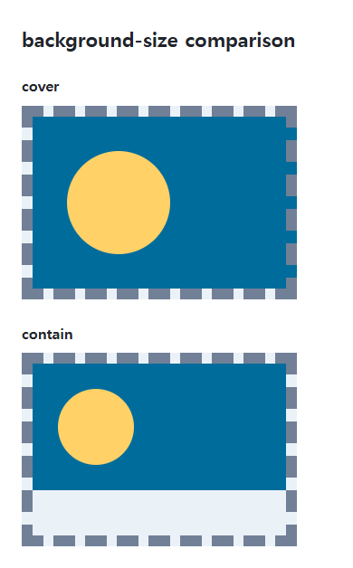
The built-in shape has a 160:80 ratio. Cover may crop it; contain leaves space when the area has a different ratio.
Percentages and a single size
Two values mean width then height. With one size, height is auto. Percentages use the background positioning area, whose box depends on background-origin, rather than the image’s original pixel size.
Image type and important content
Adjust background-position if a crop removes an important part. A background does not create an element’s height. Separate layer sizes with commas, and remember that gradients have no photographic intrinsic dimensions.
Change one setting at a time
Use the complete example file above. Change only the specified selector or value rather than several comparison conditions at once.
- In the wide original example, the default padding-box positioning area is 240+40=280px wide and 150+40=190px high.
- For the 2:1 image, that area gives 380×190px with cover and 280×140px with contain. A narrower content width changes those numbers. Change only background-position to center, compare cropping, and restore left top.
For combining background properties in one practical design, see CSS Background Colors and Images: cover and contain. Related properties to compare alongside these conditions are background-position, background-origin.
When the result is missing or unexpected
- Check the element’s size and the image request before adjusting its background size.
- Use no-repeat when contain leaves space that should stay unfilled.

CSS / Reference / font-weight: Numeric Weights, Relative Weights, and Font Matching
Request numeric or relative font weights and inspect the supplied faces. Compare static and variable-font behavior without assuming every number produces a unique weight.
CSS / Reference / content: Generate Pseudo-Element Text and Decoration
Generate strings, attribute labels, counters, and decorative pseudo-elements. Compare none with an empty string and retain important information in real HTML.
CSS / Reference / font-size: Understand px, em, rem, and Text Enlargement
Choose text-size units by their reference and test nested em scaling. Check the actual root size, browser enlargement, and layout constraints.

CSS / Reference / empty-cells: Show or Hide Empty Table Cells
Control empty-cell borders and backgrounds in a separated table while preserving its structure. Compare show, hide, whitespace, and the collapsed-border exception.
CSS / Reference / font-style: Italic, Oblique, and Available Font Faces
Request italic or oblique forms while accounting for real faces and synthesis. Separate visual styling from emphasis semantics and inspect font-loading failures.

CSS / Reference / background-repeat: Tiling, Space, and Round
Control horizontal and vertical background tiling and compare repeat, no-repeat, space, and round with the same tile and positioning area.
CSS / Reference / text-indent: First-Line Indents and Hanging Paragraphs
Create first-line and hanging indents, distinguish them from paragraph padding, and check inheritance, writing direction, and narrow-screen clipping.

CSS / Reference / list-style-type: Change List Markers and Numbering
Style list markers while keeping ordered and unordered semantics. Compare numbering styles, starting values, marker removal, and shorthand resets.

CSS / Reference / calc(): Calculate CSS Values and Understand Their Types
Combine percentages and lengths with calc(), inspect the actual parent width, and distinguish invalid expressions from newer typed arithmetic and special numeric results.
CSS / Reference / quotes: Choose Nested Quotation Marks
Choose generated quotation pairs for nested text and distinguish them from literal punctuation. Compare automatic marks, none, and quotation-depth operations.