
CSS / Reference / box-sizing: Content and Border Boxes, Including Small-Size Limits
box-sizing determines which box width and height describe. Content-box adds padding and borders to the declared content size; border-box includes them inside the declared size. Neither includes margins.
Syntax and value choices
| Property | Initial value | Inherited | Main application conditions |
|---|---|---|---|
box-sizing |
content-box | No | Boxes accepting width and height |
Initial values are not necessarily the values assigned to HTML elements by the browser’s stylesheet. Inspect the actual result in developer tools’ Computed panel.
*, *::before, *::after { box-sizing: border-box; }
| Value or category | Behavior and choice |
|---|---|
content-box |
Outer width is declared width plus horizontal padding and borders. |
border-box |
Declared width normally includes padding and borders. |
margin |
Remains outside either sizing model. |
inherit |
Explicitly inherit; the property is not normally inherited. |
For supported values and conditions, see MDN box-sizing.
Run the example and compare results
Save this complete code as css-reference-10630-example.html in UTF-8 and open it in a browser. Keep its demonstration styles in that file rather than pasting them into a site-wide stylesheet.
<!doctype html>
<html lang="en">
<head>
<meta charset="utf-8">
<meta name="viewport" content="width=device-width, initial-scale=1">
<title>box-sizing comparison example</title>
<style>
body { margin: 0; color: #20242b; background: #fff; font: 16px/1.7 "Malgun Gothic", sans-serif; }
#demo { padding: 24px; max-width: 820px; margin: auto; }
h1 { font-size: 22px; margin: 0 0 20px; }
.samples { display: flex; flex-wrap: wrap; gap: 24px; }
.label { margin: 0 0 8px; font-weight: 700; }
.target, .reference { width: 200px; padding: 20px; border: 5px solid #006c9c; background: #bfe3ff; }
.target { box-sizing: content-box; }
.reference { box-sizing: border-box; }
</style>
</head>
<body>
<main id="demo">
<h1>box-sizing comparison</h1>
<section class="samples"><div class="a"><p class="label">content-box</p><div class="target">width: 200px</div></div><div class="b"><p class="label">border-box</p><div class="reference">width: 200px</div></div></section>
</main>
</body>
</html>
The first outer width is 200 + 40 + 10 = 250px. The border-box sample is 200px wide, leaving a 150px content box.
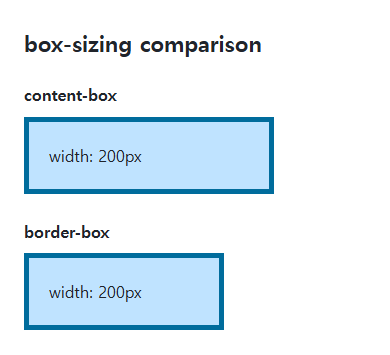
When borders and padding exceed the size
A border-box content size cannot become negative. If the padding and borders exceed the declared width, the content floors at zero and the outer box can be larger than the declared width. This property is not a universal overflow fix.
A site-wide reset and external components
Border-box often simplifies percentage widths with padding. Include pseudo-elements deliberately and check external widgets that expect content-box. Some tables and controls have browser rules, so inspect actual computed values.
When the specified width is smaller than padding and borders
Save this complete document as css-reference-10630-practice.html in UTF-8 and open it in a browser. Test it as a separate file rather than nesting it inside another example.
<!doctype html>
<html lang="en">
<head>
  <meta charset="utf-8">
  <meta name="viewport" content="width=device-width, initial-scale=1">
  <title>When the specified width is smaller than padding and borders</title>
  <style>
    body { margin: 16px; color: #20242b; font: 16px/1.7 sans-serif; }
    main { max-width: 52rem; margin: auto; }
    h1 { font-size: 1.35rem; }
    .samples { display: flex; flex-wrap: wrap; gap: 24px; }
    .samples > * { max-width: 100%; min-width: 0; }
    :focus-visible { outline: 3px solid #005fcc; outline-offset: 3px; }
.box { width:30px;padding:20px;border:5px solid #006c9c;background:#ffd166; margin-bottom:20px; } .border {box-sizing:border-box;} .content {box-sizing:content-box;}
  </style>
</head>
<body>
<main>
  <h1>When the specified width is smaller than padding and borders</h1>
<p>border-box</p><div class="box border"></div><p>content-box</p><div class="box content"></div>
</main>
</body>
</html>
Horizontal padding and borders total 50px. The border-box content cannot shrink below zero, so its outer width is 50px; content-box is 30+40+10=80px. Compare declared width with getBoundingClientRect().width. Change only width to 100px, expect 100 and 150px, and restore 30px.
Before a common reset on *, *::before, and *::after, decide its scope and inspect third-party widgets that may assume content-box. Do not apply a site-wide reset merely to fix this sample. Exclude the widget scope or restore its original value on the appropriate selector, then recheck dimensions.
For relating content, padding, and borders in a layout, see The CSS Box Model: Content, Padding, Border, and Margin. Related properties to compare alongside these conditions are border-width.
When the result is missing or unexpected
- Compare the full box-model dimensions rather than width alone.
- Check margins separately when a box appears pushed out of place.

CSS / Reference / list-style-type: Change List Markers and Numbering
Style list markers while keeping ordered and unordered semantics. Compare numbering styles, starting values, marker removal, and shorthand resets.

CSS / Reference / background-size: Cover, Contain, and Background Sizing
Compare background cover and contain using a known image ratio. Account for positioning areas, percentages, cropping, repeated tiles, and the element’s own size.

CSS / Reference / font-style: Italic, Oblique, and Available Font Faces
Request italic or oblique forms while accounting for real faces and synthesis. Separate visual styling from emphasis semantics and inspect font-loading failures.

CSS / Reference / white-space: Preserve Spaces, Line Breaks, and Wrapping
Choose whitespace behavior by preservation and wrapping needs. Compare traditional values and break-spaces, and handle long words with separate wrapping properties.
CSS / Reference / clip: Understand Legacy Clip and Migrate to Clip-Path
Read legacy rect coordinates and compare them with clip-path inset distances. Keep layout sizing and clipping separate when migrating existing CSS.
CSS / Reference / font-weight: Numeric Weights, Relative Weights, and Font Matching
Request numeric or relative font weights and inspect the supplied faces. Compare static and variable-font behavior without assuming every number produces a unique weight.
CSS / Reference / background-attachment: Viewport, Box, and Internal Scroll Attachment
Compare local and scroll backgrounds inside a scrolling box and distinguish them from viewport-fixed backgrounds. Test target-browser behavior and a usable fallback.
CSS / Reference / font-family: Font Lists, Glyph Fallback, and Loading
Build a font stack with appropriate generic fallbacks and inspect the fonts actually used. Distinguish naming a family from loading files and covering characters.
CSS / Reference / opacity: Group Transparency, Background Alpha, and Interaction
Fade an element and its children or make only its background translucent. Check stacking, contrast, keyboard focus, and the difference between transparency and hiding.
CSS / Reference / background-position: Percentages, Centers, and Edge Offsets
Position backgrounds using centers, percentages, or edge offsets. Calculate percentages from the remaining space and account for oversized cover images and multiple layers.