
CSS / Reference / background-image: Images, Gradients, Relative Paths, and Layers
background-image paints an image or gradient behind an element. A background has no image alternative text, so use an img with appropriate alt when the picture conveys essential information.
Syntax and value choices
| Property | Initial value | Inherited | Main application conditions |
|---|---|---|---|
background-image |
none | No | All elements; visible effects depend on the text, image, or box conditions below |
Initial values are not necessarily the values assigned to HTML elements by the browser’s stylesheet. Inspect the actual result in developer tools’ Computed panel.
.hero { background-image: url("images/scene.webp"); }
.card { background-image: linear-gradient(135deg, #006c9c, #bfe3ff); }
| Value or category | Behavior and choice |
|---|---|
none |
No background image. |
url(...) |
Load an image from the specified address. |
linear-gradient(...) |
Create a gradient image in CSS. |
image1, image2 |
Paint the first listed layer above subsequent layers. |
For supported values and conditions, see MDN background-image.
Run the example and compare results
Save this complete code as css-reference-10590-example.html in UTF-8 and open it in a browser. Keep its demonstration styles in that file rather than pasting them into a site-wide stylesheet.
<!doctype html>
<html lang="en">
<head>
<meta charset="utf-8">
<meta name="viewport" content="width=device-width, initial-scale=1">
<title>background-image comparison example</title>
<style>
body { margin: 0; color: #20242b; background: #fff; font: 16px/1.7 "Malgun Gothic", sans-serif; }
#demo { padding: 24px; max-width: 820px; margin: auto; }
h1 { font-size: 22px; margin: 0 0 20px; }
.samples { display: flex; flex-wrap: wrap; gap: 24px; }
.label { margin: 0 0 8px; font-weight: 700; }
.target, .reference { width: 240px; height: 140px; border: 1px solid #718096; }
.target { background-image: linear-gradient(135deg, #006c9c, #bfe3ff); }
.reference { background-image: url("data:image/svg+xml,%3Csvg xmlns='http://www.w3.org/2000/svg' width='160' height='80'%3E%3Crect width='160' height='80' fill='%23006c9c'/%3E%3Ccircle cx='40' cy='40' r='24' fill='%23ffd166'/%3E%3C/svg%3E"); background-repeat: no-repeat; }
</style>
</head>
<body>
<main id="demo">
<h1>background-image comparison</h1>
<section class="samples"><div class="a"><p class="label">Gradient</p><div class="target"></div></div><div class="b"><p class="label">SVG background</p><div class="reference"></div></div></section>
</main>
</body>
</html>
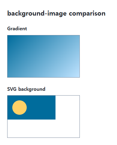
The first box uses a gradient and the second uses an SVG built into the example. No external image file is needed for this complete exercise.
File references and layer order
A relative image URL in an external stylesheet normally resolves from the stylesheet’s location, not the HTML file’s folder. The first listed image is the top layer; background color is underneath all image layers.
An image does not create the box height
An empty element still needs size from content, padding, height, or an appropriate aspect ratio. Use no-repeat when tiling is unwanted, then choose position and size independently.
Change one setting at a time
Use the complete example file above. Change only the specified selector or value rather than several comparison conditions at once.
- An external CSS image path resolves from that stylesheet. With site/index.html, site/css/style.css, and site/images/scene.webp, use ../images/scene.webp in style.css.
- Combine the gradient and SVG as two layers, then reverse only their order. For a file exercise, supply a real file and inspect its resolved request and response in Network.
Replace the original .target background-image declaration with this rule. The translucent gradient paints above the SVG. Reverse only the two image values to put SVG on top and compare overlap; restore the original single gradient afterward. A later background shorthand can reset image, repeat, position, size, origin, clip, attachment, and color.
.target {
  background-image: linear-gradient(135deg, rgb(255 209 102 / 50%), transparent),
    url("data:image/svg+xml,%3Csvg xmlns='http://www.w3.org/2000/svg' width='160' height='80'%3E%3Crect width='160' height='80' fill='%23006c9c'/%3E%3Ccircle cx='40' cy='40' r='24' fill='%23ffd166'/%3E%3C/svg%3E");
}
For combining background properties in one practical design, see CSS Background Colors and Images: cover and contain. Related properties to compare alongside these conditions are background-size, background-repeat.
When the result is missing or unexpected
- Inspect the resolved request URL and response in Network.
- Check the element’s dimensions if a correctly loaded background remains invisible.

CSS / Reference / caption-side: Place a Table Caption Above or Below
Place captions visually while keeping them first in the table’s source structure. Match caption text to the data and check alignment, width, and writing direction.

CSS / Reference / box-sizing: Content and Border Boxes, Including Small-Size Limits
Calculate content-box and border-box sizes, including margins and the minimum content-size limit. Apply resets deliberately and check external components.

CSS / Reference / box-shadow: Offsets, Blur, Spread, and Inset Shadows
Build box shadows from offsets, blur, and spread, then inspect clipping and layering. Distinguish box geometry from glyph or transparent-image shadows.

CSS / Reference / calc(): Calculate CSS Values and Understand Their Types
Combine percentages and lengths with calc(), inspect the actual parent width, and distinguish invalid expressions from newer typed arithmetic and special numeric results.

CSS / Reference / background-position: Percentages, Centers, and Edge Offsets
Position backgrounds using centers, percentages, or edge offsets. Calculate percentages from the remaining space and account for oversized cover images and multiple layers.

CSS / Reference / opacity: Group Transparency, Background Alpha, and Interaction
Fade an element and its children or make only its background translucent. Check stacking, contrast, keyboard focus, and the difference between transparency and hiding.
CSS / Reference / background-attachment: Viewport, Box, and Internal Scroll Attachment
Compare local and scroll backgrounds inside a scrolling box and distinguish them from viewport-fixed backgrounds. Test target-browser behavior and a usable fallback.
CSS / Reference / text-decoration: Decoration Propagation, Underlines, and Link Meaning
Style text decoration and compare parent-originated lines with child rules. Keep links identifiable and separate meaningful deletions from visual strike-through.
CSS / Reference / background-image: Images, Gradients, Relative Paths, and Layers
Paint gradients or image layers, resolve paths from the correct stylesheet location, and keep meaningful pictures in accessible HTML rather than background decoration.
CSS / Reference / font-variant: Small Capitals and Font Features
Use small capitals without changing the source string and choose specific variant longhands. Compare real font support with synthesized presentation.