
CSS Tutorial / CSS Grid Basics: Tracks, Lines, and Item Placement
CSS Grid defines rows and columns for two-dimensional layout and places direct child items into that grid. Grid lines bound tracks and cells; an item can span multiple tracks without changing the document order.
Identify containers, lines, tracks, cells, and areas
A Grid container is a parent that applies display: grid, and Grid items are direct children of that parent. Children within the first child are not independent items in the outer grid. Drawing a grid in CSS doesn't create new HTML elements; it just changes the way we calculate where each child will fall in the grid.
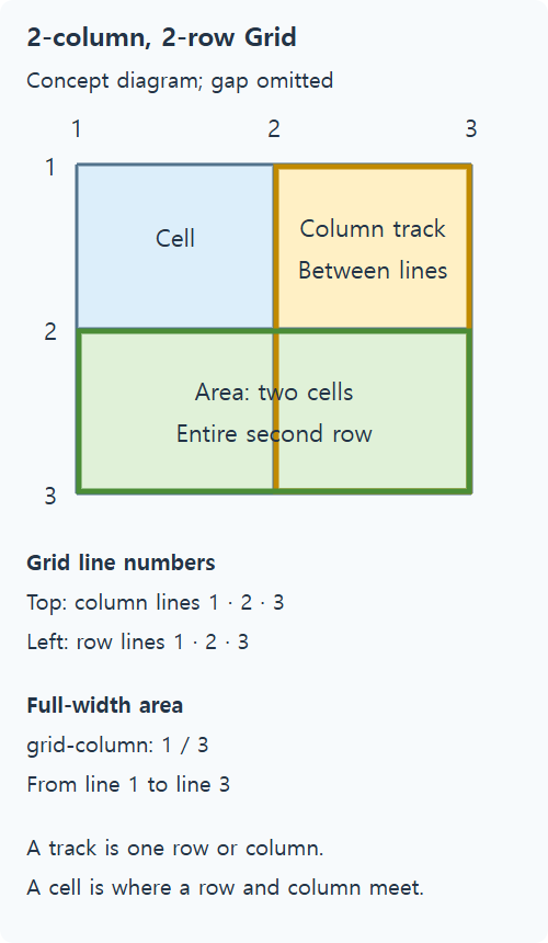
| terminology | meaning | Example of 2 columns and 2 rows |
|---|---|---|
| grid line | Boundary dividing rows and columns | 3 vertical lines, 3 horizontal lines |
| track | One row or one column between two adjacent grid lines | first column, second row |
| cell | Minimum area where one row and one column meet | one space in the upper left |
| area | Rectangle made from one or more cells | Title area spanning two columns |
Line numbers and column numbers are different. If you count to the outer border of the two columns, the number lines are 1·2·3. If you place an item on lines 1 through 3, it will occupy two columns. gap is the gap between tracks and is calculated separately from the item's padding or border. It's easy to see line numbers and actual areas by turning on grid display in Elements in Developer Tools. MDN's Grid basic concepts summarizes terms and basic operations.
Define columns with px, percentages, and fr
.grid {
  display: grid;
  grid-template-columns: 160px 1fr;
  gap: 16px;
}
This partial code can be compared by replacing the column declarations within the .grid convention of the full example. The first column uses 160px, and the second column uses the remaining space. fr is a fraction, which divides the remaining space by a ratio after considering other tracks and gaps. Freezing the first column without regard to content may make the body too narrow for narrow screens, so judge this based on the actual content.
In a container with a width of 640px, if the gap is 16px and the two columns are 1fr·2fr, the space to distribute is 624px. If there is no minimum size constraint, the first column is 208px and the second column is 416px. The full example uses minmax(0, 1fr) minmax(0, 2fr) to ensure that the minimum width of the track is not fixed significantly due to its content.
If you use 50% 50% and gap: 16px together, the width of the container may already be filled with just the columns and then the gap may be added to overflow. For the same flow column, fr is easy. This doesn't mean you need to make all columns the same ratio. Your list may need to have a small name column and a large description column, and you may also want to use a combination of fixed and flexible columns.
Compare explicit and implicit rows
grid-template-rows: 80px explicitly defines one first row. If there are not enough rows to place the item behind, an implicit row is created, and its size can be adjusted with grid-auto-rows. Creating two columns does not limit you to two rows.
| row size | movement | Situations to watch out for |
|---|---|---|
| auto | The size is determined according to the space and alignment conditions of the content and container. | In fixed height containers, free space may be reflected |
| 100px | fix row height | If the content is long, it may contain too many items or characters. |
| minmax(100px, auto) | Ensure at least 100px, go larger if necessary | Useful for cards whose content can expand |
Use a fixed row where a clear size requirement exists, but let explanatory cards accommodate extra lines from translation or enlarged text. minmax(100px, auto) sets a minimum and allows growth; it does not require all rows to have identical heights. Each row depends on its content and layout conditions. For further detail, see Description of grid-auto-rows in MDN You can see size rules outside of explicit rows in.
Place items with lines and spans
.feature {
  grid-column: 1 / -1;
}
/* Different representations spanning two columns in the same two-column explicit grid */
/* .feature { grid-column: span 2; } */
1 / -1 means from the first line to the last line of the explicit grid. It is suitable for titles or highlighted areas that take up the entire width of the screen, whether it is two-column or one-column. Negative line numbers are counted relative to the end of the explicit grid and do not represent the end of all automatically generated tracks. How to adjust the number and minimum size of repeating columns is compared in CSS Grid: repeat, auto-fit, auto-fill, and Areas.
span 2 means take up two tracks, and if you don't specify an exact starting line, automatic placement will determine the position. On mobile, if you only have one column and you keep span 2, you might create an unintended extra column. If you want to maintain the full width, use 1 / -1 or respecify the span value on mobile. When you minimize placement specifications, any remaining items will default to empty cells in HTML order.
Run the complete Grid example
Save the code below as grid-basics.html and open it. A and B are placed in the first fixed row, C is placed in an automatic row that takes up the entire column, and D and E are placed in the next automatic row. Below 480px the columns turn into one and the C continues to take up the full width.
<!doctype html>
<html lang="en">
<head>
  <meta charset="utf-8">
  <meta name="viewport" content="width=device-width, initial-scale=1">
  <title>grid-basics.html</title>
  <style>
* { box-sizing: border-box; }
body { margin: 16px; font: 16px/1.6 sans-serif; color: #243447; }
h1 { font-size: 24px; } h2 { font-size: 20px; margin-top: 32px; }
a { color: #145f8f; } a:focus-visible { outline: 3px solid #b4470b; outline-offset: 3px; }
.grid { display: grid; grid-template-columns: minmax(0, 1fr) minmax(0, 2fr);
 grid-template-rows: 80px; grid-auto-rows: minmax(100px, auto); gap: 16px;
 width: min(100%, 640px); }
 .grid > div { min-width: 0; padding: 12px; background: #dceefa; overflow-wrap: anywhere; }
 .feature { grid-column: 1 / -1; }
 @media (max-width: 480px) { .grid { grid-template-columns: minmax(0, 1fr); } }
  </style>
</head>
<body>
<h1>Column proportions and row heights</h1>
<div class="grid"><div>A: first row</div><div>B: first row</div><div class="feature">C: Area that occupies two columns. As the content grows, the height of this auto-row also increases.</div><div>D: next line</div><div>E: This card has a long description. The height you need will vary depending on the length of your content. Instead of forcing all content to fit at a fixed height, set it to accommodate content beyond the minimum height.</div></div>
</body>
</html>
- On wide screens, make sure the .grid width is 640px and turn on Show Grid in Developer Tools. The columns are 208px·416px, and the spacing between them is 16px. If you change the column ratio to 1fr·1fr, it becomes 312px each. After comparison, it is restored to 1fr·2fr.
- The first row has a height of 80px. If you add multiple lines of text inside A, the row height itself will remain the same and the content may overflow. If you return the text to its original state and change grid-template-rows to minmax(80px, auto), it can grow depending on the content.
- Sufficiently increase the contents of C. grid-auto-rows is minmax(100px, auto) so the rows can be larger than 100px. Change only grid-auto-rows to 100px and observe the difference in fixed rows, then return it to its original value.
- If you just remove the grid-column declaration of C, C will be placed in one cell and the position of the items behind it will also change. Restores 1/-1 again. Narrow the screen below 480px to see if the overall width specification is maintained in 1 column.
Handle long content on narrow screens
Grid's 1fr track can be drawn wide by long strings due to its default automatic minimum size. minmax(0, 1fr) is a method of setting the minimum size of the track to 0, and actual line breaks in the string require separate rules. min-width: 0 is also applied to the item itself depending on the situation. Save the following code as grid-long-text.html. If items overflow beyond the column, check CSS Overflow, Long Text Wrapping, and Ellipsis for long string line wrapping rules.
<!doctype html>
<html lang="en">
<head>
  <meta charset="utf-8">
  <meta name="viewport" content="width=device-width, initial-scale=1">
  <title>grid-long-text.html</title>
  <style>
* { box-sizing: border-box; }
body { margin: 16px; font: 16px/1.6 sans-serif; color: #243447; }
h1 { font-size: 24px; } h2 { font-size: 20px; margin-top: 32px; }
a { color: #145f8f; } a:focus-visible { outline: 3px solid #b4470b; outline-offset: 3px; }
.grid { display: grid; grid-template-columns: minmax(0, 1fr) minmax(0, 1fr); gap: 16px;
 width: min(100%, 600px); }
 .grid > div { padding: 12px; background: #e8f5de; overflow-wrap: anywhere; }
  </style>
</head>
<body>
<h1>Grid minimum size and long strings</h1><div class="grid"><div>ABCDEFGHIJKLMNOPQRSTUVWXYZ0123456789ABCDEFGHIJKLMNOPQRSTUVWXYZ0123456789ABCDEFGHIJKLMNOPQRSTUVWXYZ0123456789</div><div>A description of ordinary length</div></div>
</body>
</html>
- Change only overflow-wrap to normal to confirm that letters can overflow even if the track width is maintained.
- If you replace both columns with 1fr 1fr, you can see how the minimum size of a long string affects the column distribution. After comparing, we restore both minmax(0, 1fr) and anywhere.
Choose a responsive transition point based on the actual reading width of the content rather than the device name. The 480px in this example is a learning choice and is not a standard for all Grids. You can narrow the screen and zoom in on the text to see fixed lines, long strings, and extra columns created by spans to help you isolate the cause of the overflow.

CSS Tutorial / CSS Colors and Units: px, em, rem, and Percentages
Compare equivalent color formats and practical sizing examples, including nested em values, rem, percentages, and unitless line height.

CSS Tutorial / Organize CSS with Shared Styles, Nesting, and Layers
Refactor a small stylesheet without changing its layout, compare nesting and cascade layers, and check relative file paths and selector specificity.

CSS Tutorial / Responsive Images and Video: aspect-ratio and object-fit
Compare original image proportions, cover, contain, and object-position, then test responsive video sizing with a downloadable sample.

CSS Tutorial / CSS Media Queries and Content-Based Breakpoints
Calculate a practical layout breakpoint, compare overlapping min/max conditions, and test the widths immediately around each threshold.

CSS Tutorial / Basic CSS Selectors: Type, Class, ID, and Attributes
Choose basic selectors for a small page, combine conditions correctly, and inspect whether each rule matches the intended elements.

CSS Tutorial / CSS display: Block, Inline, inline-block, and Hiding
Compare block and inline sizing, replaced elements such as images, and the layout and interaction differences between common hiding techniques.

CSS Tutorial / CSS Tables: Borders, Sizing, and table-layout
Style semantic tables, compare automatic and fixed layout with long content, and provide horizontal scrolling when a table needs more space.

CSS Tutorial / CSS Syntax: Selectors, Declarations, Comments, and Errors
Read and write CSS rules, use comments, and distinguish syntax errors from selectors that do not match and declarations overridden by other rules.

CSS Tutorial / CSS Overflow, Long Text Wrapping, and Ellipsis
Compare scrolling, clipping, long-word wrapping, and single-line ellipsis, including keyboard access and minimum-size issues in layout containers.

CSS Tutorial / CSS Width, Height, min/max Limits, and box-sizing
Compare content-box and border-box sizing, percentage heights, fluid width limits, and the consequences of fixed heights for growing text.