
CSS Tutorial / Pseudo-Elements: ::before and ::after
CSS pseudo-elements style a particular part of an element or create a presentation-only box. ::before and ::after can add decorative content, but essential information should remain in the HTML rather than depend on generated content.
Distinguish pseudo-classes and pseudo-elements
CSS Combinators and Pseudo-Classes picks what state or condition an existing element is in. a:hover targets the link itself that the mouse is hovered over. A pseudo-element targets a specific part of the element or its created representation. a::after decorates a pseudo-element created behind the link content. In new code, use one colon for pseudo-classes and two colons for pseudo-elements to make it easier to distinguish between the two.
a:hover { color: #1d4ed8; }
a::after { content: ""; }
before and after do not add actual HTML sibling tags outside the selected element. Creates expressions before and after the content of the element. Developer tools may display pseudo-elements as separate lines, but this is not the same as having spans written in the original HTML. You can't just retrieve pseudo-elements created by code that looks for common child elements.
Understand content and display
h1::before {
  content: "";
  display: inline-block;
  width: 12px;
  height: 12px;
  background-color: currentColor;
}
content: "" creates a pseudo-element with no text. Even if the content is empty, it can appear as a decorative box if you give it a background and size. On the other hand, if content is omitted or changed to none, this pseudo-element is not created and the dot does not appear even if the size and background are added.
The default display of ::before and ::after is inline. Use inline-block for a decorative dot that needs explicit width and height, and block for a line below the content. For these pseudo-elements, omitting content or setting it to none prevents the generated box. For further detail, see CSS display: Block, Inline, inline-block, and Hiding. See MDN: ::before.
currentColor is a keyword that refers to the color value of the element, that is, the current text color. If you change the title from green to blue, the background of the pseudo-element will also use the same color. border-radius: 50% rounds the corners of boxes of the same width and height to make them look like circles. margin-right is the outer space between dots and letters.
Add a dot before a heading and a line after a link
The following complete example creates a 12px dot before the title and a 2px line below the link. It also leaves the default underline on the link itself, so the link's separation is maintained even if the extra line is gone. On mouse hover or keyboard focus, the decorative lines become thicker to 4px.
<!doctype html>
<html lang="en">
<head>
  <meta charset="utf-8">
  <meta name="viewport" content="width=device-width, initial-scale=1">
  <title>Small Garden</title>
  <style>
body { margin: 24px; font-family: sans-serif; line-height: 1.7; color: #333; }
    h1 { color: #087f5b; font-size: 30px; }
    h1::before {
      content: "";
      display: inline-block;
      width: 12px;
      height: 12px;
      margin-right: 10px;
      border-radius: 50%;
      background-color: currentColor;
    }
    a { display: inline-block; color: #087f5b; text-decoration: underline; }
    a::after {
      content: "";
      display: block;
      height: 2px;
      margin-top: 4px;
      background-color: currentColor;
    }
    a:hover::after, a:focus-visible::after { height: 4px; }
    a:focus-visible { outline: 2px solid #1d4ed8; outline-offset: 4px; }
  </style>
</head>
<body>
<h1>Small Garden</h1>
  <p>We open at 9 a.m. every day.</p>
  <a href="#visit">Visitor Information</a>
  <h2 id="visit">What to bring</h2>
  <p>Bring a water bottle and comfortable shoes.</p>
</body>
</html>
Save it as index.html and run it. The title retains the actual text “Small Garden” and the circle in front is a CSS decoration. The link also has the name “Visitor Information” and a moving address in HTML. a:hover::after is an expression that selects the after of a in the hover state. Long notations feel less complicated if you read them separately by the number of colons and the order of selection.
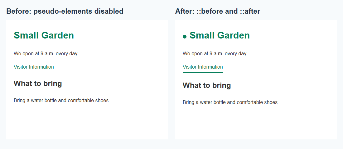
The above comparison is the actual result of rendering the same example in the browser and changing the before and after content to none on the left side only. The text and link address are the same, only the decoration is different. The decorative line on the right link is 2px by default, and becomes 4px on hover or keyboard focus.
Keep essential information in HTML
| What to put in | Recommended Location | reason |
|---|---|---|
| Dot before title, dividing line | CSS pseudo-elements | Even without it, the meaning of the document and how you work with it are maintained. |
| Operating hours, prices, precautions | HTML text | Even if you turn off CSS or read it in a different way, the important information should remain. |
| Button name, link name | Actual content in HTML | Prevents the name of the control from relying on decoration creation. |
Different screen readers and browsers may deliver generated content differently, so don't rely on putting essential information solely in pseudo-elements. It is clearer to write the conditions in the actual label or guidance sentence than to inform the input conditions with content: "Required". The mere fact that a pseudo-element is visible does not confirm its accessibility.
It is better not to rely on the general decoration implementation of adding before and after to elements that display external content, such as img. Apply it to elements that contain content, such as h1 or a, as in this example. If you need decoration around the image, you could consider having a separate HTML element surrounding the image and decorating the pseudo-elements of that element.
Diagnose missing pseudo-elements
- Replace
content: "";inh1::beforewithcontent: none;. The title text should remain the same, but only the dot should disappear. After confirmation, restore it to an empty string. - Replace
display: inline-block;in the dot withdisplay: inline;. Notice that inline decorations without text cannot maintain the original 12px dot with width·height alone. Revert to inline-block. - Change the color of h1 to
#1d4ed8. Make sure the dots are also colored blue and the links remain green. currentColor does not refer to a single color on the entire page. - Hover your mouse over the link and see if the line becomes thicker. Move the mouse away and use Tab to move the focus to the link and check whether the line and outline are visible together.
When checking, first check whether the selector matches the actual element and whether the content is valid, then look at the display, size, and background. If you change the height of the link line to 0, the line will not be visible, but the pseudo-element itself created as content will not necessarily disappear. Distinguishing between “the element was not created” and “it was created but has no draw area” can help you narrow down the cause of the failure.
After the exercise, restore the original values and save. Pseudo-elements can supply decoration without extra HTML elements, but essential content must remain available independently of that decoration. Start with a dot or line and check that the actual text, link destination, and keyboard behavior remain intact.

CSS Tutorial / Pseudo-Elements: ::before and ::after
Add decorative pseudo-elements, compare them with the original page, and keep essential information in HTML while checking keyboard access.

CSS Tutorial / Basic CSS Selectors: Type, Class, ID, and Attributes
Choose basic selectors for a small page, combine conditions correctly, and inspect whether each rule matches the intended elements.

CSS Tutorial / CSS Paragraph and List Styling
Style paragraphs and ordered or unordered lists, compare inside and outside markers, and check spacing and wrapped text on narrow screens.

CSS Tutorial / CSS Transforms and Transitions
Compare transform order and origins, add hover and keyboard transitions, and test overflow and reduced-motion behavior.

CSS Tutorial / Fluid CSS Layouts with min, max, and clamp
Build a bounded fluid layout, compare flexible sizes and spacing, and check that longer content fits without introducing horizontal page scrolling.

CSS Tutorial / Build a Responsive Website with HTML and CSS
Create a complete two-file learning website with responsive cards and navigation, then test long text, keyboard focus, zoom, and reduced motion.

CSS Tutorial / CSS Overflow, Long Text Wrapping, and Ellipsis
Compare scrolling, clipping, long-word wrapping, and single-line ellipsis, including keyboard access and minimum-size issues in layout containers.

CSS Tutorial / CSS Inheritance, Specificity, and the Cascade
Work through inheritance and conflicting rules, compare specificity and source order, and understand the limits of !important in a simplified example.

CSS Tutorial / Check Responsive CSS with Width, Zoom, and Keyboard Tests
Follow a repeatable browser checklist, test breakpoint boundaries and longer text, and record layout problems before changing CSS rules.

CSS Tutorial / CSS Background Colors and Images: cover and contain
Create and load a local background image, compare repetition, cover, contain, and position, and diagnose image-path and cropping problems.