CSS line-height:行高的取值与继承
CSS 的 line-height 参与计算行框高度。1.6 这样的无单位数字按比例继承。字号为 20px 时得到 32px 行高,字号为 30px 时得到 48px。
line-height 的语法和常见取值
此属性可以继承,初始值为 normal。实际高度取决于字体度量和浏览器。开发者工具可能直接显示这个关键字。
| 取值示例 | 字号为 20px 时 | 字号为 30px 的子元素继承时 |
|---|---|---|
normal |
根据字体决定的常用高度 | 继承 normal,并使用自身字体和字号 |
1.6 |
32px | 继承 1.6,得到 48px |
32px |
32px | 继承 32px |
1.6em |
32px | 继承已计算的 32px |
160% |
32px | 继承已计算的 32px |
CSS 通用关键字 initial 恢复初始值 normal,inherit 取父元素的计算值。示例中的 em 和百分比以声明所在元素的字号为基准。
比较 20px 的父元素和 30px 的子元素
将完整示例保存为 line-height-example.html,然后在浏览器中打开。每张卡片都包含字号 20px 的父元素文本和字号 30px 的两行子元素文本。
<!doctype html>
<html lang="zh-CN">
<head>
  <meta charset="utf-8">
  <meta name="viewport" content="width=device-width, initial-scale=1">
  <title>比较继承的行高</title>
  <style>
    body { margin: 1rem; color: #18324c; font: 1rem/1.5 system-ui, sans-serif; }
    .cases {
      display: grid;
      grid-template-columns: repeat(auto-fit, minmax(min(100%, 18rem), 1fr));
      gap: 1rem;
      max-inline-size: 42rem;
      margin-inline: auto;
    }
    figure { margin: 0; min-width: 0; }
    figcaption { margin-block-end: 0.35rem; }
    .sample {
      font-size: 20px;
      padding: 0.5rem 0.75rem;
      background: #ecf4fc;
      overflow-wrap: anywhere;
    }
    .ratio { line-height: 1.6; }
    .pixels { line-height: 32px; }
    .em { line-height: 1.6em; }
    .percent { line-height: 160%; }
    .child { font-size: 30px; }
  </style>
</head>
<body>
  <main class="cases">
    <figure>
      <figcaption>line-height: 1.6</figcaption>
      <div class="sample ratio">
        父元素文字 20px
        <div class="child">子元素文字 30px<br>第二行文字</div>
      </div>
    </figure>
    <figure>
      <figcaption>line-height: 32px</figcaption>
      <div class="sample pixels">
        父元素文字 20px
        <div class="child">子元素文字 30px<br>第二行文字</div>
      </div>
    </figure>
    <figure>
      <figcaption>line-height: 1.6em</figcaption>
      <div class="sample em">
        父元素文字 20px
        <div class="child">子元素文字 30px<br>第二行文字</div>
      </div>
    </figure>
    <figure>
      <figcaption>line-height: 160%</figcaption>
      <div class="sample percent">
        父元素文字 20px
        <div class="child">子元素文字 30px<br>第二行文字</div>
      </div>
    </figure>
  </main>
</body>
</html>
四个父元素均为 32px。查看 .child 的计算样式,第一个为 48px,其余三个仍为 32px。下图展示了子元素字号较大时的差别。
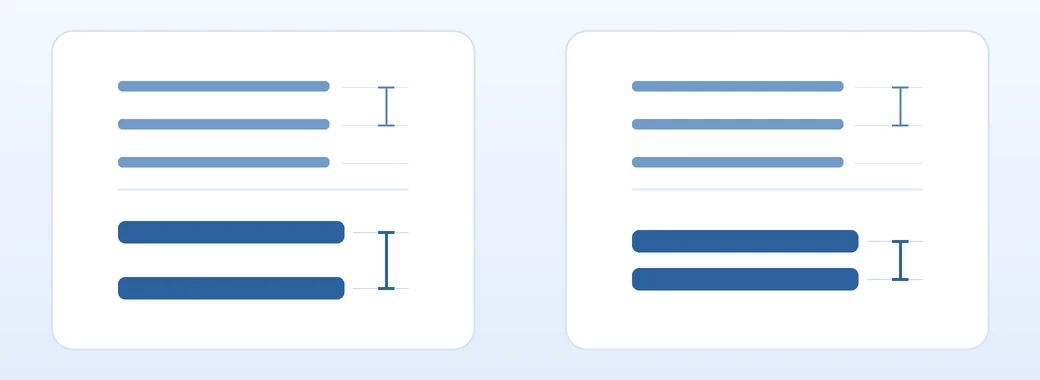
将 .child 的 font-size 改成 40px,只有第一张卡片的子元素行高变为 64px。把 .ratio 设为 line-height: 1,它的子元素会变为 40px。比较完成后恢复原值。
区分行框和段落间距
在字体和字号相同的横向文本中,可以用相邻基线之间的距离比较行高。字形轮廓有自身的尺寸。较大的行内文字、行内图片和 vertical-align 都可能增加实际行框高度。
用 margin-block 调整段落之间的距离,用 line-height 调整同一段落内的各行。
如果按钮文字可能换行,可以设置内边距并用 Flexbox 或 Grid 居中。将行高固定为按钮高度,换行时可能出现溢出。
设置正文与标题的行高
正文可以从无单位的 1.6 开始尝试,再根据标题换行情况调整。请用实际字体和文字测试,也要检查放大文字后的效果。
body { line-height: 1.6; }
.heading { line-height: 1.3; }
WCAG 2.2 的文本间距准则要求用户将行高调整到至少为字号的 1.5 倍,同时修改段落、单词和字符间距时,内容和功能仍然可用。若组件设了固定高度和 overflow: hidden,请检查加大间距后文字是否被裁切。
排查文字重叠与间距异常
- 较大的子元素文字重叠时,比较
font-size与继承的line-height。 - 声明未生效时,检查后面的
font简写是否重置了行高。 - 仅段落之间距离过大时,检查段落的
margin或父元素的gap。