
HTML Tutorial / Add Placeholder Text to Form Fields
To display a short hint inside an empty HTML form field, use the placeholder attribute. Use label for the field’s name and value for an actual initial input value. Keeping hints separate from values prevents example text from being submitted as user data.
The difference between label, placeholder, and value
A label identifies a field, such as “Email” or “Message.” A placeholder is a short hint displayed inside a field when its value is empty. The value attribute on an input sets its initial value.
| Feature | Purpose | After typing | Relationship to submitted data |
|---|---|---|---|
| label | Names the field | Remains visible | The label text is not the input value. |
| placeholder | Provides a short example or format hint | Disappears when the field has a value | The hint itself is not submitted. |
| value | Sets an input’s initial value | Appears as editable text | The initial value may be submitted if the user leaves it unchanged. |
For example, “Email” works as a field label, while “e.g. alex@example.com” works as an input hint. Putting an example address in value on a blank contact form can make it look like a real address, so use placeholder for that example. An account-editing form that displays a saved address needs an actual initial value instead.
Add a placeholder to an input
Add placeholder="Your hint" to the input’s opening tag. This example shows an email address as a hint while the field is empty.
<label for="email">Email</label>
<input type="email" id="email" name="email"
       placeholder="e.g. alex@example.com">
Match the label’s for attribute to the input’s id to associate them. The name identifies the field in submitted data. These attributes have different jobs: setting an id does not replace the need for a name. See how to connect labels and inputs correctly for more examples.
The HTML standard supports placeholder on these input types: text, search, tel, url, email, and password. Do not rely on the same behavior for date or number inputs; place their instructions outside the field. The HTML definition of placeholder and input type attribute table explain its scope.
Add placeholder text to a textarea
The textarea element, which accepts multiple lines of text, also supports placeholder. To display only a hint, leave the space between its opening and closing tags empty.
<label for="message">Message</label>
<textarea id="message" name="message" rows="4"
          placeholder="e.g. When will my order arrive?"></textarea>
A textarea’s initial value comes from the text between its tags, not a value attribute. In the following example, “Please tell me when my order will arrive.” is an actual editable value, not a hint.
<textarea name="message">Please tell me when my order will arrive.</textarea>
Spaces or indentation between textarea tags can become part of the value. If a supposedly empty textarea does not show its hint, check for leftover text between the tags. The HTML textarea specification defines its initial value and placeholder behavior.
Keep important instructions visible while typing
A placeholder disappears when the user enters a value, so it cannot replace a field name or important instructions. Keep names such as “Email” in visible labels, and put instructions that users need while typing in separate text.
<label for="email">Email (required)</label>
<input type="email" id="email" name="email"
       placeholder="e.g. alex@example.com"
       aria-describedby="email-help" required>
<p id="email-help">Enter the email address where you want to receive a reply.</p>
The accessibility attribute aria-describedby associates the input with additional explanatory text. Set it to the explanation element’s id so assistive technology, such as a screen reader, can use that description. Keep the explanation visible too, as in this example. The W3C form instructions tutorial demonstrates this approach.
Complete example: required email and optional message
Save the following code as form-guide.html using UTF-8 encoding and open it in a browser. The email field is required and the message is optional. The hint color is chosen for a white background, and the fields fit the form’s width on smaller screens.
<!doctype html>
<html lang="en">
<head>
  <meta charset="utf-8">
  <meta name="viewport" content="width=device-width, initial-scale=1">
  <title>Form guidance example</title>
  <style>
    body {
      margin: 24px;
      color: #222;
      font-family: sans-serif;
      line-height: 1.6;
    }
    form { max-width: 440px; }
    label { display: block; font-weight: bold; }
    input, textarea {
      box-sizing: border-box;
      width: 100%;
      padding: 10px;
      border: 1px solid #777;
      border-radius: 4px;
      font: inherit;
    }
    input::placeholder, textarea::placeholder {
      color: #666;
      opacity: 1;
    }
    .help { margin-top: 4px; }
    button { padding: 8px 20px; font: inherit; }
  </style>
</head>
<body>
  <h1>Contact us</h1>
  <form method="get">
    <p>
      <label for="email">Email (required)</label>
      <input type="email" id="email" name="email"
             placeholder="e.g. alex@example.com"
             aria-describedby="email-help" required>
    </p>
    <p id="email-help" class="help">Enter the email address where you want to receive a reply.</p>
    <p>
      <label for="message">Message (optional)</label>
      <textarea id="message" name="message" rows="4"
                placeholder="e.g. When will my order arrive?"></textarea>
    </p>
    <button type="submit">Submit</button>
  </form>
</body>
</html>
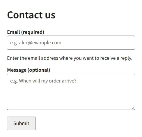
Both fields initially display hints. Once you type an email address, its example address disappears, but “Email (required)” and the explanation below it remain visible. Clear the field completely and the placeholder appears again.
- Leave the email field empty and press Submit. Normal browser submission is blocked by the
requiredcheck. - Enter
abcin the email field and submit again. Thetype="email"format check blocks submission. - Enter a correctly formatted address such as
alex@example.com, leaving the message empty. The form can be submitted with the optional field empty.
required checks for an empty value, and type="email" checks the email format. A correctly formatted address is not proof that the address exists. Error messages and their appearance vary with the browser and its language settings.
This example does not include a server that saves messages. Because the GET form omits action, normal submission targets the current document’s address. When the file is served by a web server, its URL’s query string can show the submitted values. Handling of a locally opened file can vary. A working service needs a server endpoint and an appropriate submission method.
What gets submitted: placeholder text or value?
Placeholder text is not submitted as an input value, but an empty value can still be included in the submitted data. For example, an enabled field with name="email" can produce email= in a GET submission when it is empty and no required-field check blocks submission. Fields without a name, or with disabled, are omitted from normal form data. These distinctions follow the HTML rules for constructing form data.
<form id="compare-form">
  <input type="text" name="default_name" value="Alex">
  <input type="text" name="hint_name" placeholder="e.g. Alex">
</form>
Open that code in a separate HTML file, then run the following code in your browser’s developer console. FormData builds a list of the form’s field names and current values. This code inspects the list without sending it to a server.
Array.from(new FormData(document.getElementById("compare-form")).entries())
With both fields unchanged, the result is as follows. “Alex,” supplied through value, is included. The placeholder “e.g. Alex” is not.
[["default_name", "Alex"], ["hint_name", ""]]
Type “Sam” in the second field and run the code again: the value for hint_name becomes “Sam.” If the user edits the first field, its current value is included instead of the initial value.
Even with required, a field prefilled through value can pass a simple empty-value check. Creating a FormData object does not perform required-field validation either. Treat browser submission checks and data-list construction as separate operations, and validate input on the server in a real service.
When placeholder text is missing or hard to read
- Check whether the field already has a value. An input’s initial value, textarea content, browser autofill, or a script can keep the placeholder from appearing.
- Check the input type. For controls with specialized interfaces, such as date fields, provide instructions outside the field.
- Keep the hint short. Put a brief example inside the field and detailed conditions in visible explanatory text. Do not put line breaks in an input placeholder.
- Check the text and background colors. A very pale color or low opacity can make the hint hard to see. After adjusting the styling, check readability on a mobile screen too.
Use the CSS ::placeholder pseudo-element to style placeholder text. CSS (Cascading Style Sheets) controls a page’s appearance; the complete example uses it to set the hint’s color and opacity. For more styling examples, see styling placeholder text (in Korean). Use labels for field names, placeholders for short examples, and separate descriptions for instructions that must stay visible.

HTML Tutorial / What Is HTML and What Does It Do on a Web Page?
HTML gives web content structure and meaning. Learn how it differs from CSS and JavaScript, see how basic markup appears in a browser, and make your first HTML file.

HTML Tutorial / Responsive Images: srcset, sizes, and picture
Offer image resolutions with srcset and sizes, and switch crops with picture. Downloadable files let you test the examples in a browser.
HTML Tutorial / Form Validation with required, Length, and Range Limits
Apply built-in required, length, and numeric constraints, test error states, and understand why server-side validation remains necessary.

HTML Tutorial / Images: img, Alt Text, and Dimensions
Add an image with HTML img, write useful alternative text, and set width and height correctly. A downloadable example helps you test file paths and sizing.

HTML Tutorial / Lists: ul, ol, dl, and Nested Lists
Choose the right HTML list for ordered items, unordered items, and name–description pairs. Try a complete example, custom numbering, and correctly nested lists.

HTML Tutorial / Connect Labels and Inputs Correctly
Connect labels to inputs with for and id, distinguish id from submitted name, and learn why placeholder text cannot replace a label.

HTML Tutorial / When to Use div and span
Understand the structural difference between div and span, style only the content you need, and choose semantic elements when they better describe the content.

HTML Tutorial / Table Basics: table, tr, th, and td
Build a basic HTML data table with rows and header or data cells, then organize its headings and body without using tables for page layout.

HTML Tutorial / Basic Structure of an HTML Document
Learn the roles of doctype, html, head, and body, then save your first HTML file and open it in a browser. Includes a complete example, a diagram, and fixes for common filename, refresh, and encoding problems.

HTML Tutorial / Choose Input Types for Email, Numbers, Dates, and Choices
Choose input types based on the value being collected and understand how checkboxes and radio groups behave when submitted.