
CSS / Reference / background-clip: Background Painting Areas and Text Clipping
background-clip sets where backgrounds may be painted. border-box includes the area under the border, padding-box excludes that border area, and content-box limits painting to the content box.
Syntax and value choices
| Property | Initial value | Inherited | Main application conditions |
|---|---|---|---|
background-clip |
border-box | No | All elements; visible effects depend on the text, image, or box conditions below |
Initial values are not necessarily the values assigned to HTML elements by the browser’s stylesheet. Inspect the actual result in developer tools’ Computed panel.
.card { background-color: #bfe3ff; background-clip: padding-box; }
| Value or category | Behavior and choice |
|---|---|
border-box |
Paint under the border as well as padding and content. |
padding-box |
Paint padding and content but not the border area. |
content-box |
Paint only within the content box. |
text |
Clip the background to text, with appropriate text-color handling. |
For supported values and conditions, see MDN background-clip.
Run the example and compare results
Save this complete code as css-reference-10582-example.html in UTF-8 and open it in a browser. Keep its demonstration styles in that file rather than pasting them into a site-wide stylesheet.
<!doctype html>
<html lang="en">
<head>
<meta charset="utf-8">
<meta name="viewport" content="width=device-width, initial-scale=1">
<title>background-clip comparison example</title>
<style>
body { margin: 0; color: #20242b; background: #fff; font: 16px/1.7 "Malgun Gothic", sans-serif; }
#demo { padding: 24px; max-width: 820px; margin: auto; }
h1 { font-size: 22px; margin: 0 0 20px; }
.samples { display: flex; flex-wrap: wrap; gap: 24px; }
.label { margin: 0 0 8px; font-weight: 700; }
.target, .reference { width: 240px; height: 150px; border: 12px dashed #718096; padding: 20px; background-color: #eaf2f8; background-image: url("data:image/svg+xml,%3Csvg xmlns='http://www.w3.org/2000/svg' width='160' height='80'%3E%3Crect width='160' height='80' fill='%23006c9c'/%3E%3Ccircle cx='40' cy='40' r='24' fill='%23ffd166'/%3E%3C/svg%3E"); background-repeat: no-repeat; }
.target, .reference { background-image: none; background-color: #79c7ed; }
.target { background-clip: border-box; }
.reference { background-clip: content-box; }

/* Keep the practice box within a narrow viewport. */
.target, .reference { max-width: calc(100vw - 48px - 64px); }
</style>
</head>
<body>
<main id="demo">
<h1>background-clip comparison</h1>
<section class="samples"><div class="a"><p class="label">border-box</p><div class="target">Content area</div></div><div class="b"><p class="label">content-box</p><div class="reference">Content area</div></div></section>
</main>
</body>
</html>
Inspect the dashed border gaps and padding. Border-box paints behind them; content-box leaves those areas unpainted.
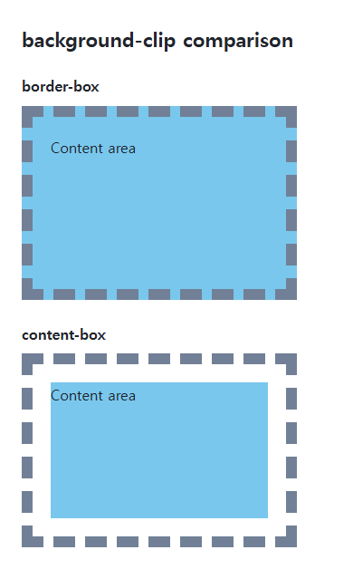
Origin and clip have different jobs
background-origin establishes the positioning and sizing reference; background-clip establishes the painting boundary. Clipping does not shrink width, padding, or border. Several background layers can use comma-separated values.
Text-clipped backgrounds
Opaque text can cover a background clipped to its glyphs. If text becomes transparent, provide a readable fallback for missing images and forced-color environments. This property is different from clip-path, which clips the element itself.
Text clipping with a readable fallback
Save this complete document as css-reference-10582-practice.html in UTF-8 and open it in a browser. Test it as a separate file rather than nesting it inside another example.
<!doctype html>
<html lang="en">
<head>
  <meta charset="utf-8">
  <meta name="viewport" content="width=device-width, initial-scale=1">
  <title>Text clipping with a readable fallback</title>
  <style>
    body { margin: 16px; color: #20242b; font: 16px/1.7 sans-serif; }
    main { max-width: 52rem; margin: auto; }
    h1 { font-size: 1.35rem; }
    .samples { display: flex; flex-wrap: wrap; gap: 24px; }
    .samples > * { max-width: 100%; min-width: 0; }
    :focus-visible { outline: 3px solid #005fcc; outline-offset: 3px; }
.gradient { color:#164a6b; font-size:2rem;font-weight:700; } @supports (background-clip:text) { .gradient { background-image:linear-gradient(90deg,#164a6b,#8a2465);background-clip:text;color:transparent; } } @media (forced-colors:active) { .gradient { background-image:none;color:CanvasText; } }
  </style>
</head>
<body>
<main>
  <h1>Text clipping with a readable fallback</h1>
<p class="gradient">Readable CSS text</p>
</main>
</body>
</html>
Make text transparent only inside the support query, retaining an ordinary fallback color. Temporarily disable background-image in developer tools to observe the transparent-text failure, then restore it. For loading failures and printing, provide a readable fallback appropriate to the actual conditions.
In the first example change only .target’s background-clip through border-box, padding-box, and content-box. Keep image, color, spacing, borders, and origin unchanged, then restore border-box.
For combining background properties in one practical design, see CSS Background Colors and Images: cover and contain. Related properties to compare alongside these conditions are background-origin.
When the result is missing or unexpected
- A solid opaque border can hide the difference between border-box and padding-box.
- Use enough padding and contrasting background colors to see the content-box boundary.

CSS / Reference / letter-spacing, word-spacing: Compare Character and Word Spacing
Adjust character and word gaps independently using the same text and a normal baseline. Account for inheritance, language, wrapping, and excessive negative spacing.
CSS / Reference / content: Generate Pseudo-Element Text and Decoration
Generate strings, attribute labels, counters, and decorative pseudo-elements. Compare none with an empty string and retain important information in real HTML.
CSS / Reference / font-weight: Numeric Weights, Relative Weights, and Font Matching
Request numeric or relative font weights and inspect the supplied faces. Compare static and variable-font behavior without assuming every number produces a unique weight.
CSS / Reference / text-indent: First-Line Indents and Hanging Paragraphs
Create first-line and hanging indents, distinguish them from paragraph padding, and check inheritance, writing direction, and narrow-screen clipping.

CSS / Reference / calc(): Calculate CSS Values and Understand Their Types
Combine percentages and lengths with calc(), inspect the actual parent width, and distinguish invalid expressions from newer typed arithmetic and special numeric results.

CSS / Reference / empty-cells: Show or Hide Empty Table Cells
Control empty-cell borders and backgrounds in a separated table while preserving its structure. Compare show, hide, whitespace, and the collapsed-border exception.
CSS / Reference / font-family: Font Lists, Glyph Fallback, and Loading
Build a font stack with appropriate generic fallbacks and inspect the fonts actually used. Distinguish naming a family from loading files and covering characters.
CSS / Reference / quotes: Choose Nested Quotation Marks
Choose generated quotation pairs for nested text and distinguish them from literal punctuation. Compare automatic marks, none, and quotation-depth operations.

CSS / Reference / list-style-type: Change List Markers and Numbering
Style list markers while keeping ordered and unordered semantics. Compare numbering styles, starting values, marker removal, and shorthand resets.
CSS / Reference / font-style: Italic, Oblique, and Available Font Faces
Request italic or oblique forms while accounting for real faces and synthesis. Separate visual styling from emphasis semantics and inspect font-loading failures.