
CSS / Reference / line-height: Unitless Ratios, Inherited Lengths, and Line Boxes
line-height participates in line-box height. A unitless value such as 1.6 scales with each element’s own font size, including when that ratio is inherited by larger child text.
Syntax and value choices
| Property | Initial value | Inherited | Main application conditions |
|---|---|---|---|
line-height |
normal | Yes | All elements; visible effects depend on the text, image, or box conditions below |
Initial values are not necessarily the values assigned to HTML elements by the browser’s stylesheet. Inspect the actual result in developer tools’ Computed panel.
body { font-size: 1rem; line-height: 1.6; }
.heading { line-height: 1.3; }
| Value or category | Behavior and choice |
|---|---|
normal |
Font- and browser-dependent normal height, not a guaranteed 1.2 multiplier. |
1.6 |
A unitless ratio multiplied by the element’s font size. |
28px |
A fixed line-height length. |
160% |
A percentage of this element’s font size, with length-like inheritance. |
For supported values and conditions, see MDN line-height.
Run the example and compare results
Save this complete code as css-reference-10639-example.html in UTF-8 and open it in a browser. Keep its demonstration styles in that file rather than pasting them into a site-wide stylesheet.
<!doctype html>
<html lang="en">
<head>
<meta charset="utf-8">
<meta name="viewport" content="width=device-width, initial-scale=1">
<title>line-height comparison example</title>
<style>
body { margin: 0; color: #20242b; background: #fff; font: 16px/1.7 "Malgun Gothic", sans-serif; }
#demo { padding: 24px; max-width: 820px; margin: auto; }
h1 { font-size: 22px; margin: 0 0 20px; }
.samples { display: flex; flex-wrap: wrap; gap: 24px; }
.label { margin: 0 0 8px; font-weight: 700; }
.target, .reference { width: 260px; font-size: 20px; border: 1px solid #718096; }
.target { line-height: 1.6; }
.reference { line-height: 1; }
</style>
</head>
<body>
<main id="demo">
<h1>line-height comparison</h1>
<section class="samples"><div class="a"><p class="label">line-height: 1.6</p><div class="target">Compare line-height values.<br>The second line has the same font size.<br>Inspect the third line.</div></div><div class="b"><p class="label">line-height: 1</p><div class="reference">Compare line-height values.<br>The second line has the same font size.<br>Inspect the third line.</div></div></section>
</main>
</body>
</html>
The first 20px sample has a 32px line-height value. The second uses 1, leaving less room between glyphs; exact glyph appearance depends on the font.
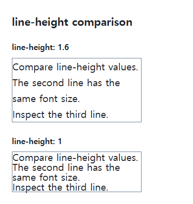
Ratios versus inherited lengths
A unitless number is inherited as a ratio. Lengths resolved from px, em, or percentages can remain the same inherited length even when a child’s font grows. This distinction matters in wrappers containing larger headings.
Line height is not paragraph spacing
Paragraph margins separately control gaps between paragraphs. Centering a control with a fixed line-height can break when its text wraps; use suitable flex or grid alignment instead. Test enlargement and the actual scripts used in the text.
Compare inherited ratios and lengths
Save this complete document as css-reference-10639-practice.html in UTF-8 and open it in a browser. Test it as a separate file rather than nesting it inside another example.
<!doctype html>
<html lang="en">
<head>
  <meta charset="utf-8">
  <meta name="viewport" content="width=device-width, initial-scale=1">
  <title>Compare inherited ratios and lengths</title>
  <style>
    body { margin: 16px; color: #20242b; font: 16px/1.7 sans-serif; }
    main { max-width: 52rem; margin: auto; }
    h1 { font-size: 1.35rem; }
    .samples { display: flex; flex-wrap: wrap; gap: 24px; }
    .samples > * { max-width: 100%; min-width: 0; }
    :focus-visible { outline: 3px solid #005fcc; outline-offset: 3px; }
.parent { font-size:20px;background:#e6f2ff;padding:8px;margin-bottom:20px; } .ratio {line-height:1.6;} .fixed {line-height:32px;} .child {font-size:30px;}
  </style>
</head>
<body>
<main>
  <h1>Compare inherited ratios and lengths</h1>
<p>line-height: 1.6</p><div class="parent ratio">Parent: 20px<div class="child">Child: 30px</div></div><p>line-height: 32px</p><div class="parent fixed">Parent: 20px<div class="child">Child: 30px</div></div>
</main>
</body>
</html>
Both parents compute to 32px, but the ratio child computes to 48px and the fixed-length child to 32px. The inherited number is multiplied by the child’s own font size. Change only .child to 40px, expect 64 and 32px, then restore it. Other inline content can enlarge a line box; distinguish this computed value from total paragraph height.
For coordinated font sizing, line heights, and typeface choices, see CSS Fonts, Font Sizes, and Line Height. Related properties to compare alongside these conditions are font-size.
When the result is missing or unexpected
- Inspect inherited fixed lengths when large child text overlaps.
- Inspect paragraph margin separately when the lines fit but paragraph gaps are large.

CSS / Reference / background-image: Images, Gradients, Relative Paths, and Layers
Paint gradients or image layers, resolve paths from the correct stylesheet location, and keep meaningful pictures in accessible HTML rather than background decoration.

CSS / Reference / empty-cells: Show or Hide Empty Table Cells
Control empty-cell borders and backgrounds in a separated table while preserving its structure. Compare show, hide, whitespace, and the collapsed-border exception.

CSS / Reference / font-size: Understand px, em, rem, and Text Enlargement
Choose text-size units by their reference and test nested em scaling. Check the actual root size, browser enlargement, and layout constraints.
CSS / Reference / letter-spacing, word-spacing: Compare Character and Word Spacing
Adjust character and word gaps independently using the same text and a normal baseline. Account for inheritance, language, wrapping, and excessive negative spacing.
CSS / Reference / caption-side: Place a Table Caption Above or Below
Place captions visually while keeping them first in the table’s source structure. Match caption text to the data and check alignment, width, and writing direction.
CSS / Reference / quotes: Choose Nested Quotation Marks
Choose generated quotation pairs for nested text and distinguish them from literal punctuation. Compare automatic marks, none, and quotation-depth operations.

CSS / Reference / overflow: Visible Overflow, Scrolling, Hidden, and Clip
Choose clipping and scrolling behavior with appropriate size constraints. Compare hidden with clip and inspect axis interactions and flex minimum sizes.

CSS / Reference / box-sizing: Content and Border Boxes, Including Small-Size Limits
Calculate content-box and border-box sizes, including margins and the minimum content-size limit. Apply resets deliberately and check external components.
CSS / Reference / border-spacing: Separate Cell Gaps and Collapsed Borders
Set horizontal and vertical gaps in separate-border tables. Distinguish cell padding, zero spacing, collapsed borders, and browser default styles.
CSS / Reference / font-style: Italic, Oblique, and Available Font Faces
Request italic or oblique forms while accounting for real faces and synthesis. Separate visual styling from emphasis semantics and inspect font-loading failures.