
CSS / Reference / box-shadow: Offsets, Blur, Spread, and Inset Shadows
box-shadow paints outer or inset shadows around a box. Horizontal and vertical offsets are required; blur and spread are optional. A shadow does not reserve layout space for neighboring elements.
Syntax and value choices
| Property | Initial value | Inherited | Main application conditions |
|---|---|---|---|
box-shadow |
none | No | All elements; visible effects depend on the text, image, or box conditions below |
Initial values are not necessarily the values assigned to HTML elements by the browser’s stylesheet. Inspect the actual result in developer tools’ Computed panel.
.card { box-shadow: 4px 6px 12px 2px rgb(0 0 0 / 25%); }
.inset { box-shadow: inset 0 0 0 3px #006c9c; }
| Value or category | Behavior and choice |
|---|---|
First two lengths |
Horizontal and vertical offsets; negative values reverse the direction. |
Third length |
Blur radius; negative blur is invalid. |
Fourth length |
Spread distance, which may be negative. |
inset |
Paint an inner shadow. |
Commas |
Layer multiple shadows, with the first listed shadow on top. |
For supported values and conditions, see MDN box-shadow.
Run the example and compare results
Save this complete code as css-reference-10628-example.html in UTF-8 and open it in a browser. Keep its demonstration styles in that file rather than pasting them into a site-wide stylesheet.
<!doctype html>
<html lang="en">
<head>
<meta charset="utf-8">
<meta name="viewport" content="width=device-width, initial-scale=1">
<title>box-shadow comparison example</title>
<style>
body { margin: 0; color: #20242b; background: #fff; font: 16px/1.7 "Malgun Gothic", sans-serif; }
#demo { padding: 24px; max-width: 820px; margin: auto; }
h1 { font-size: 22px; margin: 0 0 20px; }
.samples { display: flex; flex-wrap: wrap; gap: 24px; }
.label { margin: 0 0 8px; font-weight: 700; }
.target, .reference { width: 200px; height: 100px; padding: 18px; background: #bfe3ff; margin: 14px; }
.target { box-shadow: 4px 6px 12px 2px rgb(0 0 0 / 25%); }
.reference { box-shadow: inset 0 0 0 3px #006c9c; }
</style>
</head>
<body>
<main id="demo">
<h1>box-shadow comparison</h1>
<section class="samples"><div class="a"><p class="label">Outer shadow</p><div class="target">Box shadow</div></div><div class="b"><p class="label">inset inner shadow</p><div class="reference">Box shadow</div></div></section>
</main>
</body>
</html>
The first box has a blurred shadow toward the lower right. The second has an inset band. Neither shadow pushes nearby boxes away.
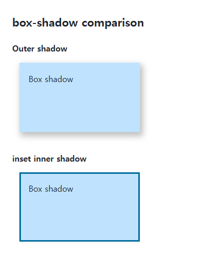
Color and curved corners
Omitting the shadow color uses currentColor. Explicit alpha colors make the intended effect clearer. Box shadows follow border-radius, but do not trace the transparent contour of an image as a drop-shadow filter can.
Clipping and rendering work
Ancestor hidden or clip overflow can cut an outer shadow off. Large blurred areas and many repeated layers can increase rendering work, so test the actual interface. Use text-shadow for glyph shadows.
Change one setting at a time
Use the complete example file above. Change only the specified selector or value rather than several comparison conditions at once.
- Change only .target’s 12px blur to zero and restore it. Then change only its 2px spread to -2px, compare the painted area, and restore it.
- With two comma-separated shadows, the first paints above the second. Reverse their order and also inspect ancestor overflow rather than blaming every cut-off edge on the shadow values.
For using borders and shadows together on components, see CSS Borders, Rounded Corners, and Shadows. Related properties to compare alongside these conditions are text-shadow, overflow.
When the result is missing or unexpected
- Inspect ancestor overflow and available space when a shadow is cut off.
- Check for a later none or another shadow declaration.

CSS / Reference / border-spacing: Separate Cell Gaps and Collapsed Borders
Set horizontal and vertical gaps in separate-border tables. Distinguish cell padding, zero spacing, collapsed borders, and browser default styles.

CSS / Reference / font-size: Understand px, em, rem, and Text Enlargement
Choose text-size units by their reference and test nested em scaling. Check the actual root size, browser enlargement, and layout constraints.
CSS / Reference / font-weight: Numeric Weights, Relative Weights, and Font Matching
Request numeric or relative font weights and inspect the supplied faces. Compare static and variable-font behavior without assuming every number produces a unique weight.

CSS / Reference / list-style-type: Change List Markers and Numbering
Style list markers while keeping ordered and unordered semantics. Compare numbering styles, starting values, marker removal, and shorthand resets.

CSS / Reference / background-attachment: Viewport, Box, and Internal Scroll Attachment
Compare local and scroll backgrounds inside a scrolling box and distinguish them from viewport-fixed backgrounds. Test target-browser behavior and a usable fallback.
CSS / Reference / letter-spacing, word-spacing: Compare Character and Word Spacing
Adjust character and word gaps independently using the same text and a normal baseline. Account for inheritance, language, wrapping, and excessive negative spacing.
CSS / Reference / background-clip: Background Painting Areas and Text Clipping
Choose border, padding, or content painting areas independently of image positioning. Compare visible boundaries and plan readable fallbacks for text-clipped backgrounds.

CSS / Reference / white-space: Preserve Spaces, Line Breaks, and Wrapping
Choose whitespace behavior by preservation and wrapping needs. Compare traditional values and break-spaces, and handle long words with separate wrapping properties.
CSS / Reference / caption-side: Place a Table Caption Above or Below
Place captions visually while keeping them first in the table’s source structure. Match caption text to the data and check alignment, width, and writing direction.

CSS / Reference / calc(): Calculate CSS Values and Understand Their Types
Combine percentages and lengths with calc(), inspect the actual parent width, and distinguish invalid expressions from newer typed arithmetic and special numeric results.