
CSS / Reference / letter-spacing, word-spacing: Compare Character and Word Spacing
letter-spacing adjusts character spacing; word-spacing adjusts spacing used between words. Positive values add space and negative values reduce it, without directly changing font size or line height.
Syntax and value choices
| Property | Initial value | Inherited | Main application conditions |
|---|---|---|---|
letter-spacing |
normal | Yes | All elements; visible effects depend on the text, image, or box conditions below |
word-spacing |
normal | Yes | All elements; visible effects depend on the text, image, or box conditions below |
Initial values are not necessarily the values assigned to HTML elements by the browser’s stylesheet. Inspect the actual result in developer tools’ Computed panel.
.title { letter-spacing: 0.08em; }
.copy { word-spacing: 0.5em; }
| Value or category | Behavior and choice |
|---|---|
letter-spacing: normal |
Use the normal font and browser character spacing. |
letter-spacing: 0.08em |
Add character spacing relative to the current font size. |
word-spacing: 0.5em |
Add space to the normal word separation. |
Negative lengths |
Reduce spacing; excessive values can make glyphs overlap. |
For supported values and conditions, see MDN letter-spacing, MDN word-spacing.
Run the example and compare results
Save this complete code as css-reference-10463-example.html in UTF-8 and open it in a browser. Keep its demonstration styles in that file rather than pasting them into a site-wide stylesheet.
<!doctype html>
<html lang="en">
<head>
<meta charset="utf-8">
<meta name="viewport" content="width=device-width, initial-scale=1">
<title>letter-spacing, word-spacing comparison example</title>
<style>
body { margin: 0; color: #20242b; background: #fff; font: 16px/1.7 "Malgun Gothic", sans-serif; }
#demo { padding: 24px; max-width: 820px; margin: auto; }
h1 { font-size: 22px; margin: 0 0 20px; }
.samples { display: flex; flex-wrap: wrap; gap: 24px; }
.label { margin: 0 0 8px; font-weight: 700; }
.target, .reference { width: 280px; padding: 12px; background: #e6f2ff; }
.target { letter-spacing: 2px; }
.reference { word-spacing: 12px; }

/* Keep the practice box within a narrow viewport. */
.target, .reference { max-width: calc(100vw - 48px - 24px); }
</style>
</head>
<body>
<main id="demo">
<h1>letter-spacing, word-spacing comparison</h1>
<section class="samples"><div class="a"><p class="label">letter-spacing: 2px</p><div class="target">Hello CSS world / The same sample sentence.</div></div><div class="b"><p class="label">word-spacing: 12px</p><div class="reference">Hello CSS world / The same sample sentence.</div></div></section>
</main>
</body>
</html>
The character-spacing sample spreads letters; the word-spacing sample enlarges word separators. Use a normal baseline and change one property at a time to distinguish the two effects.
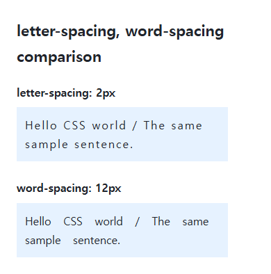
Spacing and font size
Relative em spacing can scale with a title’s font size. Large tracking changes line lengths and wrapping, so use actual content rather than a short decorative word. These properties are inherited and may also reach nested buttons or code.
Language and readability
Word spacing does not separate every Korean character; the example includes real spaces and English words. Avoid aggressive tracking in scripts whose letters join. normal and 0 can differ in the freedom allowed during text justification.
Compare spacing on identical text
Save this complete document as css-reference-10463-practice.html in UTF-8 and open it in a browser. Test it as a separate file rather than nesting it inside another example.
<!doctype html>
<html lang="en">
<head>
  <meta charset="utf-8">
  <meta name="viewport" content="width=device-width, initial-scale=1">
  <title>Compare spacing on identical text</title>
  <style>
    body { margin: 16px; color: #20242b; font: 16px/1.7 sans-serif; }
    main { max-width: 52rem; margin: auto; }
    h1 { font-size: 1.35rem; }
    .samples { display: flex; flex-wrap: wrap; gap: 24px; }
    .samples > * { max-width: 100%; min-width: 0; }
    :focus-visible { outline: 3px solid #005fcc; outline-offset: 3px; }
.sample { padding:12px; background:#e6f2ff; overflow-wrap:anywhere; } .letters { letter-spacing:2px; } .words { word-spacing:12px; }
  </style>
</head>
<body>
<main>
  <h1>Compare spacing on identical text</h1>
<p>Baseline: normal</p><p class="sample ">Hello CSS world / CSS spacing example.</p><p>letter-spacing: 2px</p><p class="sample letters">Hello CSS world / CSS spacing example.</p><p>word-spacing: 12px</p><p class="sample words">Hello CSS world / CSS spacing example.</p>
</main>
</body>
</html>
The text, font size, and available width stay identical. Change only the letters’ 2px to 0, compare against the baseline, and restore it. Then test only the words’ 12px against 0 and restore that value.
For coordinated font sizing, line heights, and typeface choices, see CSS Fonts, Font Sizes, and Line Height. Related properties to compare alongside these conditions are line-height.
When the result is missing or unexpected
- Include actual word separators before judging whether word-spacing works.
- Restore excessive negative spacing before changing font size or container width.

CSS / Reference / font-variant: Small Capitals and Font Features
Use small capitals without changing the source string and choose specific variant longhands. Compare real font support with synthesized presentation.
CSS / Reference / text-indent: First-Line Indents and Hanging Paragraphs
Create first-line and hanging indents, distinguish them from paragraph padding, and check inheritance, writing direction, and narrow-screen clipping.

CSS / Reference / empty-cells: Show or Hide Empty Table Cells
Control empty-cell borders and backgrounds in a separated table while preserving its structure. Compare show, hide, whitespace, and the collapsed-border exception.
CSS / Reference / letter-spacing, word-spacing: Compare Character and Word Spacing
Adjust character and word gaps independently using the same text and a normal baseline. Account for inheritance, language, wrapping, and excessive negative spacing.

CSS / Reference / calc(): Calculate CSS Values and Understand Their Types
Combine percentages and lengths with calc(), inspect the actual parent width, and distinguish invalid expressions from newer typed arithmetic and special numeric results.